Pods embed error: Pod not found

Geology of a Canyon via Excel

I’ve been daunted by the ds106 Spreadsheet Invasion assignment where you are charged with creating an animation using the software designed for… sales reports, etc. It is, ironically, the first Design Assignment. And one that is least frequently done.

But thankfully, it was my student Tiffany who undertook it bravely in her Tale of a Flower version that pushed me over the hump of inertia to try this.

So here, I tell in a rather horribly inaccurate fashion, the process of Geology that form sedimentary rock (invasions of inland seas, rivers, and desert environments over time) and uplift/eroison processes that shape canyons.

I did this while idling time yesertday at BWI airport, wine was involved (Malbec, I love relaxing at Vino Vola). A lady at the next time working on NUMBERS in her spreadsheet must have been tsk-tsking me coloring in cells.

There is a fair bit of slop, I was not careful to move the selection box (I could not find a way to get it out of the way). But more or less, I just kept adding to it, coloring selections of cells and reverting them to no fill as needed- I ended up with 82 screen shots.

When I wanted to elevate the landscape, I just deleted 3 rows from the top, and colored the empty cells at the bottom.

I used an old Mac file renaming tool to change the file names to be “geo01.png, geo02.png” etc. This is because in QuickTime PLayer 7 You can do File- > Open Image Sequence…, select the first one, and it grabbs all the rest into a video file. I set the frame rate to be 1 second…

Which was pretty horrible, so I brought into iMovie. I broke the main clip into sections by finding the pots I wanted to have different speeds, and splitting the clip (control click for menu, select “Split Clip”)

Then for each clip, I use the little menu in the top left to do a Clip Adjustment, and change the speed to make it go faster or slower:

Beyond that, it was a matter of adding some titles, a few transitions. I grabbed a bit of the opening of John Mayall and the Blues Breakers “The Mist of Time” as a sound track.

Another little trick is get some black screen on the end. You cannot use the “Fade to Black” transition without something to fade into. Sometimes I import a black PNG, but what I did here was to add a title sequence with just spaces in it (no text), which creates a video sequence of black. I could then extend the audio sound track to match, so there is some outtro music.

This was quick and slightly dirty, I’d like to think about how to do something more elegant. It would be more useful to do some things with different sized columns, maybe make them square so you have pixel shapes to work with. Or perhaps the animation could eb done by creating the action as a long horizontal sequence, and doing a screen recording as you scroll the horizontal.

But I love using Excel for something it was not built for, this is so Ed Parkourish.

Splash the Color – It’s all downhill from here

Today’s DS106 assignment, entitled “Splash The Color“, was submitted by Alan Levine (aka CogDog). He states:

“Color splash is a technique to emphasize details – you remove all color from a photo, and then restore original color to a single object.”

Bird's Hill Bike Path - Color Splash

I began the task with the help of Annie Belle’s excellent video tutorial. Although she provided two different techniques to create her color splash, I soon learned that the tools that she described in her “Photoshop CS4″ corresponded in no way to the limited number of tools I had in “Photoshop Elements 6″. However, learning is all about discovery… so I forged on.

First I selected a color photo that I had taken on a new bicycle path in Bird’s Hill Park. I thought that the yellow colored signs would be easy to crop and work around.

My process involved the following two repeated steps:

  • Use the “Polygonal Lasso Tool” to select a portion of the colored photo
  • Use menu items: Enhance > Adjust Color > Remove Color

Once all the color, except for the yellow on the signs, was removed my “splash” image was saved and uploaded to Flickr for sharing. Although the “tweaked” photo is shown above, those who wish to compare it with the original, should visit my DS106 creations in Flickr which are referenced at the bottom of this post.

The Teachable Moments:

  1. As a “newbie” to Photoshop Elements, I found it very difficult to find the starting point of my polygon when using the “Polygonal Lasso Tool”. After selecting a polygon area, I would click repeatedly in the vicinity of my starting point hoping to hit the exact initial pixel from which my polygon boundary was formed. What a hassle! Thankfully an “unknown hero” in a forum recommended that one simply double-click when one was close to the starting point and a line would automatically join the present location to the starting point. Thank you Google!
  2. Although I believe I created a colour splash, in hindsight, I am not certain that I did it correctly. I know that Annie Belle demonstrated how she could change the color saturation of the door that she had selected. I know that I have no control over the yellow intensity in my signs as the colour shown in my photos is only the original.

Knowing that I may have faked by way through this first “Visual Assignment”, I know that there are many creative DS106 users who are much more experienced with Photoshop Elements 6. I trust that they will provide constructive feedback through the Comments area.

Take care & keep smiling :-)

Brian Metcalfe’s DS106 “photostream”
http://www.flickr.com/photos/life-long-learners/

VII-A Haiku of Contrasts

(Link to the original assignment that is not a URL.)

Today I’ve done another ds106 assignment for you all. So without further adieu:

Image

(Link to original photo on tumblr by teatimestar).

“A black tea kettle

Atop a white board, it is

Certainly contrast.”


(Note: I enjoy listening to this while reading haikus, even though by the time the video loads you will have finished reading mine. Also, please read on to see why I chose these words for the haiku)

The Assignment

The assignment was to “take a random photo from dailyshoot and write a haiku about it”. I really like haikus, they were like the Twitter of feudal Japan. You only had a limited amount of space to express your thought, so you had to make a few words go a long way. This is probably a good practice to get into for me since I am notoriously long-winded, in any language. On a somewhat related note, I am actually starting to like Twitter. Never would have thought that would happen.

The Process

First I had to figure out what in the nine hells dailyshoot was. A cursory typing of “dailyshoot.com” into my browser turned up nothing, but Google quickly came to my rescue. Apparently it’s a site where people upload photos under specific guidelines in order to complete an assignment, similar to ds106. I thought it may have something to do with ds106, because every photo had a tag that began with #ds and then a number, currently up to 690. After much contemplation, I have come up with three hypotheses:

1. #ds just stands for dailyshoot,

2. There are infinite ds’s, and our 106 is merely one, just as theoretical physicists and Mormons believe there are infinite universes,

3. I don’t know what I’m talking about.

I report, you decide.

Anyway, in accordance with the letter of the assignment, it would be best to truly select a random image. In order to do so I used one of my favorite internet tools, this dice roller which was intended for playing Dungeons & Dragons. If you have great moments of indecisiveness (due to apathy or other maladies) I think you will find this extremely useful, I know I do. This tool allowed me to randomly choose between pages and pictures until I arrived at the one above. The assignment this picture was submitted for called for “a picture with high contrast”.

The Story

Initially, I found it daunting to write a haiku about a tea kettle. This is ironic, because considering the revered place of tea in Japanese society, I am inclined to believe there are probably a great many haikus written about it. But I am not Japanese, not much of a poet, and also not that fond of tea.

Then it dawned on me. Contrast. Isn’t contrast one of the properties of an image, for example the setting you change on your television in order to improve the appearance of the picture? This gentleman seems to have literally gone for contrast by putting something black on top of something white. I don’t know anything about photography, art, or the price of tea in China (see what I did there) but it seemed a little heavy-handed, a little obvious. Or maybe he was being ironic. TheI think not though because he himself wasn’t too fond of it according to tumblr:

“  So, today’s dailyshoot was to make a high contrast photo.  As usual, it didn’t really turn out how I planned.  This particular photo probably turned out the best of the bunch that I shot, but there are still a number of things I don’t like about it.  The composition is all wrong.  The top of the pot blends in too much with the table, and I don’t like that the edge of the table is in the frame.  Anyway.  It is late.  I still haven’t found a good excuse to shoot anything with my new telephoto zoom.  I’m considering returning it to the store.”


It seems like he’s in the midst of quite a crisis, and I hate to kick him when he’s down, since my haiku was basically poking fun at the picture. But maybe this is the picture that turned him around. Maybe he took that telephoto zoom back to the store and got a new one that changed him forever as a photographer. Maybe he gave up photography. Maybe I should contact him on tumblr and ask him. No, I think not, I’m hungry.

Alan Kay 106 Horror

Assignment:Here is my third DS 106 assignment. This time I did a Visual assignment called “106 Horror!” Sound pretty interesting, and I thought by doing this assignment I will be able to play around with  programs and learn more about them. This assignment submitted by CogDog tell us to:

create or modify an image of the number 106 that is in the genre of a horror movie.Make 106 seem scary and ominous

We are almost ending this Pioneer section, so I decided to use one of the Pioneers for this assignment and after looking at each of them, I found a picture of Alan Kay which I thought will match for this assignment

Process: As always I used Google image research to look for a matchable image.

 The picture above was the original image 

 My next step was how to combined Alan Kay and the number 106 making it  look horror. For this work I mainly used Aviary, and FotoFlexer . It was my first time to use FotoFlexer which I founded by typing image editing in Google. It was similar to Aviary in a way that you do not need to download it’s not too complicated to use it. This program have amazing tools, colors and effects so I recommend people to use it.  Especially, people that are stuck with other edit programs.

With Aviary I added the letters and numbers using a font that will give an horror impression. After playing with it for about 20 minutes I ended up having a pretty scary image. After I started to look for new programs and I found FotoFlexer. I just downloaded the image that I had already and start to try some amazing tools that they have. I used ink splotches because I thought it will give more horror to my image.

This time surprisingly took me only 30 minutes which shows that each time I complete an assignment, I am getting better of using edit programs

Story: First of all, I  just want to mention that I have nothing against Alan Kay hahaha. I am mentioning this because of the phrase mention in the image “Alan Killer”. Well I wanted to make a horror image, and using the initials of the Pioneer, I realized the K for Kay will give a scary image if a transform it  into Killer. Now, I will give a story of the original picture. I went back to Google images and find this picture. Then I clicked to take me to the page where it was originally.On 28 January 2010, Alan Kay was awarded honorary doctorates by the University of Murcia for his contributions to the development of the personal computer and object-oriented programming. In the ceremony he wore the clothing above and present a speech which I found a Youtube video of it posted below. Sorry I couldn’t find an English version, however from 3:58, show the speech of Alan Kay although it last only few minutes.

in the last 10 years, Alan Kay has received many awards and recognitions such as the one in Murcia University, or one in 2009 from Kyoto University.

Vocaloids: Gateway to Geekery

Why it’s Daunting:

For fans of the William Gibson novel “Idoru”, her rise was foreseen. She topped the charts with a number two album in 2009 and a number one single on iTunes in 2012.  Her name in Miku Hatsune, and she is a Vocaloid. Vocaloids are synthetic music software programs that anyone can purchase and use to edit and create songs. They can then upload the song to the web or make  a CGI video with an avatar dancing and performing the song. Miku’s most popular web videos where compiled into albums and a devoted fan base developed. Americans find it strange to be a fan of a digital entity that doesn’t really exist. In an industry that auto tunes most acts anyway, there can hardly be said to be a difference.

Where to Start:

Miku’s first viral video was of her singing a Finnish polka song “Ievan Polka” while animated in Japanese “Chibi” style, waving an onion. The plucky electro pop beat and quick lyrics are quite catchy. This is also an example of the irreverent nature of her open source contributors.

Miku’s iTunes chart topper “Tell Your World” is fairly standard Jpop. The natural sounding piano instrumental combined with her buzzing vocals makes an uplifting, inspirational piece.

Next Step:

Her fan base originated on the Japanese site Nico Nico Doga, a video media streaming service. She propagated to Youtube from there and reached a larger international audience. All told, tens of thousands of users have created content for the Hatsune Vocaloid. Finding what is appealing is a matter of a short web search.  She is used quite well in the electronic and trace genres, fitting considering her electronic origins as a robotic researchers voice software. “Lost You” is a deliciously chilly progressive trance track, probably my favorite.

“Sky High” is a deep ambient piece, with a ghostly disembodied other worldliness in the vocals.

If you tire of the endless computer searches and want to enjoy an evening out, you can purchase Miku Hatsune concert tickets. That’s right, a virtual idol has live concerts. She’s projected as a hologram on a stage and performs her most popular songs with a live band. She’s had shows in Tokyo and Singapore

To get the full Miku Hatsune experience, you can buy the program and make Hatsune songs yourself. This is what is so profound about her. Anyone with talent can produce there own music and have it performed by a beloved national idol to the adulation of tens of thousands of fans any where in the world.

Where Not to Start:

Miku Hatsune Death Metal


Captcha Art (ds106 assignment)

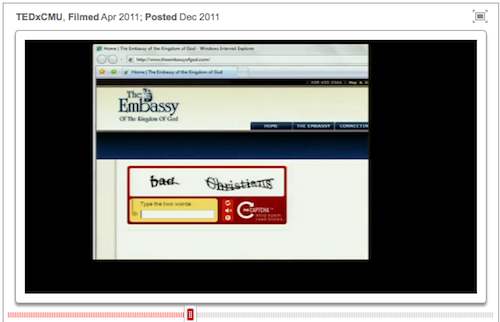
Among other TEDx Talk videos I have seen recently, the one by Luis von Ahn on Massive-scale online collaboration, Stephen Downes notwithstanding, generated a number of ideas for me. von Ahn is the man behind the idea of reCaptcha- originally a Carnegie-Mellon project eventurally gobbled up by Google. What I liked most is his example of looking differently at a problem- digitizing texts via OCR and turning a normally wasted amount of human activity- proving themselves to not be bots by entering the text into a box of scrambled letters– into a useful activity by making the captcha images not random, but ambiguous words in the proces.

The video alone is worth watching for von Ahn’s description of his newest project, to translate the web into all languages via free language learning lessons (see the video or http://duolingo.com/)

I signed up for to get an invite for dulingo, but it was von Ahn’s examples of humorous random examples that got me thinking, e.g. “Bad Christians” showing up on a theology site

Then he talked about how some people were setting up sites to illustrate the word combinations, such as “Invisible Toaster”

And thus SHAZAM! Here’s a ds106 visual assignment idea.

Go to any site that uses a repcatcha e.g. the repcatcha site itself and recycle them until you get something that might be illustratable. The recycle button is the one at the top:

Take a screenshot of the word pair, then find some re-usable image(s) that might cleverly illustrate the words, mix them together to a single image that includes the captcha.

Now here is the thing- the reCaptcha images seem to have gotten more complex; most have one recognizable word and the other is a fragment or maybe a word in some other language (?), so you might have to be super creative.

Like this one I might illustrate someone talking to a confused waiter in a restaurant trying to order something strange:

I ended up cheating a bit- a few years back I had noticed interesting word pairs in reCaptcha and played with building a story out of the images, so I used some of the ones I had saved for my two examples.

My first one tries to describe what dentists really eat for dinner, foods that are easily chewable and always floss, hence Dentist Dinners:

Image credits:

For captcha art number two, we see how we can ascertain that bulldogs are above taking bribes; they have stanps of approval by the US government as Ethical Bulldogs:

image credits:

So what can you make with random captchas?

Four Icon Challenge – Fantastic Voyage

All icons either Public Domain or CC by Attribution from the Noun Project (http://thenounproject.com/)

“Reduce a movie, story, or event into it’s basic elements, then take those visuals and reduce them further to simple icons.”

Those aren’t my words, but rather the instructions from the Four Icon Challenge ds106 assignment. Since this coming semester’s ds106 theme is apparently that of a “fantastical voyage” (the opening post for the course is “journey to the center of the internet”), I thought it might be appropriate to pay homage to the 1966 Academy Award winning film, Fantastic Voyage.

For those of you who may be new readers of my blog, I am an open participant in the most excellent storytelling course, DS106. A completely open, collaborative effort by a growing number of universities, DS106 (digital storytelling 106) is an exploration of media, technology, and story telling in a way that challenges its participants to create, remix, and manipulate images, sound, and video to tell a narrative. Besides being witness to stupefyingly great digital art that assaults my education-focused thoughts with the kind of creativity and deviance that attracted me to teaching in the first place, ds106 is a great way for anyone, including teachers, to explore and experiment with all sorts of free tools and software that can aide in the creation of digital artifacts for learning.

For example, I created the image above using Adobe Illustrator, a terribly complex and robust piece of software that no elementary-trained educator in their right mind would ever really need or want to use. However, thanks to the extremely helpful ds106 community, I was able to focus on just some very basic tools within the program, use some of the great free icons from The Noun Project, and assemble this piece of digital art. Sure, I don’t understand how to create vector-based artwork (for which the tool is intended), but I at least now know how to manipulate paths, fill colors, and arrange layers to remix images for educational uses.

Even IF you don’t want to take the plunge and start exploring a professional grade graphic suite, you could always just use a word processor or a simple paint program to have students assemble their own “four icon assignment”. Using the free icons from The Noun Project, have them build a representation of the learning goals for a particular unit, or summarize the main ideas of a reading passage. You could even use the visual element as a springboard for writing, reflection, or compare and contrast all of the students imagery to see if the class can pick up on common important elements of a story.

At the very least, you owe it to yourself to check out what some of the other people have been doing with this visual assignment for ds106, and see if you can’t challenge yourself to create a four icon image of your typical day at school and share.