Pods embed error: Pod not found

Danger Diabolik!

Danger Diabolik is one of my favorite Mario Bava films, and this animated GIF is taken from probably my favorite scene in the film which has Diabolik tearing around in his bitchin car driving to the tune of Ennio Morricone’s best song off the soundtrack “Driving Decoys.”

From Mario Bava's Danger Diabolik!

I would narrate the process here, but I already have elsewhere. My fourth visual assignment, which means I have met the course requirements for week 1 and can move on with the game….can you?

Bear with me, this is a journey

I have fallen in love with Tim Owens’ Averaging Concepts using Flickr visual assignment. I liked it so much I did it before #ds106 Summer of Oblivion even started.

Then today came Lou McGill’s post Layers, which took the idea to a whole new level. I still aspire to make something as wonderful as the final image of his her dad. But that’s not the direction I went today, though I did push this averaging thing a little further along in a different direction.

It was Tim Owens’ averaging tutorial post that pointed me toward the work of Jason Salavon, in particular his portrait project. I am crazy for these things, these “atmospheric meta-portraits”.

As it happens, I had a ready-made image series to experiment with. In summer of 2009 I took a Drawing I class, and our final project was this: dress up as your alter ego, shoot a bunch of photos of yourself, pick the best one, crop it to the right proportion, print an 8×10, and use that as a reference to enlarge and redraw at 16×20 inches using our choice of media. We could draw black and white or color images. I chose to create mine in color using art markers. So you can see the photos I started with, here is a video I made documenting that drawing assignment.

So from the photo shoot from the drawing project, I had 62 photographs that were of similar composition. I decided to make an averaged portrait. I followed Tim’s tutorial. When I saw the result I was happy with it, but I still wanted to try adding it to another photo, like Lou McGill did. I tried some other photos in my catalog of images but I just wasn’t happy with the juxtaposition for any of them, and then it hit me:

Animated GIF.

I brought my final selection photo, the one I made my drawing from, and masked it using the Quick Selection tool to grab only my skin, feathering the selection about 60px and then turning that selection into a layer mask. I liked the Soft Light blending mode, but you could still see my face too clearly, so I reduced the opacity to 10%. Then I made an animated GIF, playing with the timing and whether the masked photo layer was on or off, varying the opacity when it was on. I only needed eight frames to get what I was after – a sort of flickering in and out of the more discernible version of my face.

So here is my final result, an animated GIF + amalgamated self-portrait using averaging. I’m liking it.

The ds106 99: #10 bavatuesdays…the movie

ds106 internaut Elizabeth Castillo recently came up with a Design Assignment I just couldn’t resist: “Create a movie poster for your website.” I kind of think of my blog as inspired by movies, so this assignment immediately appealed to me, and I made quick work of this —kept it minimalistic—but the tag line says it all :)

One of the elements of this course that is often overlooked is how cool the “Submit an Assignment” portion of the ds106 site is. It allows anyone to submit an assignment idea and everyone to do it. What’s more, when you link back and use the right tags your interpretation of the assignment shows up beneath it (see this assignment as an example of that). We’ve had an amazing amount of activity in this area of the course (more than 100 assignments submitted), and it’s a veritable treasure chest of assignments that have built-in examples for people to riff off whether or not they are part of the course. I’m going to dedicate a series of the ” ds106 99″ this week to the design of the ds106.us site, but Martha Burtis’s work with “Submit an Assignment” is absolutely one of the most powerful ways we have crowd sourced the teaching of the course itself. I mean I wouldn’t have been pushed to do this movie poster if it weren’t for this capability, and Elizabeth’s willingness to have fun with it. #ds106 FTW!

Update: One more thing, I did this poster entirely in GIMP. It can be a bit clumsy (I wonder how much of that is premised on my comfort with Photoshop?), but in terms of a free, open source Photoshop-alternative it’s top notch. This Summer I will be incorporating GIMP into the class as a free tool for the visual and design assignments. I’ll need to work on some tutorials, but it can more than get the job done, and I am increasingly more comfortable teaching it given I have been playing with it all semester for animated GIFs.

The Pit of Despair!

I decided to do another design assignment since the last one was such a success!

This time I picked the movie location poster one, but I decided to animate it.

The movie: The Princess Bride.

The location:

It is all grey-scale, and on the very darkest end of the scale. The idea was to preserve the gloomy, oppressive nature of the torture chamber, and I think it worked pretty well. I made the cogs radially symmetric around each cog, so that I only had to animate the rotation of the distance of one spoke.

The entire animation is only five frames, but it loops seamlessly. The whole picture is limited to 8 colors, and I used a patterned dither rather than a gradient-based one so that it looks more artistic and abstract, rather than literal.

The low number of colors and frames make for a fairly quick, smooth animation, especially considering its size. I’ll be curious to see how it does on other computers, and especially with less solid internet connections. My guess is that it’ll be a little slow to download, and once it’s cached it’ll run fine pretty much anywhere.

Despite the simplicity of the design, the final Photoshop document is 14 layers deep. Most of them are repeat layers for the animation (I copied a layer for each cog, for each frame of the animation. There might be a better way to do it, but this wasn’t too bad). I don’t do this kind of stuff very often, so it took me a bit longer than I’d anticipated, but I think the result is pretty cool.

I thought about making a poster for the Cliffs of Insanity or the Thieves’ Forest instead, but when I came up with the animation idea I decided that this one was definitely the coolest to animate.

What do you guys think?

I am a glutton for punishment

I started on the pokemon card assignment and thought, “That example isn’t really a pokemon card. Let’s see what the cards look like nowadays… SNAP. No, not going to do that. Too complicated.”

Too complicated? TOO COMPLICATED?!?

Hah! I wound up getting most of the pokedex entry done, apart from the description. Then I thought, “Why not make it a GIF? It’s only animating text. How bad can it be?

Well, I started on this assignment at 4:00. It’s almost nine now.

But I have something to offer from all of this tedious work:

Moves:

Analyze
Test
Squeak
Apocalypse

EDIT: I made another one! With this one, I made the choice not to animate every letter. MauveShirt suggested I animate each line. This is what MauveShirt would be as a pokemon:

Moves:

Mutter
Dig
Disorienting Stare
Confusion

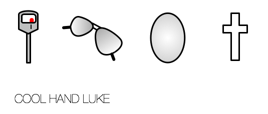
1 Story – 4 Icons

Assignment: Reduce a movie, story, or event into its basic elements, then take those visuals and reduce them further to simple icons.

That’s my attempt above. I tried to stick to a three color scheme. The first image is supposed to be a parking meter. My wife was unable to ID it. It needs work. Hopefully the other three are at least identifiable.

I don’t use vector drawing tools very often. I clearly need to spend some more time with them to get some skills but that was half the reason I attempted this. My learning is now public, fairly messy, but most of all not really what I want. That is ok. It’s fun. It isn’t a contest. I’m enjoying it. I do not fear Jim Groom’s red pen.

You might also notice that I’m doing assignments in and around the #ds106 course but not necessarily all the ones that are assigned, nor am I necessarily doing them in the order they are given. I’m doing extra “work” with the interest and energy moves me1. I may go back and do some. I may not.

I like the MOOC idea. I find it valuable to have a group of people moving through the roughly same ideas at roughly the same time. I like the freedom I find in the structure. What worries me is how just calling something a course seems to bring a ton of baggage with it. People worry about not completing every assignment, being compared to others/graded and, most depressingly, being found wanting. I’ve seen this in the blog posts of participants and the comments of people I know in “real life” who’ve opted not to participate.

I see this mentality as a direct result of our educational system – adults, scared to try new things, as a learned response. I don’t blame the people. I think I see how this point is reached systemically. It’s just a pretty depressing legacy for a system that claims to produce life-long learners. It’s going to take an enormous amount of time and work to fix something buried this deep.

So, I’m inviting you to take part. If you’ve wanted to play along but haven’t because of lingering fears or doubts, come on in. The water is fine. The people couldn’t be nicer2. Jim couldn’t grade you if he wanted to3. Hey, there’s even a rather bizarre participant-run and -created streaming internet radio station.

Inspired by Colt Rane who ought to be making a huge number of English teachers happy with this image. He’s got one for the Great Gatsby as well but I don’t remember the book well enough to know if it’s good or not.


1 Clearly animated gifs got under my skin for some reason.

2 Even an odd Nazi photoshopping (by a non-class member) incident seems to have been settled fairly amicably.

3 Grades are for paying customers. All you might get is helpful feedback or compliments.