Mini MOOCs

(click for full size mini mooc)

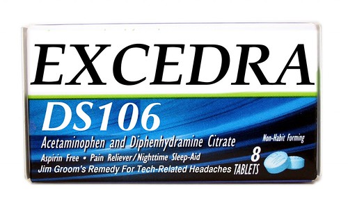
Found among the coffee additives at HB’s, a restaurant in Pine, AZ, this little product that was created for the ds106 Re-brand ‘em Assignment:

The logo is an important part of a company. For this assignment, you are to choose a company and re-brand them. Take their logo and remix it, or start from scratch and make it your own piece of art. Need inspiration? Here’s a cool site (http://www.underconsideration.com/brandnew/) that blogs about recent changes in company logos, and posts both the new and old versions. It can really highlight what subtle changes can do to a logo.

Once MOOCs get tired of being so massive and unweildy, they will implode and emerge as “mini-moocs” This is the most important dairy product in 200 years.

I suggest grabbing a handful of them.

Anything You Can Do, I Can Do Better

Re-branding – Micron should pay me for this.

This is from the design assignment called Re-brand ‘em.  I took the advice from underconsideration.com and simplified the logo a bit.  Since Micron uses circular wafers, I incorporated the circular shape of those into the colors Micron generally likes to use for their products.  I made an oval shape and filled it and made that a layer underneath of the text layer for the word itself.  I think it came out looking pretty neat. :)

Telsa Motors Rebranding (your logo sucks, guys)

How can you use the name of Tesla and not have anything about AC power in your logo?

I love Tesla Motors and what they are pushing for in their designs, but I think their original logo is terrible since it has nothing to do with their company. “HOLY HELL! A SHIELD WITH EDGY TEXT! I’M SOLD!” Yeah, that isn’t how logos work.

I feel like “HOLY HELL! A SYMBOL FOR AC POWER WHICH WAS INVENTED BY TESLA WITH EDGY TEXT! AND THE WORD ‘MOTORS’! I’M SOLD” is a better play.

Re-Brand ‘Em

This is for the assignment Re-Brand ‘Em


http://www.flickr.com/photos/75437437@N06/6906569259/in/photostream


i had alot of fun with this even tho i am not good with photoshop at all i was still able to combine the art that i wanted and was able to create a cool logo for burton company which makes snowboards and snowboard gear and is well known for their products because of how well they are made.

Wells Fargo, do us all a favor and…

CHANGE YOUR HIDEOUS LOGOS AND SIGNS! When deciding which brand I wanted to Re-brand for a design assignment,http://assignments.ds106.us/assignments/re-brand-em/ , it was no competition what I was going to pick. Wells Fargo has the ugliest signs and I wish they would consider changing them. So, what I did… I actually used Picnik and some of their [...]

Tech Induced Headache?

Try some EXCEDRA DS106! Etc. or EXCEDRA?

This is my finished product for the Re-Brand ‘Em design assignment.  Maybe you haven’t noticed how Jim Groom says “etc.” but I have.  Since the third class I’ve thought about doing this and when I saw this assignment it seemed to fit in pretty well.

I used Google Image to find a picture of an Excedrin package.  Once I’d downloaded it I used Gimp to edit.  You can see where I had to crop out lettering behind the “DS106.”  I tried blending the colors with the smudge tool but it was difficult to blend it without losing the abstract pattern that’s obvious in the rest of the blue area.  It was easier to edit the top half of the box where the background is just a solid white.  Finally I added text below the description of the medicine.

Assignment Details

Ariat Remixed

Ariat is a really common and popular brand of horse and rider equipment, and their brand is really well-known. If you see this design on a pair of boots or a shirt -

You know you’ve got some good quality stuff there.

So since it’s such a recognizable image (at least to horse people!) I chose to remix this for the Re-brand ‘Em design assignment. Because the colors are very conservative, I decided to choose the brightest color combination I could think of.

I used GIMP for the process. First I cut out the three interconnected horseshoes, leaving a blank space, which I then filled with bright pink color. Then I deleted the gold background by using the tool that selects by color. Then it was a simple matter of drawing the black boundary with the pencil tool and filling in the background with a nice shade of lime green.

This was not nearly as hard as I expected, and definitely fun because I think that Ariat would be preeeeetty surprised by this take on their logo…though perhaps they can use it for a children’s line of riding clothes?

Re-brand ‘Em

_cokwr: The logo is an important part of a company. For this assignment, you are to choose a company and re-brand them. Take their logo and remix it, or start from scratch and make it your own piece of art. Need inspiration? Here's a cool site (http://www.underconsideration.com/brandnew/) that blogs about recent changes in company logos, and posts both the new and old versions. It can really highlight what subtle changes can do to a logo. , _cpzh4: Design, _cre1l: http://www.underconsideration.com/brandnew/, _chk2m: Chris Randles, _ciyn3: 118, _ckd7g: , _clrrx: , _cztg3: