Logo for a Narrative Podcast about Aliens and Space Post-Mortems

“As designers are shifting towards the KISS – Keep it simple stupid formula and creating Logos that are super simple and easy to understand. I want a something challenging Logo that is simple yet detailed. I know it is hard to a achieve but not impossible. You can use logo generator tools like https://www.logoorbit.com/ or https://www.tailorbrands.com”

Create A Logo That Is Simple But Detailed

I thought that the biggest problem with this assignment was going to be coming up with the word part of the logo. What title or catchphrase could I use as a logo for a narrative podcast about aliens and space post-mortems? Well, that turned out to be very simple, take that overthinking brain! The title of the specific coroner’s recording had letters and numbers in a subtle nod to this class, so I choose that.

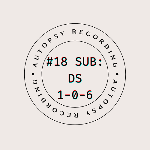
I wanted a design that was like the stamps that go on library books. The ones that have the name of the library on it but also the date.

I went to canva, which is so awesome to do designs on. It has a simple and intuitive interface and it is very easy to pick up and use. I actually found a template that was very close to how I wanted the logo/stamp to look and when I played around a bit, I got this.

I was very picky with the font cause I wanted it to look just like those kinds of stamps. {The circle around it would be the part that stays consistent and the title in the circle would be the part that changes based on the number of the recording.}

Now, I wanted the type to look sort of imperfect, like how an actual stamp looks like when you stamp it, but canva did not have a ‘click here to make the font look like ink on textured paper’ but it did have a filter called ‘glitch’ that added some layers and makes it look suitably fuzzy. 

I imagine this logo in black ink stamped on the cover of the manila file folder with the transcript inside of it, filed away but ready to be read by whatever curious intern picks it out.  

Chupis Roots

My friend is super obsessed with house plants and always tells me she wants to start her own etsy shop. I was scrolling through some of the assignment bank options and stumbled upon the create your own logo. I knew that I wanted to try and make one for her so that if she ever decided to open her own shop she could have one of the logos I made for her.

I made a couple to chose from because it was a really fun process to just check out different fonts, images, and colors. It was cool to actually sit down and think about which elements of a logo you want emphasized and which kind of elements you wanted to include/leave out. It got you to take a break and just focus in on creating a project. In sitting down and takign some time to sit and design it was really relaxing and time flew by. I ended up creating a couple. Some I used one of the suggested website to make and the other I made on my own!

I made this one without the website!

My Very Own Logo!

4 stars…. Original Assignment: Create a Logo that is simple but detailed

This assignment was to “As designers are shfiting towards the KISS – Keep it simple stupid formula and creating Logos that are super simple and easy to understand. I want a something challenging Logo that is simple yet detailed. ” I really enjoyed making this simple logo.

I have said it before but simple things are my favorite because it’s not as busy, straight to the point, neat, but still looks great. I used the website called Tailor Brands to make this. It was really fun designing what I wanted my simple logo to look like!

I am very passionate about taking photos so I decided to make my logo about photography and used my name in the logo so that’s how I came up with that idea! I could use this on my Instagram and website I have for that already!

Bumper Sticker Things

For this assignment, I had contacted my group and explained what my ideas were for a logo since I knew one of my other classmates had created a poster for our radio show. I decided to use this assignment to base my logo off of, but then concluded I think this would be best being a bumper sticker, as most bumper stickers are not often detailed. I once again used the site canva (a life saver) to create my bumper sticker and wanted the title The Breakfast Club to resemble the movie poster one of my classmates was using. However, I could not find the right font. I subsequently took the movie poster to photoshop, and then cut the title and pasted it onto my bumper sticker. I am pleasantly surprised at the results of this bumper sticker, as I feel it is simple, yet effective. 

Breakpoint Boards Logo Design

This week I decided to do the Design Assignment Create a Logo That is Simple but Detailed. I decided to do this assignment because logo design is probably my biggest hobby in my free time. I love designing logos for fun, for friends, and for my own personal projects. The chance to design a logo for this class was very exciting.

For there assignment, it asks you to create a simple but detailed logo, that is it. So, I asked my sister for a random company idea and she told me a surfboard company would be really cool. After some quick brainstorming, we came up with Breakpoint Boards as the company name. A Breakpoint is a type of wave, apparently.

I quickly jumped onto my iPad and opened up Procreate, my favorite designing app. I played around with some sketches using waves and beaches but settled on surfboards as the main logo concept.

After some trial and error I liked the above logo orientation. Three surfboards, with complimentary colors in a fan-like pattern. This logo, to me, is simple and nice to look at while also telling the viewer exactly what the company does/sells.

After the logo was done, I found some nice typefaces that matched the aesthetic of the logo and the surfboard company theme. Designing the logo and the company name was a lot of fun. I always love designing new logos for existing or new companies, real or fake. This assignment helped me with my drawing skills, as well as my proportion and coloring techniques.

Desserts by Alli

Click here for the original assignment!

I used Tailor Brands to create a logo for a fake business. One of my hobbies is baking so I decided to create a logo for that. Tailor Brands made it easy to use and I had a lot of fun making it. I probably spent way to much time on it but I lost track of time because it was so much fun. The logo is simple but explains enough for the viewers to understand it.

New Logo in Town

Bank Assignment

My assignment was picked from Logo Create using Tailor Brands. I have been quilting for about 20 years now, just for myself and to enjoy my hobby. I thought if one day, I could go into business and quilt others but I don’t think I will since I might lose the point of enjoying my hobby.

Using Tailor Brands was easy, you enter your logo name and choose several font and design options. In the end, it comes up with a logo, you can either like it or edit it. Well, I edited mine. I changed the color of the letters and added the icon of a sewing machine and thread. I made the letters more cursive since that’s what quilting is curvy, i made the icon black to stand alone from the font.

The logo is simple and not busy. It works if I were to go into business of quilting.

The Banana Candle You Never Knew You Needed

Come one, come all! I present to you my latest business venture: Banana Candles!

This challenge was more fun than the previous one, in large part due to the fact that I didn’t need to use GIMP! The goal was to create a simple yet attractive business logo.

Let me know what you think!

What I enjoyed about this challenge was that I got to use a website that actually guides you through making your own logo. I’m intentionally throwing shade on GIMP because it gives you ZERO guidance. This program, Tailor Brands, allowed me to create my business name, choose my font and colors, and add an icon that I liked. The result is a simple, yet elegant logo. Hope you’ll consider buying one of these candles ?

Details on the challenge can be found below:

Create a logo that is simple but detailed

For my assignment, for 4 stars, I created a logo for the Ice Cream shop that is primarily a big part of Season 3 of Stranger Things. I used to shop “Scoops Ahoy” and created a logo that I thought would represent their brand and what color scheme would be most appropriate given the show. I came up with this through Tailor Brands and played with the customization tools to make it it’s best.

Scoops Ahoy Logo

LOGO

I made this logo using the photoshop drawing tool. I like it cause it is simple but has my signature “B” in it. I picked the colors cause purple is my favorite color and because with black it pops out. 

DesignAssignments, DesignAssignments2002