Here Comes the Bride.. Hopefully!

Original DS 106 Assignment: Wedding Invitation (3 stars)

Step 1: Find the photo you want to use for the background of the wedding invitation. For this one my wedding is going to be at Vaughan House in Forest, Virginia. It’s going to be on our 5th anniversary of meeting, so we can use those detail to incorporate.

Step 2: Open Canva at canva.com, in the search bar looking for “wedding invitations” and select the template you want to start with. Text, fonts, and photos are able to be edited, but if there is one that will save you time, start there!

Step 3: Use the upload feature on the right hand side to insert a background, if you’d like. If not! Get to editing. If you click on the text, you can change size and position. If you double click, you can edit the text, font, color and text size.

Step 4: More customization! In light of me not wanting a lot of people to show up to my wedding I am sending out my RSVP’s with less than a month until our wedding day. Will people be upset? Absolutely. Have I been dropping subtle hints that it is our 5 year anniversary? Yes.

Step 5: Time to print! JK… we are saving the planet and trees. Invitations are going to be sent via email, text, FB messenger etc… for most people, we’ll probably still print out like 10. And tadaa! Done.

EHem I appreciate you guys as class members, but please do not come.

Hmmm, I think simplicity helps the final results.

For this redo assignment, I tried to make another book cover. This is my original post, and I think it turned out fantastic. This is another cover that I have created, but I think it just has too much going on.

The book in question is an amazing one and will have a movie coming in the future. Andy Weir has three published books, and his newest is Project Hail Mary. He writes sci-fi stories that revolve around plausible scenarios using real physics. I think that is what piques my interest in his writing style. I like the idea of thinking of crazy situations like the one in this book and how people could work together to create a positive outcome!

My book cover was made in Canva, and I wanted to try to make it animated this time. The craft on the cover is a recreation of this ship described in the book. I wanted a green background, and the opposite color of red worked well, but the result looks like a watermelon, not the intended idea for this one. =]

If anyone finds some time over the break, I highly recommend this book!

My cover grabs more attention!

For this assignment, I was told to design an alternate book cover. However, I am loosely following it because I felt that the book’s title was pretty hard to interpret as anything other than what it says. Also, my choices of immediate books near me were The Hobbit (someone already did this idea =] ), this one, and many programming books!

I wanted to design something attention-grabbing, so I chose yellow as it stands out. Then I considered my next color and felt that purple would best suit because it is an opposite color. I wanted this cover to come off more as a joke than anything, so I kept the goriness of the subject minimal. (Note: when traveling space avoid black holes…)

The program I used for this assignment was again Canva, and it has helped my in several of my classes and personal projects as well!

The Box in the Woods

The Box in the Woods is a book by Maureen Johnson. It details a high-stakes treasure hunt surrounding a mysterious box in the woods, containing a treasure rumored to grant magic powers to someone worthy. Along the way the brave adventurers deal with pirates encounter monsters you would only ever find at the edge of the map.

Actually…

The box in the woods isn’t a mysterious treasure chest. The cover doesn’t even look like that.

The actual cover from Goodreads

Instead, The Box in the Woods is the fourth book in a mystery series. I wouldn’t recommend though. The first three were only meant to be a trilogy and this one certainly feels like it was just there to sell more books. However, the first 3 were fun and sparked joy in my life.

How I created it

Once more, to make this I used Canva. I am starting to think it’s become my go-to for these assignments. I found the map picture in my search for map under items as well as the treasure chest. I then placed it near the center of the page. I simply added the text and changed the font.

Assignment-

For the assignment, Alternative Book Covers, I had to take a well-known book and re-design the cover to suggest something completely different. I don’t know how exactly well-known the book I choose was, but I had never heard of Cormac McCarthy’s The Road before now so I figured the book I choose was popular enough. I also selected it because I thought the title would be vague enough not to give it away. For example, if I selected a book like Anna Dressed in Blood, King of Scars, or A Darker Shade of Magic it would be hard to try and sell them as a different genre than they are.

The Horror of To Kill A Mockingbird

I liked the idea of messing with the meaning of a book title.  Many are symbolic or draw from an important line in the story.  But taken out of context, their meanings may not be clear.  As such, this assignment had me essentially examine classic books with odd titles.  I immediately found To Kill a Mockingbird.  This is a classic story of childhood and race relations, but out of context the title essentially discusses death.  Perhaps it could be interpreted as a suspenseful horror novel?  Subject in hand, I searched for images of dead mockingbirds to create the backdrop for the horror edition of the book.  In advertising the title and author, I specifically used a font (AR DARLING) which evoked a horror feel with its slightly distorted lettering.  I used a related font (AR CENA) for the fake testimonial.  Naturally I used the master of horror, Stephen King, as the one giving Harper Lee praise for her new terrifying novel.  The final product gave me a good laugh, and is featured below.

to-kill-a-mockingbird-alternative-cover

The Crucible Remix

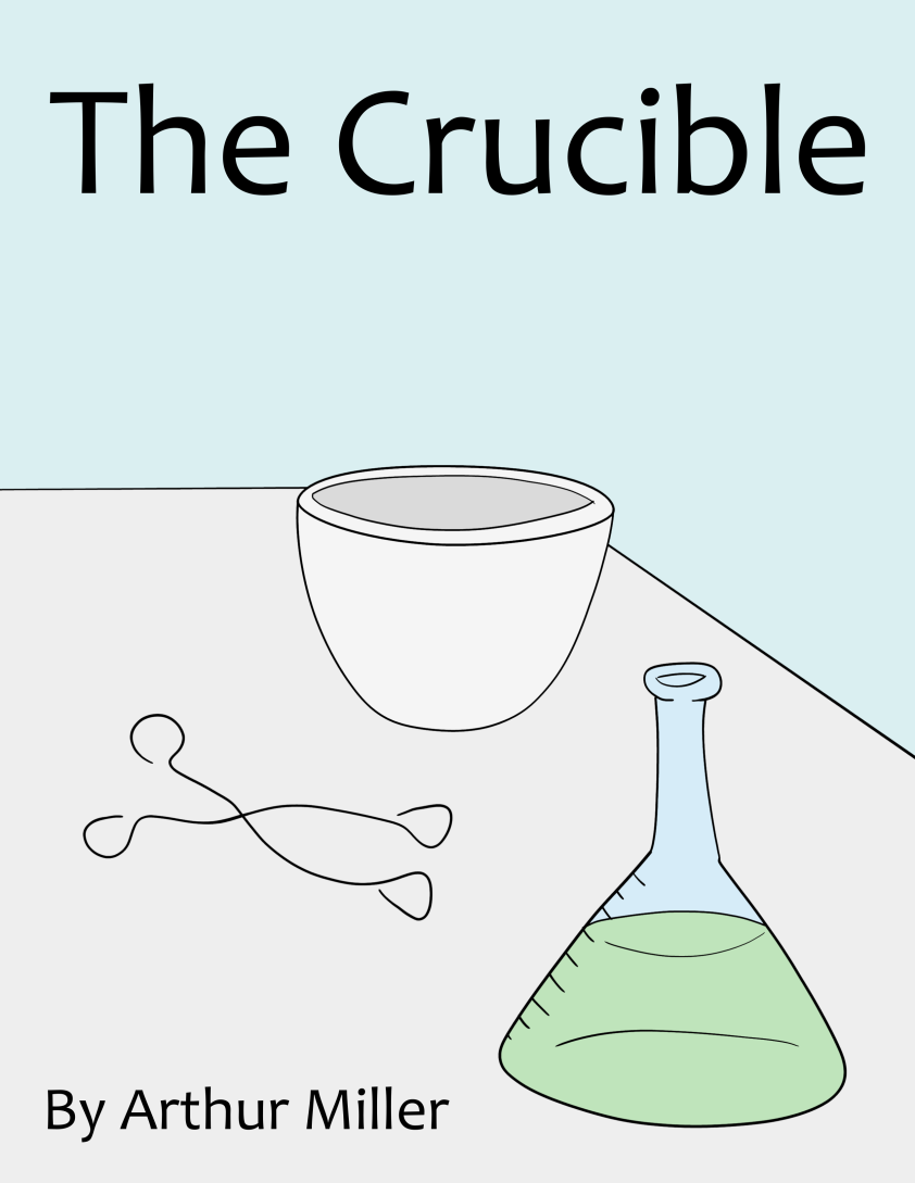
This is my response to the Alternative Book Covers assignment. The challenge was to create an alternative cover for a book that changes the entire theme. The Crucible was originally a bout the Salem Witch Trials. A crucible is a piece of lab equipment used to hold hot metals, so I made a cover that makes it appear as though the book is about scientists working in a lab. I drew the image in Gimp with my Wacom graphics tablet. I used Inkscape to put the text in because text is easier to work with and more versatile in Inkscape.

Crucible.png

Alternative Magic Realism

orlandoorlando_fl

This assignment is to take a cover of a well-known book and re-design the cover to suggest something completely different.  I scanned my bookshelves and selected Orlando by Virginia Woolf, giving Lord Jim a miss.

Orlando to most people means Disney World, so I found an image of the Magic Kingdom on Flickr by Oscar_shen (BY-NC-SA) to use as a part of the cover.

I found a short tutorial on creating a vignette effect in Photoshop, so used that to blend the photo with the cover.  The blurb is entirely made-up but applies to both Orlandos.

A Whole New Mind – Alternate Cover

A Whole New Mind - Alternate Cover

Designed for DS106

A Death Notebook — ???

This was the quickest assignment I have ever done, but it was still some fun.

The assignment was to take a title of a well-known book and re-design the cover to suggest something entirely different.

I looked at the best-selling books on Amazon to get an idea. Then I figured, why not make something Nicholas Sparks has done into something really dark and not romantic?

So I took The Notebook.

I took the original cover from his website:


But there really wasn’t any point in saving any of it. So I positioned a picture of Light on top of the bottom image, then erased the top. Then I used Optimus Princeps font from dafont.com to make the title cover text.

I then decided to do something with a similar name: Death Note.

This is what I came up with:

New Book

The Kite Runner

I made this example for a blog post describing three activities from the DS 106 anthology.