You Should Be Creating

Time to let out your inner Big Brother! Create a propaganda poster for ds106. Use your photo editing software of choice and write a message to inspire your fellow ds106ers. For example, I took a WW2 poster about increasing ammunition production, and turned it into a poster promoting tweeting.

DS106 is all about creating so why not create an inspiring propaganda poster promoting creating. This assignment is one which adds points to my 15 star total goal and is worth 3 stars. This means my total is now to 9.5/15 stars. Not that these stars are really that important right now. The importance is in the poster and the need to inspire so here you go.

Unclesamcreating

DESIGN MEGAPOST!

This week we had to do 15 stars worth of design assignments. This is what I meant by the hardest part of my week. I always thought I knew how to use Photoshop but I guess I was very, very mistaken. I used Photoshop because it is and extremely common program so it’s easier to [...]

DS106 Propaganda

This assignment was to create a propaganda poster for DS106 using a WWII poster. The process of completing this assignment was rather simple. I scanned through Google images to find the perfect poster to convey my message, and I came up with this one:

WWII_poster

After that, I used Pixlr to edit the image and change the message. I am fairly new to pixlr, so there are definitely some flaws to my final product, however practice makes perfect right? My primary difficulty was working around the top portion of the lady’s bandanna in the blue text area. Anyways, Here it is!

Edited_WW2

This Man is Your Friend

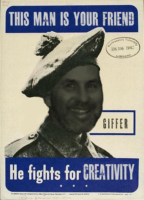
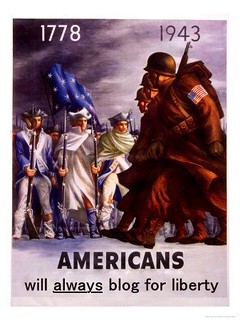
“This Man is Your Friend,” by aforgrave on Flickr

If you don’t know Alan Levine (and many of you must, if you are reading this via the ds106 stream), then you should. Alan, currently teaching the Spring session of University of Mary Washington‘s for-credit course in Digital Storytelling, is also one of the prime forces in the ds106 community — be it for-credit or #4life.

Alan’s passion for creativity, photography, openness, mash-ups and remixes, learning, friends, and general #4life-edness are becoming legend.

I first met Alan in person during the summer of 2011. I had been invited to Windsor by our mutual Flickr friend Diane Bedard (WindsorDi, on Flickr), who was hosting a get-together for Alan during his 2011 CogDog Odyssey. Between the time I had been invited earlier in the year and the time we got together in August, I had heard Alan interviewing folks on ds106radio about the first Unplug’d event that they had attended as he traversed Canada. I had been at Unplug’d, and found Alan’s interviews to be a marvellous way to hear how friends at the event had been reflecting on things, as I had certainly been, since the get-together. Alan followed suit with another such interview at Diane’s, where I tried to verbalize that Unplug’d “was more than a bunch of Canadian hippies camping out in the woods.” Following the visit and some marvellous photowalks with Diane, the Big Red Dog followed my Jetta to Hamilton, where we met up with some other Unplug’d folks, and a couple weeks later, Alan stopped by in Belleville for dinner and then, unexpectedly, a very important ds106radio broadcast, before he headed south to Baltimore.

Alan has been an important friend ever since. And he is an integral part of ds106 and ds106radio. So he gets his face on this poster. And he will like what it said before substituted the text which now reads GIFFER.

Read theWikimedia entry for this image

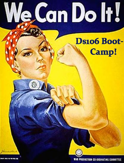
When I came across this original propaganda poster (I had searched for Canadian WW2 Propaganada posters), this was one of the first images I saw. At first, I was going to stick the bava‘s face on there, but (sorry, Jim), a flash second later, I decided to honour Alan.

Much to my chagrin (counter-balanced by my decision moments ago to formalize my use of TinEye before starting in on any future found-on-the-internet image re-mix projects) I worked on a small 421×587 image before finding a cleaner and less discoloured 2,164 × 3,000 tiff moments ago. It was a struggle to my developing photoshop skills to get the colour from Alan’s image face (Giulia Forsythe’s photo, DS106 Panel – Alan, D’arcy, GNA) to match, but in the end, I am happy with it.

After experimenting with the What the Font font finder and discovering that it was a useful tool to guide you to $40-a-pop font licences on MyFonts.com, I dug around on Dafont.com and FontSpace.com. I played around with a few, and had settled on  Headliner No. 45 — that is until I did a last minute switch to Billy Argel‘s font, Masterplan, which I had already used for the GIFFER text. Headliner No.45 had a couple of little almost serifs that didn’t match the original.

I found a lot of other Canadian Propaganda posters (Canadians and propaganda, who knew?) in a forum post on Canadaatwar.ca, and may just do another, if the time and mood coincide.

Thanks for leading a great charge on the Battle for Creativity, Alan!  You rock teh ds106 #4life. Truth.

WWII Propaganda ***

To continue on my 15 star design assignment quest, I completed a poster redesign called DS106 Propaganda Posters from the ds106 Assignment Bank.  This 3 star rated assignment called to take a propaganda poster and tweek it to publicize ds106.

I found the poster I wanted to use via Google from ww2propagandaposters.com.  Below is the original poster:

WII Prop original

I opened the poster in Picasa and retouched the text under Americans.  I only wanted to change the word “fight” to “blog”, but instead of trying to match the font perfectly, I took out the entire line and rewrote it in as close a font as I could find. I also enhanced the colours to modernize it.  Et voilà!

WWII Propaganda

This Class is Propaganda

So this assignment was literally propaganda.  I had to redesign a WWII poster to propogate our class.  Now, everyone has seen the craze of Keep Calm and Chive On, Keep Calm and Shop On, Keep Calm and Drink Coffee, etc.  Now what most people don’t know is that that the original one was a set of three posters that the British had in store in case the Germans invaded.  The posters would be placed around the city to keep the peace.  The original one was Keep Calm and Carry On.  Here’s the original.

Keep-calm-and-carry-on-scan

Now for mine, I adapted it for our ds106 class.

keep calm and ds106 on

I loaded it into gimp, got rid of the crown and everything after the “and” in the picture using the color picker to pick out the gray background, and then the paintbrush to paint over all the white.  I ended up with only the Keep Calm part of the picture.  Then I stole the ds106 logo off the site and loaded it into the picture, enlarging it using the scaling tool.  After that, I added the “on” in the photo.  Eventually I decided on a book to replace the crown, and loaded up a clipart image of a book at the top, enlarging it enough to fit nicely in the picture.  That was it.

Uncle Sam Goes Digital

My first ever design assignment task was to create a DS106 propaganda poster {***}. This was the one I chose from the Designing Posters category. We had to pick a poster from WW2. I know these propaganda posters are well-known and I was excited to get started to inspire my fellow DS 106ers!

I decided to design this WW2 poster:

ww2 poster

I had a lot of ideas running through my head when I chose this picture. This has never happened to me before. Normally, an idea pops into my head and I have to write it down before I lose it. So this was a nice change.

To start, I opened GIMP and uploaded my picture that I got here from Flickr. I tested out the different ideas in my head, but none of them went how I was picturing it. {I wanted to promote DS 106 Boot Camp, but that had already been done and I wanted to come up with a new, fresh idea} After about an hour later, it brings me great pleasure to give you my finished product:

ww2 posterFINAL

I matched the colors {as best as I could} and tried to make the words look “vintage” but GIMP is not like Instagram. I wish I could post all of the posters promoting DS106 from current and past DSers on EagleNet so people can see it when they sign up for classes. I mean really, how cool would that be??

DS106 Propaganda (***)

The war on education has arrived and we need more production!! For my propaganda poster, I took this WWII image I found on Google and transformed it into something less violent:

DSPropaganda

I used GIMP to erase (or rather stamp) the words to leave just the white background so that I could have a space to work with. I then tried to match the font of the original as much as possible by using the closest font I had in my library, Impact Condensed. I had some trouble making the text look old and faded, the most I could do was turn down the opacity and feather the edges a bit.

Sidenote: Does anyone else think the guy counting looks like Cogdog with a haircut? Just me? Okaaayy.

Destination: Danger Zone

In order to help recruit a new trainer for ISIS (and the on-going space mission), I have created a series of design media.

1. Propaganda Poster

Recruit You

This poster corresponds with the Propaganda Poster Assignment in the design assignment repository. I created it by taking a screenshot of this picture of Archer. In Photoshop, I carefully edited out everything around him, and left only his upper body. From there, I saved the picture and opened it up in the ever-so-handy Picasa. I used this WWI poster as inspiration, and added the typography to the poster, and threw on a ‘museum matte’ boarder using red and blue to give it the patriotic touch that it needed. This poster also poses as something a little less with the color theme that you will see in the next two posters.

2. Minimalist Poster

Minimalist Poster

Corresponding to the Minimalist Poster Assignment in the design assignment repository is my minimalist poster for this glorious tv show. To achieve said poster, I took the “a” from the title of the show–literally cropped straight from this picture, or a bigger version of it–and edited it in Picasa. This time, I used two features in Picasa, the ‘museum matte’ and the regular old ‘boarder’ feature. I stuck with the original color scheme, because it suits the show, and makes it more recognizable for the audience–if they have seen the show at all.

3. A “How To Archer” App

How To Archer App

This is the icon for an app that teaches the Archer fanatic How To Archer. It corresponds with the Create Your Own Smartphone App assignment in the repository. I also got the idea from a book that was actually written for the show called How To Archer, written by Sterling Archer himself. I even used part of the original book cover in my icon, so that the targeted audience can relate back to it.  Perhaps it will become the logo for the show one day–this or the minimalist poster would be cool.

This series of design assignments sets me at an initial 8 stars. More to come soon. We are on the brink of recruitment!

Promoting Ds106 BOOT-CAMP

Promoting ds106 BOOT-CAMP

I found a propaganda poster of Rosie the Riveter saying “We can do it” on google images. Then opened the image up in artweaver and added a text box. In the text box in navy blue color I typed in Ds106 Boot-Camp. Encouraging student that yea the start to this course is a bit overwhelming but WE CAN DO IT!!!