House Minimalist Poster

This is my submission for the design assignment. I made a minimalist poster for one of my favorite shows, House. In the poster the ‘O’ in the word “House” is made out of 2 canes configured in the shape of a heart to convey both the main character’s disability and the medical aspect of the series. Meanwhile the black vs. white color scheme represents that the show is a “dramedy,” with elements of humor in addition to darker themes.

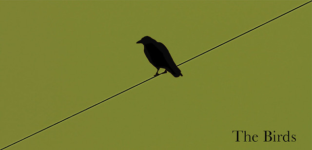
The Birds

Here is an attempt at the minimalistic movie posters assignment for ds106, the best course in the known universe:

Image of minimalistc The Birds poster

I really like how this assignment attempt came out, and the background color is significant, any Hitchcock fans out there have any idea what it is referring to?

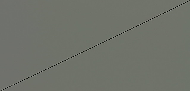
Anyway, the coolest think about this poster is that it was inspired by and actually a modified version of a daily shoot I took today chasing lead lines.

Here is the original image:

Thanks to AJ for the inspiration.

Minimalist Movie Poster: JAWS

I decided to do my poster on one of my favorite movies, Jaws. I used adobe photoshop.

The Social Network

I was going to do the “minimalist” poster assignment but wasn’t satisfied with my first attempt and decided to do another one that’s “semi-minimalist” but with a key frame of the movie integrated in there. I like how this turned out, and I do love me some monochrome action here.

DS106 Design Assignment: Minimalist Movie Poster

While I am really enjoying the Daily Shoot (one week in, one week to go), I decided to give one of the Design assignments a try this week as well. I might do more than one as I am very much a frustrated, unskilled and untrained designer that always wishes she was better!

The one that intrigued me at first was the Minimalist TV/Movie Poster. I enjoyed the two that are posted there  over at  Minimalist TV/Movie Poster | Stacy’s Blog and the king’s speech | D’Arcy Norman dot net. I chose a movie I have not yet seen, True Grit. Since there are two versions, I did two versions of the poster to reflect the difference.

I decided to make these in PowerPoint instead of Photoshop because, with the minimalist approach, I didn’t need the power of PS and you really can do quite a bit with PowerPoint drawing tools these days so it just seemed like something to stretch my design work a bit.

I also took the opportunity to install the plugin, Lightbox Plus, on our WordPress installation here on campus.

Here they are:

Minimalist Poster for the Movie True Grit

and

Minimalist Poster for True Grit

I also uploaded them to Flickr and was greatly amused at how they look in the photostream preview:

screenshot of Flickr previews

Minimalist TV/Movie Poster

For this ds106 assignment I had to look at the assignments submitted by anyone at this location and pick one of the submitted assignments (drop down menu) to do. I chose the minimalist tv/movie poster which is described as: [you] create a tv/movie poster that captures the essence of the story through the use of minimalist design/iconography. I chose to do a movie because the first thing that popped into my mind, when I was reading the description, was Darren Aronofsky’s Black Swan. The story line(script) itself, I honestly didn’t care for but I thought the cinematography, mise-en-scène, and acting was fantastic! The movie poster itself is a bit minimalist and I’ve seen many versions of it; all of which I really like.

Movie Poster 1

The first one to the left, is the really popular, most seen, one. The next two are more related to the assignment because they are minimalist. They kind of remind me of graphic art and I really like them too. There are two more at this site. While I was looking at these posters, I was wondering what I could do. And a couple of scenes kept coming back to me: Throughout the movie there are many close ups of Natalie Portman’s eyes. So, I decided to just have a picture of her eyes (with the make up on) and then just the title “Black Swan.” (I don’t know maybe too minimalist?) There were two ways I thought I could go about doing this. One way was to copy and paste her eyes and then just delete all the excess stuff but I figured that wouldn’t be minimalist and it would be too easy and not fun. SOOO I decided I would draw the eyes myself….on paint….with a mouse….lets just say it took me a while.

The first thing I did was copy and paste her eyes, from the first movie poster, into a paint file. Then, using my fingers as rulers, I tried to match up my paint eyeball with her eyeball; so they were the same size. I then tried to get the outline of the make up to match up too. Now, I only did this with one eye (my left) because it’s a lot easier to just flip that image horizontally and BOOM you have the right eye too. To give you a visual, here’s one of my first tries:

Not bad for paint, right???? Well, after that I just filled it all in and it really didn’t take me that long; about an hour. And all I can say is, I’m very thankful for the ctrl-z because I used that a lot. I also opened up several paints and just copied and pasted and fixed things here and there. There was a lot of zooming-in and zooming-out. Finally, when I was finished/sick of trying I saved it and added the text “Black Swan” through Picnick. Overall, I was hoping this was actually minimalist because there is detail in the eye make up…so I guess its not very minimalist in that aspect and I could’ve made it blocky-er but I just decided to leave it that way. I was also thinking, I can’t be the only one who thought of this so maybe other people have done just the eyes too but I haven’t seen any; I mean the real life poster, it’s self, is amazing with the eyes so I guess that’s the one. But heres mind: