The Big Picture- remix (Food!)

I decided to try my hand at one of the assignments for DS106 this week, and I went with the Big Photo Remix. The idea was to take a photo from the big picture and add typography to change its meaning.  I don’t think I was that great in the typography aspect, but changing its meaning I may have done a better job ;-)

The actual photo is of people at the train station going home for new years.  Of course, when I saw this photo a (funny) alternative meaning is that of the graduate student rushing to where there is free food on campus – the stereotype being that graduate students take advantage of all possible free meals on campus (I know that as a graduate student I have done some of this, but I am not sure how true the stereotype is)

The Big Caption

_cokwr: In the spirit of http://thebigcaption.com/ take any photo featured on The Big Picture (http://www.boston.com/bigpicture/) and add typographical text elements in a way that changes the message., _cpzh4: Design, _cre1l: http://www.timmmmyboy.com/wp-content/uploads/2010/12/tumblr_l4rbusqEoL1qbs8kyo1_1280-562x580.png, _chk2m: Tim Owens, _ciyn3: 6, _ckd7g: , _clrrx: , _cztg3:

Eat Your Veg!

"big caption" assignment from ds106

Yes faithful readers, submitted for your eyes is another ds106 assignment, this one focused on taking an image from the Boston Globe’s Big Picture website, and adding either a humorous caption or comment on the image. While it’s easy to make light of some of the images, it’s a terribly difficult assignment as many of the images posted recently revolved around the E. coli scare currently going on in Europe. Farmer’s livelihoods are being dealt a serious blow as many are forced to destroy their crop (seen in the above image), as many Europeans are afraid of fresh vegetables for fear they might be carrying the dangerous bacterium.

However, in the interest of learning, it would be interesting to take a series of these photos to create some rather intriguing posters for your classroom, laying out the general guidelines of your learning environment, or perhaps allowing students to create their own “Emily Post’s Ettiquette Book” so to speak. I couldn’t stop thinking about all the cliched lines of “eat your vegetables!” spoken by many mothers around the globe when I saw this image, the large iron teeth tearing the poor cabbage to shreds. At the very least, it would be an entertaining exercise to help “break the ice” the first day of class as you get to know your students.

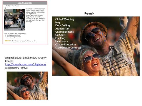
Assignment #1 – The Big Caption – Who’s Laughing Now?

http://ds106.us/assignments/design/ – Assignment: The Big Caption  – Description: In the spirit of http://thebigcaption.com/ take any photo featured on The Big Picture (http://www.boston.com/bigpicture/) and add typographical text elements in a way that changes the message.

Here’s my go at it :)

I saw this picture of really happy revelers at Glastonbury Festival – just sheer joy on their faces… and I thought, well this is so straight forward – what if I turned it on its head… what if they weren’t just really cool people having good fun… but something more sinister.. AND with so much trouble in the world and so many wars  etc.. should anyone really be smiling?  OK, lighten up, I know.. but back to the juxtaposition… I started by thinking of the reasons why folks shouldn’t be smiling – or why in reality so many folks are NOT smiling – times are tough! – anyway – so who MIGHT be smiling these days… a-ha…. it came to me…  The text on his shirt was difficult to make readable….

Glastonbury Remix assignment

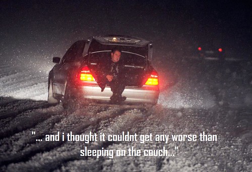
Design Assignment I — The Big Caption

I couldn’t help myself.  Since you can’t see the cards the man in the car is holding, I went ahead and delved into my middle-school Pokemon memories of trading cards that, in reality, were worth the paper they were printed on.

got war….. but he needs more


*THE big CAPTION

ARTIST IN LIBYA. GADDAFI MURAL

I wanted his shoulders to act as a scale comparing two opposites, war and art.

enjoi

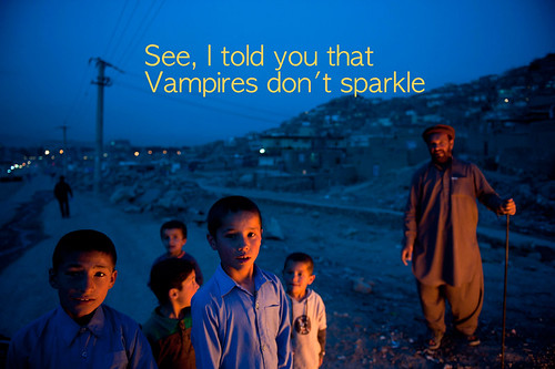
Somewhat Satirical picture captions

This is the assignment: The Big Caption. I’ve added the first two, frankly the more appropriate ones, the other are fairly tactless. I have a tendency to make off-color jokes, which some of the images put me in the frame of mind of.

*: This is one particular visual assignment that could have gotten me in the most trouble. The sense that I am talking about is how the first thought that would pop into my head upon seeing the image would be crass/inappropriate. So I actually made a bunch of these captions for the different pictures that I got from the boston.com “The Big Picture.’ Many of the available images are of a serious nature, so some of my attempts at humor could definitely come off as crass or mean. In the end I stayed with these two images, the captions of which I felt changed the nature of the image completely, and left me satisfied.


The Big Caption 1
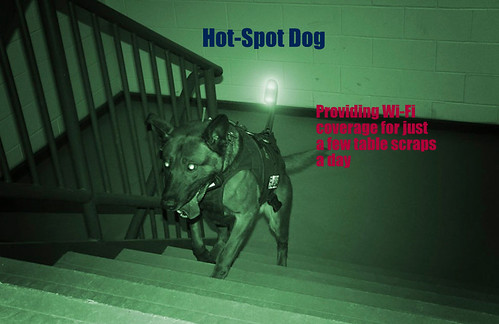
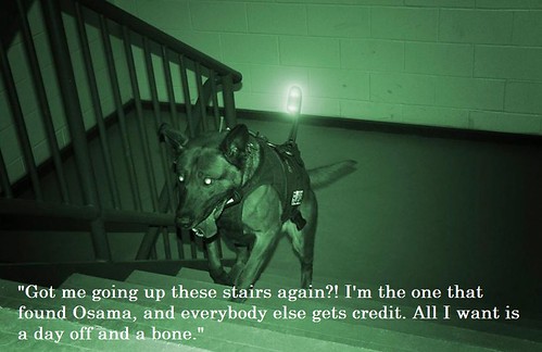
HotSpot Dog

The Big Caption

The second of my projects for the week, this one took some thought and time, but I thought it was painless and fun at the same time. Enjoy.

Zarar - The Big Caption

The Big Caption

The first assignment I completed was The Big Caption, by taking a photo and adding my own comment/text to it and changing its meaning. I initially was not sure if my caption would be inappropriate, but after some discussion, I decided to submit the picture. For the record, I have no intention whatsoever to offend, hurt, or disrespect anyone. But, rather I decided to take a humorous approach to this event.

OBAMA-BINLADEN/SEALS

Visual Design – Adorable


I love this photo and I though, what better way to show it off than to use the dogs cuteness. I used Adobe Photoshop once again for the text, but this time I decided to use a color that would blend in a bit with the dogs and also make it seems stand out, that way the text would seem part of the picture.