Clicka Clicka

My last design assignment {:(}was to Design a Computer Book for Kids (***). The task for this assignment was to take a well-known children’s book and redesign it as a computer book. I looked at the website that was in the assignment details. I loved looking at all of the redesigned children’s books.

I love and am familiar with children’s books because I’m going to be a teacher {I’m sorry, I know I say that in like every post :)} I knew I wanted to do this assignment right away!

I started with one of my favorite children’s books. Chicka Chicka Boom Boom.

chicka-chicka-boom-boom

I love this book because:

  • It’s funny
  • Children can really learn about the alphabet
  • It has polka dots on the cover {for those of you who know me, you know I’m obsessed with chevron and polka dots. Almost unhealthy.}

I covered the original title on Paint. I saved it and then opened it in Powerpoint {I did this on campus and did not have my GIMP software} In Powerpoint, it was easy to match the font and colors. It was also nice that to happen at least once this week!! :) Here is my finished product:

Clicka clicka doom doom

The words seem pretty clever because usually when you click too much or too fast, you’re doomed.

That brings me to 16/15 stars! I wish the rest of the semester could be photo and design assignments!!!

Dr. Seuss Remix

DR. Seuss remix

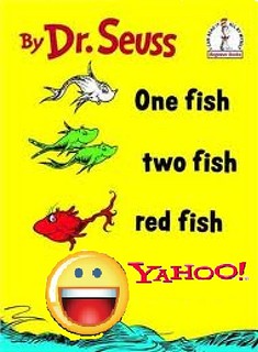
I edited this in the program paint. As a child this was one of my favorite Dr. Seuss books. So I used this and added in the yahoo search engine logo and the Smiley face that goes with it!! I got the three images off google search engine. Then I opened them up in paint, I then put the yahoo over the “blue fish” and the smiley face over the “the blue fish picture.” After that I used the eye droplet tool to color the white spaces from the yahoo word and symbol with yellow so it matched the book. Lastly I cropped it!

Green Viruses and Ham

This assignment was really difficult and frustrating. I thought it was a very cool idea and all of the examples were interesting. But with no instruction on how to do ANYTHING for this, I was completely lost and clueless. I tried to figure out how to do this using GIMP because I used this program for the animated GIFS and it was easy to use for that assignment. However, not knowing anything, I found this was very hard to do.

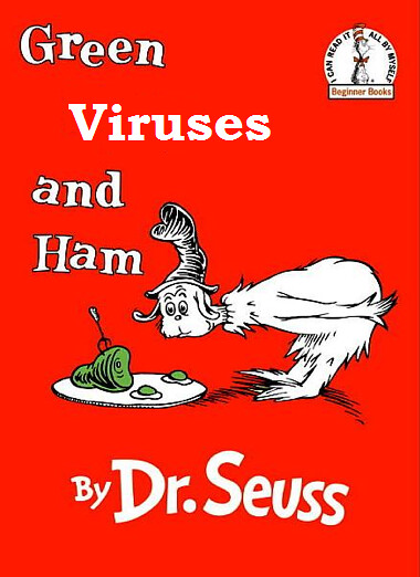
I used Doctor Seuss’s Green Eggs and Ham, and turned it into Green Viruses and Ham just because I thought that would just be a different shift in the overall message. I was able to eraser the Eggs text on GIMP and fill it with the cover’s color but when I tried to add text, for viruses, nothing was working. I tried going on the manual and searched around for answers for like 30 minutes and nothing helped. Finally, I just went back to Paint on my laptop and just inserted text. Although this didn’t work the first time, I had to double check it. This was just really frustrating because I feel like I could have made a much better product, I just didn’t know how to do anything and the resources were no help at all.

Green Viruses and Ham

3 STARS

TOTAL STARS: 4/15

Computer Books For Kids

Mozilla Firefox

Here we had to take a well known children’s book and turn it into a computer book. This struck me because the example photo is of Dr. Seuss’ book Oh, the Places You’ll Go to Oh, the Places You’ll Google. I thought that was really creative and cool, so I wanted to give it a shot. I Googled imagined children’s books and found the cover of The Lorax. As soon as I saw that cover it reminded me of the Mozilla Firefox because of the trees in The Lorax picture. I saved both images onto my computer and reopened them onto a program called Artweaver. Which is much like Photoshop. I cut out the Firefox with the lasso tool and pasted it on top of the actual Lorax. Then I recolored the trees and added the text The Firefox to replace The Lorax. I think this assignment allows a lot of creativity. Depending on what story someone uses some of these could be really funny.

To Kill A Thunderbird

Is not a popular novel, but To Kill A Mockingbird is, and that is the book I chose to recreate. The assignment was to create a computer book for kids. Some examples can be found here. I know To Kill A Mockingbird isn’t exactly a “kids” book, but it is a well-known and awarded novel. From there, I took a lesser known email software, Thunderbird, and combined them to create To Kill A Thunderbird. I went online and used the cover of the book and the Thunderbird logo and came up with this book cover:

I started by editing the original mockingbird off of the cover by selecting an area of blue and re-pasting it over the image. I then dropped in the Thunderbird logo and flipped it around so that it would look like it was flying away from the nest. The next task was changing the title. Sure, I could have went and found the text online for it, but instead I just used the existing letters in the title. The hardest letters were the ‘H’, ‘U’, and ‘E’. I had to steal the ‘H’ from Harper and then change the color. For the ‘U’ I took the ‘O’ and chopped off the top and tried to color in the bottom with the orange color. Lastly, for the ‘E’, I took the ‘I’, copied it 3 times and cut those mostly in half and rotated them 90 degrees. Surprisingly using GIMP to do this assignment went very smooth, phew!

13/15

Design Assignment #3

For the third assignment, I chose to do this one. It’s worth 3 stars.

children's book made computer-y

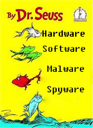
I got the image off of google. The original book is One fish, two fish, red fish, blue fish. I love this book and immediately thought of all the -wares of the computer world. I pulled the image into Photoshop and used the eraser tool to get rid of all the writing about fish. I used the magic spot thing to put the yellow color back in. I tried to use an online font identifier so I could make my font identical to the original, but to no avail. Instead, I chose the ‘computer’ writing style, which I think makes the book even more related to computers. Also, I left the fish images there because they are just too darn cute to take out.(and it helps people realize the original book). This one was kind of daunting because no one had done it yet, which meant I had to work through it on my own. I like the finished product and once it was in flickr, I was really happy.

Children’s Book Remix

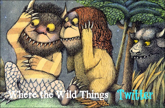
I’ve now used Where The Wild Things Are twice for a blog post. I guess that’s one of my favorite children’s books. Haha. Well I used a different picture then the book cover for this design assignment. I decided to use one of the pages from the book. I thought the expressions of the monsters went with the remix. I changed the title to “Where the Wild things Twitter”. I wanted to make it “Tweet”, but i didn’t think that was exactly what the assignment was asking for. I imagined if the monsters from this book had a twitter, the things they would tweet would cause similar faces to those in the picture.

WTWT Twitter


Computer Books for Kids

Take a well-known kids book and recast it as a computer book. Look for inspiration here:
http://www.somethingawful.com/d/photoshop-phriday/childfriendly-computer-books.php