Rose’s

I have always wanted a tattoo as long as I can remember, the older I get the more picky I become but the rose idea hasn’t changed for a while. The rose has some deep personal meaning to me and it is also a family name. For this assignment I had to create a tattoo that included 2 examples of rules we are learning for 3.5 stars. I decided to google and use the tattoo generator to come up with this design, now I may shade it in but I don’t think so.

This is the tattoo I want to have, not to sure where but i like the way it is placed. This is a good example of topography because of the different fonts used as well as size of different fonts. The size of the top font signify importance but the bottom is showing how intricate love is and how intertwined it is with the rest of the words. There is no period after love because love never ends, while living and laughing eventually end. This is also a good example of minimalism because there are clean lines and not a lot of details just simple lines to create an elegant picture. There is the outline of the rose and the words are written a little more bold which draws attention to the words but the rose is important being there showing the little bit of design can make a big difference.

I was inspired by the rose because that is my middle name and its the name of many of my family members. The words beneath it are words I want to live by because I think they make for a good and happy life. I was able to use google and word to put these different things together then to safe it as a JPEG to upload to my blog. I enjoyed being able to think and really figure out why I like this tattoo and the spent time figuring out what font I wanted my words in as well as size because they do make so much of a difference. I think I did a good job with this and it represents what I want very well as well as satisfies the assignment. I used what I learned to come up with this picture with words. I enjoyed having it work well and able to tell what I like about the minimalist design as well as the topography. I picked those two characteristics because they are the ones I spent the most time figuring out and editing to see how I want it to look in the end. I am happy with how this assignment turned out even though it took a lot of time it was very much worth it.

Special Agent Tattoo Design


This would be my secret agents tattoo. The reason I picked the magnifying glass is because my agent is named Agent Reveal and she is a special agent and a private investigator and one would only know what the tattoo means if they knew her.


Stars: 3.5

Inked

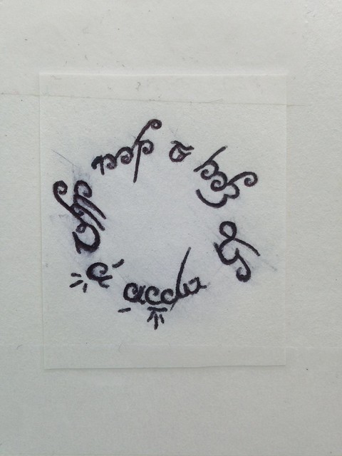
For my second design assignment this week I chose to do the “Ink” assignment worth three points. In this assignment we were to design a tattoo that displayed at least two design elements covered this week. I have been thinking about tattoos and designing one for a while now and this assignment gave me the kick I needed to get going on it. My inner nerd really came out while I was doing this assignment. I chose to take it in the direction of what I would get if I were to ever get a tattoo (highly unlikely because needles are not my thing).

I was inspired by my favorite quote, “Not all those who wander are lost”. This is a quote from the J.R. Tolkien book series, Lord of The Rings. I’m a huge LOTR fan so this is very fitting for me. The next step I took in the design was deciding how the quote should be written. I tried it in a few regular cursive fonts but none of them really evoked the essence of the quote. After trying this numerous times I decided that maybe it wasn’t the font, but the language it was being written in. This thought is what drove me to writing it in elvish, the language of the elves in LOTR. I chose to write it in elvish because the style of the writing is very free and flowing, like someone who wanders, and because of its mysterious nature. The language written down reminded me of the wind in a way. This is a good example of the design element typography.

The next step I took in the design also had to do with the way in which the quote was written. This time it had to do with positioning. I tried writing it out in a straight line first to get a feel for the quote written in elvish. It looked completely wrong written that way so I wrote it again in kind of a wavy line with the last letter trailing off. This again wasn’t working for me. That’s when I thought of the circle concept. Someone who wanders goes around looking for things until they find what they were looking for. This lead me to the idea of the explorers in the age of Christopher Columbus and Magellan. I wrote it out in a circle and something just clicked for me. Having the quote written in a circle really conveyed the message I wanted to send through my design, which is that though someone is wander around they always come back to where they were before. Wandering is a cycle. This to me is a perfect example of form/function/message.

I believe that my final product is very minimalistic, and element that I really enjoy, and successful. It is scaled to size, the size of a quarter.

IMG_3330

Here is a link to the original assignment: http://assignments.ds106.us/assignments/ink/

Geek Tattoo

I knew I had to do this design assignment when I saw that it was about creating a tattoo. I love tattoos and I have one of my own so far. What made this even better is when I saw we had to tie in what we’ve learned about design this week and I tied in typography, color, and a metaphor/symbol concept. It came into my mind what to do because I have seen some pretty crazy tattoos that people actually get, and when I babysit for the family I regularly do, the girls want to play Super Mario Brothers on the WII (I think it is because they know they can beat me) and this represents a common item that everyone wants to get in the game. It has a dominant color of green and white, the wording that goes along with it lets you know what it does, and it is a symbol of an extra life. If you haven’t looked ahead then you should realize by now (if you play Mario) that yes, it is the green mushroom of life!


IMG_20141004_143237855

images

Ink

This is the ink assignment of tattoo, I used color, typography and symbols in this art work.  I made it looks like this because I think love is a belief, if you trust it is there then it never left. I never thought about the idea of design your own tattoo, if one day I get one I might just go with something that already made not my own, but I like the idea though.

Ink

Ink

“Design a tattoo that includes good examples of at least 2 design element we learned about”


I drew:
This design shows typography, balance and dominance. I love to quote “all things must change” it’s always true, it may be the only thing that does not change, if you can wrap your head around that … Everything is always growing, changing, evolving, and it always will be for as long as we live. Change is inevitable, and though seen negatively I think it is positive. Stagnant would be boring and every change brings a new opportunity or lesson.

I made this by drawing it, scanning it and uploading it here!

Ink

Design a tattoo that includes good examples of at least 2 design element we learned about color, typography, metaphors/symbols, minimalism & use of space, form/function/message, balance, rhythm, proportion, dominance, unity.