Its Always Sunny

For this assignment I was tasked to take one of my favorite shows with a large cast and to make a cover for a “How to___” book or app. I chose to do Always Sunny In Philadelphia and instead of doing one singular character I did it about the main cast.  The cast of Always Sunny, or The Gang, is a group of life long friends in their late 20s that own a bar and the show revolves around their daily lives. With most shows have main characters that are likeable even though they are jerks. In this show that is not the case. All of the main cast are scum and watching their antics fail in almost every episode is glorious to watch.  None of the characters have any qualities to that benefit society only themselves and even when they are trying to help others it is usually for their own benefit

To make this picture I used paint and PICFONT to crop a photo I found of The Gang and added text. I liked how the picture turned out even though I did not know exactly the best way to word the title of the book. I feel that some of the secondary characters in the show would write a book like the one I posted about The Gang.

This clip is from one of my favorite scenes from Always Sunny in Philadelphia and it shows how scummy these people are.
Always Sunny – The Implication

DP5ujp1433100539

This assignment was worth 3.5 stars.
http://assignments.ds106.us/assignments/how-to-_________/


How to: Sasha Kellogg

Well, clearly I am getting popular in the noir106 community because I was approached by someone who wants to write a book about my life! My one stipulation was that I would make the book cover to satisfy the “How to________” assignment (3.5 pts). They agreed, and this week I created the cover for my book! At first I didn’t know what to put on the cover, but I started with a picture of myself, and went from there. I had to include a little information on what is included in the book, so I put that in a text box under my picture. I chose a generic font for the words “how to:” and added my personality with a cursive font for my name. After that, the book still looked a bit bare, so I scoured the internet for a good background image. I wanted the book to pop with brilliant colors so people will read it, but I didn’t want it to distract too much from the words or my picture. Finally, I decided to use this blue/green background that had whimsical circles on it. It fits perfectly with my personality, and provides a great release from this dreary noir world. Look for this book cover soon in bookstores near you!

how to Sasha Kellogg

While I take a little offense of the line “without knowing what on Earth you are doing,” I think the cover turned out great! I assembled the different aspects in PowerPoint, which easily lets you add text boxes and put colors in them. While the words and picture are centered, I like how the background breaks up the monotony of the symmetrical aspects. It creates the look of both serious and fun, which is what I’m going for. Overall, this project took a while, but was not technically difficult for me. I just spent a lot of time picking out the perfect fonts and pictures for the cover. It is serious work because hundreds of people are going to see that cover in book stores, so it has to look good and convey my personality correctly or people won’t stop to buy it. I know I’m popular, but my popularity can’t sell the books by itself, so the cover has to pitch in. I don’t know how long until the book comes out, but I hear the editing process can take a long time, so we will have to be patient!

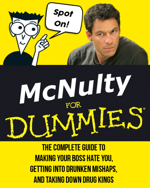
Spot On!

Design Assignment #2: How To… (3 stars)

For this “How to ______” assignment I wanted to model the iconic “For Dummies” books but include elements of McNulty on the cover. Using GIMP I uploaded images from the covers of the “For Dummies” books as layers. I painted the background of a picture of McNulty yellow to blend into the book cover. With the addition of some text, the book cover looks pretty legit! Can you guess which episode the “Spot On!” is from?

McNultyForDummies

How to “Stabler”

Original Assignment (3 1/2 stars)

Ask anyone in my family, and they will tell you that I am a Law & Order SVU fanatic. I know for a fact that I’ve seen every episode. Now I don’t watch a lot of TV, but when I’m unwinding on the late night tip, I always seem to discover an SVU marathon on USA Network. The character I chose from the long-running series is Detective Elliot Stabler.

Stabler is a former Marine, so he does have a temper, but his track record speaks for itself. He is also a family man, and you can tell he is passionate about his work (helping victims of sex crimes). I chose Stabler for this assignment because he takes no sh#t and proves why him and his partner, Olivia Benson are the toughest duo in the squad. Since his departure from the show in 2011, the series is still good with it’s new cast members, but it’s still not the same without Stabler.

For the design, I did not want to make a book or an app icon. It is more like a poster or simple profile card stating some of the traits that the character possesses. I found the background image of Stabler in the NY streets on Google (the quality was excellent. Once again, I threw it in Photoshop and built my design on the fly. Decides to use the rounded rectangle tool to make text box effect to list some of his noted traits. It was a matter of choice of font and adding text from there on. Nothing too crazy with this creation, but it took me a bit to figure out the layout.

Another fun project accomplished. These assignments are really helping to improve my skills in Photoshop, so I appreciate that. Here is the finished product. Am I the only Law & Order fan around here? Talk to me.

stabler


Cool Smooth Lester

Thomas Carlyle once said, “A loving heart is the beginning of all knowledge.” So basically I did this assignment for this week. We basically had to choose a type of main character that appears in a lot of the episodes in the TV show. Then afterwards, we can either create a book cover, a smartphone app icon, or any other similar ideas like that. I chose basically a book cover and did about Lester.

When I decided to think about who I was going to choose, I remembered in the beginning of Season 2 like I think it was episode 3 but I know it was early in Season 2 that the scene when the group gets back together before McNulty does. I remembered that after Lester gets out of his case with Bunk, he goes to Daniels and the crew and Kima was like “Cool Smooth Lester”. I had to do this assignment with a swag name like that. Here’s the picture I did below for this assignment:

lester


So to do this assignment, I basically used Paint and always used the same font, Segoe Script. I used the white color for my font but the big words that says “Cool Smooth Lester”, I basically typed the sentence first “Guide to become like Cool Smooth Lester” then I made another text book saying “Cool Smooth Lester” with the same font and size but different color. I put the “Cool Smooth Lester” text book aligned a bit with the “Guide to become like Cool Smooth Lester” but I moved it down a bit to make it like that. I did the color blue which I really liked because I thought it would be a cool color to fit in Lester’s way. Then I have a JPEG of Lester and I tried my best to make it just him. It’s hard cutting the other stuff out to get one thing on Paint. Other than that, this is it! Hope you guys enjoyed my creativity for this assignment!

How To Ziggy

I decided to do the How To _______ design assignment and create a book cover for a book on how to be a certain character.

I decided to do make one for Ziggy as his quirks and “skills” would be easy to come-up with.

how to ziggy

I used a screenshot I took from one of the earlier episodes in season 2 and erased the background. I then added in the text. I chose Helvetica for “How To” since most how-to series would use a standard, basic font for the how-to. I made “Ziggy” orange in color and chose the font Curlz MT as it seemed weird and spunky like he is. I then put the list of skills in Comic Sans, because just like the font, no one takes him seriously.

I tried to choose “skills” that none of the other characters display, such as dressing really vibrantly (although Bubbles is pretty close), caring (poorly) for a duck, taking dick pictures (as part of a prank), naming his car “Princess,” and finally losing his shit and shooting a couple people because he was “tried of the being the punchline of a joke.” I think it’s a pretty good representation of him. While they may not be the skills he wants to be known for, I think they really do represent some of his more memorable moments, and they also show his growth as a character from someone who is annoying and dresses oddly to someone capable of causing significant harm and whose sanity should be questioned.

How to Rod Serling

“One day, perhaps on a short stroll during your lunch, you take a side street that you’ve not taken before, and come upon a store. Like a lost memory from your childhood, it’s a bookstore of nostalgia, squeezed between a barber shop and a shoe-repair nook, from a time before the big-boxes and Kindles and e-readers took over. In a dark and dingy corner, you lose yourself, amid glorious heapings of precious, musty paper — and discover, well-thumbed and studied and marked, …  a treasure … from the Twilight Zone.”  

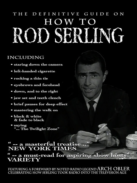
“How to Rod Serling” by aforgrave, on Flickr

Thanks to Brian Bennett (@bennettscience) for drawing attention to the Design Assignment 848: How to ____________” with his post last night, “How to: Riker” (Great beard!)

I spent a good 10 minutes trying to find just the right image of Rod Serling on the Google Images, but many were too blurry and unclear. In the end, I used MPEG Streamclip to capture some frames from the Nick of Time episode and selected one that seemed to reflect a key number of Serling’s on-screen characteristics. I used the Magic Wand tool and the Eraser tool in Photoshop to remove the background and superimposed the shot on a black background. The fonts are Charlemagne Std, Cochin, and TwyliteZone, the last available free from fontspace.com.

I’m trusting and hoping that de-constructing a bit of Serling doesn’t take away, but rather add to one’s appreciation of his work. His introductions are so uniquely Serling that they form an integral part of The Twilight Zone experience. I’m sure there are other “Serling bits” that will come to light as the ds106zone continues — maybe we’ll find a 2nd edition of this release wandering out of the ds106zone later in the course.

How to: Riker

’ve been on a ST:TNG (follow the link if you don’t know what that is) kick recently, so I decided to model my guide on the ever-present Commander Riker…

Calvin and Hobbes

Calvin and Hobbes Book


Someone please write this book.

How To Brian O’ Connor

The world must know how to become like Brian O’Connor. I’ve learned these ways, they have improved my life drastically!