Another King

So for one of this weeks assignments, we had to remix a photo from a designated list and make a story for it.  I had a good time doing it and did all my work in Gimp.  I originally made a different photo, which I decided wasn’t remixed enough for the assignment.

coryremix

honestly, I didn’t change much in the photo.  I made the picture in the background a picture of my foot instead of a little girl, which was funny, but you can’t really tell after I made the guy on an acid trip with all the colors…  I actually tried to make it like one of those scratch off images that has the rainbow in the background with the black over top, but I couldn’t figure it out.  So then I changed my thing and made something else.

coryremix2

So what I did was put him on the Iron Throne.  Origninally, I was going to make him replace Mace Windu on the Jedi Council chair, but I couldn’t find a good picture to put him on there.  Then Game of Thrones was on TV, and the rest was legendary.

Cory outsmarted the Lannisters and invaded the Golden City through the tunnels that Tyrion used to defend them.  After the city was taken over, Cory sat on the Iron Throne to lay his claim to the kingdom.  Now all he has to do is defend himself from the dragons.

I got the picture of the Iron Throne off of google and the other image from the website mentioned earlier.  I also tried to change the color of Cory to something that matched more, but I couldn’t figure the scheme out so I ended up getting rid of it :(
Creative Commons License
This work is licensed under a Creative Commons Attribution 3.0 Unported License.

Locked Up

I can honestly say that I have put off this last assignment like no other! I don’t know why…maybe because this is my LAST WEEK of classes as an undergrad!!!! That could have been it…

The For The Remix assignment had DS students use pictures that Jonathan Worth’s website of author Cory Doctorow to promote his books. This was a contest so it would be judged. Not only was this for a grade, it was also judged by the person who took the pictures. Maybe that’s another reason why I put off this assignment to the last thing I did for remix week.

I looked on Cory’s website at some of his books and thought that Pirate Cinema seemed really interesting. We are running into copyright and download errors so I thought it would be interesting if I used the theme of this book in my remixed picture of Cory. In this book, the main character gets banned from the internet for a whole year! I can’t imagine not having the internet for a year. I mean not only would I not have homework {which I could get used to} but I wouldn’t be able to go on social media sites, check email, watch videos, or Netflix! Oh man…it would be like being in prison. And that’s where my inspiration came from.

I used the good ole’ GIMP to open up this picture and started to get remixing! I found a picture of a jail cell on Google and wanted to layer that onto the picture of Cory. I started by using the free select tool to remove the background on the picture of Cory. I got rid of the books and bookshelves and was going to replace it with a transparent jail cell background. I wanted to make it look like Cory was sitting in his chair in a jail cell. This would symbolize his book Pirate Cinema.

This idea did not just come to me. I spent some time thinking and was going to just do it another day but I told myself I wouldn’t put it off anymore. Even if the sun outside was tempting. Ok, I might have taken a break and sat outside. But I was still thinking about this assignment and what I was going to do!!

Locked Up!

Creative Commons License
This work is licensed under a Creative Commons Attribution 3.0 Unported License.

Because of the Creative Commons License, I could take this picture and remix it. I was very happy to see that someone acknowledged the fact that using someone’s work and changing it to make your own work is NOT a copyright violation.

Song blog post title: Locked Up – Akon

Truncat: A Cat’s Tale

My third contribution to the FTR! For The Remix! project began very differently. I was planning to do another traditional DS106 assignment (this time Slide Guy) because the arrangement of stuff around Cory Doctorow’s desk looked like a perfect (albeit uncomfortable) slide. So I added slide guy and … it was boring.

However, recently, I have taken a number of pictures of my cat climbing on my bicycle:

IMG_0589IMG_0610

It has been a true testament to a cat’s extraordinary balance (and my cat is about as ungraceful as a cat can be without having some sort of neurological disorder). I particularly love the image of her standing perfectly upright and have wanted to use it for something ever since I took it. And so I thought, “Well, what if she is climbing on slide guy while he is attempting to slide down the pile of stuff?”

So I added her to the picture. Several fancy Photoshop techniques later and … it just looked awkward. So then I thought, “Well, what if she is at the computer?” (which eliminated the need for most of my fancy Photoshop work, but c’est la vie).

Setting that up required a little more magic with layers, and … slide guy just didn’t fit. So I removed him, cropped the image to focus on the cat at the computer, and played around with the color balances and exposure to get her to blend in with the background more.

Which left me with the problem of connecting this to Cory Doctorow’s work. Sure it could have just been a picture of a cat working in a home office that just happens to actually be Cory Doctorow’s home office, but I wanted to have more of a connection. So I sifted through his bibliography, trying to find a title that could be turned into a decent (or terrible) cat pun. And I found Truncat.

So here it is, an alternative cover for Truncat, starring my cat:

Interesting note on the font: “Cory Doctorow” and “Truncat” have the same font color and same blending effect (I literally copied it from one layer to the other) and yet they appear to be different. It’s an interesting example of how size and background content affect perception of color.

Note: This contribution falls under a different license from other content on my site. All contributions to the FTR! project are under a non-commercial, share-alike license.

Creative Commons License
This work is licensed under a Creative Commons Attribution-NonCommercial-ShareAlike 3.0 Unported License.

Vontorson: A super-ground-breaking-author-extraordinaire!

For my second contribution to FTR! For the Remix!, I wanted to do a traditional DS106 assignment. And given that Cory Doctorow is a famous science fiction/cyberpunk author, creating a Troll Quote seemed appropriate. I used a quote from Kurt Vonnegut (or rather, an extracted quote for the sake of convenience), this image of Cory Doctorow, and attributed it to William Gibson.

CoryMisquote_web I suppose one reason why I like combining these three authors is that each was ground breaking in his own way. Kurt Vonnegut brought science fiction to the mainstream and experimented a great deal in format, using humor, non-linear narrative, and narrators with personality. William Gibson is often credited as the founder of cyberpunk. And Cory Doctorow was the first author to publish a novel under a creative commons license. Together they make a super-ground-breaking-author-extraordinaire! Or a troll. Your pick.

Note: This contribution falls under a different license from other content on my site. All contributions to the FTR! project are under a non-commercial, share-alike license.

Creative Commons License
This work is licensed under a Creative Commons Attribution-NonCommercial-ShareAlike 3.0 Unported License.

Makers: A Zine About DIY, Hacking and Junk

I have a confession to make. I’ve never read any of Cory Doctorow’s fiction. A couple of his novels have been on my To Read list for ages, I have friends who love his work and think he is amazing, I’ve read some of his non-fiction, seen interviews with him, etc, etc. He’s one of those authors who are inescapable if you are involved in speculative fiction or know a lot of geeks. And yet, there’s still that glaring fact.

But in doing research for this project, I’ve decided to actually bring one of his novels (TBD) to the top of my reading list. Right after I finish reading a friend’s manuscript. Because, you know, priorities.

A large part of that is because I really respect his ethos. I have to respect any author who is willing to release all of his works under a creative commons license and distributes his works freely online, actively encouraging fans to remix them. Which makes participating in FTR! For The Remix! even cooler. This isn’t just an interesting DS106 assignment, this is public art in it’s truest form. People tend to get upset if you climb all over sculptures in the middle of the sidewalk or attempt to contribute your own artistic interpretation to them. But here, with FTR! we get to remix and remix the remixes and just create in whatever way inspires us.

My first contribution to the project sort of began backwards, with no concept, just two images that I found interesting (one of his office, and one of Doctorow himself). At first I thought I wanted to turn them into faux paintings, but the images were so high quality that I would have had to significantly reduce them to actually have visible brush strokes. But in toggling back and forth between them, trying to decide what to do next, I realized that I wanted to combine them. I did a simple quick select of his face to copy it onto the image of his office. And it looked very cutout-y. Like a zine. And then it hit me.

I could make the cover of a fake zine.

It was perfect. The zine represents a pre-internet DIY ethos that complements Cory Doctorow’s fan culture and how his works are distributed. Now I just needed to grab one of the titles of his novels and – wait, he has one called Makers?? About hackers who reuse tech junk? Oh this is amazing. And perfect as a faux zine. So here it is – Makers: A Zine About DIY, Hacking and Junk.

About the design:

I used the Chalk & Charcoal filter in Photoshop to create the degraded black-and-white effect on Cory Doctorow’s portrait. His office is just desaturated. To create the title, I used the “Label Brushes” brush set created by Invisibles Now which can be downloaded for free here. And to give it even more of a handmade look, I wrote the author’s name and drew a thought bubble in Photoshop Touch on my iPad and then added them as layers and changed them to white so that they would show up better on the black-and-white image. And voila! A pseudo-photocopied fake zine. About Makers.

Note(s): I created a few other contributions, which I will be posting separately. Also, these contributions fall under a different license from other content on my site. All contributions to the FTR! project are under a non-commercial, share-alike license.
Creative Commons License
This work is licensed under a Creative Commons Attribution-NonCommercial-ShareAlike 3.0 Unported License.

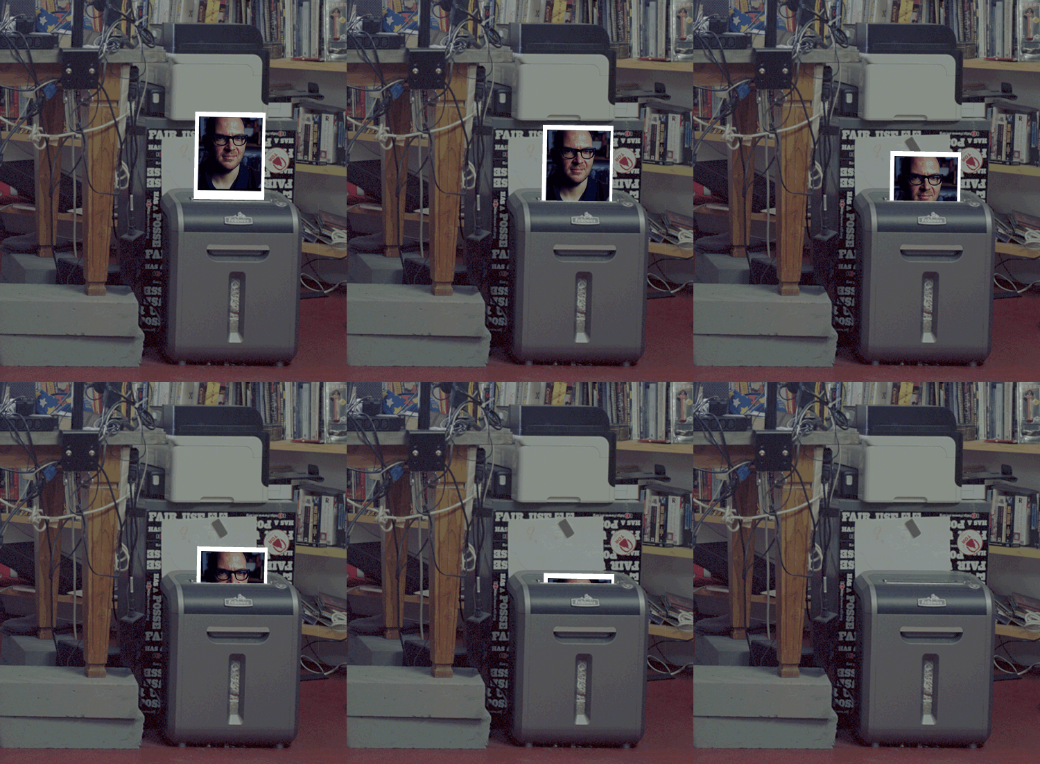
Ripping up a Shredder Head

So a new rather interesting DS106 assignments, For The Remix!

A series of photographs taken by Jonathan Worth of author Cory Doctorow are now available for you to remix, regenerate, and to make new art, especially in light of the themes and topics of his books.

The deal seems to be you should think deeply, share your idea and processes. More details: FTR! For The Remix! | remixing cory doctorow and How Do You Think Yoda Got So Wise? – CogDogBlog.

So I had a look a the pictures, watch Jonathan’s introductory video and though I might stretch to a quick gif.

Looking at the thumbnails, Mr. Doctorow’s office is impressive, with a nice range of cables and kit. I was hoping to play with the idea of printing some of the head shots, riffing of the idea of Jonathan sharing digital copies for free while selling prints. This idea he borrowed from Cory’s famous publishing method.

On downloading the high rez image I found what I though might be a useful printer was in fact a shredder, so I got rid of that idea:

shreader

I like the idea of taking a 45mb, 4000 dpi, 8000 odd pixel image and ripping a 500 pixel, 128 colour, 72 dpi gif out of it.

Here is how

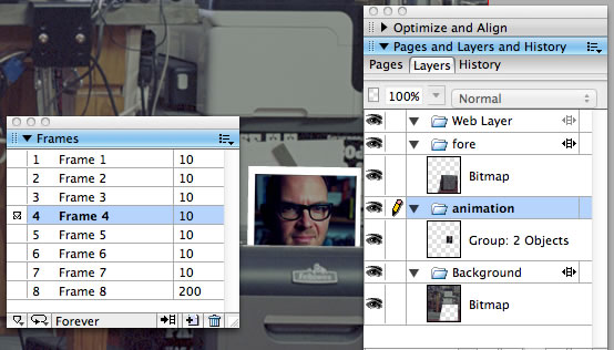
Unlinke most ds106ers I use Fireworks for giffing, mostly because I am familiar with it as I got a really great deal on Fireworks 8 but being a teacher years ago. Fireworks has some nice features for giffing. An image can have layers and frames, layers can persist across frames.

Here is what I did:

  1. The downloaded image opened automatically in preview.
  2. I cropped out the shredder and switched to Fireworks.
  3. Created a new document, Fireworks assumes you want to use the clipboard and set the image dimension to that, about 3000 pixels.
  4. Paste in the clip.
  5. Switch back to preview and copy one of the cory heads from the thumbnail sheet.
  6. Back to fireworks.
  7. The original layer is set to be shared across frames, I make a new layer, not shared. (This from the popup menus in the layer palette) and paste in the head.
  8. Draw a white rect for a frame and group it with the head. (I think I saw a polaroid ref somewhere?)
  9. I then used the polygon tool to cut out the lower section of the shredder.
  10. Make a new layer, set to share across frames, paste in the bottom half of the shredder.
  11. Move this new layer to the top, so that the head, animation layer is sandwiched between the two other layers.
  12. Move the animation layer so it is about to go into the shredder.
  13. Using the frames palette, I duplicate the first frame. Move the head into the shredder a bit.
  14. Repeat.
  15. Use the frames palette to adjust the delay on each frame.
  16. Resize the whole image to 500 pixels across.
  17. Export to animated gif.

method

Some folk still want to print

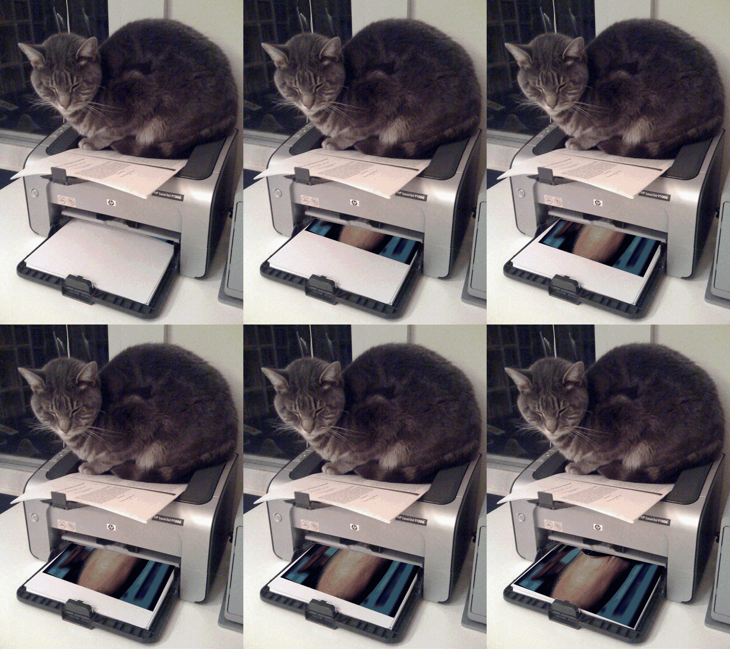
After all that I still wanted to print, so a quick search of flicker finds Printer Tiger

THis was a little trickier as I needed to skew the head a bit, I think photoshop has better tools for this.

print

Credits

Images of Cory Doctorow, Jonathan Worth, Creative Commons — Attribution 3.0 Unported — CC BY 3.0

Printer Tiger, Marco Varisco, Creative Commons — Attribution-ShareAlike 2.0 Generic — CC BY-SA 2.0

Artificial Intelligence

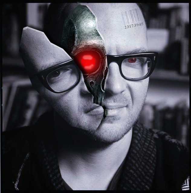
In an age where artificial intelligence is becoming more and more prominent, we must become weary of those who walk among us. Who is real, and who is a machine? As the decades go by, it will become more difficult to answer this question. Your best friend could be a cyborg and you would never know.

(My blog makes the image seem like it’s squished together. Right click it and choose “View Image” to see the right proportions.)

Artificial Intelligence

Creative Commons License
This work is licensed under a Creative Commons Attribution 3.0 Unported License.
This activity was done for the “For the Remix” assignment. I made this image using a portrait from Jonathan Worth’s website, Creative Commons images of a metal skull and bar code, and GIMP. First I turned the whole image’s color to a silvery-blue to try to mimic the dramatic lighting found in a Terminator movie or something. Then I selected half of his face, cut it away, and pasted it as a new layer. Making it a new layer allowed me to freely rotate the piece without messing up the rest of the face. When I rotated it, I wanted it to look like half of his face was breaking open like a pinata to reveal his metal skull.

The skull was another layer in itself and it was was moved to fit directly under the face layer. The problem I had with this was that the skull was an image that faced directly forward while the face was turned at an angle. I tried to fix this by slightly warping the skull to turn it a bit. The red eye inside the skull was done with a series of fuzzy brushes and Gaussian blurs (to add the glow) Meanwhile the other eye was red to show that there was also a red light behind that part of the face too.  Finally, I added the bar code to his forehead to show that he is just a product; an android that could be bought at an AI industry. (this layer’s opacity had to be turned down to make it look like it was naturally printed into is forehead.)

I had ALOT of fun making this and I was impressed with how it turned out. My first idea was to open his head and inside there was going to be the inside of an apple, symbolizing knowledge. But that would’ve been too easy and I went with something much cooler. I mean, would you rather have a fruit for a brain or an advanced piece of technology that could grant you the power to do unimaginable things? Yeah, I thought so.

Moving Mashup

In Doctorow’s novel Pirate Cinema, the main character is obsessively driven to create and transform a video “mashup from something trite and obvious to something genuinely moving”.

It’s a great complement to this week’s ds106 remix challenge.

Jonathan Worth, the brilliant prof behind #phonar, has released all his great Cory Doctorow photographs under a creative commons license for all the world to remix. Cogdog has already given Cory the Jedi Master treatment.

I decided to choose this picture:

cc licensed ( BY NC SA ) by Jonathan Worth

cc licensed ( BY NC SA ) by Jonathan Worth

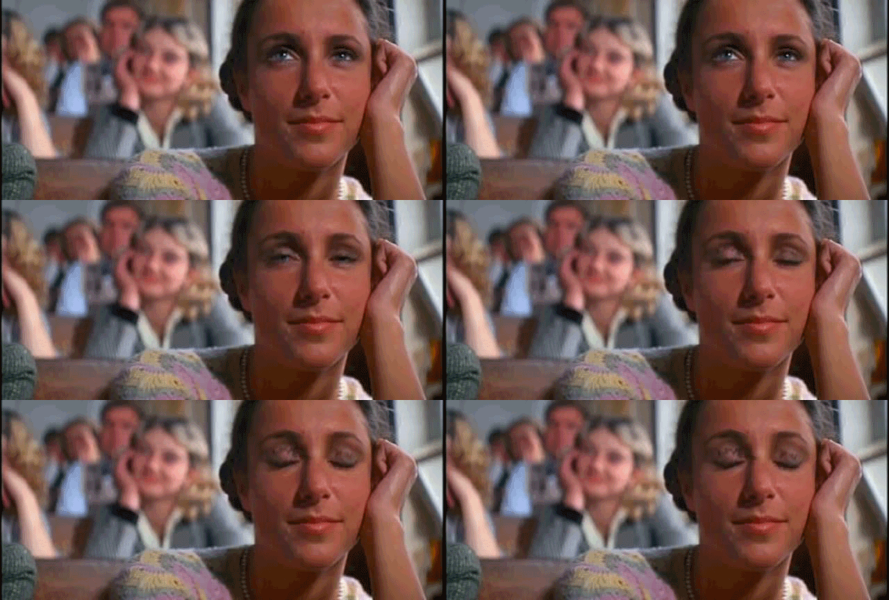
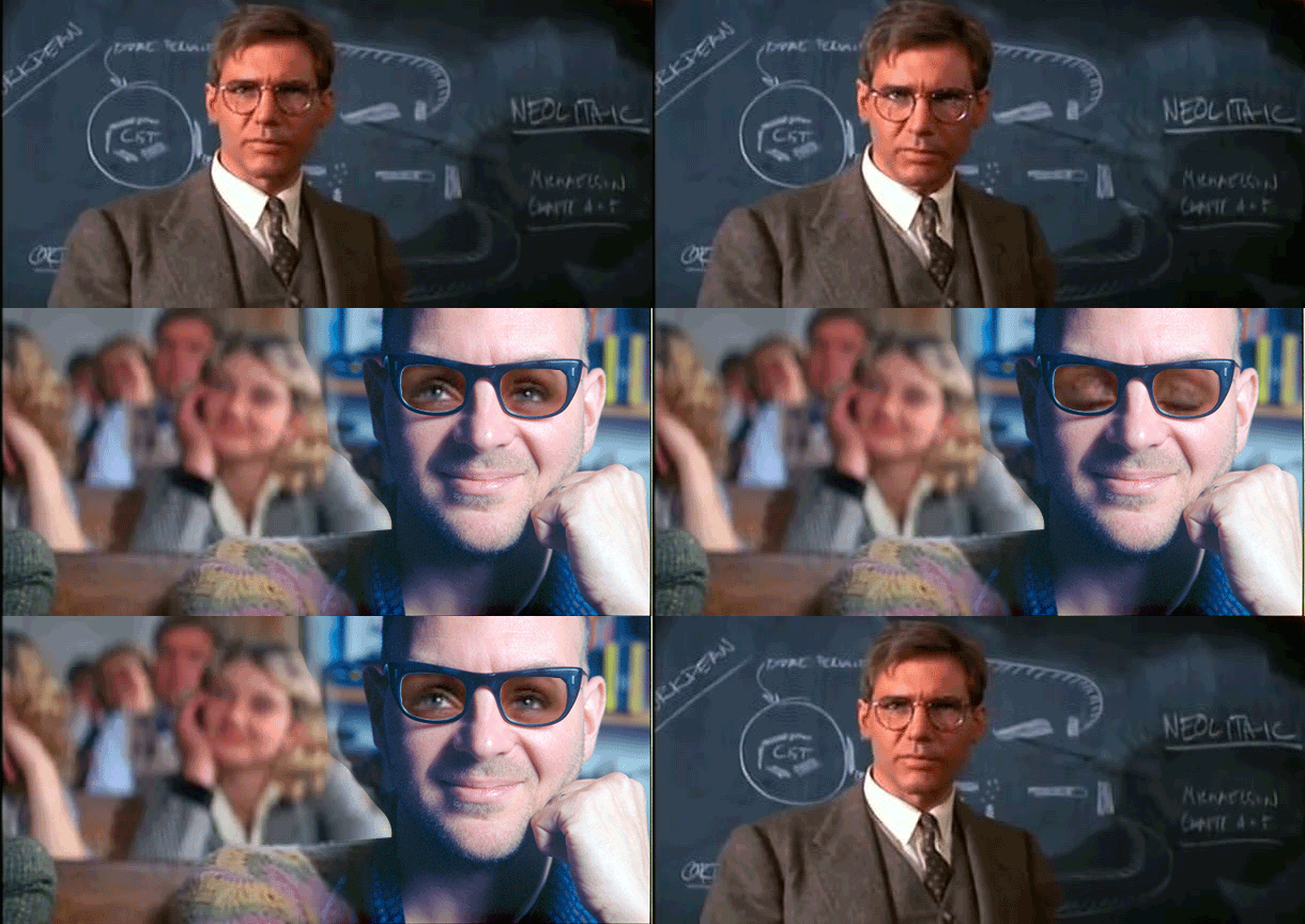
I stared at it so long I thought I could almost see Cory blink. The way his face leans on his hand reminded me of the scene from Indiana Jones when the adoring student blinks slowly to reveal ‘LOVE YOU’ written on her eyelids.

Student infatuated with professor Jones

Student infatuated with professor Jones

I always loved the way the nervous professor Indiana Jones stopped suddenly to look at the girl’s eyelids.

I wonder if he’d look the same at Cory?

While it’s not exactly the kind of moving mashup* Trent from Pirate Cinema has in mind, it does make me chuckle.

Professor does a double take

Professor does a double take

Technical stuffs:
I downloaded a spanish version of the Prof Indiana teaching scene using pwnyoutube, clipped the eyelid scene in MPEG Streamclip, exported as mov, then imported frames as layers in Photoshop. I put the Indiana frame layers in a masked folder so that the only movement would happen in the eye area and then added Cory as a layer below.
While Jonathan’s photography is beautiful, the colours were so different between the photo and the film so I modified the skin coloration by adjusting the levels, hue and saturation. There’s still a huge colour difference between the eyes and Cory’s face but I think it adds to the absurdity.

*Also, I realize there’s some deeper discussions about the difference between Remix and Mashup but I’m lazy and I’m going to use them interchangeably.

How Do You Think Yoda Got So Wise?

yoda-gets-wisdom

Why he read all of the ancient and modern parables of the Wise One, especially borrowing attributes of those who took on Empires, like Jedi Yallow, for later training. He than sought out The Boing Boing Being in the deep depths of Hainault Forest, spending weeks at his feet, taking notes on his iPad.

This is a quick remix example for an exciting ds106 project, where our students are among the first to get a crack at remixing the portrait photos of Cory Doctorow that Jonathan Worth is sharing with the world for open remixing. Jonathan described it for us

and as well visited with me and my students during this week’s ds106 show. To be a base for the site, and knowing the flood of action once Cory announces this on Boing Boing, I suggesting hanging the web site on wordpress.com- with the name borrowed from internet speak and one of Cory’s booksFor The Remix

For The Remix!

The first set of photos is available at http://fortheremix.wordpress.com/photos licensed under a Creative Commons Attribution license (please no license debates, ok?). The original high resolution images (as large as 50 Mb) are stored on Amazon’s cloud.

For now, our method of collecting remixes is embarrassingly simple- we want people to write up their entries ds106 style, and add a link in the comments to our HOW page.

For my students, they have a ds106 Mashup assignment they have to do for this last segment of the course.

And that’s where I want your help. We want to have a good variety of examples of remixes before we take the project to the wide open web. We are hoping people di more than simple images, like I did here, but actually think about making stuff. I’ll be nagging a lot of you ds106ers to do this. You have been warned.

Okay, for my remix above, the original image or Cory sitting on his chair reminded me a bit of Yoda:

cory004f1_duo

I found an image of the scene where Yoda is teaching Like in the woods in a post from Death Star PR A Chronological List of Things Yoda Tried (and Completely Failed) To Do:

Yoda_Luke

I was thinking at first that I would replace Yoda, maybe with a flip horizontal to match the angle Cory is sitting at. I took both into PhotoShop, and used the magnetic lasso to select around Cory’s shape and remove the background. When I started moving and resizing over the Star Wats scene, I realized hw was a better match to replace Luke, and the concept made sense- Yoda learning from Cory Doctorow.

I had to do a bit of clone brushing on the original layer to wipe out Luke’s foot, but it fit pretty good. Once I had Cory’s photo in place, I used Images -> Adjustments -> Hue Saturation checking the “COlorize” box to try and match the green hue of the star wars scene. Not too bad, eh?

I left a copy of my PSD file for anyone who cares to fiddle. Since the start wars image was low quality, I did te sloppy thing and up-sampled, which I know is not good, but sue me. I made a 300dpi version PNG at 3600X2842 px (7 Mb).

I just wanted to have one quick example out the door first! My next one is going to be an animated GIF..

For The Remix!

A series of photographs taken by Jonathan Worth of author Cory Doctorow are now available for you to remix, regenerate, and to make new art, especially in light of the themes and topics of his books.

Your challenge is to make something new out of the photos, or better yet, remix of someone else’s remix. But we not only want you to make art, we want you to share the story behind it. Be sure to write up your work somewhere on the public web, license it under creative commons, tell the story of what it means or why you did it, cite the sources (e.g. links) to the image, and share how you made it.  Here’s HOW to write up and share your remix.

This is a new experiment in public art, and a new way of thinking about digital media. Who could be a better figure than an author who releases all of his published works under creative commons license with an open invitation to remix? Jonathan explains more about this project