For Movie Mashup I had to take a movie I like (The Avengers) and make a poster of it and a movie it has been compared to (Justice League). On my first attempt at this, I found the Justice League poster and The Avengers poster and downloaded them onto my computer. I then cropped the posters down to one character, getting a new poster for each new character, and did a collage of them all together on Canva. I added text in the black space for a new title for this movie. Overall I really don’t like the end results and wish it had turned out better. I feel like the poster combination would have worked better if their backgrounds had been more similar or if I had the time to figure out how to more precisely crop. Also, feel as if it would have gone better if beforehand I hadn’t spent over an hour gathering videos for another assignment only to have those videos decide not to work in OpenShot. Oh well… I guess I’ll chalk this one up to a learning experience to check one video before I gather multiple ones.
However, really not liking that first attempt when I went back later I decided to try again. This is second attempt is the image at the top. To create it I found pictures of the Avengers and the Justice League. I took them back to Canva and adjusted them so that each on took up about half the poster. I added text, but it couldn’t really be seen so I found an effect to add a background behind the text. While this second attempt was still far from perfect, I like it a lot better than the first.
I’m embarrassed to say but the Divergent series is my comfort series, but I’ve heard many people compare it to The Hunger Games. So, this assignment was easy.
I found photos with transparent backgrounds, and put them into Canva. I also tried adding a filter to the Katniss photo so it could blend better, but I was having trouble doing so. I think it overall turned out really well.
Movie Mashup– is worth 4.5 stars. The instructions were to to make a movie that you really like. Now think of a movie that has been compared to it, and make a new movie poster that incorporates the two!
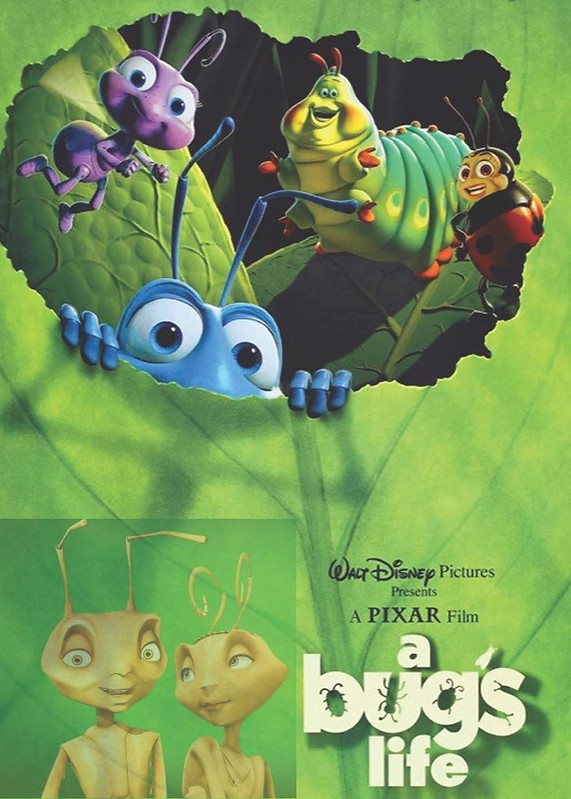
The two movies I decided to mash together is A Bug’s life and Antz because they are extremely similar and the digital animation of the movies ties into our theme well. I used Canva to create the poster. I was able to add the characters from Antz to the poster nicely. The green background two both movies were green just different shades. I had fun making this poster and Canva was very very easy. I’ll be using it more going forward.
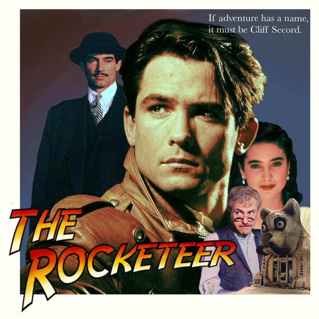
One of my favorite comfort movies is the 1991 superhero film The Rocketeer. One of the most prominent descriptions of the film that I have seen is that it is “an airborne Indiana Jones.” So, for my second mashup assignment, I decided to make a Rocketeer poster in the style of Indiana Jones.
The specific poster I used as a template was one for Temple of Doom. This poster prominently features images of the main character, their love interest, the sidekick, and the main antagonist, so I had to find analogues for each for mine. I found images of Cliff Secord, Jenny Blake, and Neville Sinclair. I ran into some trouble finding an adequate image to use for Peevy, who is the main character’s closest friend. I ended up taking a black and white photograph of him that I really liked and ran it through a website that uses AI to colorize photographs. The last photograph I used in my poster was of the Bulldog Cafe, a prominent location in the film.
I edited the images together in Procreate, sharpening them and adjusting their individual color balances to achieve the look I wanted. I also downloaded an Indiana Jones style font to use in the poster. Though my poster does not fully capture the intensity of the Indiana Jones poster nor the whimsy of the actual Rocketeer film, I think it still stands as a worthy merging of the two properties.
This Movie Mashup (4.5 stars) asks you to find a movie you like, find one that it is compared to, and then create a poster that includes the two. Well, Stranger Things isn’t a movie, but it does have so many 80s references, so I chose that. We know Stranger Things pays homage to lots … Continue reading “Stranger Things feat. E.T.”
One of the mash-up assignments I found this week was the movie mash-up where you combine movie posters, but the stipulation is that you should take two movies that have been compared to each other.
I figured it would be easier to first think about what themes go together. I thought about doing something like Captain America with Superman, but it didn’t flow too well for me.
Then, it came to me. One of my favorite movies is Constantine, and the exorcism theme is pretty common among movies. I looked into other pictures for movies like The Conjuring and Insidious, but I decided to go back to the original – The Exorcist.
The poster for The Exorcist looks like this…
…while the Constantine poster looks like this.
After looking over these posters, I knew they would work together really well. I decided that I could put John in the Exorcist’s spot because of how the posters are laid out and because John is an exorcist.
I went back to my old friend Pixlr and used the two posters as layers. I got rid of the background on the Constantine poster and put John over the Exorcist. The issue with this was that John doesn’t have the bottom half of his legs in the poster, so I was able to darken and blur the legs of the Exorcist poster to make them look like John’s. Because the Exorcist also has pieces that stick out such as his hat and briefcase, I also had to blur the background some.
I then changed the color of the Constantine layer to make him blend more into the poster. I also added some words about John Constantine into the words of the poster.
The final product!
It definitely could be a little more neat, especially with the blur. But I couldn’t quite figure out how to fix it, especially since Pixlr is a little more limited. I tried Gimp before but was very confused and gave up, even after watching tutorials.
Given my minimal skills with this, I’m very happy with how it turned out. I also feel the need to watch both of these movies again.
I know that neither of these are directly related to the themes. I do think though that the Exorcist was a big start for horror movies and we saw a large increase of them in the 80’s.
Something that I think about a lot with these movies is religion. I was born and raised Catholic but never believed almost any of it, and I was able to stop going to church once I moved out. Personally, I can relate these movies to what is happening in the world right now. I think a lot of people are questioning their faith (or seeing a large increase in it) because of the amount of people dying and getting sick.
I don’t know if this is making any sense. Basically, there’s a good and evil. Good being God, evil being Devil/temptation. We’re all tempted to leave our house and have a constant fight with ourselves to be good (I hope). John was supposed to go to hell for being a bad person but made a self-sacrifice and was then able to go to heaven (if he lived out the rest of his life as a good person).
So, let’s “self-sacrifice” by staying indoors and avoiding the temptation. We can save a lot of lives.
That’s probably just a lot of rambling to you. It makes sense in my head, I just don’t think I can put it into words well.
As mentioned in a previous post, Mia loves watching all kinds of movies. However, secret agent movies are her favorite! She likes watching both the Mission Impossible and Bourne movies. Not because they are true to life, but because they differ so much from what her life as a secret agent is like! She thinks it’s interesting to see what everyone’s perception of the secret agent lifestyle is.
The “Movie Mashup” assignment was to “Take a movie that you really like. Now think of a movie that has been compared to it, and make a new movie poster that incorporates the two!”
For this assignment, I went with two movie series that Mia really likes watching. I looked up posters for the Bourne Identity, then found a picture of a poster without text. Then used Canva to add the lines found in the original picture along with text. For the text, I found the same (or a very similar) font as the one on the original Bourne poster. I inserted the words “Mission Impossible” and lined them up correctly. The final product ended up looking like a real movie poster! I also did a tutorial on my process for this assignment that you can find here.
Take a movie that you really like. Now think of a movie that has been compared to it, and make a new movie poster that incorporates the two!
BEHIND THE SCENES
A world in which monsters roam the earth, alien or otherwise, and you can’t see them coming or make any noise whatsoever…
For this assignment, I combined two movies that have been compared in recent years, Bird Box and A Quiet Place Both are horror, and both involve losing a sense in order to survive (or at least involve one of the six senses in some way). With this in mind, I found a way to incorporate two of the their posters together, so that they formed a cohesive poster of their own!
STEPS TO SUCCESS
— Open up my art program (Clip Studio Paint) and activate my tablet
— Look up posters of both Bird Box and A Quiet Place and choose two
— Copy both posters into the same file and begin working
— Use clipping mask to remove the scene in Sandra Bullock’s shoulder, and place a portion of the Quiet Place poster in its place.
— Remove all traces of the Bird Box title using color-matching and the blur tool
— Make the transition from BB to QP smooth my blurring the borders
— Save as a PNG and post here
And that’s really about it! This gave me some challenge, but I feel as if powering through it has only made me Stronger. It’d be fun to do again!
For the Movie Mashup assignment, I wanted to make it spy-themed and to mashup two spy movies. Spy movies seem to kind of run together in my head, especially movies like the Bourne series and the Jack Ryan series. This mashup mashes together Jack Ryan: Shadow Recruit and The Bourne Identity. The two original posters are here:
I tried coming up with a font and color scheme pretty similar to the original, and I went with the Jack Ryan poster because I could fit more actors in it easily. As well mashing together the titles, I mashed together the tag lines and other elements. I used red carpet images of the actors and just used Photoshop to paste them over the original actors’ faces, added a little finishing touches. with some brushes and color adjustment, and voilà, a generic mashup spy movie poster.


