Art Comes To Life (3 Stars)

I replicated the soup can picture from Andy Warhol, or one of the many. I never saw the appeal in this stuff……

I also didn’t have a soup can, so I used this can of beans that I’ve had in my pantry forever. I took a picture of the can, ran it through one of the those sketch things, and did some excellent coloring on the top of the can.

476.1996.1

Girl with the Pearl Necklace

Art has always been one of my first true loves.  So I thought it was only right that my first visual assignment was the Art Comes to Life category.  With this, I had to recreate a popular piece of art and make it my own in a modern way.  It took me quite some time to figure out the painting I wanted to do, since, I mean, there are so many great ones to choose from.  But, after a little help from my dear friend Google, I choose to recreate this:

The Girl with the Pearl Earring
girl with the


Isn’t she beautiful? The simplicity is breathtaking.  The blue scarf, the suttle red-lip, the pearl earring, ahhh! So so great.

Now, I didn’t want to recreate this so literally.  I looked in my jewerly box and seen that I do in fact have a pair of faux pearl earrings BUT I also had a pearl necklace! DING! Of course that will be my choice!

WAHH LAHH!! (or, however you spell it)

Girl with the Pearl Necklace
photo (2)

I used no editing tools on this picture, just my more than simple iphone camera and a steady hand.  I guess if you want to consider my makeup a form of editing tools, then aye, do you boo.

Pearls, pearls, pearls, pearls, pearls all over da worlddddddd


Still, Life! : VisAssign

Still, Life!
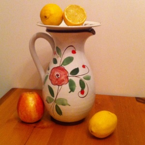
Take apples and make lemonade…

Visual Assignment #308: “Take a famous painting or print and do your best to recreate it in real life. Capture it in a photo and present the two in a blog post.”

Photographed with an iPhone.

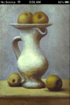
The original is a still life by Picasso:
Still Life With Apples

Most of the props were handy, all except for the apples. Only one apple in the house. So I had to take Picasso’s apples and make lemonade.

Art Comes to Life

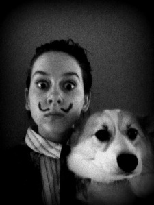
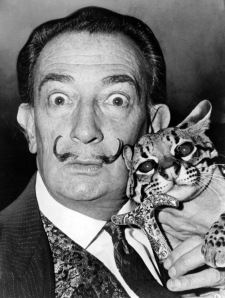
This assignment was to take a famous painting or print and recreate it. I chose a print of Salvador Dali. Unfortunately, I don’t have an ocelot, so my dog had to stand in.

photo (1)Salvador_Dali_NYWTS


http://assignments.ds106.us/assignments/art-comes-to-life/


Modern Mrs Me


This visual assignment is ‘Art Comes to Life.’  The assignment is to recreate a famous painting in a real-life photo, and represents three out of my 10 stars this week.

To try to capture the essence of the Mona Lisa, I did some research on what was so special about the painting, anyway.  I found out that DaVinci was the first to begin doing portraits from the waist up, hands folded in the lap, more intimate view.  He was also the first to give a slight blur to the background, to draw focus toward the portrait of the person itself.  He is also praised for how realistic the painting of Mona, or Mrs. Lisa is.

So I decided to try to wear modern garb, while still dark, try to capture the general setting (my poor husband must have photographed me in front of about 5 different bodies of water), and use Instagram to pale the colors and blur the background a bit – abilities on the iPhone camera are impressive for a phone, but still very limited.  Here’s what I came up with in the end.

Modern Mrs Me

I most definitely did NOT get the dark aspect of the shot.  Like at all.  Nothing here is dark enough, not even my black shirt.  But what about the expression.  Ambiguous enough, you think?

This was really difficult. Please share with me and tell me what you think I could have done to make this work better.  I think I was too focused on finding a body of water to shoot in front of (which is behind me in this shot, but not visible as it turned out in what we thought was the best shot).  I’m just not sure how to pull this one off better.  Let me know what you think! It was a lot of fun trying, anyway – I hope I at least kind of caught the spirit of the work. :)

Art Comes to Life

Eric Lisa

This is my masterpiece known as the Eric Lisa, modeled after the Mona Lisa.  When posing for this photo, I wanted to be sure that I had the nature in the back ground, the arms crossed, and most importantly, the half smile/smirk/facial expression/look thing.  I think I captured this element pretty well

Resurrection of Frida

frida

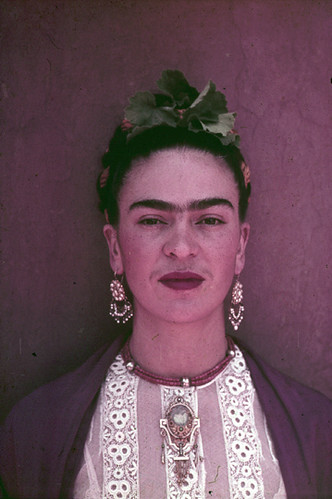
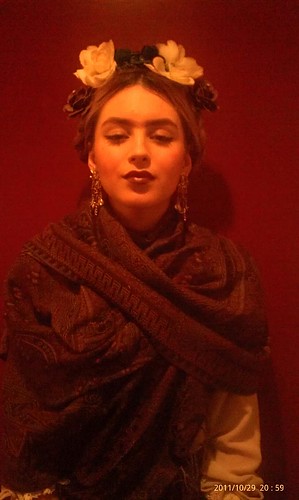
In honor of my idol, Frida Kahlo, I have decided that my first visual art assignment will be Art comes to life. for this assignment we had to “Take a famous painting or print and do your best to recreate it in real life. Capture it in a photo and present the two in a blog post.” so here i have my favorite portrait of Frida, the colors are deep and dark, so i based my wardrobe around that aspect. I braided my hair and added flower embellishments as she always wore and penciled in her famous unibrow.

290546_2340059553649_1614728469_2260551_1024911233_o

Don’t Call Me a Hipster!

The goal of this assignment was to recreate a famous painting and give it a modern twist. Without any hesitation, I knew I was going to do this assignment on the infamous Frida Kahlo.

The Process:

I settled on Frida’s more famous self-portrait. It was clean, colorful, and spoke to the very essence of Frida. Next, I rounded up my friend Amanda to be my muse. Considering she was Frida for Halloween I knew she would not object to the unibrow.

When concerning the composition, I wanted to portray Frida as a modern American. She was political rebel, feminist, and Surrealist or in other words, a hipster. So I designed the costume to reflect what I image a person at Occupy Wall Street might look like. However, I did want to maintain the integrity of Frida’s unibrow, because it was a critical element of her identity (modern hipsters have discovered tweezers).

During the photo shoot I captured the perfect shot on my first try. But for good measure I took 10 more just in case.

On my computer I cropped the photo, so it would be a little tighter, and adjusted the exposure by 10%. All of this was accomplished in Picnik. Below is master creation!


Ta-da!


Out, vile blog post! Where is thy luster now?


How do make a Minimalist even more minimal? By remaking a brick sculpture out of paper blocks.

This is supposed to be a joke, a little. Let’s say it’s 10-15% just a joke.

Here is a photo of the original, which I think is in the Tate?–>“Equivalent VIII”–Below are some photos of the final product (for a slightly fuller gallery, click here)


Freaks & Meat.

The Assignment

This is my first of my ds106 assignments for the next section of this course, “State of the Net.” I know it doesn’t start until Feb. 1, but I was excited to post this. I couldn’t just keep it sitting in my draft box waiting for Wednesday to arrive. I decided to do the Art Comes to Life assignment, which asks you to:

Take a famous painting or print and do your best to recreate it in real life. Capture it in a photo and present the two in a blog post.

It didn’t take me long to remember that I already had an image with a great story that fit this requirement.

The Process

The image that I’m thinking of is a collaboration that I did with a group of friends for a contest in 2009. We did a few images and all of them were based on the artwork of Frank Frazetta, a classic American fantasy and sci-fi artist who passed away in 2010. I’m only sharing one image we did today though, as it is by far my favorite. Before I show you what we came up with, I want to show you the image we were basing it on. The following image is Fire and Ice by Frank Frazetta. Some may recognize it as a movie poster, since it was a 1983 film. (If you’re into badass old fashioned fantasy animation, I recommend it. Some people don’t like the pacing or lack of dialogue, but I think it’s a charming watch.)

The image below was our recreation. I am the one in the luchador mask holding an “axe.”

So, to really describe the process. We knew the characters we needed: A chick in a purple bikini (Princess Teegra), a blonde warrior (Larn), an axe weilding Batman (Darkwolf), and a bunch of ogre things (Nekron’s sub-humans).

Bikini Girl (Princess Teegra): We decided it would be a lot funnier if my friend John played the bikini chick instead of me. I loaned him one of my cosplay wigs and he donned a flesh colored t-shirt. The purple bikini bra he’s wearing is actually an elastic band for resistance workouts that we stretched and duct-taped onto his back.

Axe-wielding Batman (Darkwolf): I was already in a bikini top and shorts so all we needed was a weapon and a mask. There always seems to be an excess of luchador masks, so I used that. For the axe we used a bokken and taped some torn up brown paper bags onto the end to mimic a blade.

Blonde Warrior (Larn): Self explanatory. I had a leather strapped potion bottle that he put on his belt for added fantasy effect.

Ogre Things (Sub-Humans): This is pretty straight forward. They each stuck turn up paper bags in the back of their pants to imitate loin cloths. For my friend on the right he would be the only sub-human with his face showing, so we had him wear a hulk mask and wield a plastic sword.

The Hulk: You’ll notice that the Incredible Hulk is not in the original picture. My friends just own one and decided to include it for extra fun.

We didn’t have a rocky precipice and mountainous backdrop to work with, so we just used my friend’s backyard. We had some other friends present to take the picture and to guide us roughly on positioning.

The Story

So who are these people in the picture? Why Frank Frazetta? Why are we doing this?

The company and website no longer exists but in 2009 a company called “MeatCards” made a little splash on the internet because they had an interesting idea. They were offering business cards made of beef jerky, that had your information seared onto it via laser. Here is a link to an old TechCrunch article about it. They also have an old Flickr page with the process of prototyping Meat Business Cards here.

Check out their Flicker

Photo by Tikaro (MeatCards).

They were having a contest where the top 15 entrants would be part of their alpha testing phase and receive a sheet of 4 meat cards. The contest was to recreate at least one of three Frank Frazetta art pieces (from their pre-selected list). I think somebody told me about this at work when it blew up and then I decided to do it immediately.

My friend John and I would host anime nights at his place on a weekly basis, so that’s where we got half of the participants. The other half of the people involved in the photograph were coworkers of mine (working in the game industry, it’s easy to enlist participation in crazy stuff like this).

We got the photoshoot done on one evening before our usual screening times. I was checking the MeatCard website and when we had finished only 7 entrants/winners had been announced. However a convention over the weekend stalled our submission and on Monday morning when I went to send our submission I saw that all 15 slots had filled! I sent them in anyways and we were given the 16th slot because we “brought it” and because as an anime club we fit their target demographic.

The cards arrived vacuum sealed and we gave it as a gift to John who was moving to PA soon after. Unfortunately his dick roommate ate them.