Drawing the Line Somewhere

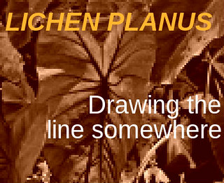
I completed An Album Cover for my second visual assignment this week for 2.5 stars.

[So here’s something fun for everyone to do, should be quick and easy, but try to make it pretty. First, go here:http://en.wikipedia.org/wiki/Special:Random The title of the article is now the name of your band. Next, go here:http://www.quotationspage.com/random.php3 Go to the bottom of the page. The last four to five words of the last quote are the title of your first album Lastly, go here:http://www.flickr.com/explore/interesting/7days Select the 3rd image. It is the picture for your album cover. Manipulate the picture, resize it, add some other color, whatever. Do the same with the band name and album title, put them over top. However you wanna do it. Make it look cool.]

I actually really enjoyed this one! I liked the randomness of each response given because there are so many unique and creative things you can do with the variety of options people got when picking their quotes and pictures. Again, for this assignment I used Pixlr to edit. I will go into a further tutorial below.

Drawing the Line Somewhere

Here’s how I completed the assignment:

  1. Follow the links listed in the instruction, taking note of each random assignment for Band Name, Album Name, and Album Cover.
  2. Go to Pixlr.
  3. Use Pixlr Editor.
  4. Upload the random image for the Album Cover.
  5. For text (Band & Album Name):
    1. Use the Type Tool (represented by the “A” symbol in the Tools section on the left hand side.
    2. Type in the text exactly as assigned for the Band Name and Album Name.
    3. Adjust text size, color, and font to desired setting.
  6. For the Album Cover Image:
    1. Use the Adjustment feature listed at the top of the page, or the Filter feature.
    2. Choose desired layers, filters, etc. (For this image, I used “Sepia”, and I also adjusted the “Pixel” sizes.)
  7. When image completed, save and upload to website of your choice. (I uploaded these to my flickr account.)

As far as this band and album go, if they were real, I’d probably listen to some of the songs! I imagine they’d have a down-to-earth, alternative sound to most of their songs, which is typically the kind of music I’ll listen to on a daily basis. “Drawing the Line Somewhere” makes me think that the songs on this album are about boundaries, both personal and relational. Maybe this artist just suffered a break-up or wants to pave a new way for themselves, cutting off ties/drawing the line. They aren’t going to take any more crap from anybody! They’re moving on. And Lichen Planus is actually a kind of skin rash, gross, but I thought it was cool that I got a random image of a plant which kind of correlates with the word Lichen? Who knows, but I enjoyed this assignment!

Andrea on an Album


Here is the link to the assignment: http://assignments.ds106.us/assignments/an-album-cover/

This assignment is worth 3 stars.

Lie About Your Age

album cover

For this assignment (worth 3 stars), I had to make an album cover through a detailed process for each aspect: title, band, and image. I tweaked this assignment by creating my own image based on what I found as well as Sylvia and Ami‘s relationship. The title was generated by a random quote: “The secret of staying young is to live honestly, eat slowly, and lie about your age.”- Lucille Ball. The band name was from a randomly generated Wikipedia article.  I made the image in Photoshop using silhouettes from online, the gradient tool, and text.

Ami and Sylvia are both femme fatales. I imagine them being best friends in crime, constantly on the hunt to ruin the lives of men. There could even be a possible romantic aspect between the two. I think it would be cute. But mostly, they would probably form a grrrl band, with Ami singing front and Sylvia on drums or guitar. This is their album cover. The band is called Justus || as a play on the words “Just us two,” as they are literally partners in crime. The title of this album reflects their bitingly critical view of patriarchal standards by alluding to the fact that women are EXPECTED to lie about their age.


HOT NEW BEATS

album

DROPPING AT A RECORD STORE NEAR YOU

FULL OF DOUBTS BY JARDINELLA


I did the album cover assignment for three points. It looked like fun, and I like fun things. It also satisfied my remaining stars. My band name was Jardinella, a type of snail or something. The album name was “Full of Doubts”, someone said it. The icture was the third on flickr on the thing.

I used picmonkey photo editor. It was easier to use than GIMP, but still had a bit of a learning curve. Especially with the words. It took me way too long to realize that I had to have my text box positioned before I put the words in. It didn’t move otherwise.

The HOTTEST new album from Pseudosetia…

WOW!  This assignment could not have turned out any more hilarious!  I decided to do the “An album cover” assignment and man-o-man was it funny!  The assignment had a link to a random wikipedia article, a random list of quotes, and a random list of flickr pics from the last 7 days.  The idea is to have the wikipedia article be your bands name, the last 4-5 words of the last quote be the album title, and the 3rd image on flickr be the album art.  This combination is too good to be true.  If I ever saw an album with cover art like this there would be absolutely no hesitation.  I would buy that in a heartbeat.  Enjoy folks…

Screen Shot 2014-09-28 at 11.27.02 PM

Check Out My New Album

Album Cover

For this Visual Assignment we were tasking with taking random input and making an album cover. Accordingly my band’s name is House Grey Memorandum with our hit new album Do What You Can. Looking at my band name I decided they were going to be an alternative band. Judging by the title Do What You Can I figured this album could be about the band wanting to go back to a simpler time. When I saw the picture of the boys I thought it was perfect because it looks like it was an older picture and they were standing outside their old town.

To make the cover I added the band and album name in a way I thought was artistic and stood out. As for the picture, I edited its color and appearance in powerpoint. I gave it a sepia color scheme and a plastic wrap filter to give it an old timey photo feel.

Michael DeKort’s “Someone Who Has Offended Them” (Album Cover)

For our visual assignments this week, I chose the album cover one (3 stars) to contribute towards my 8 star requirement. Following the given three steps, I obtained these random elements that contributed to my creation of my album cover:

1) Band Name

2) Title of Album: “Someone who has offended them

3) Album Art

I used the google docs tool to implement all three elements and they had an option of letting me implement text on the photo so I could put in the band name and the album name. After playing around with it for a little bit, I ended up with this final product:

Screen Shot 2014-09-28 at 5.53.39 PM


Since this assignment was created solely on random events, there is no inspiration or background story to this, but I did have a great laugh while creating this because of what elements I was randomly given. To me, the name sounds better as a single rather than a whole album but that’s just me. The difficult part was trying to find the right fonts and colors because of how blury the picture was but I was able to compensate well enough and find some stuff I found worthy to be on the cover.

Look out for Michael DeKort’s “Someone Who Has Offended Them” in stores near you soon!


Jean-Claude Bastos de Morais

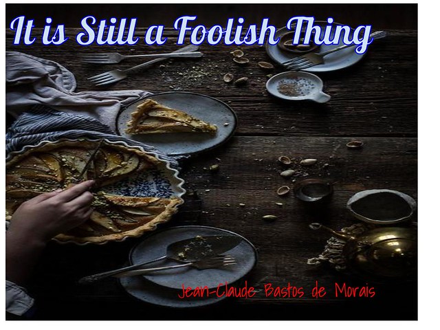
There is an epic new band with a wacky name known as Jean-Claude Bastos de Morais. Their music has been sweeping the nation and have quickly gone gold. If you guys couldn’t tell I decided to make the album cover. This assignment was very fun since I listen to a lot of music, and generally enjoy looking at album art.

This was a nice assignment because everything you have to do is laid out right in front of you. So I received my random wikipedia article, random picture and random quote and got to work. I started out by placing the picture in google docs. I figured from there it would be easy to edit. I liked how the picture looked as is though so I decided not to mess with it. Then I fooled around with different fonts and textures until I was able to get the album cover to look the way I pleased.

Jean-Claude Bastos de Morais

The album name is It is Still a Foolish Thing, by Jean-Claude Bastos de Morais. This almost feels like a real album cover to me, especially because of the picture. It feels like an image that would really be used as an album cover. This was one of favorite visual assignments because it was fun to do and I was glad that I got an interesting image, quote, and article name. This was a three star assignment. I recommend that everyone go ahead and give this a try, I might even make another album at some point, maybe for Jean-Claude Bastos de Morais or maybe for a new band.

What an obscure name for a band

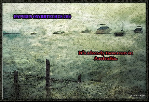
Continuing the trend of visual assignments for the week, I worked on an album cover that utilizes random quotes, pages, and pictures. The band name was chose from this wiki article, and the album name was taken from this random quote by Charles Schulz: “Don’t worry about the world coming to an end today. It’s already tomorrow in Australia.” I actually thought it was a really nice quote too, and works well as an album name.
Latest LP

The cover art was taken from this random image provided by Flickr. I couldn’t have asked for a better picture. I downloaded it and opened it in GIMP. I provided two layers for each quote, the band name and album name. I used a text placement tool for each, and chose a different font and color. I then used the “alpha to selection” option for both quotes and changed the selection size to make an outline. I then added an extra layer beneath the text layers and filled in the selection with different colors to give the font a border, making it stand out. I then applied a “circuit” filter over the entire image, and lowered the transparency until it was barely noticeable. And there we have it! Looks like the sort of album cover an obscure indie band would use.


Difficulty: 3 stars

You Create What You Will

This blog post is dedicated to my first Visual Assignment for the week, An Album Cover. For this assignment we were given a random article title from Wikipedia, which would be our band name. Then some words from a random quote from quotationspagewhich would be our album title. And lastly a random image from flickr, which would act as our main cover art for the album.

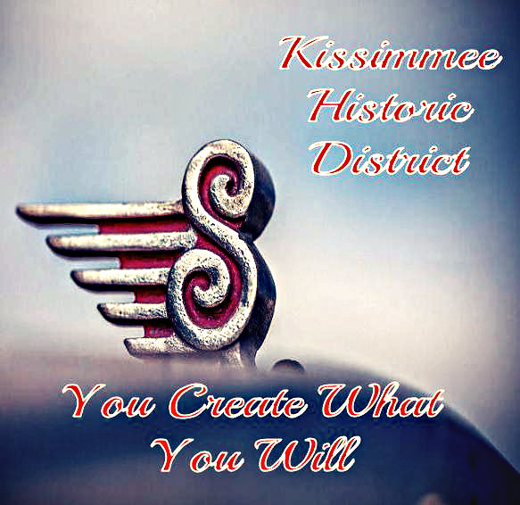
To start off, I was given Kissimmee Historic District as my band name, which is obviously a winner. For my random quote, I was given a quote by George Bernard Shaw:

quote


So choosing the last five words for my album title would be, You Create What You Will. So this far I had the album You Create What You Will by The Kissimmee Historic District. I’m not 100% sure, but that definitely sounds like a Grammy Nomination in the making.

My third step in the process was to get my random image. And here’s the one I landed on:

15125576337_3eb676098c_z

Now that I had all that figured out, the rest was a cake walk. I used Google Draw to create my cover art, and then I used to Pixlr express to further edit it from there. So here’s my album cover:

Kissimmee Historic District

As far as my inspiration goes for this, I chose the script type font because the band’s name is The Kissimmee Historic District and to me, that gives the vibe of an old school, cursive writing type thing. It’s hard to explain. Initially, I really wanted to incorporate the “S” from the picture into the band name or the album title, but seeing that there were no words beginning with an “S”, that made it hard to accomplish. On the positive, the “S”, does, in a way, look like a G-Clef in music. That’s just my opinion though. I again, also chose the grainy but sharpened filter to help really give this album an old school feel. An image that someone could look at and think in their mind, “This must be a classic rock album from the 70’s or 80’s.” So there’s my first visual assignment for the week, it was worth a total of 3 stars

I hope everyone enjoyed, and definitely go buy Kissimmee Historic District‘s album You Create What You Will, it’s in stores next tuesday (only kidding). Til next time amigos. Adios.