

Design Week in The Village kept me busy. I took on the Postcards from a Magical Place (#363) assignment. If I followed directions, I would’ve designed both the front AND back of a postcard. I only designed the front. Why design the back of a postcard from The Village when there is no outgoing mail here?
The Village is truly a magical place though. I did my best to capture the majesty of the mountains, our inspired chess games, and our ever-present sentinel, Rover.

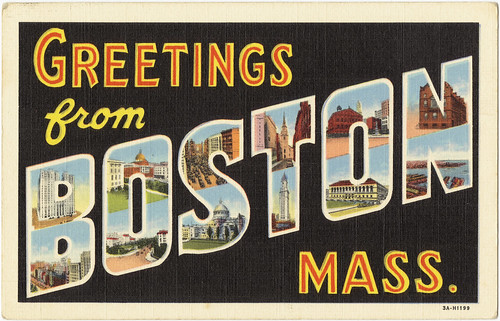
Greetings from The Village
This version isn’t fit for The Village store, but some progress was made. “The Village” doesn’t pop as much as I would like. Actually, none of the text does, but that’s something to fix later. Perhaps something like this:
vintage postcard
I used the Seaside Resort font for the smaller text and found the Vacation Postcard font for “The Village.” However, I quickly discovered that I couldn’t fill that text with an image as I explained in this post.

Only the outline of the text would fill with the image
A more experienced GIMP/PhotoShop user may know how to get around the problem. I couldn’t make it work despite the good suggestions left in the previous blog post.
This is what I did (I think):
1. I opened the image of the chess scene
2. I added the “Greetings from” and “Be seeing you” text layers and moved those around as needed.
3. I added “The Villlage” text layer and rotated the text by going to layer > transform > rotate > arbitrary rotation. I used -15 as the angle.
4. I followed the steps in the “How to Create a Vintage Postcard in GIMP” tutorial for blurring “The Village” text in order to get a nice 3D effect. I duplicated “The Village” text and then added a blur filter to the duplicated layer. Activate the copy/duplicate and select filter > blur > motion blur. I used a length of 20 and an angle of 205.
 Keep making copies of the blurred layer until you have a nice 3D effect. Then hide all but your blurred text layers. When these are the only layers visible, right click them and select “merge visible layers.”
You can also select colors for your main text and the blurred text layer so that you can tell the two apart.
 5. Add the image that should appear within your text. Add an alpha channel to this image by right clicking the layer.
6. Right click your main text layer. Click “alpha to selection”
7. Turn off your main text layer.
8. Activate the image layer. You’re now ready to delete everything outside of the text. Go to Select > invert and then go to Edit > Cut.
(The screenshots below aren’t part of my actual project, which is why you don’t see all of the layers I had)


Though the final product isn’t what I envisioned, I ended up learning a lot about GIMP. Again, this “How to Create a Vintage Postcard in GIMP” Youtube tutorial was extremely helpful in the process.
I also found an easy explanation for adding image to text here.

