Minimalism

For this assignment, we had to make a minimalist design that reflected a movie or tv show.  Instead of doing exactly that, I chose to do video games.  The first one I did was Mario.  Here it is.

minimalist mario head

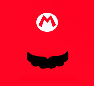
I did this all in Gimp.  First I took a picture of Mario’s head and opened it with Gimp.  Then I highlighted the area around the M of Mario’s hat and then loaded it into another frame that I had opened and just simply painted red.  Then I just drew a moustache in.  I didn;t really like the entire work, mostly because of the high amount of red.  I think realistically I should have made the entire hat on a white background instead of making everything red.  I made another because I was frustrated with it.

minimalist bob omb

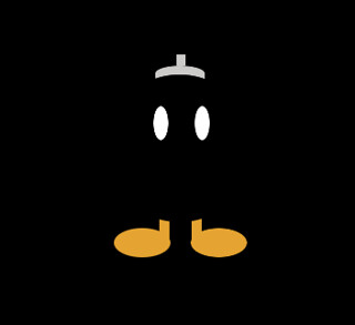
I did a Bob Omb instead and it turned out a lot better I think.  The dominance of the black really makes everything come out better.  I only used the shapes and paintbrush for this.  First I made the background black using the Bucket Tool.  Then I used the oval tool to shape the eyes.  When I decided on a good shape, i painted it white.  Then I copied it, pasted it back in, and used the move tool to put it in a good place.  Then I went for the feet and, again, put in some ovals using the oval shape tool and put them where I wanted them.  After that, I copied and pasted it across to the other side again using the move tool.  Then I made the legs using the rectangle tool.  After I found a good shape, I painted it the orange color using the bucket fill tool.  Again, I copied it into the opposite foot.  The last thing I made was the fuse-cap.  I used the oval tool to make a round top and then the square tool to make the fuse and extend the oval down to make a box with a round top.  I filled all these using the bucket fill tool.  The last thing I did was use the oval tool to shape the body of the bob omb.  I didn’t fill this one because it wouldve gotten rid of the eyes.  Instead, I used the paintbrush tool to simply go around the edges of the circle with black.  The advantage of this is that the paintbrush can’t paint out of oval selection, so nothing will be messed up.  This made the round edges of the legs and the round edge on the cap, finishing everything.

Minimalist Movie Poster Walk Tutorial and Poster

I decided to make a better more improved minimalist movie poster and let you all know how I did it.

Here is ma poster:


Well to accomplish this assignment you either have to have some way of making all those cartoonish looking drawings on a computer, or spend a couple of minutes messing around with a photo editing program. Rather than using my usual go to photo editor of pixlr.com I was adventurous and tried to do the whole thing in GIMP. I sort of accomplished this.

My idea was to make a minimalist poster for Office Space, one of Mike Judge’s non-King of the Hill related works.

Here’s the original Movie Poster

So what I did was that  I found a stock image of the classic red Swingline staplers that almost anyone whose even heard of the movie knows about. After I found one I wanted I loaded it into GIMP.

This is where my experimenting began, but for you I’ll skip to the meaty parts. Once the image is in, darken it a little. Just like when we made the stencil image, things just seem to work better when the original image is a little bit darker. DON’T mess with the contrast; we’re trying to make a hand drawn looking picture here so the lines can be a little simplistic. Once darker go ahead and click “posterize” and take that number of layers down to 2.

Now we’re halfway there, things are starting to look simpler and more minimalist by the minute. After we’ve poserized the image, go ahead and use GIMP’s filter labled “cartoon” under the “artistic” tab.  Lower the number of black marks, because too many, again, add to must definition. Only do this once, don’t repeat this step. After this go back over the image and “clean it up.” By this I mean eliminate anything that seems messy or too defining. I tried to keep the number of colors no more than three: red, white and black.

The matchstick was a personal choice, but if you choose to include it ONLY cartoonize it. It doesn’t really need to be posterized.

This is were I reverted back to my old ways and used pixlr, mostly because I don’t really understand how text-boxes work in GIMP. All I did was pick an office-y looking font, slap in the words “Office Space”, added my two GIMP images as layers, “free transformed” them around till they looked good, and then flattened the images.

The good thing about making a minimalist movie poster is that it doesn’t have that many steps once you figure the basics out. The most important things to remember is to posterize THEN cartoonize.


DS106 Week 4 – Design: A Sansing Sprint

Inspired by my Slaughterhouse IV bunkmate Chad Sansing, I composed a Design Assignment Sprint. I spent a lot of time in tinkering in Adobe Illustrator and Adobe Photoshop, which always leaves me wishing I could do more than I actually … Continue reading

Minimalist TV/Movie Poster

_cokwr: Create a tv/movie poster that captures the essence of the story through the use of minimalist design/iconography. , _cpzh4: Design, _cre1l: http://bionicteaching.com/wp-content/uploads/2010/02/Picture-8.png, _chk2m: Tom Woodward (via Martha), _ciyn3: 43, _ckd7g: , _clrrx: , _cztg3: