My DS106 Radio Design

Halloween

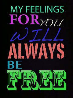
I chose to do this as my design for our radio show to demonstrate this months festivities. I went to Google and found the perfect picture to represent spooky story telling, which is part of our theme for our radio station. After I found my image I went to Picmonkey. From there I added Halloween font and came up with my saying. I really can’t wait to hear other peoples stories about Halloween and this time of month!

Design Assignment #4

This was one of my favorites of the week. I love a good post-secret. (it was also worth 2 stars)

ds106postsecret

So, ever since a friend had showed me post secrets, I became mildly obsessed. The blue screen is so dreaded; and I am more than paranoid about losing assignments the night before they are due. After some searching, I found the perfect blue screen image. I put the image into photoshop and added a text box where I typed my secret. Then I saved it and put the image into the flickr. I think it resembles the post-secret style.


My dream in your eyes

I had a dream that Michelle Obama was walking into UMW campus and talking to me. It was a wonderful dream. I took this photo when Michelle Obama was in UMW and there was an artist who had this art. Background of the photo is UMW‘s campus, near Secobeck. I used paint for selection and then I edited with the Microsoft office photo editing software. I really enjoyed putting my dream into visualization, it was fun.

.

Design Assignment #3

For the third assignment, I chose to do this one. It’s worth 3 stars.

children's book made computer-y

I got the image off of google. The original book is One fish, two fish, red fish, blue fish. I love this book and immediately thought of all the -wares of the computer world. I pulled the image into Photoshop and used the eraser tool to get rid of all the writing about fish. I used the magic spot thing to put the yellow color back in. I tried to use an online font identifier so I could make my font identical to the original, but to no avail. Instead, I chose the ‘computer’ writing style, which I think makes the book even more related to computers. Also, I left the fish images there because they are just too darn cute to take out.(and it helps people realize the original book). This one was kind of daunting because no one had done it yet, which meant I had to work through it on my own. I like the finished product and once it was in flickr, I was really happy.

Design Assignment #2

For my second design assignment, I decided to do this one. It’s worth 3 stars.

self meme

I work at a produce stand in Mechanicsville, called Pole Green Produce. I love my job so much but people tend to think I must be my boss’s child or part of the farm family instead of just a girl that doesn’t mind getting dirty. I tried to find images through fotopedia and creative commons, but the variety was really limited. I ended up just google image searching farm-related things. The best and worst part of my job is customers. I also talk A LOT, and get in trouble sometimes from my boss because of it. Like the assignment creator suggested, I used this link to add my images and content (super easy to do). Overall, I’m pleased although can google or someone get more images of farm girls that don’t look slutty? Please!

Design Assignment #1

I did this one first, worth 3 stars.

Here’s the image:

realsweeney

I chose these images off a simple google search, simply because other websites did not have the icons I needed. The four icons featured are a girl, a barber chair, a razor and pie. It took a while for me to come up with the movie I wanted to base my icons on, but I really love this movie (hint: it’s a Tim Burton one). The challenge was picking only four elements of the story. The razor was the first one that came to mind, then the girl (it’s always a girl isn’t it), then the pie, then the barber chair. I think all four of these embody the movie in ways that other icons wouldn’t.  Once I located my images, I put them into Picasa and arranged them into a collage. Then, I uploaded my image to flickr, and voila!


If you haven’t guessed the movie  yet, it’s Sweeney Todd.


recycle the bottles

I took photo of the recycled bottles, and then I used GIMP to manipulate the colors, although I did not know how to use GIMP for manipulating colors but the tutorials on YouTube was a great help to me.

.

Feelings & Liberation

Typographic Song Lyrics

I don’t know if I did this assignment the correct way, but I think this turned out pretty cool looking. Typography is a branch of design that I haven’t really explored before until this week. It is pretty interesting, and there is actually a whole science behind what fonts, styles, etc. marketers use in advertising. Crazy.

I don’t listen to Avicii, but this song is good and I was listening to my grooveshark, and that song popped up randomly. So, I chose to use those lyrics. To achieve this look, I took a picture of blackness on my iPhone, and emailed it to myself. And then used the different fonts & colors in Picasa to write out the lyrics with. It looks pretty chic (and maybe a bit “high school”) but I dig it. Looking at it now, I don’t like the spacing of the words as much as I thought I did, but it’s probably as good as it’s going to get. Pretty simple. Worth 2 stars.

Hey! I’m a cartoon!

Cartoon you was one of the assignments that randomly came up on the design assignment page and it’s worth 2 stars.  For this assignment I choose a picture of myself and made it look cartoonish using Photoshop.  To create this picutre I had to go through a lot of steps.  Cartooning the picture wasn’t the difficult part, but I was concerned about the quality of the picture.  The original picture I used was very poor quality, so I chose Photoshop to enhance the coloring, add brightness, crop it, change the lighting and the background to a darker color so that the image would stand out and AFTER all of that I finally decided to use the cartoon option to make my picture a cartoon looking one.  With the choice of making a cartoon picture I also had to choose what kind of shading I wanted to picture to have, but the overall quality of the picture turned out great.  I’m really pleased with the work I did, specially spending the time to make the original picture better in order to increase the quality of the overall project.

Cartoon me

I loved how the picture came out and I love my flower dress that I was wearing :P

Skipping a beat

Week six we got introduced to design!  We had to choose different design assignments, and I choose to do Valentine’s Alternative!  This assignment was worth 2 stars, and it was a little bit more complex than I had originally anticipated.  I messed around with Photoshop, which I had never done before so that’s where the challenge came in.  It took me a little bit to figure out what to do, and what each individual tool was for.  I was a little difficult to figure out how to have a background image, and put some more on top as well as figuring out how to crop my heart picture to make it fix!

Slide1

Valentines day is the of love, and I wanted to express that by putting a picture of a heart on my card.  I feel that having a real heart is more meaningful, specially because it went with my quote.  ”You give me premature ventricular contractions” is basically scientific talk for “you make my heart skip a beat.”  When I first heard that quote in a movie called No Strings Attached  I absolutely loved and I was waiting for the perfect opportunity to say it and I guess this is it!