Flowers of the beach

What beautiful flowers growing in the dry sand of the beach. I captured this picture on a stormy day in South Carolina. We were racing against a storm in attempt to see the lighthouse off shore. As thunder rolled in, I could not resist photographing the eerie atmosphere. As we walked down the tattered trail of sand and beach grass, this flower trickled into the path.

beach flower

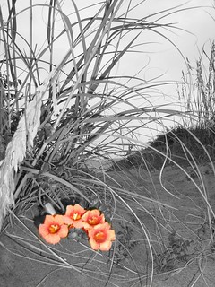
I used a app called “photo splash smart” on my Mac for this picture. I actual wrote a tutorial for using this app http://livegraced.com/2012/09/photosplashing-for-macs/ .

Common Object, Uncommon Colors

I am big into color changing, so I was excited when I came across another assignment that involved taking ordinary things and giving them different colors. I randomly came across this assignment, so I didn’t have any idea of what object I wanted to do. I am also having a lazy day, so I didn’t really want to move far. I then realized that I till had my sunglasses on top of my head from when I wore them to class. Perfect! So I went ahead and took my picture with my phone and uploaded it onto my computer. I have become quite fond of Pixlr and decided to use that website again. I started trying to crop the back ground out and try some effects, but none really looked that exciting and changed the colors. I then started playing with hue and saturation, but again it didn’t satisfy me. I came across a “wand” type tool that highlighted shadow areas. I had no idea what it was/what it did. So I left one spot highlighted and used a paint brush tool and figured out that when the wand tool highlighted a spot, the brush tool would only paint in that spot too! It was exactly what I wanted. So I played around with these tools, the shadowing, along with a variety of colors until I came up with the perfect mix of all three.

^^Before the Color Changes

^^BAM, Color changes

Broccoli … and an assignment proposal

Okay, so I have this awesome map of the results of the 1988 presidential election:
It breaks down the popular votes by county, with an inset map showing the electoral votes break down. And there are two small charts, one showing the total number of poplar votes and the other showing the total number of electoral votes for each candidate (Bush: 48.9 million, 426 electoral; Dukakis: 41.8 million, 111 electoral).

I love this map for two reasons. The first is that it very eloquently demonstrates how a candidate who only received a strong majority of votes in a handful of locations (color intensity indicates how much of a majority they had) and won by a margin in the popular vote (Bush received 54% of votes) can still achieve a landslide victory in the electoral college. The second is that it predates the “Red State, Blue State” system introduced back in 2000. In looking at this map today, our instinct is to assume that Dukakis won in the blue counties and should have won the election. Nope. Historically, red is the color of liberals (like how red is equated with communism).

When reading the description of the GIF-fiti visual assignment and looking at the examples of Animated Banksy gifs, this map came to mind. I though it would be really cool to animate some sort of graffiti message across it, or perhaps do something funky with a couple of the states. My ideas, however, exceeded my Photoshopping skills. I probably could have used some sort of graffiti font or brush set, but I didn’t feel like digging, because I decided to do something a bit more educational…

If you have trouble viewing the animation, open the image in a new window.

This doesn’t even remotely fit the assignment’s instructions, so I’m going to be submitting it as a suggestion for a new visual assignment on creating animated gifs that are semi-educational (akin to The Oatmeal’s famous gif on SOPA). Here’s hoping my idea is accepted!

The ghost of ME!

Is that a… GHOST?!” …No its just me! This is visual assignment 426 (3 stars). The instructions were as follows:

“Take a photo in which there is a ghost like subject by either using a long exposure or 2 different pictures in a photo editing software.”

I chose to use two separate photos. And for an even stranger effect, both photos are of myself.

These are the two photos I chose to use:

I used GIMP to edit my photos. I didn’t have to research any to complete this project, I think that means I am getting comfortable using GIMP (or maybe this was just an easy project) :)

This was a somewhat simple project (and lots of fun!) First I added the 2 photos as layers in GIMP. Then I “flipped” the worried faced photo. I made sure that the photo I wanted to turn into a ghost was on the top layer. Then I decreased the opacity of my top photo (the worried face). Next, I moved the photos so I was happy with the angle and my final product!


I know this is a little creepy, but for some reason I really like it! Once I saw the finished product, I thought it looked like my conscious was looking shocked and disapprovingly at the dumb face I was making. I really like how it looks like the ghost is starring right at that weird girl! (oh wait, that’s me)  I originally created this as the funny faced photo being the ghost, but for some reason I just did not like it as much as this version!

I know I’m strange, but I hope you found this somewhat entertaining at least! You can laugh at me, I completely deserve it!  :)


A Man and His Dog

So I was clicking the good old “random” button on the Week 5 assignments and came across, “Draw It.” I figured, “Hey, I used to use Photoshop in school all the time and I remember there being a filter to just change it! Too easy!” Well, turns out, GIMP does not have that feature.(Or at least I couldn’t find it) I wish I knew where my Photoshop CS2 CD is…even though it is majorly obsolete by now! But I used the tools that GIMP gives and from what I remembered, and a little prodding on GIMP Forums, I was able to create this:

Okay, so he isn’t actually MY dog, but I was watching him while my old suite-mate’s family came to visit him. (Odd how this was almost exactly a year ago!)

So of course I wanted to see how other people’s pictures turned out. And first on the list was Kiersten Pyrtle’s How to draw a horse! I also noticed that she had made a tutorial of what she did…after I did my own! SMH. Anyways, gotta love the fact that you can use different techniques to get a similar end result! I think I may post again with my own tutorial about how to create this because it was basic use of GIMP and anyone can do it!

4/10

I’m a Professional!

— Rob Skoczylas (@sgtsocks) September 26, 2012

Well here is one I couldn’t resist! This assignment is “Your very own Spubble“! As soon as I read it, I knew the exact picture I was going to use:

After some weekend training and PROPER use of equipment, us rescue folks like to have a little fun. What I’m wearing is a Stryker Speed-Sheet. We ordered a bunch to test them out. They are used to ease patient transfer from our stretchers to a hospital bed or such. It’s a one time use and well…after we used it in training, I decided to use it some more!

This was a quick create. Open photo in paint, click rectangular callout, change the colors of the callout, add some text, save! BUT remember to save it with a different name so you don’t lose your original files!

2/10

Overedit Yourself… Wow.

I look like an alien. But I overedited myself, I made my hair blonder, my eyes are originally blue, and I gave myself a tan.

Normal To Extrordinary: The dot effect

I really liked the assignment for Normal to Extraordinary. It creates normal pictures (of extraordinary people) into something different. I knew I immediately wanted to do my best friend, so I went through the pictures I have of her and came across one she sent me when she was bored one day (accompanied by pictures with “I” and “you”). I really liked this picture because it describes her. She is such a sweetheart. I used Pixlr again and started playing around with effects. I came across the “pointize” effect and thought it looked like an old pop culture painting. I took the background out and added the pointize effect in purple. But, I didn’t like the way it was just one color, but I didn’t want to add to much since it was already quite a busy picture. So I decided to change some of the white dots into pink ones. I also highlighted the heart and made that pink too. At the end, I randomly added in a swirl effect which made everything much more smooth instead of so harsh cut. It was just a few simple adjustments but I think the combination of the effects and the colors really turned out cool!


Adds 3 more stars: 5 stars down, 5 more to go

Return to the Scene for the Crime

Hey Eagles! Did you know that Campus Walk was nonexistent until 1985?! That’s right the school used to have a road going right down the middle of campus! Originally called Campus Drive, it bricked over in order to promote a pedestrian friendly and smaller community. The transformation was met by tons of protest, but ultimately it was seen as a wonderfully addition.  For all you eagles complaining about the sunken gates being closed and having to drive around the perimeter of Mary Washington…blame those who voted in favor of bricking up Campus Drive. However those of you who chose this school for is cozy, comfortable, close-knit community, you can praise our ancestors who vote in favor of Campus Walk.

Original 1985 Campus Drive outside of Trinkle:

brickway

Today 2012 Campus Walk outside of Trinkle:

today

Same old Trinkle, but not so noisy:

scene of crime


Source: “Back to Brick: Chaning Campus Drive to Walk” 


Common Everyday objects

The assignment was to take an everyday object and manipulate the colors.

My original object is a chair in my dorm room. As you can see it is brown and white with geometric patterns. I have a aqua-blue pillow on the chair. Notice how the wall stickers and lamp shades are all in the same color pallet of brown,blue, green, white.

room

Using photo-editing software called Gimp 2.6, I played around adjusting colors. Making things “coloized’ in a particular hue. I ended up really like how “inverting” the colors looked.

room


“Inverting” the colors means the software detects which color is displayed and, then, swaps them out for the opposite. If you look at a color wheel this becomes more logical. Example: Blue would be swapped with orange , yellow swaps with purple, etc.

color-wheel-for-color-mastery

I think it is interesting to see what my room would look like if I had chosen a more feminine color pallet with pinks and purples dominating my accents. I also really like the ghostly effect it gives my photography.