Pods Embed Error: Pod not found.

Up, Up and Away

New to the art of creating a GIF, I didn’t realize what I was getting myself into when I decided to take on DesignAssignments313 to animate a movie poster. After completing the project I decided it was well worth using it to create a new Animated GIF Assignment.

It’s A Good Life: Trading Cards

Brian Bennett beat me to the punch this evening by posting a ds106zone The Twilight Zone trading card of Mr. Hollis from the episode “It’s a Good Life.”  While I had started working on GIFs from the episode a couple weeks back (originally thinking of doing a multi-panel GIF, either synchronized or sequenced), it was after I had initially posted my original static trading cards (and then GIFfed the Katatmit) that I decided to put the episode into Trading Cards, and completed my first two, that of Mr. & Mrs. Freemont, and the Mr. Hollis Jack-in-the-Box shadow.

This evening when Brian posted his Mr. Hollis head trading Card, I decided it was a good opportunity to complete a couple more and add mine to complement his.

Here, then, are four animated Character Trading Cards from the Season 3, Episode 8 entry, “It’s a Good Life.”   I have posted static jpeg versions to the Flickr group for inclusion in the Gallery.  (Animated GIFs can get easily borked when posted to Flickr.)

"Anthony" animated GIF Trading Card by aforgrave

“Anthony” animated GIF Trading Card by aforgrave

"Mr. & Mrs. Freemont" animated GIF Trading Card by aforgrave

“Mr. & Mrs. Freemont” animated GIF by aforgrave

"Mr. Hollis Jack-in-the-Box" animated GIF Trading Card by aforgrave

“Mr. Hollis Shadow Jack” animated GIF by aforgrave


"Mrs. Hollis" animated GIF by aforgrave

“Mrs. Hollis” animated GIF by aforgrave

I Can Read Series: Eye of the Beholder

Making the Twilight Zone approachable for new readers…

i-can-read-beholder

This is a slight riff from the I Can Read Movies ds106 design assignment, I did not use the templates, but instead mocked it from Biscuit Goes to School

I started with the idea of the Janet Tyler character facing the “beautiful” people maybe putting a mirror in between.

Instead I cropped out the back if her head and put it through some palette and poster edge filters in PhotoShop to simplify the colors of the back of her head. I got the mirror and the pig face from the Noun Project (just using the snout of the pig in the mirror). The text was done with the Chalkboard Font, and warped a bit to match the original.

I thought it a bit literal, so got the idea to GIF the pig nose in. I switched to the timeline mode of the animation paletter, toggled open the available slides for the pig layer, By setting key points in the timeline, I could make the opacity go from 0% to 40% and back to 0%, making it fade in and out:

timeline

I’d like to see more book covers as animated GIFs.

The prize of this episode as many are the way it flips our assumptions. When you know the ending its amazing to see the ways they avoided showing the nurse’s and doctor’s faces, yet did not make it too falsely set up.

Wow, I had planned to do some other things today, I ended up doing more #ds106.

Street art — selective colourization (#ds106 assignment)

I’m participating in ds106 at the moment, as an open, online participant. It’s a crazy, compacted summer course for students taking it on campus at the University of Mary Washington–just see what they need to do for week 1 (which has just finished). Here’s the full syllabus for the on campus participants.

As an open participant, I’m free to do what I want (a lot) and have time for (not much). I’ve managed to do two assignments so far, an animated gif assignment and the one discussed here. Plus, I did quite a few “daily creates” from last week, which are posted in my daily create set on flickr. But this is a tiny fraction of what many people are doing. I have to cram all my ds106 work into 2-3 hours after my son goes to bed at night, and I’ve been staying up pretty late to get even these things done. Having a blast doing them, though.
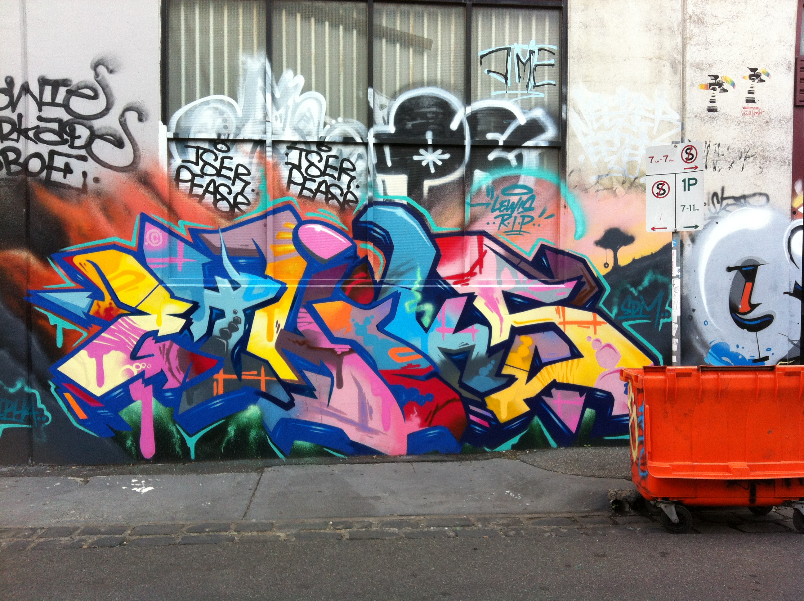
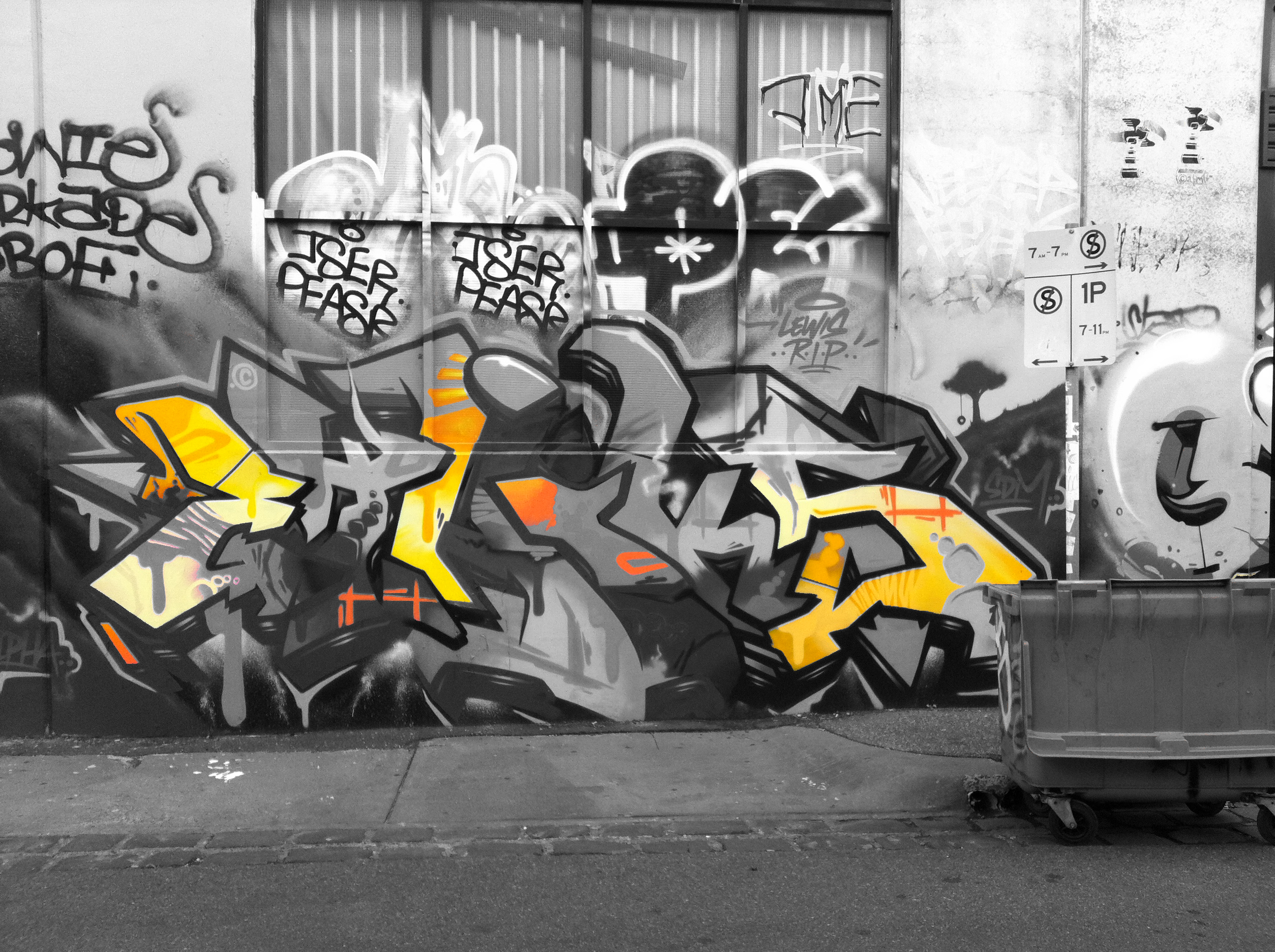
The image below was done for theFocus on one colourassignment: “Either in your room or a room in your house [take a photo] and use gimp or any other photo editor to focus on one color in the room.” Well, looking around the apartment I’m renting in Melbourne, Australia right now, most of the rooms are really dull in colour–white, grey, brown. Not much colour happening here. So I decided to use a photo of some street art I had taken earlier and do selective colourization on that. I realize it doesn’t quite fit the assignment, but I doubt anyone will mind much.

Here’s the original image:

Street art in the Fitzroy neighbourhood, Melbourne, Australia


And here’s the selectively colourized version:


Street art selectively colourized

There were quite a few colours in the image, so first off I had to choose which one to focus on. I picked the yellow first, because: it was spaced pretty evenly over the image, there was enough of it to stand out (not so with some of the colours), there was not too much of it (which was important too, because it woudn’t stand out from the greyscale as well if there were a lot of it; this would have been the case if I did all the shades of blue, for example), and I thought it would look pretty nice against the greyscale image. Of course, the pink could have worked too, or just the light shade of blue alone. I didn’t do red because there just wasn’t that much of it.

I was just going to do the yellow, but thought the orange would look nice with it as a colour (and much of the yellow was close to an orange shade anyway). Plus, doing the orange too  would highlight a couple of other areas in the image that I thought would provide a nice balance. So not only did I not follow the assignment instructions for taking a photo of a room, I also didn’t follow them for picking one colour.

Process

I did this the hard way, I think. I used GIMP and wanted to work a bit more with layer masks, which I had only tried once before. So even though there are lots of tutorials like this one about how to do selective colourization with GIMP using the eraser tool, I thought I’d try to do it with a layer mask. Which meant I came up with a process on my own (partly because I couldn’t easily find a tutorial on selective colourization with layer masks, and partly because I wanted to see if I could figure it out on my own). If there are easier ways to do this with a layer mask, or better ways for some reason, please let me know!

I’ll be explaining in detail, because I don’t yet really understand all this and need to explain it in detail to firm it up in my own mind. It might also be helpful for other total novices like me!

First I created a duplicate layer of the original image; actually, I created two duplicates so I always had the original image without touching it, just in case I messed something up with the two layers I was going to use (most people won’t need to do this, and it’s probably unnecessary, but I wanted to make sure I could always go back to the original easily, w/o having to do “undo” a bunch of times). I turned off the original layer (or whatever it’s called: I clicked the “eye” button next to the layer so it’s not visible) so I just had two layers with the same image.

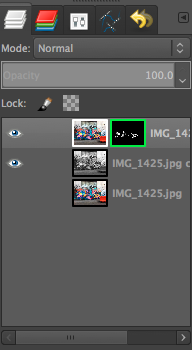
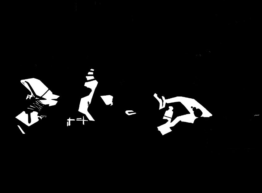
On the top layer I created a layer mask. I’m pretty sure I did this backwards: I had the top layer coloured and the bottom layer greyscale (I used Image>desaturate to make the bottom one greyscale), and then I used a layer mask on the top image to make transparent all the colours except the yellow and orange–thus the greyscale from beneath would show through and the yellow/orange would stay from the top layer. Here’s a screenshot of my layers:

It would have been more intuitive, probably, to have the top layer greyscale and create a mask so that the only the yellow/orange parts were transparent and thus showed through from the bottom image. But it ended up working fine.

Here’s a screenshot of my layer mask, with white for the stuff that’s opaque (the yellow and orange) so that the greyscale from beneath doesn’t show through, and black for the transparent stuff that ends up greyscale.

I could have used the paintbrush tool to paint white all of the stuff I wanted to be coloured–the yellow & orange bits–or I could have used the lasso tool to select those bits. But I wanted to play around with the fuzzy select and colour select tools, so I used those instead. The colour select selects everything in the image that is the same colour as what you click on, and the fuzzy select selects everything that is that colour that is also contiguous to that colour. That was a LOT of work, as it turned out, because what seems like one colour is actually many different colours, so when you use either of these tools you only get a small portion of the “yellow” or “orange” sections. There was a whole lot of clicking going on to get all of it, and I still missed some of the edges of the colours. So really, the paintbrush or lasso tool would have been better. But I’m not yet proficient at using the lasso tool with a mouse for detailed work.

I would have liked to have selected some of the yellow right below the street sign in the original image, near the tree part of the painting, but it was really fuzzily blended with the pink on top of it. I didn’t know how to do a fuzzy selection where it blends into the next section. I would have gotten this hard line where there isn’t a hard line. Can anyone help me with getting a more fuzzy line for my selection? Or is that only possible if I used the paintbrush to paint the white parts rather than a selection tool?

I then created a layer mask on the top, coloured layer and set it to “selection.” It automatically made the selection white and the background black, which is what I wanted, but I think you can invert that pretty easily if you want it to be the opposite (haven’t tried, so not sure how–anyone know how?).

And that was it, really–I had two layers, coloured on top with a mask that had white on the yellow and orange bits so they were opaque, and black for the rest so the greyscale image below showed through.

Happy to hear any comments on the image or process!

Share this

Pressing the Panic Button

twilight-zone-panic-button

It’s the end of the school year, end of term work is piling up on your desk and inbox,  it makes more sense to count the remainder of the instructional time you have with students in hours rather than days, and you feel like if a panic button magically appeared on your desk, you’d smash it without a moment of hesitation. That’s sort of where I am right now. I’ve been failing miserably in keeping up with the DS106 assignments for this past week (I managed a lowly 2 animated GIFS), the end of year PD for technology is falling apart, and I’m chasing the loose ends of all the conferences I’m attending his summer like a neophyte teacher with eyes wide.

That’s not to say I’m not enjoying the experience! But after watching the pilot episode of the Twilight Zone, I’m desperately seeking a panic button for a few hours of escape. Titled under the misnomer of “Where is Everybody?“, the fledgling episode of Rod Serling’s seminal program about the paranormal explores the depths of human sanity with the deprivation of all contact with other beings (sorry, no spoiler alerts for a 60+ year old television program). The premise starts simply enough; a man with no recollection of who he is, or where he came from, awakens to find the world completely devoid of other beings. Tea kettles are left boiling on stoves, jukeboxes playing, and automated recordings are all that’s to be heard when dialing the operator. As the main character attempts to pass off his uncanny solitude with jokes and monologues delivered to himself in the mirror, it becomes painfully obvious that someone, or something is watching his every move. The feeling of being under careful watch, something that all teachers in Michigan can most likely identify with these days, becomes apparent, and before long, our protaganist is reduced to a sobbing heap of a man, finding a crosswalk signal, and desperately mashing the button as though it were some sort of “panic button” capable of ending his torment. It’s a fantastic story, and worth watching if you haven’t experienced the joys of the Twilight Zone. Provided Hulu is still allowing embedded video, you can watch it below.

I’m glad that I’ve jumped into this abbreviated term of DS106. It’s a great release for the stress that builds up at the end of the school year (my own personal “panic button” if you will), and it’s a great chance to explore and mine a lot of really great vintage media from the Twilight Zone; the theme of DS106 this go around is the DS106 Zone, a riff on black and white series of yesteryear. If you haven’t ever watched the original Twilight Zone episodes, or if it’s just been a nice long time since you caught them on TV, slide over to Hulu and watch a few episodes! I had anticipated watching a few minutes in order to produce the animated GIF at the top of this article for the Twilight Zone animated GIF assignment, but I ended up watching nearly an hour of terrific classic sci-fi and paranormal story telling, a great release for any teacher at the end of the school year, when some of the stress and duties put upon us feels as though some omnipotent being is orchestrating the very demise of our sanity.

Minimalist Book Cover for “The Invaders”

Minimalist-The-InvadersI’m doing a little experiment this evening — pushing myself to see if I can reach 10 stars worth of assignments before midnight for this week’s feature The Twilight Zone episode, The Invaders,  – making an attempt to maintain a decent level of quality and also peruse the Assignment Bank for interesting challenges that will fit the subject material.  I am going to give myself 5 stars towards The Invaders for GIFs already completed (You Best Clear Offa My Roof, and my poster + mini-GIF for the Episode of the Week This Week on ds106zone: The Invaders) — and I am going to seek out work that will NOT evolve into GIFs for the next couple of hours …

First I’m taking a run at former UMW #ds106 student Nancy Belle’s (@bellekid) Design Assignment 960: Minimalist Book Cover.

In approaching this assignment, I decided on a primary dark cover (the episode is quite dark, taking place at night and with minimal lighting), maintaining clean lines with a simple san serif text, and building the limited images out of existing primary shapes within photoshop, going with shades of grey to complement the black. (The episode was shot in black and white anyway!) . While my original plan was to place the saucer on the roof, and include a silhouette of the giant lady holding her knife through a window in the hut, I decided to simplify things and only show the saucer in the sky, and the hut on the horizon.

To balance out the larger title text at the top, I added an author line and a “based on” reference line at the bottom — keeping the lines of the text long and linear, and thus hopefully low-key. Each was reduced to 40-50% Opacity so as to not stand out in relation to the title and the other two images.  I also applied a reduced opacity to the 95% grey rectangle that provides the “sky” — trying to find a shade of grey that suggested a dark sky without being too light.

In hindsight, I might like to see how this would have turned out with a non-primitive constructed hut — something that might more accurately reflect a curved, sloping roof slightly slanted walls — but my timeline is calling for compromise — and I need to keep this minimalist.  And as I take a final look at the image before posting, it would be nice to go with a gradient of lighter to darker grey for the sky as you move upwards — suggesting some light in the distance on the horizon, but fading to the dark of space as the eye rises.  However, it is time to post.

As I look at the star count for this assignment, I think it’s a bit high 3 1/2 stars for this, as opposed to only 2 stars for an @iamTalkyTina Twilight Zone animated GIF?  I typically spend a lot more time on most animated GIFs than I spent on this.

Can’t stop spilling!

This is my animated gif from the as seen on tv video. It’s of people spilling stuff on themselves. Enjoy!

A Katamit’s Private Thoughts

With all that capacity up there in the braincase, the Katamit is able to both communicate telepathically with the earthlings, but also reserve some bandwidth for his own secure and private thoughts.

Would that our intrepid hero Cryptographer Michael Chambers had spent more time trying to decipher the Katamit text before getting on that ship.

"A Katamit's Private Thoughts," animated GIF, by aforgrave, from "To Serve Man"

“A Katamit’s Private Thoughts,” animated GIF, by aforgrave, extended from “To Serve Man

Of course, once our intrepid hero’s colleague, Patty, spilled the beans, it caused a bit of a kerfuffle on Earth.

"Oops, My Bad!" animated GIF, by aforgrave, from "To Serve Men"

“Oops, My Bad!” animated GIF, by aforgrave, extended from To Serve Man

However, by that time, our intrepid hero was en route to the Katamit homeworld, with only a simple redeeming thought for solace. Perhaps he is able to decipher THIS simple code? Can you?

"Some Solace for the Codebreaker..." animated GIF by aforgrave, extended from "To Serve Man"

“Some Solace for the Codebreaker…” animated GIF by aforgrave, extended from To Serve Man

My GIF-eye-tis must really be acting up. I’m finding it difficult to do any ds106 assignment that doesn’t wind up a GIF.

I guess there are worse afflictions.