One book over the line

A few days ago, a new alleged reading promotion poster from the Chicago Public Library came to my attention.

I shared it with some colleagues, and one responded with this graphic.

Weeding is librarian talk for the process of removing outdated and unused books from the collection. But when I read “weed a book,” I hear it in Elmer Fudd’s voice.
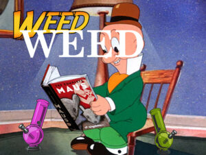
So this all made me think of the ALA Read poster series, which just happens to be a design assignment. I found a few images of Elmer reading, and played around with one, thinking about the poster series and the weed pun. Some of the posters use an Indiana Jones font, but I think the more classic Schoolbook font is more fitting. I thought about adding a pipe or two, going further with the pun. Since marijuana is becoming more legal, and some books are becoming less, I thought about incorporating that. I thought about using The 1619 Project, but that could be misinterpreted so I went with Maus. At this point I was just playing with ideas visually.
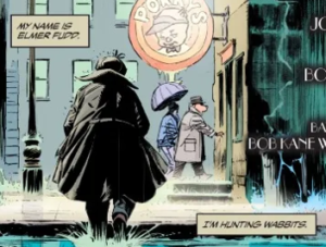
by King & Weeks, from Batman/Elmer Fudd Special 2017

As I thought about it more, it seemed that more subtlety was in order. I don’t need to spell out weed, because anyone who knows their Looney Tunes will get it from read, and anyone who doesn’t know about Elmer’s speech issues won’t get it anyway. With that in mind, the pipes were overkill too. I needed a subheading to highlight the legality issue though. I also need to make it look poster-like. My approach here was to use the Golden Rectangle for the dimensions. I made a new Photoshop image using those proportions, and pasted the Fudd picture in. I scaled it up to fill as much of the space as possible. It was still short, but the READ text filled most of the top part. I did some copy-paste work to extend the image upward. That was a bit sloppy, but it’s in the background so it’s not too distracting. I put in While it’s still legal! as a subhead. There were contrast problem with the image underneath, so I made a white copy of the subhead, applied a bit of blur, and offset it a little to make a white drop shadow, making it more legible. That didn’t fit well with the flatness of the READ headline, so I used an Emboss filter on it to give it some complementary dimensionality. I think it works. Some people won’t get the pot joke, but the right people will.

READ Poster

For this assignment we had to create a READ poster. I decided to take mine the comedic route and make fun of the one and only Donald Trump. I’m not sure if it has been made clear from my other posts or tweets, but I am not a fan of Trump. I may actually be his #1 un-supporter.

I first googled a picture of Trump reading (which honestly, there aren’t many pictures of…). I then put a slogan on top of the image in the ways the old READ posters did.

Here is the outcome:

Hope you had a laugh ?

READ

For my final design assignment of the week, I did the “Create A READ Poster” assignment. I picked this one because as soon as I read the description, one of my favorite pictures came to mind.

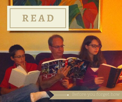
There’s a picture my mom took a few years ago of me, my dad, and my brother. It was the day the three of us each got our first pair of glasses; we’re each reading different books. I’m reading Harry Potter, my brother is reading Great Expectations, and my dad is reading a rock and roll coffee table book – upside down.

It’s a funny picture, so I decided to turn it into an even funnier READ poster.

R E A D

It was pretty easy to upload the picture to Canva and add the text. The picture works well theme wise, and it’s already well balanced. I played around with the text until it felt well-balanced too, and I played with the color scheme until it reflected the warmth of the picture while still standing out.

I’m pretty pleased with how it turned out.

Books are a girls best friend

For the Create A READ Poster assignment, worth 3.5 stars, DS106 students are challenged to make a poster urging people to read in the style of the posters made by the American Library Association. I immediately thought back to an unexpected discovery I made once. Apparently Marilyn Monroe loved to read. Just Google “Marilyn Monroe reading” to find more images like the one above. Sure, some of them are of her reading scripts, but she also often had her nose in all kinds of pleasure reading. In fact, there were supposedly 430 favorite books that Marilyn Monroe had read and kept in her personal library! Unlike many of the fashion icons, actresses, models, and celebrities of today (cough Kardashians), Marilyn was beauty and brains in one package (not to mention a lot more gorgeous than today’s models, but anyway, if you want more of that you can see from the many pictures of her that I have pinned).

As per usual, I used Drawings in Google Drive software. However, this time I’m going to structure my tutorial a little differently, in case the format of the other tutorials did prove helpful to anybody by itself.

How to make a simple text poster on Google Drive

Step 1: Insert Drawing into A Google Doc

Click Insert from the menu at the top, and scroll down to the fourth option, Drawing.

Copy of Reading Poster (1).jpg

Simply open up a Google document, slideshow, or even spreadsheet, and this option will exist just the same.

Step 2: Inserting an Image into Drawing

When you click on Drawing under Insert, this window opens up:

Copy of Reading Poster (2).jpg

Click on the the Image icon on the Drawing window menu, which I am mousing over in the following screenshot so that the label shows (my cursor will not show on screenshots for some reason).

Copy of Reading Poster (3)

When you click on that, the Insert Image window will appear. It allows you to add images by URL address. Copy of Reading Poster (5)

To get the URL address for an image, just right click to get a menu like the one below:Copy of Reading Poster (6).jpg

On that menu, you click Copy image address in order to, that’s right, copy the image’s address! (I don’t know how I survived without this handy tool. If your computer’s menu doesn’t work like this though, you can just click on the picture and copy the URL address from above, just like I did for the YouTube video in my last post.)

And of course, you paste it in. A preview should appear as follows. If the preview appears and looks good, click Select. Otherwise, there may be an issue with your URL address. Copy of Reading Poster (7).jpg

Hitting Select should return you to the Drawing window with your image. And there you have it! It should look like this:

Copy of Reading Poster (8).jpg

Step 3: Superimposing Text

After I got my picture, I still had to add text. To do that, you click on the Text box icon on the Drawing menu, which I am mousing over in this screenshot so its labelled:Copy of Reading Poster (9).jpg

Draw a text box by dragging the cursor to expand it. You can also move this text box around.

Copy of Reading Poster (10).jpg

Finally, you can add in what you want to say. In my case, I wanted to make it clear that reading makes you beautiful. To add to my message, I considered the connotations of different colors before deciding on what color the text and highlighting (for text visibility) would be. Pink is a soft, feminine color associated with beauty, and its fairly visible on the pale yellow. I usually don’t like to do colored text, especially on a colored background, but luckily in this case it adds to the 1950s aesthetic of black and white photography and Marilyn, but is also fairly readable because most colorblindness is between red and green rather than composite colors like pink and yellow. Finally, the bright, vibrant color of the text and highlighting also set the text apart from the black and white image, making them more likely to catch your attention.

When you’re happy with the appearance of the text and image, just hit Save & Close to have your image in a Google document.

Copy of Reading Poster (11).jpg

Hopefully this new format of tutorial helps anyone who still felt uncomfortable with Google Drive. Its such a lifesaver, as you can probably tell from the face I’m constantly using it for this class.

And remember: reading is beautiful!

Trump: Make Reading Great Again!

Read Poster


“Since 1985, the American Library Association (ALA) has tried to sell reading books as cool by showing celebrities reading their favorite books. You can read about the history of this promotional campaign here. Experiment with this tradition, introduce a celebrity with a book who hasn’t been recognized yet, but should be. Or use the poster you create to poke fun at a public figure, or do something else all together. have fun.”

3.5 stars

It’s no surprise at this point that I love to read. It’s been a major part of my life since I was physically able to hold a book. Reading has improved my writing, my academics, my social skills, and every other aspect of my life. It provides an escape you just can’t get anywhere else and allows for the rapid spread of new ideas and information. There’s a reason that people ban or burn books when they want to control others; they hold immense amounts of power.

Any attempt to encourage reading among kids has my full and unwavering support. Using celebrities, who young children often look up to and idolize, is a great way to encourage them to pick up a book. In today’s culture, where a large portion of us have access to social media and the internet, we’re much more in tune with things like current politics; they’re impossible to ignore, really. We see them it plastered on our news feeds, all over the news, and live-tweeting of political events has become common. This constant bombardment means that young people are probably familiar with the big political players of the moment. We know who they are, what they stand for, and most importantly, what the general public thinks of them.

There are few people getting more news coverage right now that Donald Trump, and most of the attention he is receiving is far from positive. While my poster provides a clear indication of my underlying political stance, I really just thought it would be a humorous jab at the Republican front-runner. Trump is known for his loud, uncensored mouth which many see as a sign of serious immaturity and overall low intelligence. Equating illiteracy with turning out like Trump, at least for me personally, would be enough of a motivator to head to the local bookstore or library!


To make this image, I found a stock photo of Trump using a google image search. I then found another image of books that would serve as the backdrop. Using GIMP, I cut out the image of Trump (using their free selection tool) and layered it over the stock photo of the books. I exported the image to my desktop and from there uploaded it to paint. I find GIMP difficult to work with and more complicated that necessary for some of these assignments, so I use paint whenever possible to simplify things.

I opened the new image in paint and used their text box option to add the wording. I positioned it along the top of the poster and decided something was still missing. Using their line tool, I selected the rectangular option and created a border around the image to make it feel more complete. I then saved the image and uploaded it directly to this post using the Add media button (hence why there is no flickr link).


Leonardo DiCaprio Reads

Read poster assignment for ATEC3326.

ATEC 3326

For class assignment

Justin Read Poster

This is for my ATEC 3326.001 class at UTD

Knightly Reading

For class.