Final Summary

My final story is the Studio Ghibli Lawsuit! I chose this route because I am a huge Studio Ghibli fan. I’ve seen every single movie multiple times and Spirited Away is my favorite! I was married in 2001, when this movie first came out. My son was born in 2003. Many late nights, when my infant son wouldn’t sleep, Spirited Away entertained me.

When I first saw the prompt for this final, I wanted to do a real story about me. But, the prompt was clear that it must be about someone fictional. I struggled with this because it didn’t really fit with the heart of my blog. In the end, I found a workaround by still focusing on something dear to me.

While this assignment required the most work, it was the most fun. Once I had my idea, it didn’t take long to gather what I needed and create a full world around this theme of neglectful Studio Ghibli parents. Imagine my surprise when I looked online and saw that others had done videos about this topic as well! The one that I watched was called All of the Adults in Ponyo are the WORST!

This is where I got the idea to use a Bitmoji for myself instead of shooting video. I don’t really have the resources to do video the way I want at home, so this was a good workaround. I got tonsillitis this week and found my throat hurt, so using an AI voice was a great alternative. I’ve wanted to use AI for a while and I truly enjoyed trying it out. Though, it’s very difficult to find good AI sites which offer free downloads of the material you create. This part took the longest out of everything. AI is not perfect, pronunciation is difficult, and I found that AI is equal parts smart and stupid!

In addition, see my Youtube video below.

I also created two audio files. One was a fake radio newscast. The other were sound effects of No Face attacking the bath house where Chihiro worked.

For the newscast, I created an assignment for the DS106 assignment bank. I know we didn’t have to connect our work to assignments, but I thought it might be fun to create an assignment anyway. When I started this course, I said I’d never do that. But, I did! It was easy to create the assignment after I had already done the work. In fact, it was rather anticlimactic. You can see the assignment below.

All of the previous weeks’ resources put me in a good place to create these materials quickly and fairly well. I’m most proud of the news report. The No Face one was a challenge and I used about 15 sounds to get the full effect of a busy place filled with food, dishes, and people being attacked by a monster. Even though I attempted to not evenly space the sounds out, they still have a rhythmic quality about them which makes the audio lose some of its authenticity. I guess I still need to do some work to improve in this area. In the future, I hope to try making my own audio using GarageBand or some other app.

I also created two visual items. One is the class action lawsuit visual and the other is the heartbreaking Studio Ghibli children visual. These were probably the hardest for me. You can definitely tell that the quality isn’t amazing.

Criminal Profile News
Studio Ghibli Endangered Children

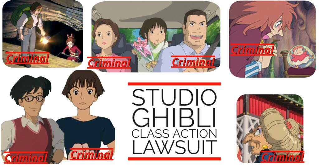
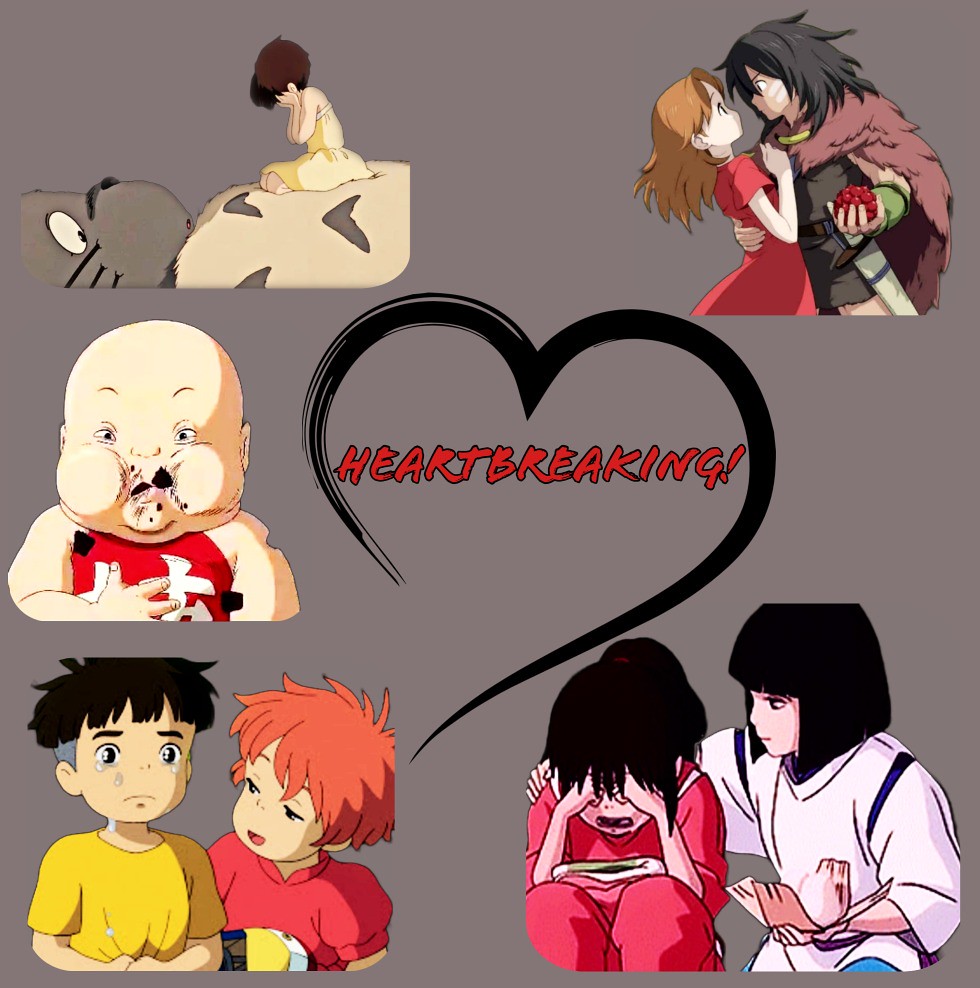
I used Adobe Express, which has become my favorite program for creating quick and professional looking art. I also used Adobe Express to create the intro image for my Youtube video on this assignment. There is still a lot I have to learn about that program though. For these images, I had to remove the backgrounds from most of the pictures. That was pretty easy and something I had never done until this class. I had to alter the contrast, brightness, etc., because most of the Ghibli characters have light outlines and neutral colors. These faded into the background. I tried to keep in mind the ideas from the color theory lessons. Design is not my strong point though. I’m very picky and often programs don’t quite have what I want. Regardless, I stand by these as part of the “lawsuit world” I created.

Finally, I did something that wasn’t required. Using Google Forms, I created a petition for justice for the Studio Ghibli children. This is a real form. People can actually sign up. And it includes links to my Youtube channel and blog so that people can follow the story. I thought it added a touch of realism.

Sign the petition! Haha! I tried to sprinkle in other media to make it realistic such as the links to a federal site about child endangerment, and the trailer for Spirited Away. I don’t know if these added to the realism or not, but I felt like they did.

During this project, I realized that it’s possible to create your own hype around any topic you wish. You just have to be smart in your decisions. Using Studio Ghibli as a title for my works has already gotten me views and followers on various platforms. The fake newscast I created has already been shared by someone and I gained a follower on it! Surprise, surprise. I wasn’t expecting it at all since this is a class assignment. I was very careful to make sure the description shows these items are part of fan fiction because I don’t want to be sued by Studio Ghibli or Hayao Miyazaki. That’s not how I want to be connected with this amazing company.


If you happen on this blog, Miyazaki san, I love your work. You’re an outstanding storyteller! I can’t wait to see your new movie, ‘How Do You Live? One day I hope to learn how you manage to create so much hype by not telling anyone what this movie is about and by not creating any trailers to advertise it. Amazing!

Image from https://www.imdb.com/title/tt6587046/mediaviewer/rm3503865089/?ref_=tt_md_1 by Hayao Miyazaki

Through this course, especially this final assignment, I gained insight into how social media works. I realize the potential I have to create a story and “sell” it to others, even if that story isn’t true. So, with great power comes great responsibility, right? Hopefully, I can use these skills to further my career and assist people with telling the stories of their historic preservation efforts. I also plan to use these skills in my personal storytelling since I have to keep a vlog of my activities during my study abroad trip in Paris, France next month.

If there was anything I would do differently for this course, I would really push myself more to use video that I recorded. While I have a new camera, I am not fully competent with it at all. I’ve been practicing, but I am definitely an amateur. The course moved so quickly that I could rarely formulate a vision in my mind for each assignment before it was due. That is challenging. But, at least I know what how to use video when I’m ready. I’ve already started to put in place small things that will make me more successful when I decide to seriously create content.


This course was challenging and fun. Thank you for the free resources!

Website Logo

For this assignment, we were instructed to create our own website logo. To do this, I looked up “crumpled paper background” on Google and selected this image. I then opened the image on Paint and added “The Legendary Blog of Tiffany Tueros” to the picture. I made sure to make the text big enough to read but small enough to fit on a line of the paper.

Website Logo

Website Logo- 3 Stars

Use an image editing software to create a logo for your webpage. The logo should have some type of text involving the name of your website. Try to remember how things like rhythm, color, and texture, can be used effectively when you create the logo. Add the logo to your webpage. If your Web site’s theme allows it, you can add the logo to the page under “customize” in the Themes tab.

I chose this assignment because I’ve been wanting to make my own logo for the website and this assignment gave me the push to do it!

The Work Itself

Website

Screenshot (29)

Here is the logo up on the website. I would like to have made it longer and more spaced out but the theme does not allow it.

The Story Behind the Story

I’ve had some experience with Photoshop design because I took a class in high school. That experience along with the tips we learned this week helped me design this logo. But it may change because I think I could do some improvements.

Narrating the Process

For this project I used Photoshop Elements 11 and an icon I downloaded from the Noun Project (credit is given below). I started by creating a blank canvas in Elements and then finding fonts within the program that looked somewhat girly (which is what I think of when I hear the word “daisy”). However, using the tips we learned this week I thought it would be best if I used two different fonts to add some texture to the logo, which is exactly what I did. Each text is a different layer so I was able to move each word around in order to position it just right. Then I used the paint bucket tool in order to change the color of the daisy.


Icon Credit: https://thenounproject.com/search/?q=daisy&i=146055


Let Go My Logo

Stirrup Trouble needed a logo. I asked Spencer to help me out. I kept it simple since I didn’t really know what I was up to. Hidden benefit could be that it’s easily reproducible for marketing reasons. That’ll keep Bananas off…
Read more

The post Let Go My Logo appeared first on Coding Spencer.

The Logos of Logos

So Bananas set up a nice site for us here. Thought I’d spruce it up a bit with a logo for our new front. Names are nice, but imagery can add a bit more depth, from my experience.

Wanted to keep it slim and dark.

Stirrup Trouble will be investigating, so I kept our name under the lights. Reminded me of a downtown neon sign when I put this together.

Then I thought of the darkness. There was too much. We’ll illuminate the dark and gritty details, so I put our stirrup over there. Used it as a D to clue people in on our purpose, to boot. Made sense to me.

Here it is, nice and big:

Header

-Donnie Rawlen


Introducing…..Headline Crime!

headline crime logo

http://assignments.ds106.us/assignments/website-logo/ (Three Stars)

Headline Crime! The news agency that brings you all current crime stories! Lena Meyers and I pair up for the launch of this agency. There has been an abundance of crime lately and the public deserves to know what’s going on. We bring you all the latest crime from murders to illegal businesses.

For this assignment I had to create a logo. I made a logo for our News Agency. To make this I used the app “Logo Builder Lite.” It represents our agency and indicates who we are.


BWA logo

For 3 stars, I did the design a website logo assignment.  I thought this would be a great opportunity to make a logo for our agency, the Black Widow Agency. I made this logo very simply. I went on Powerpoint and put “BWA” in a textbox. I changed the font until I found one I liked. I then right clicked on the background of the slide and clicked “Format Background.”  Here I changed the background of the slide to a deep red color. I also found an image of a black widow spider from Google that I felt would go well in a logo. I added this image to the slide, slightly overlapping the letter “W” with it. I had tried to use the spider instead of the “W” or the “A” but it looked better having all 3 letter in addition to the spider. After this, I put the presentation in play mode and screenshotted the slide. While screenshotting it, I used the selective screen shot to make the logo wider than a normal powerpoint slight which I think gives effect to my design. Next, I uploaded it to flickr to post here:


BWA logo

New Day Logo

Co-Op

http://assignments.ds106.us/assignments/website-logo/

So, I took a bit of a spin on this assignment. Rather than make it a DS106 assignment, I decided to take it and make it about the New Day Co-Op. I used PowerPoint as my image editor and Gimp as well for the background behind the words.

I figured if Prop Joe was going to have a website for the New Day Co-op, it would be relatively simple, but would show. I figured that it should be more of a traditional business logo rather than something more fancy. After all, this is a business rather than a bunch of random gang members. Anyways, I think this turned out pretty decently, and I think it looks pretty darn good.

Let me know what you think!


Jackal Returns

In this assignment  I didn’t know this assignment existed, so I made this logo a couple months ago, and decided to go with  a dog theme. I was looking at dogs for some inspiration, and I found a “Jackal”. So I made some sketches, and loved how this design was made. Then I grabbed a painter brush stroke, started the coat the body of the logo. To create it’s shape.


Logo

Explore the unknown

This assignment was fun, I loved thinking of a logo for my blog. Since my theme is Exploring the Deep Sea of Technology, I thought “explore the unknown” was perfect. I knew nothing about technology before this class, and honestly, this course was way out of my comfort zone. I was completely exploring the unknown.

Logo

Process

After thinking of what I wanted my logo to be, I googled an image of the deep-sea. I thought the lighting and the bubbles in the picture was symbolic to an opening, thus the unknown is getting less scary. I uploaded this picture to Pixlr and added font to it. I played around with the font till I found one I liked. I also decided to crop the picture down a little to make it seem more like a logo. I am impressed with how this came out.