

It’s great to be at camp during summer vacation.
This week I found another block of time through which to sprint after a number of ds106 design assignments. I had some trouble narrowing down which assignments to tackle until I began them; clearly, I do not yet have the patience or chops for some of the work, so it’s great that the ds106 community has shared so many different ideas for assignments. I hope to contribute some ideas this summer and fall as I try to implement a more ds106/MOOC feel in my middle school classroom.
Here are my basic hardware and software specs for the week: MacBook, OSX 10.6.8, 2.26 GHz Intel Core Duo 2, 2 GB of memory, Chrome, Wacom Bamboo tablet, SketchBook Pro (for drawing), Acorn (for fills and copy).
This week the work is not in any particular order. I made an animated comic book cover that looks pretty crummy next to all the awesome examples out there. I don’t yet have the animator’s patience to pull off a decent attempt, so I’ll pass on sharing for now. It was a simple snikt effect.
I’m becoming interested in how the community categorizes tasks. At times today, I definitely felt like a designer; at other times, I felt more like I was tweaking a pre-existing design for my own education (which seems more like a visual task to me), or mashing-up a number of designs. Some of the visual assignments feel like design tasks, too – like the album cover. I’d love to hear more about how contributors and organizers think of course- and task-design.
By week’s end I’d like to contribute a CC poster, as well.
Before I forget, everyone should watch Nishant Shah’s DML Ignite talk on remixes.
And away we go.
Postcards from Magical Places – 2 stars
I take a ton of screenshots in Minecraft. I love discovering new sights in Minecraft, as well as new perspectives on familiar places. I ask students to take a ton of screenshots, too, so I can share their work easily through blogging. (Teaching in a multi-age classroom in a middle school, I haven’t yet solved the riddle of whole-class social media use, so I try to collect and share as many digital photos and artifacts as possible.)
For this assignment, I looked through my ds106-server screenshots, found a picture I liked, cropped it some, and then appended a snappy postcard/bumper-sticker-ready punchline in Acorn. Lastly, I mocked up a simple back for the card and let it be.

Greetings from @chadsansing's
Alternative Book Covers – 3 stars
Since I wrote about how much The Road terrified me when I posted my Liminal States story-shape, and since The Road showed up as the exemplar for this assignment, I went back to Liminal States and riffed on my fake album cover assignment; with Liminal States you really can’t go wrong with a boy and his dog.
However, I wanted to use a different image this time around, so I found
“>a picture of a boy dressed as a cowboy riding a dog in The Commons on Flickr.
I brought the photo into Acorn and composed the rest of the cover there, darkening the bottom band to offer better contrast for the tagline.
The boy dressed up as a cowboy reminds me of my [privileged, white male] love for archetypes, even though many of those archetypes make horrible, horrifying decisions, like the genre-riffing characters of Liminal States. Moreover, in the book, youth – the eternal kind – is not all its cracked up to be. Considering the source material, it’s also significant that the boy and the dog clearly have different ideas about what’s going on and are, in fact, headed – or at least looking – in separate directions. The presence of grass is germane to the novel, as well.
I picked Trajan Pro for the font because it has that somber, elegiac, official feel like the title of a Tom Brokaw book.
The tag line is neither entirely true nor entirely false in its description of the book.

Alt Liminal States
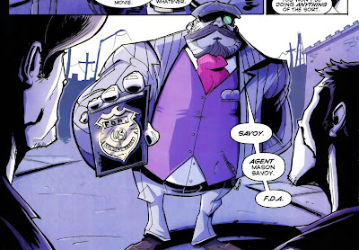
Cartoon You – 2 stars
I’ve cartooned myself many times – some examples can be found here, here, and here. There’s even a short comic I drew about the first year of our school out there in a filing cabinet somewhere.
I find using a cartoon alter ego to be very helpful in breaking up the monopoly that text holds over my blogging, and I like to use drawings in class materials, as well. Cartooning is a good way to and bring some humor to the engrimmening proceedings of American public education.
For this assignment I wanted to draw myself differently than I normally do, so I went online and searched after
“>an image of Savoy from the comic Chew as drawn by series-artist Rob Guillory. (I have no idea why I’ve never cosplayed Phillip Seymour Hoffman playing Chris Farley playing Savoy, but I know I could rock it.) I like Guillory’s style – it’s cartoony, dynamic, busy; as with Jeffery Brown’s completely different work, it makes me think I could draw a comic. It gives me hope.
I tried to capture Guillory’s sense of Savoy’s form, but left much of the interior clean, as I tend to do in larger work; paradoxically (maybe)I detail little doodles like crazy. I also colored myself for a change since I usually work in black and white.
I drew myself in SketchBook Pro using a 2.5-sized brush rather than a 4.0-sized one so that I my line would look more like Guillory’s and less like mine. I began with a blue-line drawing and then added a layer for a black-line drawing to bring into Acorn. Then I deleted the blue-line layer, switched to Acorn, and colored myself.
Thumbs up, Tiger.

Cartoon Chad
I Can Read Movies – 3 stars
What a cool assignment. I love spacesick’s book covers.
To make my own, I went for a popular, yet nerdy, property – The Lord of the Rings. In looking at spacesick’s use of patterns, I decided to use a ring motif to build Mount Doom and to perch Suaron’s eye atop it. I used a different color/material for each level of rings: silver for the Elves, bronze for the Dwarves, and iron for the humans. While that progression isn’t canonical, I used it to bring more color to the page and to communicate of how Middle Earth rank-orders its species. I could have made the other rings all white and left the one ring golden, but I am not at all unhappy with this design. I wonder also about linking the rings to show their interconnectedness in a chain-mail kind of way.
I used Acorn to compose the cover. I read up on spacesick’s fonts
“>here. The projector is the only element I lifted directly from any of spacesick’s covers.
Finally, I opened the image in SketchBook Pro for some final touches with textured brushes to worry the cover.
I’m really eager to see more of these designs from the ds106 community.

spacesick-inspired LotR cover
Chilren’s Book Cover – 0 stars
I’m not sure why this assignment is worth zero stars; I think it should get two.
For this task, I decided to make a children’s book cover for a hard science fiction novel – House of Suns by Alastair Reynolds. I love that book. It gives me hope.
My cover, however, gives me the giggles. It’s so profanely incongruous – and yet so weirdly apt – that it delights me.

House Of Suns for kids
I drew the cover in SketchBook Pro and then colored and lettered it in Acorn.
As I hunted down stray pixels in Acorn, I discovered that it’s much easier to draw and paint in that program while zoomed in a level or two (this is both an a-ha and a duh moment). I still prefer SketchBook Pro for drawing, but it was satisfying to find a way to draw and color productively in Acorn, as well. At the default zoom, even a medium-sized brush can disappear on-screen in Acorn because its reticle isn’t persistent. That means if you’re trying to paint stray pixels in Acorn without zooming in, you lose the tip of your brush if your brush color is the same color as your background. That frustrated me greatly, but now I know that it’s easier to keep track of your brush tip while zoomed.
I hope others will jam on the idea of making children’s book covers for novels meant for adults.
Minimalize Your Philosophy – 2 stars
Aude aliquid dignum: dare something worthy. I try to approach teaching and learning as if they were the most worthy things I could do and help others do. I think it’s important to ask kids to do worthy work. I think it’s important that teachers dare to resist the standardization of education. I think it’s important and worthy that we talk about how to subvert the status quo in our primary and secondary schools so that learning matters to kids, their families, and their communities. So here it is:

Aude aliquid dignum
I made the image in Acorn. I tried to minimalize the sans-serif text’s presence on the page without making it illegible (I probably cut too much of the “g”). Then, while trying to stay away from the Dr. Manhattan symbol, I made a little hydrogen atom to frame the words, with the “e” inside the electron. Hydrogen is a pretty minimalist element, but the proton and electron are also the building blocks of everything else. Hydrogen can exist by itself, but atoms do great and terrible things together. We humans can do the same, inside and outside Minecraft, a game about building – and/or destroying – alone and/or in a community!
I put another atomic particle in the upper right-hand corner so that the eye would be drawn there in an attempt to connect the two white spaces with one another over distance, which made me think that maybe the electron (which wants to create a bond) is also little person or organism looking to the stars and wondering how to connect with another being over a vast distance. I think connecting is worth daring.
Minimalist TV/Movie Poster – 3 stars
I didn’t want to burn out on minimalism early this the week, so I picked this assignment and shelved the minimalist movie travel poster for now.
Richard Ayoade plays the character Moss on the British sitcom The IT Crowd. Moss’s hair is absolutely iconic.
I found a CC-licensed picture of a glorious, insanely detailed, embroidered Moss, brought it into SketchBook Pro, and traced over Moss’s hair and glasses. I used green in homage to the show’s pixelated, primitive CGI credit sequence. Then I went into Acorn to fill it in and clean-up white speckles left over in Moss’s hair and glasses.

Minimal Moss
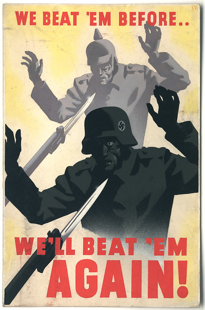
DS106 Propaganda Posters – 3 stars
For this piece, I searched The Commons on Flickr for propaganda. I went into my search looking for an ad or poster about building a shelter. I wanted to make a visual pun on our Minecraft work. However, when I found this picture, I switched gears. I hate Creepers. I’m playing the ds106 server on survival mode right now, and the Creepers have not been kind. If you look at my stretch of the beach on the server (behind camp), you can see how much Creeper damage I’ve had to patch. Finding a way to rally against the Creepers was just what I needed to lift my spirits.
I grabbed a CC-licensed picture of some Creeper cosplay. I took a screen shot of the head and cut out the background in Acorn. Then I brought in the propaganda poster. I used the scale and perspective transformations to size, angle, and position the Creeper heads. Then I made the heads monochromatic and color-matched them to their bodies.

Beat the Creeper
Now I’m ready to go back on the sever. I hope someone will put this poster into a ds106 texture pack for Minecraft!
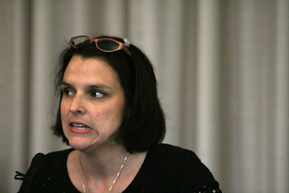
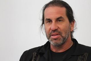
DS106, The Movie – 3 stars
#DontBlogNow starring Martha Burtis and Alan Levine. Somehow featuring the Bava, Timmmyboy, and Slaughterhouse 4. I did a lot of cutting, filling, and smudging in Acorn. I grabbed the movie poster here. I found Martha here and I found Alan here. I sepia-toned their faces, shrunk their heads, and then altered their saturation and brightness to help their faces better fit the gestalt of the photo in the poster.

#DontBlogNow
I love how different their expressions are, as if Martha has caught on to something that Alan is asking about again. “A serial killer in a red raincoat? Really? Was that a deliberate design decision? Where?”
I picked Don’t Look Now to avoid making a quick and easy visual pun about a movie I loved. I despise Don’t Look Now. I loathe that movie. I will never go to Venice. I refuse to look at myself passing on a boat. Forget it.
I will, however, spend hours remixing the film’s poster.
I just wish I was better at digital production – I really like the way the poster turned out, but I wanted it to be perfect, like my utter, unutterable, intangible, illogical contempt for this Don’t Look Now.
That’s it for today’s products. As I go further into the ds106 experience, I’m trying to stick with at least a few assignments per week that push me out of my comfort zone. I also want to balance the camp nature of camp with the profundity of the learning experience available to me here. I need to socialize more with my fellow campers, too.
I try to teach to what kids are doing in my classroom; in the same way, I’m learning to design what I discover instead of trying to design what I plan. It feels good.

I’m finally getting to some of the design assignments. This is my animated comic book cover for a Storm from X-Men.
I became interested in doing this assignment because of ds106 home page introduced us to mwalker version of the comic book cover Flash.
I found this assignment to be fun and very easy. I used the program Gimp, i then proceeded to search for an interesting picture of storm that i can used. i used storm because I enjoyed watching her control the atmosphere it was so powerful and cool. I only used two layers and had the original image on the first layer then the second layer I colored in the lighting with a plum purple shade that matched the original background. Then you click filter->animation-> clickback, and enjopyed my final product.
This was a very fun assignment to complete definitely encourage it. Good Luck!!!!

I’ve been reading a bunch of 1980s Hulk comics thanks to my time with Zach Davis out in Portland, Oregon—which I am still gonna blog! What’s more, I’ve started re-watching the Hulk TV series from the late 70s and early 80s—I saw this one as a kid, it was a big family event and it’s really interesting to re-watch. I find myself increasingly relating to the schizophrenia that is the Hulk, not to mention he is a my favorite tweeter in all his various guises. So, when I went browsing for Comic Book Covers to animate, I immediately wanted to pull something from 1980s Hulk. I happened upon this amazing comic from January 1986 titled “Freedom!”
")
In this issue Bruce Banner and the Hulk are finally separated into two different beings. As a result, Banner falls in a severe comma and is hospitalized right away. Meanwhile the Hulk, also unconscious, is taken away because SHIELD wants to get rid of him. But as usual Hulk goes mad and kills a bunch of the SHEILD henchmen and the doctor who sets him free feels bad and promises to kill him. I love this particular comic to because it’s a great profile of Hulk’s career as a superhero: no one trusts him, he’s a complete loose cannon, he kills indiscriminately, and you still can’t help but root for him. So, in honor of the Hulk—who reminds me a lot of Tom Woodward for some reason, another hero of mine—I decided I would animate the cover of “Freedom!” to complete what is for me the coolest ds106 design assignment ever: animated comic book covers.
I can’t take credit for the above animated GIF, so much of the work was done thanks to the patience and knowledge of Tim Owens and Alan Levine who walked me through their process for doing more complex animated GIFs like this. This one had a ton of steps, and I am going to write some notes below so I can have an outline of the process with the idea that I’ll come back after my trip to Austin, TX and do a more thorough tutorial for the sake of posterity.
So, here is the process, we had to isolate the two halves of the splitting Hulk and put them in their own layer. We didn’t select the red text or the Spider-Man Marvel icon when splitting the halves because they both were made their own layers, that were then locked together and place in the uppermost layer hierarchy so that they always appear despite the animation below them. After that we had to fill in the background with a new spectrum of colors that radiated out from a central point, mimicing the range of colors on the cover—this to fill in the holes left by the two halves of Hulk splitting. This was a new feature of Photoshop that Tim Owens taught me, as was the clone tool that is nothing short of amazing. I used the Clone tool to fill in the details of Hulk’s body as he rotates on the cover as well as to fill in Bruce Banner’s body in the middle. After I had cut out the two Hulk halves I filled in a lot of the Hulk’s green color in each of those halves.
After that, Tim and Alan explained how to select each of the halves and transform it by rotating the image off a particular axis point X degrees. I did this 7 times for each half at about 2.5 degrees rotation at the same angle. This was a bit painstaking, but it worked brilliantly. What’s more, Alan showed me how to control the animation process with precision in Photoshop that pretty much blew my mind. I will be blogging a comprehensive tutorial of how I did this animated GIF, so these scrawlings are really just notes I will use later to make the process I went through more precise and understandable.
I really appreciate the time Tim and Alan took to show me these details because I learned more about Photoshop in the three or four hours making this animated GIF than I have the whole time of teaching design in ds106. I guess when you really want to do something bad enough the learning not only happens, but is that much more enjoyable. Also, I now understand why GIMP is no Photoshop.
Some might say that MAD magazine is not a comic, but I went for an animated version anyhow for the Animated Comic Cover ds106 assignment:

I saw this cover of Alfred E Neumann and ET and felt like they might me a love match for each other, so they gaze at each other with affection and experience the tickle of that magic extra terrestrial finger.
Don’t they make a sweet couple?
 I read a ton of MAD as a kid, and I can recall backing out the plots of movies from the parodies there- so I knew about the Godfather from he satire first, seeing it in MAD before ever seeing it on video.
I think there is a future assignment related to the troubles faced by Roger Kaputnix or maybe a bit of mashup of Spy vs Spy.
In this animated GIF, I used a bit of magic I uncovered in the Photoshop animation palette. I copied and pasted out the eyes and ET’s finder to new layers, and filled in the background with some clone brush fill. In the animation palette, the layers have additional things you can animate via the toggle menu on the left side- you can set key frames for position or opacity, and by moving the slider on the timeline, you can nudge the position and make a key frame.
This method of animation is a bit closer to doing stuff in Flash or Director on the timeline- in Photoshop the only thing I cant seem to do is to resize objects, but doing movement and opacity offers a lot.
So I made the eyes of ET and Alfred move towards each other and away, and also made the finger move to the right. The glow and the star appear by keyframing the animation.

I thus only needed 10 layers (2 eyes each), and the animation weighs in at a puny 176k.
Don;t just get mad, get MAD! get Animated! Cause it is ds106 fir life and hell yes, I am over-branding this sucka.

Due to other ds106 pioneers success with GIFs, I wanted to challenge myself with this assignment. It took me a while to figure out what cover I wanted to do, but I finally settled on this provocative comic cover. Honestly, I do not know anything about Marvel/DC characters or comic book history, but I loved the blood on the shield, the fierce looking characters, and the refined details of this one.
On the technical side, making the GIF was a very involved process, without too much to show for it. I am still experimenting with the tools and features in GIMP, so the technical skill behind this GIF is low. First, I need to figure out the basic to creating a GIF, while hunting in The Google I found this tutorial. The guy is a little sporadic and probably 14 but he provides a solid foundation for a basic GIF.
Next, I decided to create a modest GIF by focusing on making the shield spin. First I created a duplicate layer of the original image. Next, I cropped the shield from the second layer away from the background.

Next, I clicked on the ‘rotate’ tool (the one of the two blue squares), and rotated the image by 90 degrees.

Then, I saved the image. Next, I isolated the newly rotated shield then cut/pasted it into the original layer. Last, I dragged the rotated shield into position. I repeated this process two more times until I have four separate images with the shield in four different positions.

To learn how to save the new creation, I followed the tutorial posted above. This is where it gets tricky: embedding the GIF into WordPress. To successfully embed a GIF click on New Post -> Upload/Insert -> (select your GIF file) -> Insert. Be mindful to keep the GIF in its original size. Do not be tempted to size it down, because it will not animate in your post.
Overall, this was a simple, clean animated GIF. It also marks my journey/struggle with GIMP. Soon I aspire to make a GIF like this one, it’s the dream.

Ever since Jim Groom pointed to the amazing animated comic covers created by Kerry Callen, I’ve been jonsing to make one. I loved the simplicity of the animation in each of the four GIFs he created, particularly the Spiderman and Ironman GIFs which each clock in at only three frames each. There is so much time and love for the comic and the story that goes into each one.
It took me a while to figure out which cover to do, but I finally settled on the cover for the third and final installment of Frank Miller and Geof Darrow’s Hard Boiled title published in the early 1990s. Miller was well know for his work during the 80s on Ronin and Batman: The Dark Knight. Both were part of an emerging trend in comics to write for more adult audiences (it dawned on the comic book industry that pre-teens weren’t buying comics anymore, it was the hardcore 20-40 somethings). Alan Moore‘s and Dave Gibbons‘ DC miniseries Watchmen was published the same year as The Dark Knight and both were hugely successful critically and financially, largely due to their more complex characterizations of heros and heroism. They’re both just great pieces of storytelling that happen to include both writing and pictures.
Due to these successes the Hard Boiled project was highly anticipated and Miller decided to not pencil the series instead turning to relative newcomer Geof Darrow to do the artwork for Hard Boiled. Darrow’s work is ridiculously detailed, rendering unimaginable amounts of story into a single page. Miller I imagine must have responded to this as there is very little dialogue throughout the series.
Hard Boiled is a dystopian future filled with violence and cyborgs. Darrow’s ultra-violent and erotic pictures were considered shocking at the time for a “mainstream” book. My first experience with Darrow’s work was actually with a later title, The Big Guy and Rusty the Boy Robot. The relentless detail with which Darrow draws is unbelievable, actually compulsive. He seems to just want to eek out more and more story with every extra bit included in a drawing. Here’s a frame from Hard Boiled #1, where Nixon the cyborg is undergoing repairs:

Darrow went on to become a creative consultant for the Wachowski Brothers for their Matrix series. You can likely see the resemblance to Nero’s awaking in the image above – an endless number of tubes and machines connected to tissue.
On the technical side, making this GIF was quite a long process. I spent a lot of time in Photoshop pulling apart the original cover image to create the six frames for this animation (there’s actually 53 frames needed for the timing, but only six unique ones). I used the pen tool a bunch to make paths around the titles and other parts to create very accurate selections. Also there’s a lot of use of the motion blur tool to create the three frames of the head being blown up.
But my favorite new tool is the new “Puppet Warp” tool which allowed me to animate the gore on the inside of the skull. It’s new to CS5 and takes advantage of some crazy algorithms that allow you to distort portions of a selection based on defined pivot points. It’s really, really cool. Here’s a little screen grab of the tool in action:

Here’s a look at just the gory parts animated, I hope you like the GIF, even if it’s a bit gross!


