Zero Crash Burn — ????

I started this assignment with high expectations. I was going to make a movie poster into something animated.

Making a poster even more epic? Definitely going to be good.

I researched some posters of movies that came out this year on IMdB.

After browsing around for awhile, I picked two posters that I thought would be easy, but also could be animated in a way that makes sense.

For the Prometheus one, I had planned on making her flashlight turn on and off, sort of like how it happened in the movie.

For Zero Dark Thirty, using the poster for inspiration, I would put a gif behind the words.

I started with the Zero Dark Thirty poster first.

The Steps

First, I needed to remove her photo from behind the words.

I figured the easiest way to do this was to use the background eraser.  I tried using the Quick Selection Tool to select the inside of each letter, but when the letters had black marks on the inside of the letter (like the “O”), it took the entire letter out.

So, I was stuck with using the Background Eraser. And boy was that hard.

The blue areas were easy. Her face and hair and dark shirt on the other hand… took me an hour. I wanted to preserve the quality of the lettering, so I had to be super careful with the Tolerance level.

After getting most of the photo behind the lettering gone, I had to go back in and use the Erase Block to get the darker spots that even Tolerance couldn’t help.

I ended up with this.

step 1

The checkered part is the transparency.

Then, Adobe fought back. It crashed and left me staring at my computer in complete dismay.

I let it do its thing and just waited until I felt my computer could try to open Photoshop again.

I tweeted while I waited.

Finally, I got up the courage to click on the shortcut on my desktop and wished with everything in me that it would come back. If I knew how to speak whale, I may have sounded a lot more like Dory.

Photoshop said it had recovered something!

YESYESYES.

Alas, it didn’t recover everything. I had lost about an hour’s worth of work.

I didn’t feel like going through it all again, though. So, I sucked it up and kept going with what it had recovered.

Making it into a GIF

I downloaded the trailer for Zero Dark Thirty with Fastest YouTube Downloader. Then I used MPEG Streamclip to trim it down and make a gif out of part of the trailer.

I then opened that gif in Photoshop.

I had no idea how to put the top image on top of the gif, though.

My only idea was to increase the Canvas size of the gif to the height of the poster. Then I copied the poster onto the gif and put it as a top layer.

That was it!

Ta da!

After making it into a gif, I realized you can’t even tell that I didn’t go back through and clean up the transparency.


Animated Movie Poster

For this assignment, I designed a moving poster for the move Inception.  Here it is.inception gif

For this I loaded the poster of Inception into Gimp.  I smart cutted the head of Mr DiCaprio out of the image and reversed it.  I had to play around with the clouds on the other side using the airbrush and imagine what would have gone in there so it’s not quite perfect.  Then I loaded another copy of the poster into a new Gimp file.  From there, I decided to paint the back of Leo’s head with the paintbrush, added in some airbrushed highlights (too keep the shiny part on the top, and airbrushed in some more clouds.

After I finished everything in Gimp, I loaded the three pictures into my gif creator app that I got from the appstore (I think its just called gif creator).  The final product was the original picture, followed by the third picture of the back of his head, the image of his flipped head, and then the back of his head again.

That’s why her hair is so big, it’s full of secrets.

This is design assignment 313, “Animated Movie Poster” It is worth 4 stars. The assignment reads:

“Pick a movie poster and animate it. You can see an awesome example and quick explanation by Michael Branson Smith here.

I decided to create an animated movie poster for Mean Girls to use in my final project!


In my poster. Cady (Lindsay Lohan) is sort of side glaring at the “plastics” telling each other secrets. I feel like this image depicts the story line extremely well. This group of girls is full of secrets, they aren’t true friends because none of them are really honest with one another. They are mean girls to those outside their group and in my opinion they are even meaner girls to those inside their circle. This is because they are SUPPOSED to actually be there for one another but aren’t.

I used Windows movie maker to edit the video clip down to about 2 seconds for my gif and then I opened it in GIMP over a Mean Girls poster to create my animated movie poster. DS106 has made me addicted to gifs

Original Media:

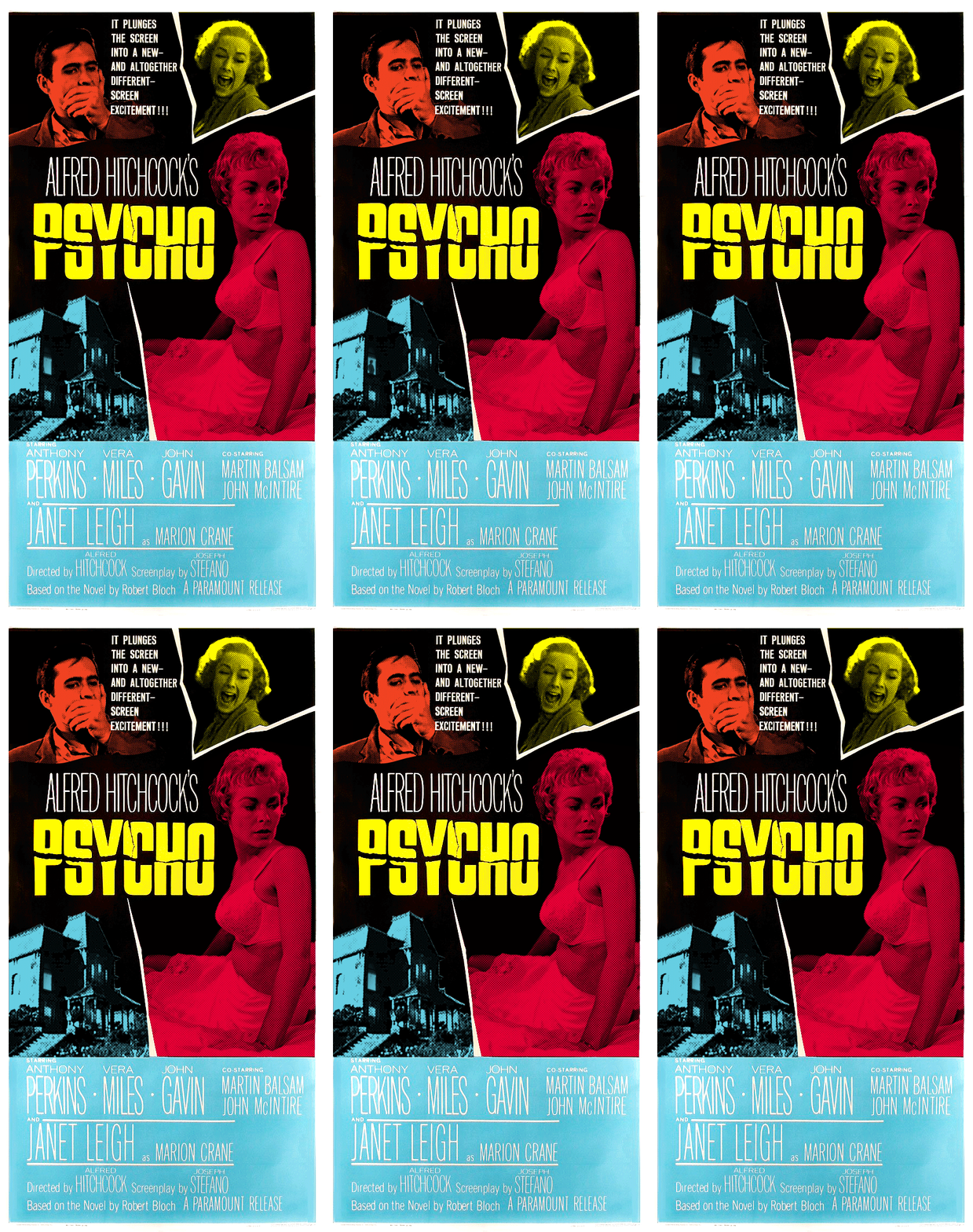
Psycho Animated Movie Poster

Phew! This poster is done!

It was harder to make than the previous four Hitchcock posters to date, but the real problem was that other efforts became a distraction over the past few weeks (good stuff honestly). But I was able to lock in over the past couple of days and I spent most of it studying Janet Leigh’s facial expressions trying to find a way to make something for the main image of her in this poster. I think it’s interesting to think about this in the context of Leigh’s description of her working with Hitchcock while filming Psycho. She described how Hitchcock made clear that his camera was ‘the focal point,’ and she was to move with it. She mentioned how other actors might have been constrained by his blocking, but she took it as a challenge. And she does make the most of it, working the camera with her fabulous expressions throughout the film.

The original poster makes room for John Gavin, but I felt that the house over looking the Bates Motel deserved better treatment. And be sure to look closely, I think mother is watching!

Master of the Flying Guillotine Animated Movie Poster

When I saw the Master of the Flying Guillotine movie poster, I knew I had to animate it for this ds106 design assignment. This is a very rough first draft, and I only got this far thanks to Tim Owens’ seemingly boundless patience with my idiotic Photoshop questions (it was a good refresher of the details I learned for the animated Hulk comic book cover I did). Like I said, it is a very rough first draft, but I have a sense of what I need to do to fix it up now. The difficulty with this one was getting the elliptical movement of the guillotine to be convincing and somewhat centered, on my next run through on this work-in-progress I’m gonna see if I can’t master that. Any and all future versions of this draft will added as an update to this post.

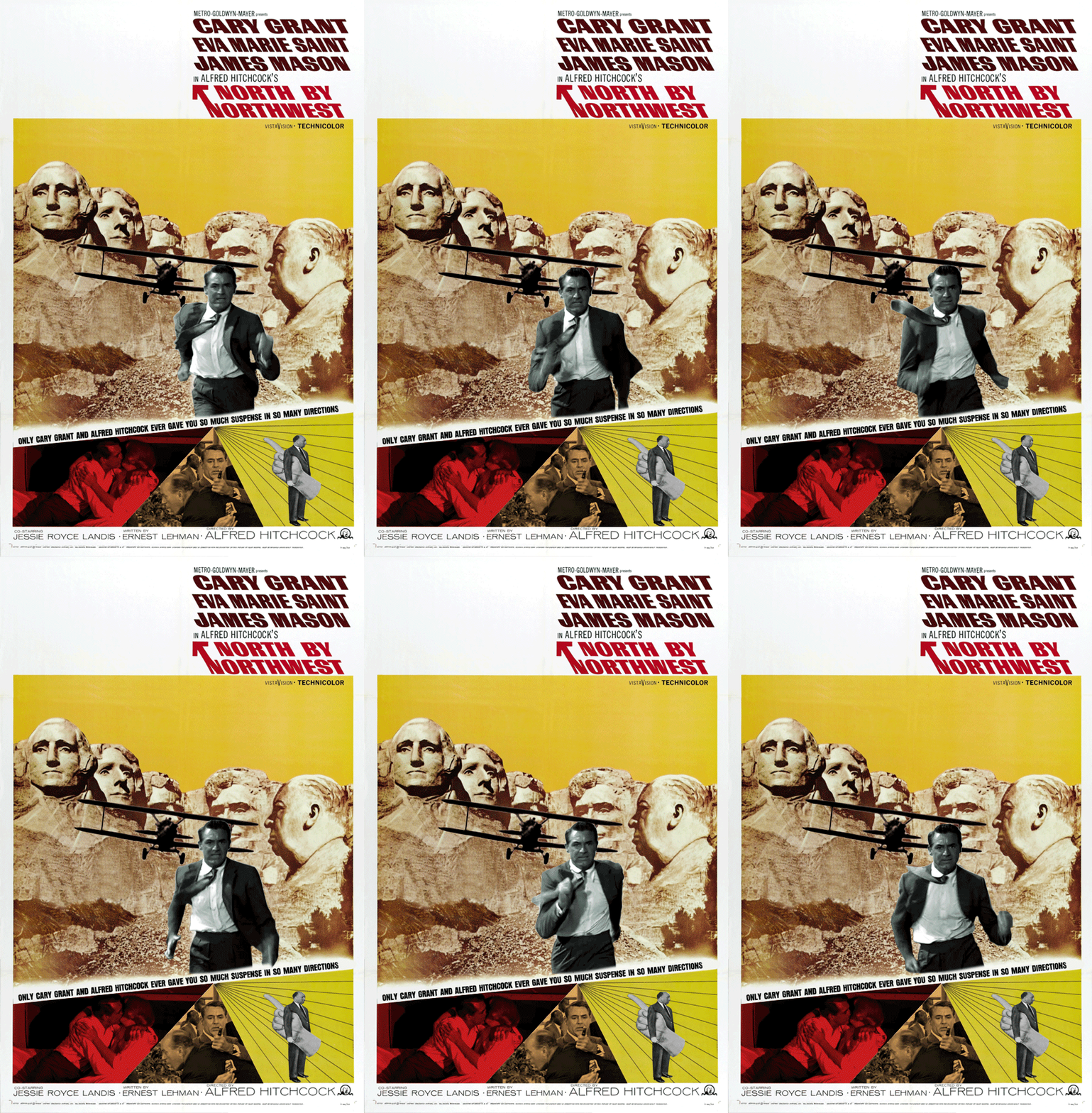
Reorienting My Compass, North by Northwest?

It’s been over a year since I first discovered ds106 and it’s amazing to me how much creative energy I’ve discovered since then – I’ve made more work in the past year than I have in the previous ten, seriously.

Ok this isn’t exactly true, I’ve made many things over the past decade, but they’ve principally been of the industrial sort – client work mostly. There’s a lot I’m proud of, particularly media materials for my wife’s non-profit Row New York (videos like Monique and Because I Row (with Daniel Phelps) as well as photography and design).

But in the last year I’ve begun to make work that reminds me of the work I used to make. Back then I made lots of stuff, all sorts of stuff, but when I made it, I was just creating, and creating and never reflecting. Despite that fact that I was in an MFA program, I was prickly about critiques, always evasive about why I made this or that. And it wasn’t because I thought ‘my art should speak for itself,’ it was because I didn’t have any confidence or sense of how or why to describe what the heck I was doing.

So probably more important than the creative energy that I’ve rediscovered is the feeling that I can and should describe my work. I falter at this effort (it’s taken two weeks to write this post and only a few hours to make Cary Grant into a track star), but it’s one I realize I need and want to work on. I want to be more confident and comfortable describing my work, not just making it.

This summer I’m hoping to focus my energy toward a bigger project. One that’s inspired by the ds106 mashup, pop culture, ‘make art dammit‘ mantra. Above is an animated movie poster for Alfred Hitchcock’s classic North by Northwest. I previously created one  for Rear Window, and I love making these. So I’m thinking I should commit to a series, six? A dozen? I’m not sure.

But I’m also thinking about something else. Earlier this semester I read an article in the New Yorker about Christain Marclay’s mashup masterpiece ‘The Clock.‘ Marclay assembled thousands of clips from films that referenced time into a 24 hour mashup movie, that when viewed it would reference the present moment in time. So if you happened to start watching at 11AM, the clips you’d see would reflect that time.

How crazy is that? A T-W-E-N-T-Y F-O-U-R H-O-U-R movie, about time. It apparently took Marclay 2 years of slaving over his computer to create it. And its supposed to be amazing. You can only see it in galleries or museums. And I’m dying to see it, here’s a BBC story about the piece to give you some sense of it.

So besides animated GIFs I’m thinking about something else – it’s not a 24hr movie – I could never. But it’s a mashup that would require help. I’m thinking about telling a story about education through the innumerable portraits created of teachers and students in movies. I feel like there might be something we could learn from these portraits of schooling.

I’m picturing a mashup of scenes that portray high school and the interactions between students, teachers, parents, and principals. I want to see what will happen if I create interactions between characters from the Blackboard Jungle and the Breakfast Club. Too crazy?

Anyway that’s where I’m thinking of pointing my creative efforts – Hitchcock GIFs and/or a high school mashup. I’m excited and anxious at the same time. It’s been a while since I’ve felt ready to do something like this.

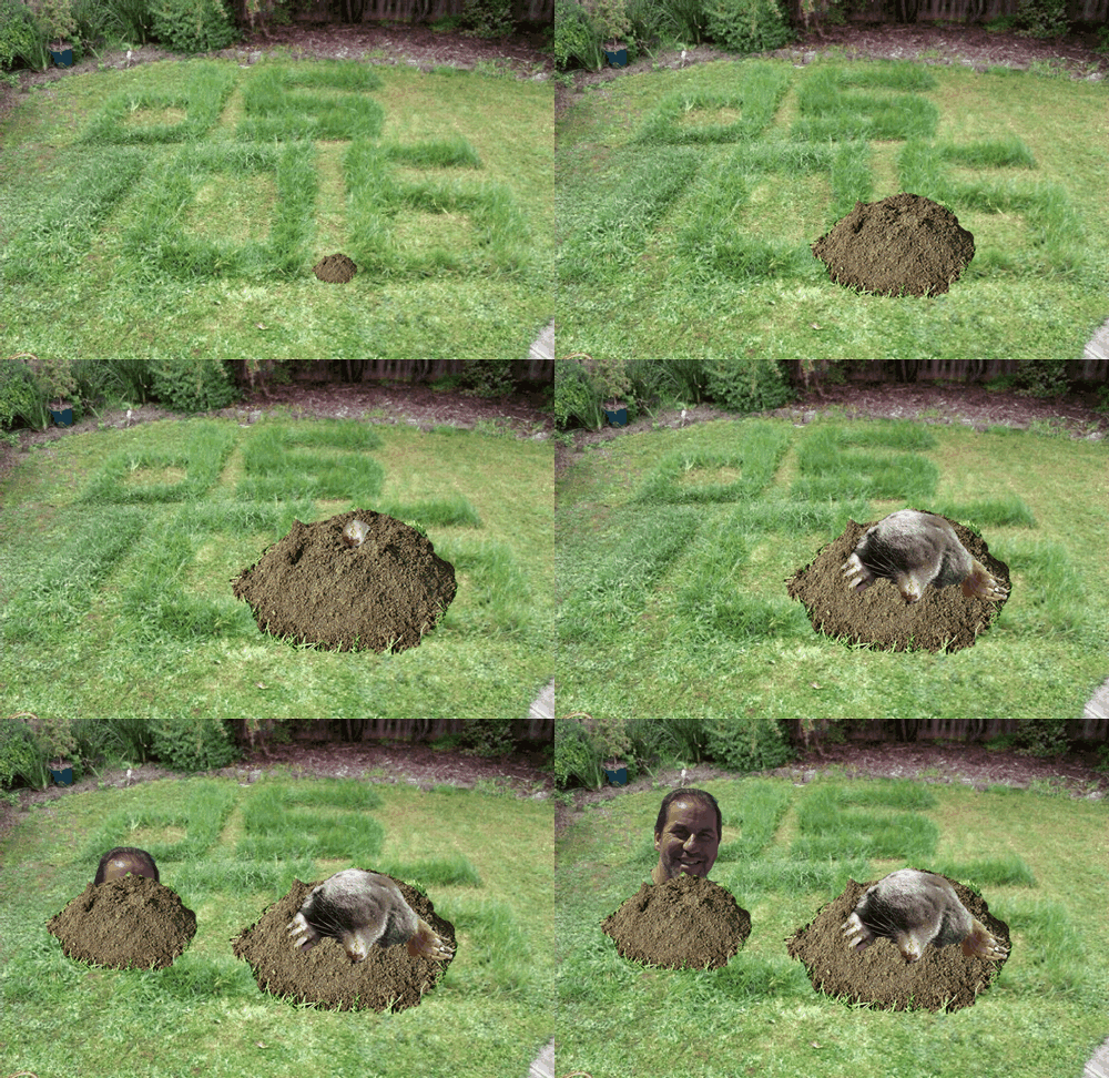
Wack a #DS106 Mole

A few days ago I noticed that Alan Levine is mashing up ds106 assignments withThe ds106 Remix Machine. This, briefly, allows you to take an assignment from DS106 and add a filter. Shades of John Davit’s Learning Event Generators.

For example this remix: stop frame photography [remixed]: Uncle Bob ? Remix Machine takes this original assignment stop frame photography and adds this remix card:

Uncle bob Remix

Use Existing Media

Remix is using the created media of others – it does not count as a remix if you use your own assignment work. As raw material for your remix, use media from examples created by other ds106 participants for this assignment.

I’ve not ds106ed for a while so, just for fun (is there another reason?), I took one of a series of images from here: ds106: Stop frame photography by Rowan Peter and did this:

Cogmole

Mole photo from Mole Flickr Attribution-NonCommercial-ShareAlike 2.0 Generic (CC BY-NC-SA 2.0)

This could be a lot better, but it didn’t take long. I am tempted to dust off a copy of flash and make a wack a ds106 mole game;-).

DS106 has been looking very interesting of late, especially the Kickstarter project which has gathered a pile of money for developing DS106 in lots of interesting ways. (I am in for a t-shirt;-)). This looks like making ds106 increasingly interesting as time goes on.

Next time ds106 runs I am going to give it another shot, set up wordpress blog to make my tagging work a bit better. and have some more fun.

The history of the animated GIF #ds106

I am sure most of the #ds106 folk will have seen this, but this is a great wee movie with lots of interesting uses of animated gifs. I’ve been a long time disparager of those animated gif clip art things on the web but recently converted to a fan by Jim Groom and ds106.