An animated gif(t) for #ds106

When I first heard the distant sirens of ds106, it was just an amusing buzz, and easily ignored. But each time they came back, they grew louder and more alluring. Soon I began to search for them, to make them stop the distracting noises, or so I thought.  After I found them though, I began to follow them around – through their blogs and tweets and youtubes, I found them everywhere. I tried to play with them, and they just smiled and began their insane chanting “#4life, #4life, #4life…”

I had noticed early on, that the object known as the ‘animated gif’ held a position of high esteem and great awe among the ds106 aristocracy. If I could just learn this arcane craft maybe they would be appeased and go away. A simple offering perhaps.

I started my search in the dusty stacks of impawards.com. Once I found what I needed, I hid myself in the land of gimp and set to work. I labored late into the night, then another night and another. What other work was I neglecting? I could not think of that, I was driven by a singleness of mind I have not known before.

I emerged at last, with my offering in hand. Yes, it was simple, but hopefully enough. I took it to the blog and carefully administered to all the incantations. And I waited. There was silence for a moment, but then, barely perceptibly it started again.  ” #4life, #4life, #4life…”

Make it stop! Make it stop!

That’s my story. Any questions?

animated movie poster


Animated Movie Poster Attempt 1

Here’s my first attempt at an animated movie poster, as well as my first real post for DS106 pt 2! It doesn’t really look like the other animated posters but this was my take on them. It’s basically the “frame” of the real movie poster. I removed most of the original image, except the candles (which I tried to keep but you can kind of tell where it’s a bit smudged and all). I then made a gif (in photoshop) of the part of the first movie where they arrive at Hogwarts via the boats. Then I put the “frame” of the poster overtop the gif and voilà! My animated movie poster.
This was pretty fun and I will probably make another one and perhaps do a step by step process post of how I did it instead of my awkward attempt at explanation.  :)
Now to spruce up my blog.

The Cooler Animated Movie Poster

The wild mating call of the animated gif has lured me once more to the clutches of ds106. For this assignment I went to http://www.impawards.com/ to check out the selection of movie posters. Although I’m not familiar with this flick the look of the poster was just begging for that neon to go live. Process was your basic Photoshop animated gif adjusting the saturation of the red using the sponge tool on a few frames and then doing a freeform selection on the eyebrows and rotating them for a single frame. Here’s the result.

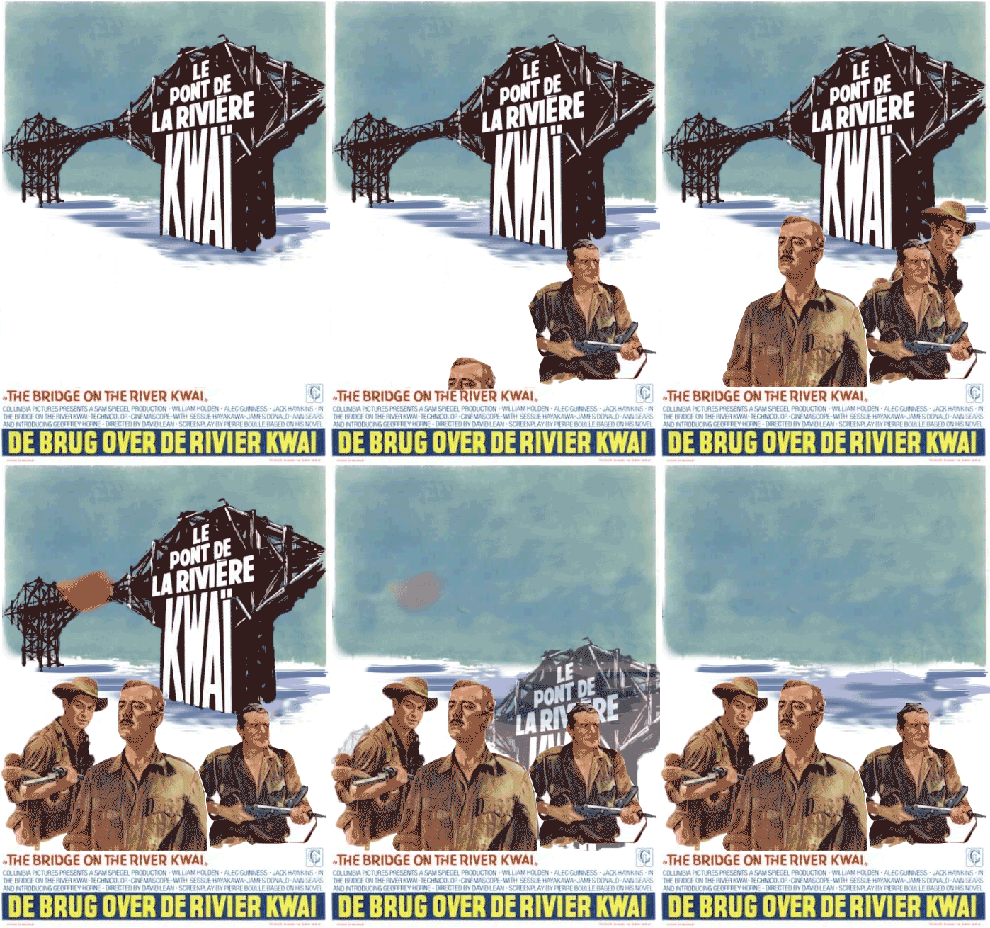
Animated Movie Poster: Bridge over River Kwai

And the ds106 pre-course assignmnet craze moves into 11th gear. Michael Branson-Smith takes the movie poster into a new dimension with his iteration of American Werewolf in London featuring two different elements of movement life sizing the original page. Next, Jim Groom crams about 5 animated GIFs into one with his version of Jason and The Argonauts, turning the whole poster into an action scene.


I pondered what I could do in this vein, and also expand some of my PhotoShop animation chops. I settled on a movie that was a favorite of mine as a kid, for no real reason I can explain, The Bridge over the River Kwai. A battle of World War II wills between a Japanese war camp commandant and his British solider/prisoners put to work building a river bridge that would ultimately hurt the Allies, it features William Holden and a youngish Alec Guinness and that tell-tale whistle song. But it is an epic in the power struggle of the three leading characters, Japanese Duty, British Honour, and American Bravado…

With some coincidence the story is based on the book authored by the same person who wrote the original Planet of the Apes, another old movie favorite of mine.

I chose the poster base as one I found at All Movie Poster, because of its graphic style. My approach to this one was to bring it into PhotoShop, and separate key elements into separate layers. This took a variety of selection tools- the Magic lasson, the Polygon lasso, the new Quick Selection tool as well as the usual magic brushing and smudging to fill in areas.

To demonstrate te layers, I did a quick screenr (if the iframe below fails, try the direct line)

In the animation window, I toggled up the other tools on the left to experiment with adding key frames for position and opacity, to make the parts I made move and fade. Its not flash animation, more like the Monty Python-ish sliding things around.

This form of GIF of course needs more frames; this one expanded to 89 frames. The GIF dithering actually adds tom fun to my little painted in explosion.

Anyhow, fitting for the beginning of ds106 comiing soon, the closing key quote from Major Clipton comes in handy. Nothing finer than blowing things up!

Madness! Madness!

Jason and the Argonauts Animated Movie Poster 1.0

I was inspired by Michael Branson Smith’s awesome American Werewolf in London animated poster this morning, so I went around searching for some possibile posters to animate. I came across an awesome Jason And the Argonauts poster that breaks the film up into multiple illustrated scenes.

After seeing this cool variant of the movie poster from the 1960s I thought, “Why not try it, I already made five animated GIFs from that film.” So in the spirit of reuse I grabbed all my animated gifs for that film, added them as layers onto the original poster and started locking and moving the layers to the pre-determined spaces. The layer scaling tool let me make the areas match precisely, and once I had all the images matched I exported the whole thing as a GIF. What I realized was that the images animated according to a consecutive layer logic according to how I had added them. So each layer animated after another, rather than independently. I attempted to merge the layers, but all my GIFs didn’t have the same number of layers, and I had spent a ton of time on this already. What’s more, GIMP provides no simple way to merge more than two layers, which is a great handicap time wise.

So, to finish off version 1.0 I replaced the original background image so that each of the animations would remain consistent with the animated GIF layers I put on top of them, essentially erasing the original images from the poster that showed up in my first version every time the GIF re-animates. As you can see the experiment was only half-way successful, I was trying to get each of the layers to animate independently, but now realize each has to have the same number of layers and they need to be merged. On the next iteration of this poster I’m gonna try and make that happen. Although I am sorry to say I may need Photoshop for this if it let’s you merge multiple layers quickly and easily, unlike GIMP. If you have any suggestions or advice I am all ears.

Animated Movie Posters

Pick a movie poster and animate it. You can see an awesome example and quick explanation by Michael Branson Smith here.