Postcard: Revisited

I originally completed the “Postcards From Magical Places” assignment back in Week 6, where I made a postcard for the 4077 MASH unit from the television show M*A*S*H. However, anyone who may had read that post might remember that I mentioned I originally did not want to generate a postcard from M*A*S*H. Instead, I wanted to make a postcard for Stalag 13, the World War II German P.O.W. camp that serves as the setting of the television series Hogan’s Heroes. I mentioned back then that I wasn’t sure how to incorporate an image from the show into a postcard, since I could not find any aerial views of the set the show was filmed on. To make matters worse, the set was burned down in the 1970s while making another movie, so there aren’t any modern-day pictures to base it off of. However, there are plenty of photographs online that feature the cast in their costumes, which gave me an idea that I didn’t have before.

In true Hogan’s Heroes fashion, I devised a concept that makes the Nazis look utterly foolish. The one looking the most foolish in this case is Colonel Wilhelm Klink, the German Kommadant of Stalag 13 (played by Werner Klemperer). A running gag in the show is that Klink is, so be frank, a gullible idiot. He can be talked into almost anything by his senior P.O.W. officer, American Colonel Robert E. Hogan (played by Bob Crane). Now, the prisoners of Stalag 13 are not being held there by force. They’re there by choice. You see, the entire concept of the show is that the prisoners are running an underground espionage and sabotage ring, quite literally underneath the P.O.W. camp. However the Nazis don’t know this, and Hogan and his “heroes” are constantly manipulating Klink and the other Germans into helping them, or throwing them off their trail by order of Allied High Command back in London.

The story I came up for rework assignment was that the prisoners made off with Colonel Klink’s military-issued stationary, leaving behind custom made postcards that make the P.O.W. camp look like a vacation resort. Now, this is something I could see the heroes doing. The cover story is that it is a practical joke meant to irritates Klink (which they take great pleasure in), however they needed Klink’s official Luftwaffe paperwork to forge documents to free another prisoner. The stationary will reappear, but not before Klink has to pen a letter to his commanding officer, General Albert Burkhalter of the Luftwaffe. Having no other stationary available, Klink uses one of the postcards the prisoners left behind in his office.

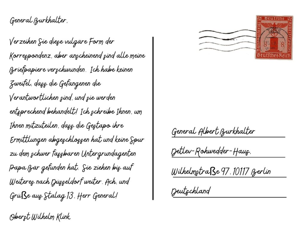
The writing on the postcard is in German, though since I do not speak the language I used Google Translate. I apologize to anyone reading this who knows German, however I wanted it to appear as authentic as possible since it is supposed to be from Klink’s perspective.

The letter says the following:

General Burkhalter,

Forgive this vulgar form of correspondence, but it appears all my stationary has gone missing. I have no doubt the prisoners are the ones responsible, and they shall be dealt with accordingly! I am writing to inform you that the Gestapo has finished their investigation and have found no lead on the elusive Underground agent, Papa Bear. They will be moving on to Dusseldorf until further notice. Oh, and greetings from Stalag 13, Herr General!

Colonel Wilhelm Klink

This short letter include many references to the show. The Gestapo (the Nazi secret state police) are constantly showing up at Stalag 13 for some reason or another. I image their presence is why the heroes need Klink’s stationary to forge documents, mainly to release an important prisoner from them. They do this by performing a sabotage operation out near Dusseldorf, which is a place in Germany that is constantly mentioned in the show. They play it off like Papa Bear, the elusive allied agent, is the one responsible. Little do the Gestapo know that Colonel Robert Hogan is, in fact, Papa Bear, and are being led away from him and suspicion of him and his tear. And he letter isn’t complete without Klink making a foolish remark, hence the final sentence, “Greeting from Stalag 13!”

I personally like to imagine Klink getting a phone call from Burkhalter after the “letter” arrives and berating Klink for using such a childish mode of correspondence. I can just imagine him telling Klink off, and saying something like, “What would the Führer (Adolf Hitler) think of one of his Luftwaffe generals passing around postcards like schoolchildren?!” Afterwards, Hogan would make a remark: “What’s wrong, Kommandant? Did General Burkhalter not like our craftmanship?” To that, Klink would forcibly dismiss Hogan (“Disssss-missed!”) and sulk in his chair, ending much like an episode of the show.

Having time to rework this assignment was really fun. I made the original M*A*S*H postcard in a hurry, so having time to think out a scenario for the original idea I had was really fun! I’m happy I got to create it too! Now it’s not bugging me so much that I didn’t get to complete the assignment how I wanted to!

Unlike the M*A*S*H postcard, I decided to use Canva for this one. I had forgotten Canva allows you to make postcards, and I’m very happy with how this one turned out. I used a template that originally had a tropical scene on it as the basis, but then changed everything around. For one, there isn’t any English on this postcard! I used Google Translate quite a bit, changing the “Greetings from” to “Grüße aus” and so forth. I mentioned before the entire note is in German, though it might not be grammatically correct because of my use of Google Translate. I have no way of checking that unless I plan to learn German, which I sadly do not have time for. The image on the postcard is a fairly common one that pops up in Google Image Search, but the one I used can be found here. I also included a Nazi-era postage stamp that I found on the U.S. Holocaust Memorial Museum’s website.

Overall, reworking this assignment was a lot of fun! I’m glad I got to use my original idea instead of the throwaway one from the original assignment. That assignment is linked below for anyone interested in taking a look at that one!

Tell me what you think in a comment down below!

Wish you were here!: a #Prisoner106 design assignment

Design Week in The Village kept me busy.  I took on the Postcards from a Magical Place (#363) assignment.  If I followed directions, I would’ve designed both the front AND back of a postcard.  I only designed the front.  Why design the back of a postcard from The Village when there is no outgoing mail here?

The Village is truly a magical place though.  I did my best to capture the majesty of the mountains, our inspired chess games, and our ever-present sentinel, Rover.

Village postcard

Greetings from The Village

This version isn’t fit for The Village store, but some progress was made.  “The Village” doesn’t pop as much as I would like.  Actually, none of the text does, but that’s something to fix later.  Perhaps something like this:

vintage postcard

vintage postcard

I used the Seaside Resort font for the smaller text and found the Vacation Postcard font for “The Village.”  However, I quickly discovered that I couldn’t fill that text with an image as I explained in this post.

Only the outline of the text would fill with the image

Only the outline of the text would fill with the image

A more experienced GIMP/PhotoShop user may know how to get around the problem.  I couldn’t make it work despite the good suggestions left in the previous blog post.

This is what I did (I think):

1.  I opened the image of the chess scene

2.  I added the “Greetings from” and “Be seeing you” text layers and moved those around as needed.

3.  I added “The Villlage” text layer and rotated the text by going to layer > transform > rotate > arbitrary rotation.  I used -15 as the angle.

4.  I followed the steps in the “How to Create a Vintage Postcard in GIMP” tutorial for blurring “The Village” text in order to get a nice 3D effect.  I duplicated “The Village” text and then added a blur filter to the duplicated layer.  Activate the copy/duplicate and select filter > blur > motion blur.  I used a length of 20 and an angle of 205.

3Dtext_pcardKeep making copies of the blurred layer until you have a nice 3D effect.  Then hide all but your blurred text layers.  When these are the only layers visible, right click them and select “merge visible layers.”

You can also select colors for your main text and the blurred text layer so that you can tell the two apart.

merge_visible5.  Add the image that should appear within your text.  Add an alpha channel to this image by right clicking the layer.

6.  Right click your main text layer.  Click “alpha to selection”

7.  Turn off your main text layer.

8.  Activate the image layer.  You’re now ready to delete everything outside of the text.  Go to Select > invert and then go to Edit > Cut.

(The screenshots below aren’t part of my actual project, which is why you don’t see all of the layers I had)

invertcut

Though the final product isn’t what I envisioned, I ended up learning a lot about GIMP.  Again, this “How to Create a Vintage Postcard in GIMP” Youtube tutorial was extremely helpful in the process.

I also found an easy explanation for adding image to text here.

Messages From The End

To finish up my assignments for the week, I decided to do Postcards from Magical Places (worth 3 stars). The task:

Design the front and back of a postcard that might be sent from the location of a movie or a work of fiction. Both sides of the cards must be created as graphics.

The front should use graphic design elements that provide a sense of place or use the classic motifs of old postcards (“Greetings from ______”)_, both pictures and text. The back of the post card should contain a stamp and postmark that fits with the theme of the movie, as well as an addressee and a message that fits the plot as well.

I actually did this assignment a couple of weeks ago, and you can see that HERE.

As my other assignments this week, we had to collaborate with another classmate. I worked with Kelsey all week. My postcard was addressed to Stella, from Blair. Blair was on vacation in Montauk, aka the end. (If you are unfamiliar with Long Island Geography, check a map. MTK is the last town on the island, hence why it is referred to as “the end”).  After finding a man on killing 4 love. She reveals something to Stella in the postcard, which continues the Noir Not the Father saga.

I used my first postcard as a template.

POSTCARD

Adding a new picture was the easy part, however editing the bottom was a completely different story. I should have just started from scratch. It probably would have been easier. I ended up having to do a lot of erasing and layering to make my new postcard. I’m pretty pleased with the outcome.

stella post card

There are some hidden things in the postcard that may not be recognizable to someone who doesn’t know the background Stella and Blair have. Note the baby carriage stamp. That has a lot of meaning that we may or may not go into later. I’ll keep you on your toes :)

Finishing the week with 11.5 stars since I got an extra star for collaborating with Kelsey!


Laters Baby ;)

I FINISHED MY STARS I FINISHED MY STARS! The last assignment I chose to do was entitled Postcards from Magical Places (worth 3 stars.) The task: Design the front and back of a postcard that might be sent from the location of a movie or a work of fiction. Both sides of the cards must be created as graphics.

The front should use graphic design elements that provide a sense of place or use the classic motifs of old postcards (“Greetings from ______”)_, both pictures and text. The back of the post card should contain a stamp and postmark that fits with the theme of the movie, as well as an addressee and a message that fits the plot as well.

I had a lot of fun creating this assignment. I used GIMP to make my design. I based it on a work of fiction, aka my character Blair. It is truly amazing how much I have created for my character, and how each week her story is able to grow. This postcard comes from one of her first love, back in NYC. They haven’t spoken in almost a decade, but that hasn’t changed his feelings for her in anyway. I am really excited  to build  this story as the weeks go on.

I started off with this picture of NYC

3-nyc-downtown-nina-papiorek

I then added “Greetings from NYC” because that is about as cliché as a postcard can get. I then added this postcard template. A6 postcard template-2

in order to have something stable to put my postcard letter in.

I found an address for Blair by searching streets in Detroit. I then wrote the message, trying to keep it semi- appropriate for a postcard. The first thing I wrote was WAY too intense, and I will definitely save if there is ever a letter assignment.

The next thing I did was take a stamp and a post marker and pasted them onto my design.

url-1


I ended up having to crop the post mark so I would just have the New York one, since the card was coming from NYC. I had to figure out how to make it transparent so you could see the stamp underneath, and after some intense searching on GIMP, I ended up figuring out how to do it, and I am super pleased with how it turned out.

I just really liked this stamp that I found from the 60s, and I thought it fit well into the postcard. I also turned it black and white to add to the black and white of the postcard theme.

1980_2493_10005-SC-C1

Here is my final piece.

POSTCARD

I finished the week with 14.5 stars.


Brother Mouzone Sends His Love

Here’s what I imagine a fictional postcard from Brother Mouzone would look like if sent from the great city of Baltimore.  I imported images I found on the internet into Photoshop, erased existing text, roughed them up with dust/scratches filter and proceeded to add Brother Mouzone’s hand writing.  I periodically made new text boxes, distorted […]

DESIGN MEGAPOST!

This week we had to do 15 stars worth of design assignments. This is what I meant by the hardest part of my week. I always thought I knew how to use Photoshop but I guess I was very, very mistaken. I used Photoshop because it is and extremely common program so it’s easier to [...]

Domino (2005)

I used the same movie for three of the five assignments from the design assignments.  I’m not sure if anyone has seen it, but I hope so or none of these are going to make sense!

The design blitz we did helped me to really identify different elements of design in advertisements and on objects.  Creating things that contained those elements was a whole different stories — I really struggled with it!

The first design assignment I did was One Story/Four Icons.

four pictures

The movie I chose is Domino (2005).  Domino Harvey is the main character, and she wears a domino necklace, which is the first object.  The second is a goldfish.  In the film, she learns early on to never become attached to anything because whatever you let get close eventually leaves or dies.  She learned this lesson when her mother gave her a goldfish when her father died, and then the goldfish died.  She has it tattooed onto her neck.  The next symbol is money – she was born into wealth but abandoned most of it and struggled for money.  She unwillingly became involved in a scam to get someone else a lot of money to pay for an operation, and then she and the others who were dragged into it found out and came up with a scheme to steal the money, give it to an impoverished country (where one of the other characters was from), and blow up the people who dragged them into it (they were violent people, to be fair. Not as out of nowhere as it sounds).  In the end, they blow up the space needle in Washington state, which is what the dynamite is for.  See? Domino in four symbols.

The next assignment was a movie playing card.

domino card

I chose the main character in the movie, Domino.  Not much to say here.  She was a bounty hunter though, which explains the gun.

The third of the three assignments I used Domino for was making a postcard for a place in a movie or fictional story.

postcard

postcardback


I had an easier time with the front of the card than with the back of it.  It was pretty difficult finding a postmark.  Actually, I couldn’t find one at all (that I could figure out how to effectively use) so I settled for drawing my own one.  It looks kind of weird.  I used 1987 though because in the movie, Domino had not yet moved from England to join her mother in Los Angeles.  She was still in England.  The quote at the bottom of the front of the card is a quote Domino says during the movie while talking about her life in England.  As for the note to her mother, Domino’s mother married a man in America for his money and moved to LA.  Domino’s mother was obsessed with Beverly Hills 90210 (part of the cast of the original 90210 actually are two of the main characters), which is why I used the description of London’s skyline at the top of the back of the card.  Domino hated the show and its actors.


It was a lot of fun trying to implement the design elements into the post card, but I tried.  Hard to tell how effective it was though.  Either way, it’s clear to me that I have a lot of practice to do!

Remix #3 Postcards From Magical Places

For this remix I decided to make a postcard. I was really hoping to go all out with this one and use the more advanced version of Pixlr. My original thought was to use the existing picture of Ireland (a shot that I took myself when I visited in 1999) and layer another picture with it to create a fanciful location. I was really hoping to insert a picture of the “wall” from the HBO series Game of Thrones and use it as a new horizon. Unfortunately, this was a LOT more difficult than I anticipated. So, after more than an hour of playing with the program, and reading a couple of tutorials to not avail, I abandoned the idea.

I decided instead to focus on an end product that I could potentially use in my classroom. I used the picture of Ireland as a picture of part of the journey that the creature from the novel Frankenstein takes in search of Dr. Frankenstein. This focus seemed fitting since the Halloween holiday just passed and after Thanksgiving break we will be reading Frankenstein in my British Literature class.
The picture includes a caption of “Still Searching…” to show that the creature is searching for his creator in hopes of finding companionship, guidance, or possibly redemption. On the back of the postcard I have included a short note from the creature pleading for Dr. Frankenstein to stop hiding and take responsibility for his actions.

Once I determined the course this remix would take, the steps were fairly simple:

1. I scanned in the picture from Ireland as I did not have a digital copy

2. I edited the Ireland picture on pixlr.com with an effect as well as a torn border. I also added the text “Still Searching…” Then I saved the picture as a separate file.

3. Then, I went to google images and found a postcard template that I liked. I picked one with an aged looked because Frankenstein is a novel from the Victorian era and I imagined the postcard to be aged and torn after traveling so far to reach the doctor.

4. I updated the postcard image to pixlr.com and added a sticker which became the stamp on the postcard. I chose the Celtic knot.

5. Next I added text to the back of the postcard. This took some playing around because I had a large amount of text and the program makes it difficult to edit and adjust the font style and size. Then I saved the picture as a separate file.

6. To complete the assignment I then created a collage with two pictures. I inserted the picture of Ireland on the top and the postcard back on the bottom. I adjusted the size and shape of the collage to fit the pictures. I then saved this as a separate file.

Greetings From Hogwarts!

Postcards From Magical Places

Design the front and back of a postcard that might be sent from the location of a movie or a work of fiction. Both sides of the cards must be created as graphics.
The front should use graphic design elements that provide a sense of place or use the classic motifs of old postcards (“Greetings from ______”)_, both pictures and text. The back of the post card should contain a stamp and postmark that fits with the theme of the movie, as well as an addressee and a message that fits the plot as well.
The inspiration was a fanfiaction assignment created by a UMW student in Spring Semester 2011- see the excellent set of LOTR cards at http://cupofchai.umwblogs.org/2010/11/22/fanfiction/

This is a 3 Star assignment.

For this assignment I decided to make my postcard be from Hogwarts.  I love the Harry Potter Series.  I decided to make this post card from Ginny Weasley.  This is because she is the first character that came to my mind for some reason and I thought it’d be more relatable to write a post card from someone other than the three main characters which are Harry Potter, Ron Weasley and Hermione Granger.  I found the picture of Hogwarts on Google Images (link to picture here) I then opened it up in paint and wrote “Greetings from Hogwarts” on it so it would look more like a postcard.  In this postcard Ginny is writing to her parents reflecting on her first few days at Hogwarts.  If you’re going by the books this postcard would take place during Harry Potter and the Chamber of Secrets.  This postcard was sent before everything happened with the basilisk.  For the postage stamp, well in Harry Potter everything is delivered by owl so where the postage stamp was I put a picture of a beak from the owl.

Postcard from Magical Places

Postcard from Magical Places


Greetings from the Overlook Hotel

Inspired by the work of the Breakfast Club edition of ds106 on their design assignments today (more on that anon), I took a shot at the Postcards from Magical Places assignment—3 stars! I spent the afternoon showing them how to do one of these in Photoshop, and while I was showing them a few things I got the idea of a postcard from the Overlook Hotel, and while I didn’t have the time to do it during class, I promised myself I would write a postcard from Danny Torrance to Mr. Halloran. This was very fun!