Primer

If you haven't seen Primer yet, then this is the clearest understanding of the movie that you will ever have.

The hard part of minimalism is not in the fabrication, obviously. The hard part is figuring out what contains the most information in context yet contains the least information out of context.

And if you have seen the movie, then I hope you think the poster is as brilliant as I thought it was when the idea came to me.

And if you haven’t seen the movie, you should.


Dead Man’s Chest Movie Poster

I’ll be honest: I don’t know much about graphic art. I’ve seen it. I’ve spent a lot time wandering the rooms of the MoMa looking pensive, and ds106 is currently producing a lot of hot art. But nothing has made me appreciate graphic art more than designing a minimalist movie poster.

With this assignment I wanted to experiment with texture and shape. It took me a while to figure out what movie I wanted to do, but I finally settled on the Pirates’ movie Dead Man’s Chest. Second, I needed to watch the movie again (very necessary). While I was watching the film, think I was drawn to the character Jack Sparrow’s face painting as the Cannibal King.

It is a key scene to the film. The character Jack is finally found on a remote island but is in a tight spot. The plot twist means that the character Will Turner must not only escape from the island himself but must also rescue Jack from the Cannibals.

The Design

I wanted to poster to look like a ghostly pirate treasure map. First, I search for an image in The Google for a photo of tea stained paper. I found one easily and downloaded the imaged into GIMP.

Next, I found an icon of an eye in the NounProject. In GIMP I altered the color of the eyes from black to brown. Next, I needed to draw the lines. In order to draw straight lines in GIMP select the paint brush tool, hold down shift key, and click the spot where you want to line to end (keep holding that shift key).

Next, I added the text to the poster. Last, I uploaded the image to Picnik in order to alter the tint of the color. I added a green color filter to achieve to the ghostly effect.

The Results

DS106 has produced a lot of fantastic designs for this assignment. Some examples can to found here, here and here. I did fret for a long time trying to get the lines in the design to be perfectly symmetrical. There are close, but not perfect. Overall, I am pleased with my work.

City of God

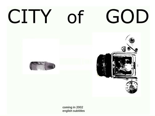
For my final design assignment, I chose to do the Minimalist TV Poster. I thought a long time about which movie to do; I had really wanted to do an older movie, but I couldn’t think of any (that I’d seen, at least) that had a simple enough iconic image that I could use for a poster. I decided to just look at IMDB’s Top 250 Movies list for ones I had seen.

I selected City of God, which came out in 2002. In case you don’t know anything about it, it is about two boys growing up in Rio de Janeiro through the 1960s and ’70s, surrounded by an atmosphere of violence and gangs. One boy grows up to be a journalist and photographer; he is represented by the camera. The other boy turns to drug dealing and violence, and he of course is the bullet – aimed at the camera. It’s a really great and very intense movie, so I tried to keep the poster as simple and stark as possible.

City of God minimalist poster

As for creating it:

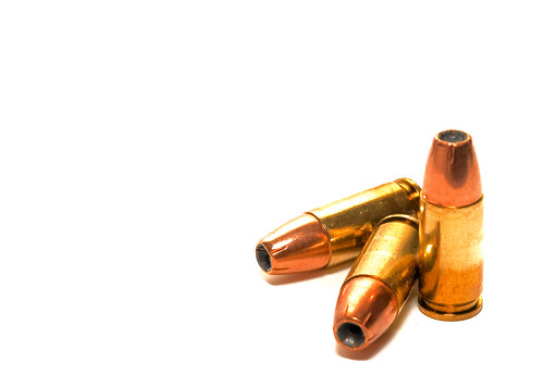
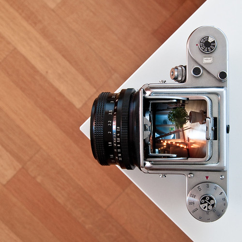
I used these two photos for the bullet and the camera:

Equalizers

Pentacon six TL

I used the lasso tool in GIMP to cut them out of their respective pictures. For the camera I put it into black and white and used the Posterize tool to remove as much color as possible. The posterize tool didn’t work as well on the bullet, so I just put it into black and white and heightened the contrast as much as possible.

Fonts have been my problem all week, and they were a problem for me today too. I just couldn’t find one that I felt fit in with the image of the movie. I settled on simple Verdana, a bold sans serif font. I thought the poster still looked too empty, so I added the text at the bottom for a little context. The original movie is in Portuguese, which is why I mentioned that there are English subtitles.

Fun project and a great movie – I may have to watch it this weekend now….

Minimalist Poster

Minimalist Poster

To Kill a Mockingbird is one of favorite novels and movies. The process was pretty straightforward and simple. I chose the mockingbird symbol as the “essence of the movie.” I used GIMP to paste the icon in the center of the background. I used the clone tool to make it blend in with the background. After that I uploaded it to Flickr and added text in Picnik.

True Blood

True Blood

Design Assignment: Minimalist TV/Movie Poster

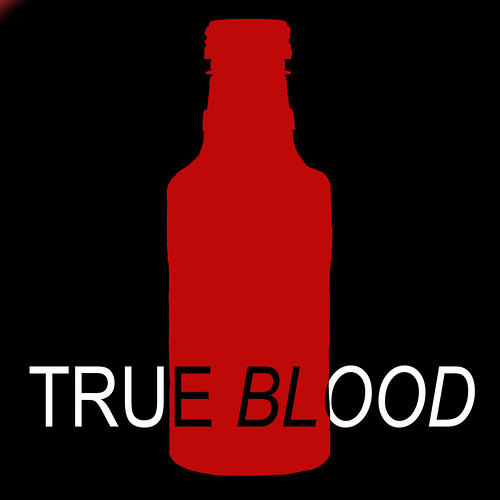
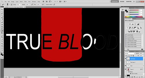
For this assignment, I chose to make a minimalist tv show poster from HBO’s True Blood series. I created the poster in Photoshop where I overlayed a tru blood bottle with a solid color and then overlayed inverted text on top.

true blood edit

If you love vampires, faeries, werewolfs, werepanthers, witches, maenads, shapeshifters or demon babies then this is the show for you. Right now I am on season 4 of the show and learning about witches of Bon Temps, Louisiana. For a good synopsis of the show, check out the video below.

DNA and Evolution

I decided to try out the Minimalist TV/Movie Poster assignment. I wanted to do this on a movie that I love, yet havent seen in a long time – Evolution. For those of you who have not seen it, it is a comedy about a group of people who lead an attack on an alien organism which had landed on earth. Starting off as bacteria, it rapidly evolves into a threat to earths civilizations.

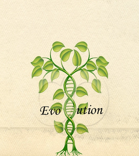
Instead of going for the comedic or threatening aspects of the movie, I decided to highlight the underlying principle – DNA and evolution. The poster features two plants, tangling into one another with a DNA helix in the middle of them. The word “Evolution” is spelled with with the helix being the “l”.

To make this, I used GIMP, copied images into it then used the text tool. I changed the text type to “Monotype Corsiva Italic” as I felt it suited the theme of the poster well.  I made two text boxes, one for “EVO” and one for “UTION” and positioned them beside the helix so that they were inline.

Evolution (fFINISHED 3)

Minimalist Movie Poster

I took a crack at the Minimalist Movie Poster as my first design assignment. I don’t know that I really like the way it came out but I took too much time to not post it Basically, I love the movie The Notebook. Typical, I know… But, my idea was to somehow display a heart [...]

The Social Network Minimalist Poster 2

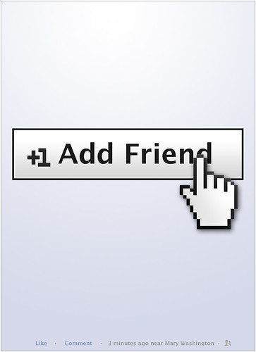
I made a movie poster of the social network earlier, here’s it is again with slight modifications.

The Social Network 2

This is the “add friend” button as it is currently displayed on facebook. I basically used the same font, added the white-gray gradient to the button shape, and using the rectangle tool, made the +1.

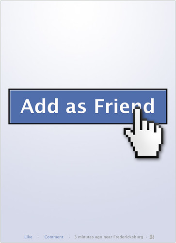
Here is the previous one:

The Social Network

They Blog, They Lion


Minimal is the new black.

These were all created in Gimp (the font is Gentium Basic), and the silhouettes are all from the public domain clip art site Clker, which totally totally rocks, esp. for silhouettes.

The first three are all from the opening (see below), and the last is from Mr. Bates (go watch it already!!), or refers to Mr. Bates. I’m all caught up now, so won’t be obsessing over this anytime soon, I think (although, possible a Bagton Abbey skit is out there somewhere in the ether…).


8. minimal again (ds106 #3)

Despite the great amount of time it took, I really enjoyed doing the past ds106 I did – the Minimalist Travel Poster for Yubaba’s bathhouse in Spirited Away. So I decided to do another similar assignment!

These Are for the Minimalist TV/Movie Poster assignment. I found this assignment a bit by chance while googling for the link to the other poster assignment (I find browsing through the dsAssignment database a bit tedious) and this came up as the second option.

Keeping in mind the feedback Paul was kind enough to leave on my other post, I decided to make a set of text focused posters. I figured it would be fun then to use iconic/memorable quotes from a TV show. My choice of TV show then was an easy one – Joss Whedon’s Firefly is so full of quotable lines that it became the obvious choice. I chose some that I thought was most memorable, and also eye catching enough that they would make someone curious as to what the show is about. Figuring that just text might be a bit boring – albeit minimalist – I decided to look for images that reminded me of the characters and the quotes I was going to use.

For River Tam’s “I can kill you with my brain” line, using an actual image of a brain was a pretty obvious choice. At first I browsed around deviantArt’s resource and stock photos, but looking at pictures of actual brains was a little too much for me to stomach. Instead I ended up using a great, realistic brush set by Falln-stock . For Mal’s “big damn heroes” poster I used a brush by emoang which looked pretty similar to the revolver the character carries in the show. Jayne’s “let’s be bad guys” got a shot gun whatchamacallit from the same brush set for lack of a better idea. For Simon’s “going mad” poster I used the tech brush set by redheadstock since he’s a doctor. Yeah idek.

For the color schemes I again turned to COLOURlovers and decided to search for palettes with the characters’ names in them. Amazingly enough, there were numerous palettes for all the characters! I didn’t expect that. Yay fellow geeks! I also searched up some poster textures on deviantArt – in hindsight I felt my last poster was a bit ‘flat’ and I figured adding a texture might be good to counteract that.

These posters took a lot less time than the travel poster as well. I did River’s first, testing out color and text combination. It took about twenty minutes, and once I was satisfied I used it as a template for the rest of them and put those together in roughly a bit more than five, ten minutes each. The basic template was a solid color
layer for the background, a layer set to Mode > Hard Light for the brush image (which I sharpened a few times to give it a more cartoon-y feel), two text layers (quote and ‘Firefly’) in Mode > Normal and the texture layer by bashcorpo set to Mode > Softlight.

For the posters I used these colours (it’s not apparent in the actual posters because the texture layer changes the colors, but still)
River; pale blush and antique fard from ‘River Tam’ by elfflame
Jayne; beleidre and too many from ‘Jayne Cobb’ by saint_611
Mal; piano and malcom reynolds from ‘Mal Reynolds’ by xeenyth
Simon; hao yun bu la and simon tam from ‘Simon Tam’ by saint611

Huuuuu, why I am I not studying graphic design ;;