Minimalist Movie Poster

3.5 Stars

I realized while I was creating this poster, that the Ghostbusters movie poster was minimalist in the first place. So then I had to decide how to explain what happened in a different minimalistic way. I really like the way this photo turned out! I used Canva in order to get everything set up the way I wanted it to. Made the ghost picture transparent, but for some reason, Canva didn’t think so which is why my background is white.

Minimal Movie

Make a wish! I designed 13 going on 30 as a minimal movie poster.

Minimalist TV/Movie Poster

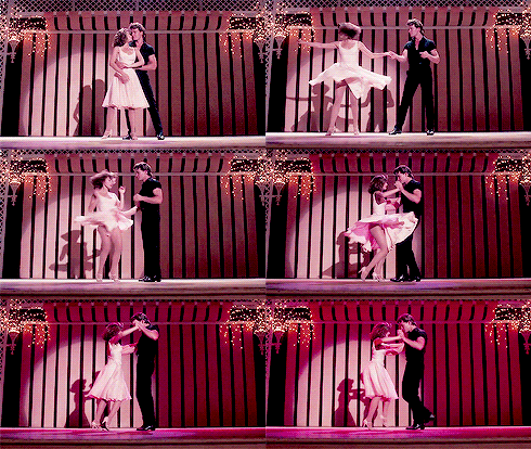
Dirty Dancing

To start this week off I decided to do a minimalist movie poster for the movie Dirty Dancing from the 80’s for 3.5 stars. I am really excited for this week because I do enjoy design and designing different things and being creative that way. I enjoyed this project and it was relatively quick because I knew what I wanted to do with it.

I am lucky enough to have a computer that accepts me writing on my screen withe a pen I have. I used a word document and wrote with my pen describing the movie in a poster form. The minimalist part was the hardest part for me because I enjoy things and details that go into pictures and designs. I thought of making music notes and the black lines represent smell. The dress is supposed to be like Baby’s dress from the movie with a little more color. I took a very literal meaning to the story title, dirty is the smell, and dancing is the dress and music notes. Below is my movie poster for the movie Dirty Dancing.

I think I did a good job with the poster, the only issue could be that I added to much and it was not minimalist enough to be correct. I was trying to make it there but also give it enough detail to be able to tell what movie I was talking about. I definitely understand it is important that we put things in certain places to make a certain picture and feeling.

I was trying to think of ideas that were not exact to the movie but meant the same thing. I was trying to be creative while also placing the object in certain locations to make more of a meaning and feeling than placing somewhere else.

Minimalist Poster

Directions: Create a tv/movie poster that captures the essence of the story through the use of minimalist design/iconography.

I decided to create minimalist posters for Wall-E! Both images with created in Canva.

With the first image, I wanted to stress the need to recycle and also keep the recognizable Wall-E movie font. But I also felt like it wasn’t minimal enough, so I took a second try at it!

For my second try, I changed the font and added an image of Earth. I took away the green coloring and replaced it with a dull gold. I think this one turned out so much better, because you get the idea that the movie has to do with Earth, possibly leaving it, which is why we see it from the view of outer space, and the gold coloring is intentional because the boarder is blue. So, it’s not like the blue coloring wasn’t available, it just changes the mood of the image when the color of the globe changes.

You’re a Wizard, Harry.

For this 3.5 star assignment we were asked to create a minimalist poster TV or movie poster. When I first saw the assignment, I was unsure which movie I would choose, but after some contemplation I decided to go with:

Harry Potter! I really enjoy Harry Potter and since I have not talked about the series, I thought I would bring it to my blog.

I made this poster using two different apps on my phone. I first used the Photoshop app to create the design of the Deathly Hallows (book 7) symbol. I found a wand that I liked, took out the background of the wand and duplicated the wand four times. I then sorted and arranged them to create the symbol. I then searched for a circle that represents a stone from the book, and placed it in the middle. I saved this portion and then took to the second app called Aviary. Here, I added the typography.

I think this assignment turned out pretty well, I am happy with it. I am kind of wishing I chose a darker background color, but that is something that can easily be changed. The design is simple, minimalist, and creates a sense of balance, an aspect of design we discussed in our design blitz.

Minimalist Movie Poster

3.5 stars

For this assignment, I had to make a movie or tv poster in a minimalist way. I decided to do one for the movie Me and Earl and the Dying Girl. The movie is definitely a tear-jerker, but one of my favorites.

The assignment was linked in this week’s “weekly assignment” blog so I thought I’d give it a go! It was a pretty easy assignment overall, but it required you to think. I chose a picture of a DVD because in the movie the main character, Greg, and his best friend, Earl, make their own versions of classic or foreign movies. When Rachel, the dying girl, gets diagnosed with cancer, they begin to make movies for her- hence the DVD in my poster. I was originally going to use a picture of all the movies that Greg and Earl made, but after looking at other examples from people who had already done the assignment, I realized that picture wouldn’t meet the minimalist requirement.

I used Canva to make the movie poster. I would definitely suggest this site to graphic design beginners! There are so many tools and cool designs on there, and it makes the process REALLY easy and fun!

I selected the poster template and then selected a grey background. I put in my own text and cropped it the way it looks now. When I chose the DVD image, it was red and orange, but I felt like the best way to keep with the minimalist theme was to keep the colors neutral. The great thing about Canva is that you can change the colors of images you want to add to your design.

I would definitely suggest this assignment to other students in the class! Don’t forget to check out my Instagram post about it as well!

ds106.richelleholnick.com 2018-10-05 15:24:13

I created a minimalist movie poster! This is for the movie Get Out, which was a really popular thriller last year! The symbol I chose for it was the teacup, because it is a key symbol of the movie. It is used to hypnotize people before harvesting their bodies. So, while a teacup it’s self is innocent, it’s use, and depiction here, is actually pretty sinister!

I wanted to do the white border around it but i couldn’t find a simple border on Canva (the program I used to make this with), so I had to actually make the border myself. The teacup was a free image that Canva provided me with. I chose the font “Computer Says No” for the typography because it fit the feel of the message. It’s not a classic horror film, so I did not want to use a font such as the Dracula font, I just wanted something simple, but not necessarily friendly! Plus, I also really liked the name of it.

This was the Minimalist Tv/Movie Poster assignment worth 3.5 stars.

Simplified Poster

I used the Adobe Spark Website to create my simplified poster (3.5 stars). I decided to base the poster off of my favorite TV show, Grey’s Anatomy. The show is a medical drama, so I used a stethoscope and heart rate. I chose the red background because it is simple and stands out. It can also represent blood and the drama in the show. I tried different fonts and colors and liked the black font with a white background. I then uploaded the picture. The Adobe spark website was super easy to use and had a lot of features.


Until next time,

Emily

Friends TV Poster

The tv poster I decided to make was for the tv show Friends.