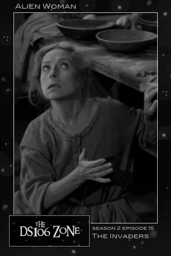
“ds106zone Trading Card: Alien Woman from The Invaders”
I am pleased that dear @JimGroom created the arbitrary constraint of doing 10 stars worth of work from within the context of the season 2 episode, “The Invaders.” Having to scour the Assignment Bank (scour is too rough a word) for assignments that lend themselves to the episode just puts a nice focus what is quite a pleasant task. Seeing assignments that “don’t fit” or which I can’t see myself “making fit” helps in the challenge of understanding exactly what each assignment is getting at. Although browsing the Bank with absolutely no context can let you perhaps more easily choose any assignment such that you can knock something out, looking through the Assignment Bank with a focus becomes a creative exercise in problem solving, and requires you to think a bit more deeply about the particular characteristics of that particular focus.
Having said all of that, the first assignment that I arrived at that spoke to me as a fit for The Invaders was The Bava Himself‘s Design Assignment 488: Movie Trading Cards — the wonderful benefit being that now having come up with a design for ds106zone Twilight Zone Trading Cards, I am now all set to start cranking them out for previous and future episodes.
So while I am about 30 minutes past my self-imposed deadline of midnight for reaching my 10 stars — this particular assignment is ranked at 4 stars, and so, were I counting, I’m over the top at 12 1/2 for The Invaders.
My Process
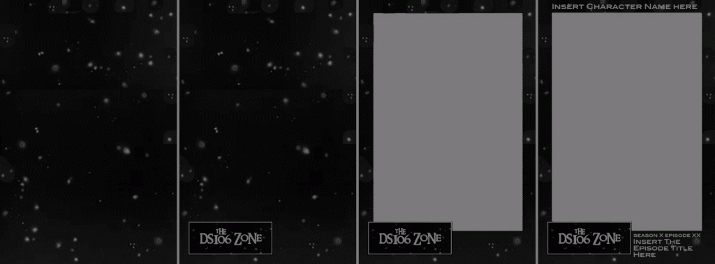
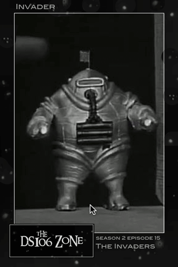
Given that The Twilight Zone is so wonderfully a child of the black & white era of television, I decided to draw upon the characteristic opening sequence star field as the basis for the background of my trading cards. I used a previously captured existing star field image that I used for my @The Focus Zone twitter avatar (turning off the text layers in the existing Photoshop .psd file reminded me how easy it would be to GIF that … but I’m not GIFfing tonight!) as the background — I had to extend the Canvas and duplicate the layer (rotating it 90 degrees to avoid an appearance of tiling) to get a non-square canvas, and then imported my existing “the ds106zone” logo (from a few days back), scaling it down and placing it in the lower left of the card. Then, using the Rectangular Marquee Tool to define a large space with an eyeballed consistent width border around the perimeter, I used the eraser tool to create a rectangular hole in the card through which each of the trading card characters will be displayed. After adding a thin white border to match the edge of the hole, I placed a photo of the Invader below the frame levels, and was almost done.

Working from Initial Starfield card through to Finished Trading Card Template
In deciding on where to place the text, I moved things around a bit until settling on the final locations. Having the character name in the top left makes sense from a focus standpoint — and by placing it on the black star field background, it will always display consistently as white on black. (At one point I had the character name inside the white frame — but that would introduce complications as the text colour there might have to change as different photos were introduced. Too much work, and aesthetically inconsistent. So not good.

“ds106zone Trading Card: Invader, from The Invaders”
In placing the Season/Episode information and the Episode Title, I shifted things around until finalizing the Season/Episode info above — where it will essentially take the same amount of space each time, and the Episode Title below, where titles of varying lengths should have sufficient space to expand to suit. Had the two been reversed in sequence, then the Season/Episode numbers would have had to float up and down with shorter and longer titles — or there would have been a gap between the two for short titles. So I’m happy with where everything finally arrived.
So, What’s Next?
What’s next will be:
1) lots more ds106zone Trading Cards
2) some kind of animated gallery so they can be easily viewed
But first, sleep. Perchance to Dream.
