


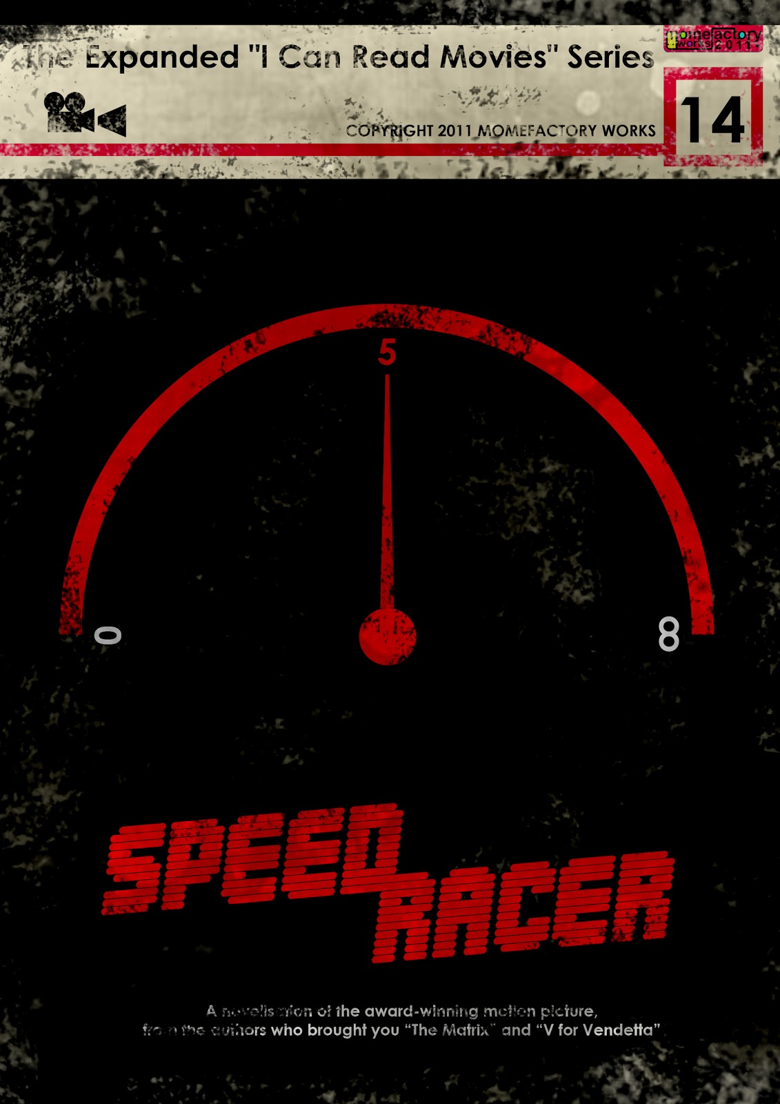
Create a film-based book cover using the aesthetic framed by Spacesick
Now, this isn’t nearly as minimalist and thought out as the original ‘I Can Read Movies’ image series by Spacesick, but I figured I’d give my own spin on it. I did a few tests where I tried to do something closer to the originals, much flatter in terms of design, but it wasn’t really working for me.
So the movie that I chose is called ‘The One Million Yen Girl’ (also known as ‘One Million Yen Girl’, ‘???????’), a Japanese movie that I really love. The movie revolves around a 21 year old girl, played by Aoi Yuu who travels from town to town in Japan, staying only for as long as it takes her to earn one million yen.
For the book cover, I decided to use a picture of Aoi Yuu, found here through the powers of Google. With the photo as a base, I looked through textures I had saved on my laptop for something that had a retro/sixties feel that would help to give the cover an old school feel like the original ones (despite being different.) To achieve this I used two textures from Claws&Fangs (from this and this texture pack). I decided to use the flower like red texture as the main design point of the cover, and resized and erased parts of the image of Aoi to fit within the flower-y part. On top of that I used an old paper stock image by ofruin-stock, set it to Multiply opacity:45% to give it an older look. Along with that I added a C&F red striped texture, Softlight opacity:66%, and a dotted black/white texture (think Roy Lichtenstein) at Softlight opacity:44%, for more of the retro feel. Lastly I added text and some details like the color border and box, plus a black gradient at Softlight to give some shadow on the left side. The text is written in black font and placed underneath the texture layers, so that they have a similar old look.
So it ended up looking quite different, but overall I’m pleased with it. Might add some more text details to make it look more similar to the originals…!

![]()

 So basically I imagined a series of rows of alien incubator pods that end in a fullblown face hugging alien. What’s always been interesting to me is that in the original movie poster the alien pod serves as the dominant image. It is a rather minimalistic poster in its own right, and the fact that the pod in all subsequent sequels is relegated to insignificance, when for me it was one of the most powerful images of the first, and best, film is interesting. I understand the original movie poster didn’t want to give the alien’s form away, a form that would thereafter become iconic. But as much as


