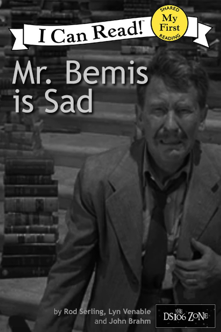
“Mr. Bemis is Sad” book cover by aforgrave, based on “Time Enough at Last”
The Inspiration
@cogdog (Alan Levine) inspired me this morning with his I Can Read Series: Eye of the Beholder children’s book cover, and upon quick reflection, it seemed to be a just perfect assignment to do for poor Henry Bemis in Time Enough at Last. The labelling of this book as a shared reading book makes it all the more poignant for poor, all-on-his-lonesome Henry.
The Process
I gathered my I Can Read series banner from a basically white-covered book Pete the Cat, which made it easier to isolate the banner using the Magic Wand Tool and there by erase the rest of the cover using the Eraser tool. In the end, I removed the existing drop shadow from the banner (also using the same process) as it was somewhat pixel-ly and distracting.
I toyed around with a few different fonts for the title, before settling on a simple, kid-friendly sans-serif Trebuchet MS at 47 pt for the title and 11 pt for the “authors.” I just eyeballed the font sizes with the slider to get something that seemed to look good.
Although I had originally planned on using an image of Burgess Meredith with the broken glasses, it was bit too difficult to get a tall enough book-propotioned crop that also showed books in the background, and so I moved ahead a number of frames to where the camera pulled back and it was easier to select a more vertical image.
I considered titles like “Henry Bemis,” “Poor Mr. Bemis,” before deciding that for a children’s book (and especially a shared reading book!) there needed to be a very clear connection between the topic of the book (the man is sad) and the title, hence “Mr. Bemis is Sad.”
The why of his sadness is our inside joke, as viewers of the episode. And including the book in the I Can Read series is just the icing on the cake.
I started with the idea of the Janet Tyler character facing the “beautiful” people maybe putting a mirror in between.
Instead I cropped out the back if her head and put it through some palette and poster edge filters in PhotoShop to simplify the colors of the back of her head. I got the mirror and the pig face from the Noun Project (just using the snout of the pig in the mirror). The text was done with the Chalkboard Font, and warped a bit to match the original.
I thought it a bit literal, so got the idea to GIF the pig nose in. I switched to the timeline mode of the animation paletter, toggled open the available slides for the pig layer, By setting key points in the timeline, I could make the opacity go from 0% to 40% and back to 0%, making it fade in and out:
I’d like to see more book covers as animated GIFs.
The prize of this episode as many are the way it flips our assumptions. When you know the ending its amazing to see the ways they avoided showing the nurse’s and doctor’s faces, yet did not make it too falsely set up.
Wow, I had planned to do some other things today, I ended up doing more #ds106.
I know to admire good design but have never studied how to create it, so I decided to try a bit of an experiment and design my book cover green with no formal study; then go on the Design Safari to study design elements, and then return to my original design to see if I would change anything.
I certainly had a good time on my Design Safari or “Search and Rescue” as I came to refer to it, and I know what the elements are and can conveniently refer back to them with my design trading cards but I can see that it’s going to take a lot more practice to understand how to apply them successfully. I was curious when reading Roger Ebert’s brilliant “How to Read a Movie” about his hypothesis that directors don’t intentionally consider visual strategies when composing their shots.
I have never heard of a director or cinematographer who ever consciously applied them. I suspect that filmmakers compose shots from images that well up emotionally, instinctively or strategically, just as a good pianist never thinks about the notes. It may be that intrinsic weighting is sort of hard-wired.
I’d like to think that the “hard-wired” intrinsic weighting can be achieved after much thoughtful study and practice until a degree of automaticity is reached. That’s the hopeful, eternal optimist perspective.
Inspiration Spielberg and Kubrick’s AI is a movie that continues to play in my head, always conjured up when I’m amazed by some new technology and how the “axemaker’s gift” may be changing what it fundamentally means to be human. I liked the idea of trying to design a novel cover that would play on the human/artificial human tension.
Process and Reflections
I measured a Spacesick’s original to get my dimensions right but stopped short of copying her template. She’s opted for “All rights reserved” and it seemed questionable to copy anything but her idea. I could be overly cautious but that’s the side I’d rather err on. I think if she had wanted to encourage copying that she would have chosen a Creative Commons license.
Using GIMP, I chose a digital background, simply typed in a giant A and I, and added a small image of the blue fairy and the android-boy that I colorized to blend in. So you see my simple, original cover on the left.
After my Design Safari, I tried hard to come up with some clever way to improve the design. No go though I do understand now some of the elements I used unintentionally. Those include the alignment of the A and I so it almost seems house-like to represent the home that the android-boy wanted so badly (metaphor, symbol) as well as the digital background to reflect the AI component. No breakthrough aha’s. I’m a bit better at GIMP now so I was able to resize the fairy-boy image to fit in the A and attempted to distress the digital background a little with the smudge tool.
I’m going to continue to try and apply the design elements and I’m especially interested in gestalt theory and how that might affect the design process. If you have resources you’d recommend, I’m all eyes.
In looking for a film to fit into the I Can Read Movies assignment, I decided would start by repurposing my initial Monkey House vector graphic and work with Terry Gilliam’s 1995 film, 12 Monkeys. Like Gilliam’s 1985 film, Brazil, the film is set in a dystopian future, but also introduces the wrinkle of time travel. Visually stunning and mind-bending, the film is worth viewing if you haven’t seen it.
I decided to work at extending my skills using Illustrator by trying to recreate the graphics template from the original book series. While that was easily doable, the further task of “aging” the book put a bit of a crimp in my timeline. I tried following the Photoshop tutorial by MOME, but struggled to get the right textures, and so, in the interests of time, I sought out some aged paper textures on the Internet, and eventually settled on Old_Scroll_Texture_II_by_Isthar_art, going back to Illustrator to get a partial effect. Unfortunately, of necessity, the layering put the effect under the text, so the text and images on the cover don’t really look aged to match the paper. However, as I was getting ready to post this, I decided to go back and try the tutorial once more, and managed to figure it out in Photoshop. Maybe I was sleepy the first time!
So here are two versions. First the Illustrator-only version, and second, the fiddled-with brushes-in-Photoshop version.
“I Can Read Movies: 12 Monkeys” by aforgrave, on Flickr
“I Can Read Movies: 12 Monkeys” by aforgrave, on Flickr
However, in doing a bit of research into the movie, I came across an amazing antecedent for the film, discovering that Gilliam’s film was actually a re-make/re-imaging of a quirky black and white still-motion sci-fi film from 1962 by Chris Marker, entitled La Jetée.
Searching online revealed a section of the film. Check it out.
Cool, eh? If there isn’t already a ds106 video assignment focusing on telling a narrative like this using using still images, there should be. This film produces a wonderful result. It’s reminiscent of the missing sections of Frank Capra’s 1937 Lost Horizon that have been replaced with existing promotion stills (to accompany the remaining audio track). It’s an eerie effect. And quite dramatic. It creates an interesting space for you to fill in some gaps on your own. Maybe I’ll aim for something like that when we get to video…
Now, as an add-in bonus, while searching for existing images for 12 Monkeys, I found this:
Brad Pitt from 12 Monkeys as an animated GIF (not mine!)
I’ve been looking for a film to explore the cinematic animated GIF assignment, Say It Like Peanut Butter. Perhaps I’ll take a further look into 12 Monkeys…
And, if that weren’t sufficient monkey-related input for summer reflection, my copy of our Camp Magic MacGuffin Monkey House name inspiration arrived recently in the mail.
“Summer Reading for Monkeys” by aforgrave, on Flickr
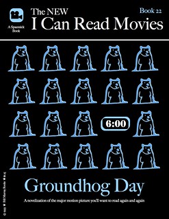
I chose one of my favorite movies for the I Can Read Movies design assignment, Groundhog Day from 1993. It is one of those movies that I can flip to on TV and start watching it from any point and still enjoy it. Usually, I notice some little thing that I had never seen before. The amount of thought that went into its production is just amazing – how did they think of so many little things?
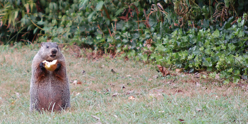
I think I thought of it for this assignment because it had so many repeating elements in its theme, it fit naturally into the I Can Read Movies book cover style. I chose the groundhog element because it is one constant from each day, but it wasn’t the easiest thing to produce with my limited artistic abilities. I looked for a CC licensed line art groundhog to use, but could only find ones that I would either have to pay for or were not licensed to be used other than in their original state. Then I started searching for pictures and found the one below by John Kratz which allowed me to use and remix it however I wished. Perfect!
I dropped the image into SketchBookX on my iPad so I could finger-sketch the outline over the image as a new layer, resulting in the repeated groundhog graphic. The alarm clock was just a “Stencil” font surrounded by a rounded edged rectangle.
I chose the same “Share Alike” Creative Commons license as the groundhog image, seemed like the right thing to do.
With activity ramping up for me at the Northern Voice conference this week, my window for MADI (Making Art Damn It) is closing, hence here I sit working an hour on a faux book cover for the I Can Read Movies assiognment:
I’d seen people do this one before, but was a first for me. I tried recalling movies I was drawn to as a kid, and the original Andromeda Strain was one I watched a few times, maybe it was the sci-fi escape the suburbs thing, maybe it was the allure of the southwest as a foreign land for a kid on the east coast, maybe it was the mad science angle.
The one thing that I did recall, and could not find too many elements was the notion that there were these five levels of the underground Wildfire facility, and things got worse as you went down (was this a precursor to War Games use of DEFCON levels?).
And the Wildfire logo (though this looks like from the more recent one but it harkens back to some of the book covers
I used as a base the spacesic image for The Labrything, filling the cover in with black, and in GIMP using the noise filters to .. make noise, and mushed things around with the smudge tool.
For the images, a=I frankly lost track of what I did! I used some layer modes, and I think the cartoon filter on the model. I wavered on just o=using one of the images, but could not decide, so I layered them and made the wildfire logo faded.
Whats it mean? We ought to be careful of things that fall from space and how the government handles them… especially if we live in Piedmont New Mexico.
This week I found another block of time through which to sprint after a number of ds106 design assignments. I had some trouble narrowing down which assignments to tackle until I began them; clearly, I do not yet have the patience or chops for some of the work, so it’s great that the ds106 community has shared so many different ideas for assignments. I hope to contribute some ideas this summer and fall as I try to implement a more ds106/MOOC feel in my middle school classroom.
Here are my basic hardware and software specs for the week: MacBook, OSX 10.6.8, 2.26 GHz Intel Core Duo 2, 2 GB of memory, Chrome, Wacom Bamboo tablet, SketchBook Pro (for drawing), Acorn (for fills and copy).
This week the work is not in any particular order. I made an animated comic book cover that looks pretty crummy next to all the awesome examples out there. I don’t yet have the animator’s patience to pull off a decent attempt, so I’ll pass on sharing for now. It was a simple snikt effect.
I’m becoming interested in how the community categorizes tasks. At times today, I definitely felt like a designer; at other times, I felt more like I was tweaking a pre-existing design for my own education (which seems more like a visual task to me), or mashing-up a number of designs. Some of the visual assignments feel like design tasks, too – like the album cover. I’d love to hear more about how contributors and organizers think of course- and task-design.
I take a ton of screenshots in Minecraft. I love discovering new sights in Minecraft, as well as new perspectives on familiar places. I ask students to take a ton of screenshots, too, so I can share their work easily through blogging. (Teaching in a multi-age classroom in a middle school, I haven’t yet solved the riddle of whole-class social media use, so I try to collect and share as many digital photos and artifacts as possible.)
For this assignment, I looked through my ds106-server screenshots, found a picture I liked, cropped it some, and then appended a snappy postcard/bumper-sticker-ready punchline in Acorn. Lastly, I mocked up a simple back for the card and let it be.
Since I wrote about how much The Road terrified me when I posted my Liminal States story-shape, and since The Road showed up as the exemplar for this assignment, I went back to Liminal States and riffed on my fake album cover assignment; with Liminal States you really can’t go wrong with a boy and his dog.
However, I wanted to use a different image this time around, so I found
“>a picture of a boy dressed as a cowboy riding a dog in The Commons on Flickr.
I brought the photo into Acorn and composed the rest of the cover there, darkening the bottom band to offer better contrast for the tagline.
The boy dressed up as a cowboy reminds me of my [privileged, white male] love for archetypes, even though many of those archetypes make horrible, horrifying decisions, like the genre-riffing characters of Liminal States. Moreover, in the book, youth – the eternal kind – is not all its cracked up to be. Considering the source material, it’s also significant that the boy and the dog clearly have different ideas about what’s going on and are, in fact, headed – or at least looking – in separate directions. The presence of grass is germane to the novel, as well.
I picked Trajan Pro for the font because it has that somber, elegiac, official feel like the title of a Tom Brokaw book.
The tag line is neither entirely true nor entirely false in its description of the book.
I’ve cartooned myself many times – some examples can be found here, here, and here. There’s even a short comic I drew about the first year of our school out there in a filing cabinet somewhere.
I find using a cartoon alter ego to be very helpful in breaking up the monopoly that text holds over my blogging, and I like to use drawings in class materials, as well. Cartooning is a good way to and bring some humor to the engrimmening proceedings of American public education.
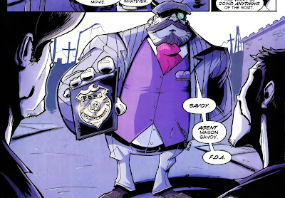
For this assignment I wanted to draw myself differently than I normally do, so I went online and searched after
“>an image of Savoy from the comic Chew as drawn by series-artist Rob Guillory. (I have no idea why I’ve never cosplayed Phillip Seymour Hoffman playing Chris Farley playing Savoy, but I know I could rock it.) I like Guillory’s style – it’s cartoony, dynamic, busy; as with Jeffery Brown’s completely different work, it makes me think I could draw a comic. It gives me hope.
I tried to capture Guillory’s sense of Savoy’s form, but left much of the interior clean, as I tend to do in larger work; paradoxically (maybe)I detail little doodles like crazy. I also colored myself for a change since I usually work in black and white.
I drew myself in SketchBook Pro using a 2.5-sized brush rather than a 4.0-sized one so that I my line would look more like Guillory’s and less like mine. I began with a blue-line drawing and then added a layer for a black-line drawing to bring into Acorn. Then I deleted the blue-line layer, switched to Acorn, and colored myself.
To make my own, I went for a popular, yet nerdy, property – The Lord of the Rings. In looking at spacesick’s use of patterns, I decided to use a ring motif to build Mount Doom and to perch Suaron’s eye atop it. I used a different color/material for each level of rings: silver for the Elves, bronze for the Dwarves, and iron for the humans. While that progression isn’t canonical, I used it to bring more color to the page and to communicate of how Middle Earth rank-orders its species. I could have made the other rings all white and left the one ring golden, but I am not at all unhappy with this design. I wonder also about linking the rings to show their interconnectedness in a chain-mail kind of way.
I used Acorn to compose the cover. I read up on spacesick’s fonts
“>here. The projector is the only element I lifted directly from any of spacesick’s covers.
Finally, I opened the image in SketchBook Pro for some final touches with textured brushes to worry the cover.
I’m really eager to see more of these designs from the ds106 community.
I’m not sure why this assignment is worth zero stars; I think it should get two.
For this task, I decided to make a children’s book cover for a hard science fiction novel – House of Suns by Alastair Reynolds. I love that book. It gives me hope.
My cover, however, gives me the giggles. It’s so profanely incongruous – and yet so weirdly apt – that it delights me.
House Of Suns for kids
I drew the cover in SketchBook Pro and then colored and lettered it in Acorn.
As I hunted down stray pixels in Acorn, I discovered that it’s much easier to draw and paint in that program while zoomed in a level or two (this is both an a-ha and a duh moment). I still prefer SketchBook Pro for drawing, but it was satisfying to find a way to draw and color productively in Acorn, as well. At the default zoom, even a medium-sized brush can disappear on-screen in Acorn because its reticle isn’t persistent. That means if you’re trying to paint stray pixels in Acorn without zooming in, you lose the tip of your brush if your brush color is the same color as your background. That frustrated me greatly, but now I know that it’s easier to keep track of your brush tip while zoomed.
I hope others will jam on the idea of making children’s book covers for novels meant for adults.
Aude aliquid dignum: dare something worthy. I try to approach teaching and learning as if they were the most worthy things I could do and help others do. I think it’s important to ask kids to do worthy work. I think it’s important that teachers dare to resist the standardization of education. I think it’s important and worthy that we talk about how to subvert the status quo in our primary and secondary schools so that learning matters to kids, their families, and their communities. So here it is:
Aude aliquid dignum
I made the image in Acorn. I tried to minimalize the sans-serif text’s presence on the page without making it illegible (I probably cut too much of the “g”). Then, while trying to stay away from the Dr. Manhattan symbol, I made a little hydrogen atom to frame the words, with the “e” inside the electron. Hydrogen is a pretty minimalist element, but the proton and electron are also the building blocks of everything else. Hydrogen can exist by itself, but atoms do great and terrible things together. We humans can do the same, inside and outside Minecraft, a game about building – and/or destroying – alone and/or in a community!
I put another atomic particle in the upper right-hand corner so that the eye would be drawn there in an attempt to connect the two white spaces with one another over distance, which made me think that maybe the electron (which wants to create a bond) is also little person or organism looking to the stars and wondering how to connect with another being over a vast distance. I think connecting is worth daring.
I found a CC-licensed picture of a glorious, insanely detailed, embroidered Moss, brought it into SketchBook Pro, and traced over Moss’s hair and glasses. I used green in homage to the show’s pixelated, primitive CGI credit sequence. Then I went into Acorn to fill it in and clean-up white speckles left over in Moss’s hair and glasses.
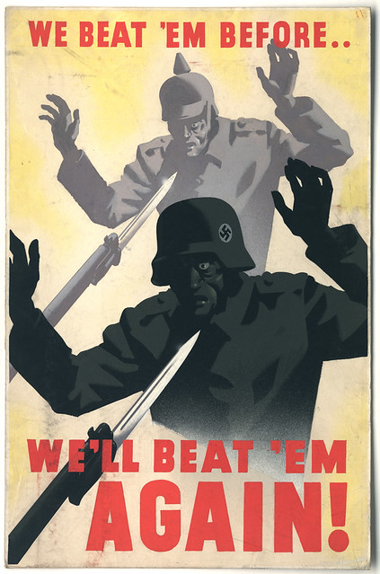
For this piece, I searched The Commons on Flickr for propaganda. I went into my search looking for an ad or poster about building a shelter. I wanted to make a visual pun on our Minecraft work. However, when I found this picture, I switched gears. I hate Creepers. I’m playing the ds106 server on survival mode right now, and the Creepers have not been kind. If you look at my stretch of the beach on the server (behind camp), you can see how much Creeper damage I’ve had to patch. Finding a way to rally against the Creepers was just what I needed to lift my spirits.
I grabbed a CC-licensed picture of some Creeper cosplay. I took a screen shot of the head and cut out the background in Acorn. Then I brought in the propaganda poster. I used the scale and perspective transformations to size, angle, and position the Creeper heads. Then I made the heads monochromatic and color-matched them to their bodies.
Beat the Creeper
Now I’m ready to go back on the sever. I hope someone will put this poster into a ds106 texture pack for Minecraft!
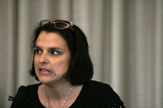
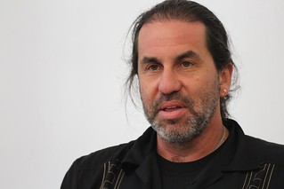
#DontBlogNow starring Martha Burtis and Alan Levine. Somehow featuring the Bava, Timmmyboy, and Slaughterhouse 4. I did a lot of cutting, filling, and smudging in Acorn. I grabbed the movie poster here. I found Martha here and I found Alan here. I sepia-toned their faces, shrunk their heads, and then altered their saturation and brightness to help their faces better fit the gestalt of the photo in the poster.
#DontBlogNow
I love how different their expressions are, as if Martha has caught on to something that Alan is asking about again. “A serial killer in a red raincoat? Really? Was that a deliberate design decision? Where?” “Over-ay ere-thay, Alan-ay! Et’s-lay o-gay!”. Why someone snapped a photo of them at this moment I will never know.
I picked Don’t Look Now to avoid making a quick and easy visual pun about a movie I loved. I despise Don’t Look Now. I loathe that movie. I will never go to Venice. I refuse to look at myself passing on a boat. Forget it.
I will, however, spend hours remixing the film’s poster.
I just wish I was better at digital production – I really like the way the poster turned out, but I wanted it to be perfect, like my utter, unutterable, intangible, illogical contempt for this Don’t Look Now.
That’s it for today’s products. As I go further into the ds106 experience, I’m trying to stick with at least a few assignments per week that push me out of my comfort zone. I also want to balance the camp nature of camp with the profundity of the learning experience available to me here. I need to socialize more with my fellow campers, too.
I try to teach to what kids are doing in my classroom; in the same way, I’m learning to design what I discover instead of trying to design what I plan. It feels good.
I did the ds106 assignment “I can read movies” where you create cover art for a book adaptation for a film you like. One of my favorite movies is the 1995 Japanese animation film “Ghost in the Shell“. It deals with cybernetics, existentialism and some badass robot fights. I think it would make a pretty good novel. As a matter of fact, the film was based on a Japanese comic book.
To make the cover art, I took a photo of a mannequin and, using Gimp, painted it’s shadows dark green. Then I painted the rest a lighter green to make a kind of contrast. This also evokes a kind of early computer screen. I added the Kanji text by copy/pasting it from wikipedia into the text box in Gimp. I wasn’t sure how to add a worn out, sort of used effect like in some of the other “I can read movies” coverart assignments.
Here is my take on the I Can Read assignment. I created a cover of the first horror movie I ever saw, The Birds. If you haven’t seen the film it’s an Alfred Hitchcock classic about a costal town in California being attacked by ordinary birds-not birds of prey.
Melanie: Have you ever seen so many gulls? What do you suppose it is?
Mrs. MacGruder: Well, there must be a storm at sea. That can drive them inland, you know.
The cover captures the theme of the movie that thousands of birds are always chillin’ everywhere. The sheer number of the birds makes this film eerie and unsettling.
The Process
I mimicked the format of Spacesick’s design. First, I uploaded one of his designs in GIMP, and cut out his work. I was left with a clean slate. Next, I found the bird icon in the NounProject. I used the cloning tool to stamp out each bird. Then I painted each bird with the paint bucket.
It was an easy process but it was time consuming. If I had the time I would create a different design, but instead I used my free time to fiddle with the minimalist poster (see yesterday’s post).
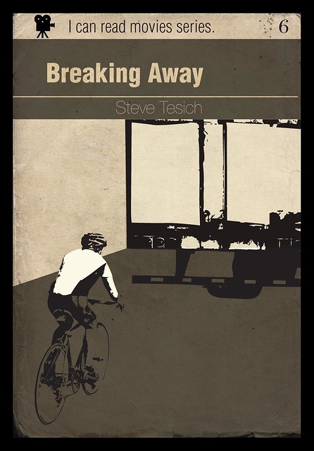
For the I Can Read Movies DS106 Design assignment, I created a cover for one of my all time favorite films, Breaking Away. If you haven’t seen the film it’s the story of four friends after high school that grew up in a college town, not feeling they were ever to go themselves. Their families all have some connection to the old Indiana limestone industry, usually as stone cutters, but the business has gone. So the local kids are derogatorily called “cutters” by the college kids and tension ensues. One of the cutters, Dave, finds escape through cycling and dreams of riding for the Italian team Cinzano. For most of the film he basically feigns an Italian accent and listens to opera – which makes for a great soundtrack actually.
This cover captures the moment when Dave drafts off a truck going down the highway. Hopefully the embed below works, as it’s my first time trying to embed from movieclips.com (lot’s of crappy unnecessary code in there).
The tractor trailer truck was a full size truck, but I wasn’t able to make it fit in the cover design. I like it a lot though and hope to find a way to use it at another time.
And this is the cyclist (possibly Lance?) and the book cover texture I can’t seem to find again. I didn’t want to use the cover templates others had done, and tried to make it from scratch to push myself to do something different in Photoshop. I could figure out how to do surface scratches, especially in dark areas revealing bits of white. I’ll have to work on that as I’m not 100% happy about it.


