We’re Gonna Do It Anyway, Even If It Doesn’t Pay

Everything is free now
That’s what they say
Everything I ever done
Gonna give it away

Someone hit the big score
They figured it out
That we’re gonna do it anyway
Even if it doesn’t pay
— Gillian Welch, “Everything Is Free”

Don’t hate me, Gillian Welch.

Not that I’ve ripped off anything from you yet. But at the rate I’m going and since you’re one of my all-time faves — it can’t be long. In my first music remix for my DS106 radio segment, I “borrowed” work from a Karoke orchestra’s version of Summertime, Mamas and Pappas, and Pat Metheny.

I’ve always taken a hard line on copyright and fair use issues with my grad students, believing that they are the last defense for their students to learn to respect the intellectual property of others and their own. One memorable gray area was when Scott used the Beatles’ recording of “Eleanor Rigby” as the soundtrack for his video response (bookcast) to Laurie Halse Anderson’s Winter Girls. He really liked the connection he saw between the anorexic protagonist in Anderson’s novel and Eleanor’s loneliness.

But I thought that he was not using the song in a transformative manner, so advised against. Then he came back with his own rendition of the song that he played on his guitar and recorded. I still think he was wrong to use the piece; the song is not his intellectual property even if he plays it. And I don’t think it’s integral to his piece. Sometimes I worry that we take the easy way out and use popular songs because listeners tend to respond to those faster when we could do a better job if we used our craft to tell our story.

Yet, I’m a huge fan of Pogo of Perth with his unique style of remixing films (most famously, Disney and Pixar films), creating music using syllables, notes, chords, and sound effects only from the movies. His work is transformative, I would argue, and he adds a special value for the public that didn’t exist before.

This is not the first time I’ve grappled with copyright and fair use and make my case in this post for the use of copyrighted materials to be transformative.

So in creating my piece for my cabin’s DS106 radio show, I appropriated up to 30 seconds from the Mamas and the Papas’s “Dancing in the Streets” and Pat Metheny’s “Letters from Home” plus a few seconds from a Karoke version of “Summertime.” How do I feel? Surprisingly, confident that I did nothing wrong and I don’t think it’s rationalization.

The music was integral to the storytelling — not something I chose because it was pretty or I liked it. In each case, the music “chose” me because it was referred to by my those who participated in my inquiry. So is it transformative? You know, I actually think so because I do think I remix music and neuroscience research to share some pretty interesting findings.

Would my piece pass the YouTube test if I uploaded it there? Well, probably not. That’s why I think the work done by Larry Lessig and others in helping us understand that copyright laws need to change to reflect the “art” that we can create today using digital tools. It’s way past due. The only approved uses included in Section 107, US Copyright Law are those of “criticism, comment, news, reporting, teaching, scholarship, or research.” Art that doesn’t fit in those categories is ignored. Tim Wu does a laudable job of helping us frame our questions for this digital era.

One of the questions I’ve framed is inspired by Creative Commons and the encouragement of the Open Educational Resources Foundation (OER Foundation) that creators share their work openly and freely through a BY, attribution-only license. There’s a really interesting discussion of this move to encouraging everyone to choose a “BY” attribution-only tag for their work in Lisa M. Lane’s post, “Why CC-BY Just Isn’t Good Enough.”

In the spirit that “learning should be free for all,” I’ve lobbied for all of the work I develop for online teaching to be free for all — those seeking accreditation pay while those interested in learning for learning’s sake pay nothing. So far, North Carolina State University and the professional associations I’ve developed online courses for have agreed.

But as a free-lancer, I still grapple with how to license the work that I do that is not commissioned. Stories like Alec Couros’s encourage me that there may be good reason to opt for the CC-NC-SA. Ultimately, I’m with Gillian — I’m going to create anyway, even if it doesn’t pay.

I was inspired to create a poster to highlight the Open Educational Resources (OER) and Creative Commons connection. It was the first time I’d attempted to use GIMP to cut and insert objects so I learned a lot. I’ve still much to learn about being precise and smoothing the edges after cutting. I also explored the use of multiple typefaces which has always seemed pretty scary to me. It’s sort of like matching plaids and florals — tricky but effective when done well. In this case, I followed the advice I’d read and used a sans serif title and a serif message that reflected the roundness of the Creative Commons typeface. Would love any feedback on whether or not it works.

Cat eyes with oreo pupils

I CAN HAS OER THROUGH CREATIVE COMMONS!

Creative Commons Poster

I found the assignment to create a CC poster more difficult than I imagined, especially after struggling a bit with the Postcard assignment.

The assignment here was:

Use creative commons licensed images to design a poster about how groovy Creative Commons is! Use a tool like Compfight to find creative commons licensed images in flickr (be sure to select the right option on the search pane), and then use photo editing software to add your message, call to arms, rallying cry, urgent plea. Include as well a creative commons logo– look to the creative commons itself for ones to use.

Most importantly, in your poster be sure to give attribution credit to the source image.

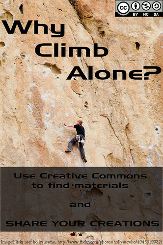
I didn’t have an obvious direction I wanted to go on this project, so just browsing CC-licensed images didn’t get me anywhere.  My sense of Creative Commons is one of easier sharing of creative efforts, but I didn’t know quite how to convey that.  Then I saw an image of a mountain that struck me and I thought of the collaborative work needed for most people to climb Everest and other tall mountains. [I know there are a few solo climbers still, but that's not the norm for most climbers.]  It got at the notion of creative practice being a collaborative effort, of building on the work of others, even if we don’t often think of it that way.  Unfortunately the image I saw was CC-licensed, but derivative works were not permitted (an apparent weakness in the Compfight search engine, unless I just missed that option).

So then I just started using Flickr’s advanced search for CC-images that allowed derivative works of mountain climbers and found this one from Flickr user hollysuewho.

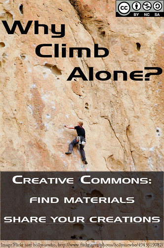
At that point, it was a matter of getting the right Creative Commons logo (hollysuewho’s photo was Attribution, Non-Commercial, and Share Alike, so my derivative work needed to be the same license), and figuring out the text.  I like the top slogan, but the bottom is still to wordy for my liking.  Still, it gets at both aspects of Creative Commons that worth advertising: use the CC-licensed materials that are out there AND share your own works that way.

I had some issues with using Photoshop to shading the bottom part and I’m still not happy with how it looks, but I would spent too much time fiddling with it. So, here it is.  Thoughts?  Recommendations?

Creative Commons Poster


UPDATE: After comments by John and Alan (and conversation with my spouse, @jenorr, I did a new version of the image that I’m much happier with.


CC Poster--Revised text

Creative Commons: Irrigation System of Knowledge

Creative Commons Poster

cc licensed ( BY NC SA ) flickr photo by englishspartan : www.flickr.com/photos/31151097@N06/4173243665/


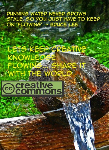
This is the Creative Commons poster I created. When I think of CC, an irrigation system comes to mind. We want to be able to share our creative works with everyone, because it will feed more creativity and knowledge. When we don’t share our knowledge with others through teaching, application, etc… it becomes stale and almost useless in my opinion.

CC Rally Poster!

CC

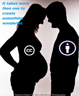
As soon as I saw the image of the kids pop up as the image for the assignment I thought, I am going to use a pregnancy photo. I knew I wanted to portray the message that it takes more then one person to create life. So I used the phrase “It takes more then one person to create something wonderful.” This was to be used metaphorically with the idea that creative commons wants people to be able to share there creations and ideas so that others may use them to well…create something wonderful! I went ahead and added in the symbol of creative commons (CC) and the symbol of the “By owner” to my photo and put in small lettering at the bottom who the photo originally belonged to. The original owner of the photo has a CC of “some rights reserved,” she just wants her name credited with the use of her photo. I then chose blue lettering for my “rally poster cry” so that it would pop out to the viewer, seeing how the rest of the image is in grey, black, or white.

Mission: ds106 – support Creative Commons with a poster

I went all over the place on this one. I wanted to do something with cloning, clones’ rights, and the future, so first I thought I might use a picture of clone troopers (who might thank you with candy), but I decided not to mess with licensed action figures. Then I remembered a pair of mastrobiggo pictures (here and here), but I like the pictures so much that I couldn’t bring myself to add anything to them. Plus, Apple products – what the heck do I do to them without irony?

Back to the clones. I searched for “mirror reflection” and found “Multiple Mirror Reflections” from the_exploratorium. I grabbed the picture and brought it into Acorn. In Acorn, I added the text and pasted and tweaked a CC logo. I enjoyed using the_exploratorium’s image for this assignment because I could desaturate and darken it a lot without losing too much of its color or any of its structure.

I try to work with 4:3 and 3:2 ratios, so I let the darkened top field take up about two thirds of the height of the image without worrying too much about the extra space under the text because I like the way the line between light and dark interacts with different faces at different heights.

Here’s the poster:

Your clones will thank you

Your clones will thank you

I have no real idea how CC might apply to clones, and I fully expect debates about whether one can claim any rights over a clone in the first place. I worry (without enough learning) about the precedents set by genetically modified crops and seed rights. I hope the tagline can be read as all at once sincere, provocative, ambivalent, and ambiguous.

I am glad to have made the time for the poster before design week officially ends. I hope it appeals to another nerd who is as interested in The House of the Scorpion as I am.

Poster Advice

It was difficult to decide on a picture to use, I searched through the creative commons on Flickr for a while before I decided on this one. I got the idea for the text from my friend, her  big saying was always “I’m bored lets go make memories”. So when I knew I was going to use that I looked for a picture I thought fit. I chose this picture because of personal experience, every summer I visit my family cabin outside of Yellow stone and we go white water rafting at least once so although this picture is Kayaking it was close enough for me. I  opened the picture in paint and added the text. I think it sends a positive message and I would certainly hang a poster like this up in my room.

Creative Commons Poster

ds106 Design Assignments

My goal with participating in ds106 (in whatever way that played out) was to learn something. I’ve only scratched the surface but I’ve learned quite a bit about GIMP and Photoshop today. In addition, without putting in much effort (as I probably should have done) I am looking at design differently, more aware of choices made and how those decisions impact the overall view of an item. Again, lots more to learn but I’ve gotten started.

I had to make some lame workarounds to create my CC poster because I’m not yet proficient enough in GIMP or Photoshop. That said, I’m fairly pleased with how it turned out. Here’s the original picture from Mean and Pinchy on flickr:

Here’s my take on Creative Commons:

The next assignment I attempted was If Movie Posters Told the Truth. I’m less pleased with this work because I know if I had more patience I could fix the ‘bad script’ part to look more a part of the poster. Unfortunately it’s late (for me) and I’m not a patient person in general. 
I picked a movie I can’t stand because that seemed more fun. It required inventing a new word but it captures my sentiment pretty accurately.
Finally, I tackled Iconic You. As simple as this looks, it took me a while because I kept trying to make it do too much. I could not come up with one thing to illustrate me and I wanted to create something that included a lot of the ways I define myself. This design came pretty quickly but I spent a lot of time trying to add more to it. I thought about using the top of the music note to be waves and add something to symbolize biking and running in order to show my participation in triathlons. I thought about adding some little faces to the apple to symbolize my children and husband. After trying some of these out and not liking anything, I got back to the simple. It may not show everything that matters to me, but I like it.

Flock Together & Share


“Sharing is Caring,” words my mother instilled in me a long time ago. I found this picture on the Creative Commons website and it looked as if all the origami birds are looking over and reviewing something. That is where I got the idea of  ”Flocking Together.. Sharing Ideas.” I also like how each bird is a different color and for my it symbolized different cultures. Or maybe I just read in to it a little too much.

I feel that this picture really shows what the Creative Commons is about. I know it’s a tad bit corny, but a bunch of birds together is a flock, and the creative commons allows you to share work with many people. Sometimes when sharing things you have to be sure that you aren’t doing anything illegal and I believe the Creative Commons allows you to share works without the fear of being punished.


For More. Click Here. –>>[Support Creative Commons with a Poster]<<–

ds106ing Creative Commons Posters

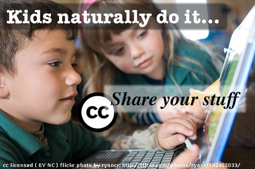
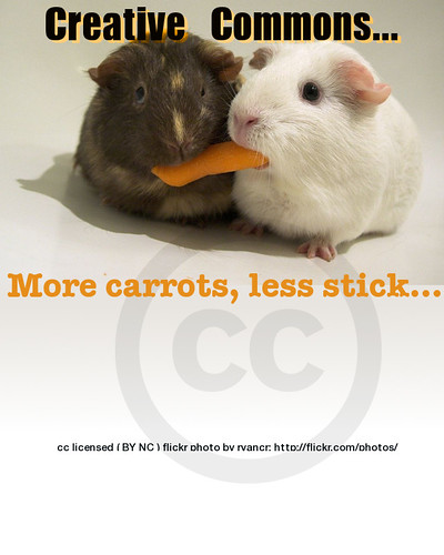
Martha and I are adding a new element to the ds106 syllabus area on design, we want students to get practice understanding creative commons by seeking licensed media and then doing a design assignment using it- make a creative commons poster

Use creative commons licensed images to design a poster about how groovy Creative Commons is! Use a tool like Compfight to find creative commons licensed images in flickr (be sure to select the right option on the search pane), and then use photo editing software to add your message, call to arms, rallying cry, urgent plea. INclude as well a creative commons logo– look to the creative commons itself for ones to use.

Most importantly, in your poster be sure to give attribution credit to the source image.

Lest you think we want blind allegiance, if you do not like creative commons or want to have fun with it, do the opposite; create a poster that makes a case that creative commons is a commie pink plot of subversion. This is the thing about ds106- you never should take the assignments literally- mess with ‘em.

To get this going, I quickly put together some posters in GIMP (I miss Photoshop, I miss Photoshop, I miss Photoshop, I miss Photoshop, I miss Photoshop, I miss Photoshop…) doing some simple layering, using fills with background to make text more readable, some transparency fudging. I had trouble getting my attribution to paste into the text editor box, so I resorted to putting it in a text file, and opening it from the file.

Here are two posters to seed the pot


cc licensed ( BY ) flickr photo shared by cogdogblog


cc licensed ( BY ) flickr photo shared by cogdogblog

Support Creative Commons With a Poster

Use creative commons licensed images to design a poster about how groovy Creative Commons is! Use a tool like Creative Commons Search to find licensed images and then use photo editing software to add a message, call to arms, rallying cry, urgent plea.
Include as well a creative commons logo– look to the creative commons itself for ones to use.

Most importantly, in your poster image be sure to give attribution credit to the source image.