The Big Caption

For this assignment, I took a photo from http://www.boston.com/bigpicture/ and added text to it to change the meaning of the image. The photo is a girl during her graduation who is happy, but I decided to change the message by adding the text. I used Photoshop, and got the text from this website.

I was trying to come up with a more clever phrase, but couldn’t think of one!

I’m a red sox fan I swear

I looked through the images provided on the link and as a red sox fan this was easy to alter to a different message. You would think they won the game already but I decided to go with the opposite.

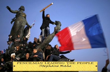
Pencilman Leading the People (The Big Caption)

In the spirit of The Big Caption take any photo featured on The Big Picture and add typographical text elements in a way that changes the message. (The Big Caption)

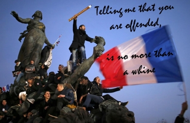
Adding text to a photograph from news agency feeds can only go in one or two ways – politics and comedy – or maybe also funny politics. Having chosen this image showing a response to the Charlie Hebdo attrocities, when people took to the streets of Paris to demonstrate their solidarity with the victims, I wasted quite a bit of time thinking about a political caption that didn’t ‘change the message’ so much as underlined or added to it. I had not taken in the instruction properly and stumbled around with a paraphrase of Stephen Fry that was too complicated to play with.

offensive whine2

So, I resorted to comedy.

For me, the attraction of the image is the man holding the massive pencil in the air. This made me think about a superhero, ‘Pencilman’. The obvious visual reference in the photograph is to Eugene Delacroix’s painting Liberty Leading the People (1830), and so the caption was designed in the style of an exhibition attribution plate fastened to the frame of a painting. The figure of ‘Liberty’ is simply imagined to be replaced by the less symbolic figure of ‘Pencilman’. The caption was built from shapes and textures in PowerPoint and exported as a JPG. On reflection, having the plate on the image rather than on the frame looks a bit awkward, but I like the jokey reference to the romantic revolutionary painting that the photograph resembles.

pencilman leading the people


The Big Caption – Design Assignment #2

SOCCER-WORLD/

This photo was an easy choice for me as the Quarter-finals for the World Cup are going on. Today Brazil and Colombia are playing at 4:00pm on ESPN. I found this picture on the big picture website. The link to the original picture is located on http://www.boston.com/bigpicture/2014/06/2014_world_cup_goalposts_around_the_world.html. I used the native application on Apple to edit the picture. Using preview, I was able to add text to the picture. I have outlined the step in the following picture. Screen Shot 2014-07-04 at 3.51.16 PM

In the text box image with the “Aa,” I added “Goal!!!” to the picture. In that same drop down menu, I was able to change the color also to lime-green.

Caption that

For my last star design assignment of the week I chose “The Big Caption,” mainly because it was one star and that’s all I needed.

For this 1-star assignment all you have to do is pick a picture off of “The Big Picture” and add a typography caption so that it changes the message of the photo. I had no idea what typography was until about a week ago. I mean I’ve seen it before, but I didn’t know that’s what it was called. Though I understand what it means, I’m not really sure what I did in this picture is considered typography. I looked at some other examples and so based on that, I think my work can be considered typography, but then again maybe not. Please let me know what you think!

For my picture I chose an image of the Northern Lights, which are gorgeous! Can you imagine seeing this in person?! Amazing!

APTOPIX Norway Northern Lights

When I saw this picture, the caption immediately came to me. I don’t believe aliens are real, but I thought this picture was to good not to add an alien caption too. I created this in Picmonkey.

APTOPIX Norway Northern Lights

Feel free to give me some help on improving my typography! I’d love to learn more.

Star Point total:15/15 DONE!


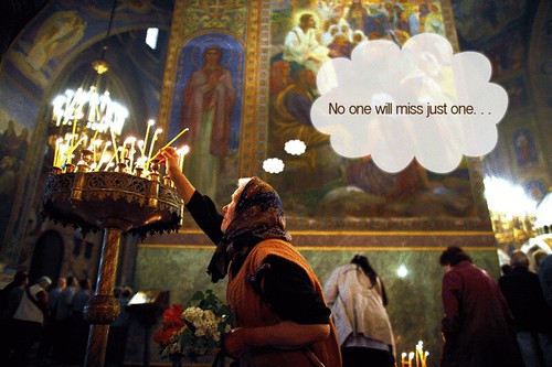
Wax Ain’t Cheap, you know

I completed the Big Caption today for another design assignment. The idea behind this one is that you take a photo from the Big Picture Web site and you recaption it so that you completely change the original meaning of the shot. 

The original caption on this photo: 

A worshipper lights a candle as she attends Sunday Mass led by Patriarch of Moscow and All Russia Kirill and Bulgarian Patriarch Maxim in Alexander Nevski cathedral in Sofia on April 29, 2012. 

I actually played with the styling of the thought bubble quite a bit to try and reduce the cheesiness factor of putting the words in an actual thought bubble. 

In any case, I’m pleased with it. It makes me giggle. 

The Big Caption

Captioned this photo with http://wigflip.com/roflbot/ for the big caption assignment http://assignments.ds106.us/assignments/the-big-caption/. I taught i would just add a little humor to a pretty serious image

Merry Christmas! Love, the Zielinskis

Meet the Zielinskis: Katarzyna, Gustav (yes, he is adopted), Jozef, Marcin, and Wanda.  Every year since 1974 (When little Katarzyna was the only Ziel-baby and just 3 months old), Mrs. Zielinski gets the kids together to take the annual Christmas card photo.  Every year they do something that plays on the last syllable of their surname.  1998′s toboggan themed card was a huge hit!  The slalom idea Marcin suggested in 2003 ended with a great action shot but poor Wanda has been afraid to ski ever since!

The Big Caption

I wanted to do a quick little design assignment and decided to do The Big Caption.  I found this photo and immediately loved everything about it.  The colors all look great together, the staggered windows add a ton of visual interest, and the facial expressions are priceless.  It reminded me of something you’d find here.

I saved the picture to my desktop and then added the font using Picnik.

The image is from the Boston Globe’s Big Picture section: http://www.boston.com/bigpicture/

Assignment Details

DS106 – “So you think you can dance!”

Today’s DS106 “Design” assignment is one that has a creative application in middle and senior year classes. Tim Owens submitted “The Big Caption” which he describes as:

In the spirit of http://thebigcaption.com/ take any photo featured on The Big Picture (http://www.boston.com/bigpicture/) and add typographical text elements in a way that changes the message.

I was amazed at the wealth of powerful, newsworthy, “large format” images that were displayed on “The Big Picture” web site. Undoubtedly teachers and students studying current events need to explore this superior resource.

As I viewed the various photos on this web site, I tried to look at each picture, in turn, through a “different lens” in order that I might change the intent.  For this assignment, I selected this rather serious photo, taken on February 1st, showing marching Afghan police during the authority transfer between NATO and Afghan security forces. Please be assured that it is not my intention to poke fun at the Afghan situation in any way. However, during this assignment I was challenged to alter the image’s message by attempting to create a humourous situation from ones that were definitely serious or tragic.


When I saw each left foot raised in unison, I immediately thought of the “Hokey-Pokey” song and dance. Next I spent considerable time exploring the standard default fonts that were displayed in Photoshop Elements. Although I tried several different styles, I did not find a font that looked “musical” to me. Rather, than be stymied at this point, I wondered if there were any free True Type fonts that I could find on the Internet that I could download and install on my computer.

Imagine my delight to find “Fontspace.com“, which claims to have a collection of 16,678 fonts for Windows and Macintosh computers. I browsed through 10 pages of fonts in the “Music” category and downloaded the following two:

I downloaded and unzipped these two compressed files to my Windows XP desktop. I then clicked on “Start > Settings > Control Panel > Fonts”. Once my current installed fonts window was open, I clicked on the “File > Install New Font” menu items. Next, I navigated to my desktop where the two downloaded unzipped files were located, selected each in turn, and clicked the “OK’ button to add the new True Type fonts to my computer.

When I returned to my “Photoshop Elements 6′” (PSE) application (which was still open) and highlighted the current text string, the newly-installed fonts did not appear in the drop-down list box. However, when I exited and re-started PSE, the necessary links were re-established and the two new fonts were now available for use.

I then used these two different fonts to enhance my captions which definitely changed the impact and message of the existing serious picture to one of humour, albeit “warped” in the eyes of some.

Take care & keep smiling :-)

Fair Use Educational Image Credits:

Playing Devil’s Advocate Through Imagery

not necessarily my own opinion, just exploring a point

have a pathological need like to argue. It’s something that I was apparently born with, as my mother insists at a very young age I was quite obviously cut out to be a lawyer. Despite my best efforts at self-monitoring and awareness of this trait, I often relapse into base level arguments when unprepared for a conversation that may challenge my viewpoints. Perhaps that’s why I was drawn to create the image above for the ds106 Big Caption assignment. While some may question the taste of the piece (it certainly doesn’t reflect my own personal beliefs), I wanted to create something that could be used as a way to provide a contrasting viewpoints, rather rational or not, to a topic of interest that students and teachers wrestle with.

In this case, I found an image from Boston.com’s Big Picture photo journalism project, an amazing look at news from around the world through striking imagery. You can see the original image of a woman looking out through the ice-covered window of a bus in Bucharest below. I took the image into Photoshop and added the text, applied some simple effects (stroke and color fill), and viola! The end result is meant to be slightly tongue-in-cheek, but the idea is to try and provide a conversation piece that might provide a contrast to a topic you’re covering in class, or perhaps just practice rhetorical skills.

A woman looks out a bus in Bucharest on February 2, 2012. (Vadim Ghirda/Associated Press)

Don’t get me wrong here, I’m not in favor of global warming, but quite often the more important discussion of how global warming will affect the lives of everyone on this planet is overshadowed by the much more mundane argument of whether it actually exists. That doesn’t sit right with me, as while I am capable of arguing over almost anything, I’d like to think that I’m discussing a topic that will lead to answers and results with greater value for everyone. Disproving global warming isn’t going to help anyone if it still happens, but talking about how cultures, countries, and citizens might have to change their long term living patterns seems as though it might be a bit more important.

I love the Big Picture site that this ds106 assignment is based upon, and the idea of captioning of striking image with a humorous, insightful, or other type of caption was made popular by the Big Caption website (warning: not all images and captions are appropriate for the K-12 setting). Forgetting the captions for a moment, there is a near constant flow of amazing images from around the world on the Big Picture site that could be used for classrooms talking about current events, or want a way to bring the world into their classroom in a very humbling manner (see the rest of the images from the European winter which has many homeless living in underground heating vents).

Imagery, especially such vivid photographs as those taken from around the world by professional photo journalists, can play a very intimate and important role in spurring discussion, or illustrating a point. I highly recommend any social studies or language arts teachers to give the site a look, and see what you could take from it for use in your classroom.