Truthful Movie Poster:

For the truthful movie poster I decided to incorporate our course theme of the 80’s and use one of my favorite 80’s movies The Breakfast Club. The assignment asked me to edit the title of the movie to a more truthful title or more explained title. I changed this one to Detention with Friends because the entire premise for the movie is these students who all got detention and didn’t know/like each other but get closer due to their time together. I used photoshop to edit this picture. I started with the clone stamp tool to cover up the old title, and the text tool to type the new one.

Truthful Movie Poster

Guns, Bullets, Action… As Expected.

This assignment was fairly easy as compared to some of the other ones I have worked on as of late. I had just went and seen this movie with my father last weekend and I remembered my expectations of it before watching it. My “truth” pretty much sums up my expectations and what exactly the movie was about.

When I googled the movie poster I had several options to choose from. I decided on the one I used as it had lots of space on the poster to work with for me to add my “truth” to it. I downloaded it to my phone and used an app called Typorama. The app had several fonts, typography and styles to use and this one seemed to fit and I added red as opposed to white or gray to go along with the red 3.

Oh Mamma Mia WHO IS THE FATHER?

Can you dance…

Can you jive…

Are you having the time of your life…

Well then you my friend are a Dancing Queen!

Mamma Mia is one of my favorite movies. The scenery, the characters, the ABBA music…LAY IT ALL ON ME!

However, with how much I love Mamma Mia, there is one thing that I always struggled with….I get so frustrated not knowing who Sophies’ real dad is!

For this of you who don’t know, Mamma Mia is the story of singer mother, Donna, and her daughter, Sophie. Donna owns a hotel in Greece where Donna has raised Sophie on her own. At the beginning of the first movie, Sophie is all grown up and getting married. She wants her father to give her away but the only problem? She doesn’t know who her father is. However, Sophie discovers her mom’s old diary, and that around the time Donna was pregnant with Sophie, there were three men Donna saw. She secretly invites three men from her mother’s past in hope of meeting her real father and having him escort her down the aisle on her big day.

Bu (AND SPOILER ALERT) the end of the movie comes and we don’t find out who her real dad is. Instead, Sophie agrees that she is happy to have them all three in her life and doesn’t care to learn who her dad is.

Well guess what Sophie….SOME OF US DO CARE AND WANTED TO KNOW!!!

However, this past Summer, the world found out that there was to be a Mamma Mia 2. I was so excited to learn finally if this was my chance to find out who Sophie’s dad is. But guess what….WE STILL DON’T

One of this week’s visual assignments tasked us to create an honest movie poster. This assignment caught my eye because I love movies, and it seemed like an assignment I could have fun completing! When I stumbled upon this assignment, I was actually in the middle of watching Mamma Mia 2: Here We Go Again. And I knew in that moment, it was like the ABBA gods showed me a sign that I should use Mamma Mia and make my honest movie poster.

So…here we go!

The sequel to the original Mamma Mia is called Mamma Mia: Here We Go Again. A lot happens in the sequel, but one thing that doesn’t happen is finding out who Sophie’s dad is. So, with this in mind, I decided to create my honest movie poster for Mama Mia: Here We Go Again!

To create my movie poster, I first downloaded the movie poster online. Once I downloaded it, I uploaded the movie poster to Adobe Photoshop. Photoshop is not a software that I am familiar with, so this assignment was a good chance for me to get to practice using Photoshop. Photoshop was really easy to use. Using the eraser tab, I was able to erase the Title on the movie poster. Once the title was removed, I saved and uploaded the image to Canva and added me new title. I had a lot of fun making this movie poster and it was a great chance to get a little familiar with Photoshop.

Plot?

I do love this movie, and my first time watching it, I had no real idea what was going on. I imagined it would be something like Pulp Fiction, where after a few viewings I would finally see a plot, but this movie is not a Tarantino film. I still do love it all the same, I need to find my copy tonight.

Sometimes a Fart Joke Makes You Cry

The Story Behind the Story

The human existence is sorrowful and futile, we are alone or we are insincerely together. We are traversing along a path that seems too passable. What is thrown at us we do not conquer, we simply absorb. But we have the power to see it all a little differently. Delusion is something of a gift in this world. There is a soundtrack to your adventure that you can play in your head, beautifully haunting harmonies, an acapella humming that buzzes so loudly in your ears you lose track of where you are. Your ribs are rattled by the deep baritones and your eyes squint as tears form at their corners with the pierce of the sopranos. It does not matter if what you see is beautiful with this music in your ears.


The Original Poster

In nearly every way, Swiss Army Man is the complete antithesis of my preference. I hate all things crude and crass, rarely will I laugh at a stooping slapstick joke. But sometimes a fart joke will make you cry. This film is an exquisitely strange experience, it leaves you feeling awkward and uncomfortable, ashamed and disheartened. It recreates what it means and feel like to be human. I cannot watch this movie in the presence of another person, I think it was a film created specifically to be watch in solitude. The plot follows a man who appears to be stranded on a desert island, on the verge of killing himself when he discovers the body of a man who supposedly died at sea. Soon he discovers that the partially reanimated corpse is his best chance at finding his way home, and he embarks on a great odyssey, teaching his discovered friend how to be human along the way.

The innocence and confusion of the discovered man as he learns how to become human draws the main character out of his stupor, inspiring him to change his life as soon as he returns to it. They conquer the simplest insecurities that make us all so plainly human, every moment of this unlikely tail is extremely relatable and matched with the incredible soundtrack developed by Andy Hull of Manchester Orchestra. I chose this project not because I want to make fun of this movie (which I think is really the intention of the assignment) but because I love it so dearly and yet it is so unlike me or my usual film tastes. I wanted to outline the simplicity of the plot: there are a lot of fart jokes, you’re going to feel extremely strange. But that is what it is to be human.


The Tutorial-

To make this movie poster, I first downloaded the original movie poster and opened it in GIMP. Once in GIMP, I then used the free select tool to cut out the Paul Dano and Daniel Radcliffe. Once I had completed the selection process, outlining the portion of the photo I wanted to remove, I clicked Edit>Cut.

From there, I opened another photo in a new GIMP page. With the new background open, I clicked Edit>Paste and the picture I had recently cut appeared over this background photo, but GIMP was still an elusive tool to use and I could not get the image to appear the way I wanted so I just pasted my baackground photo to a PowerPoint page and worked from there. I positioned the image the way I wanted, and added the text I wanted to. It was challenging to find a font that resembled the original movies poster but I selected “Mistral” which seems relatively similar. I recreated the Sundance Film Festival logo using an image from The Noun Project  created by Lesley Hunt.

Dunkirk

This assignment was to take a movie poster and add the truth to it. While I’m sure there are some people who are genuinely interested in Dunkirk, a movie that will be released July 21st that is about the Battle of Dunkirk during the second World War, I think the majority of people who go will be there for one reason. Harry Styles. Mr. Styles is a man of many talents and he’s added acting to that list. According to screenrant.com, Dunkirk is predicted to be one of the top-grossing movies of 2017. That is why I added “a.k.a that one movie Harry Styles is in” because his popularity will likely lead to many sales.

I’m very excited for this movie to be released. When I saw an assignment involving movie posters, I knew I could use this one I already had saved on my laptop. With the help of aviary.com I just added the text. You can check out more about the movie here. http://www.dunkirkmovie.com/

A Fun Take on a Traumatizing Movie

As suggested in Dr. Polack’s guide for this week, I chose the Truthful movie poster assignment from the Digital Storytelling Assignment Bank, in the Design section. This assignment is worth 4 stars.

I just picked a movie at random from a list of favorites I suggested to a friend. The movie I chose was Deliverance, a somewhat-disturbing R-rated classic. This rating is well-earned, trust me: I was traumatized for a while after I watched this movie, and not by something like cuss words, but by incest, violence, rape, etc…so be prepared.


Deliverance4It was an excellent movie though, and I also really love the design of this poster for it. It has an elegant simplicity about it, dominated by the title in the whitespace around the image. The question at the top and the surrealist image work together to convey the vaguely-unsettling atmosphere of the situation the four men find themselves in on what seems like a pleasant wilderness outing. The main thing I recall after that is the infamous “squeal like a pig” line in the rape scene. I knew that I wanted to reference it in my poster.

To make the poster, I used the free software of Google Drive. In a Google document (pretty much the equivalent of a Word document, but online and free!), I inserted a drawing, as you can see below.

4 Design Assignment (1)

In the “Drawing” window, you can insert an image by clicking on the image icon, as below.

4 Design Assignment (2).jpg

To insert the image, I simply copied the URL of the image as below.

4 Design Assignment (3).jpg

With the image in the drawing, I edited out the caption above the main image (by covering it with a white rectangle), which reads “What did happen Cahulawassee River?” and replaced it with my own snide take on the movie.

4 Design Assignment (4)4 Design Assignment (5).jpg4 Design Assignment (6).jpg4 Design Assignment (7).jpg

After adding the textbox, of course there were countless little adjustments with the font, size, bolding, underlining, etc. until the final product looked just like the original. It was a fun project overall; I’d definitely recommend doing this assignment to a classmate, especially with my post handy if you want to do it with Google Drive.

Taken 3? More like Liam Neeson must be an awful father

Truthful Movie Poster – “Imagine if movie posters told the REAL story about the fillm they’re advertising. Redesign an existing movie poster by changing the text/images to tell us the real story.” http://assignments.ds106.us/assignments/truthful-movie-poster/

  1. Figure out which movie poster you want (honestly hardest part)
  2. Figure out what you want it to say
  3. Add the text on top of the blank movie poster, making sure that the colors and font are at least a little similar to the original
  4. DONE = SAVE

Taken-3-Promo-Art

So when I came back from my Europe trip a month ago, my parents decided to FINALLY watch Taken 3 (they had been eagerly awaiting my return  before watching it). My dad asked me if I had seen it yet (looked pretty interesting) but I said “Nah, I saw the first one, but after that he just becomes a bad father”. So as soon as I saw this assignment I figured hey, might as well do Taken 3. Also, I watched Deadpool like a day after that and when he basically said the same thing I said my inner fangirl came out full swing. Which doesn’t really happen. Plus, do Marvel characters even have fangirls?

So the story behind this is that Liam Neeson has lost his daughter for the THIRD time (not a complete fact, but hey, this is my story). The first time was in Europe. Then it was at the mall. And finally, the grocery store. Neeson decides that what is best is to just microchip his daughter, never let her move out, and have her take online classes the rest of her life. Eventually, his daughter finds DS106, falls in love with it, and sees my post. She is slightly offended, finds out she’s been micro-chipped, drops out of all other online classes to move to Hollywood to try to be a singer with a blog. The end.

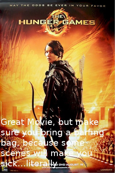
They don’t call it the Hunger Games for Nothing…..

Design Assignments – Truthful Movie Poster – (3 stars)

Hunger Games (Truth Movie Poster)

The Hunger Games movie is one of my favorite movies. It has a great plot, fantastic characters and gripping action scenes. However, the first time I saw the movie in theaters, I got dizzy watching some of the actions scenes. The Hunger Games stories in the novel have some violent action scenes,So to make the movies PG-13, instead seeing blood or gory images, the director would simply move the camera quickly just before an opponent would deliver the final blow. Its a great technique, it build tension, but also makes some people sick also. One my had even threw up in the bathroom after watching the movie.

Other by that, I highly recommend seeing the movie.

Can I be honest for a minute

Screen Shot 2015-01-26 at 7.37.16 PMScreen Shot 2015-01-26 at 7.37.16 PMScreen Shot 2015-01-26 at 7.37.16 PM


Planes-poster-1


I thought this assignment was really funny, and I knew I wanted to do it, but it was hard for me to decide (1) what movie to do and (2) what the truthful title would be. I looked through some examples, but I couldn’t think of a movie where I could play with the title. However, every movie I thought of a movie I came up with, at least to me, funny tag lines. I decided to go down that route.

I used Planes because I always thought the original tagline (From the world above Cars) was funny, and I also really didn’t like the movie Cars and don’t understand why Pixar chose to make a sequel. So, I decided to play off those feelings and make a silly little tagline for this movie.

Authors Note: If anyone actually did like Cars, I apologize. However, I recommend you watch Ratatouille because it is the best Pixar movie and will make you forget about Cars completely.