Mash Up 2

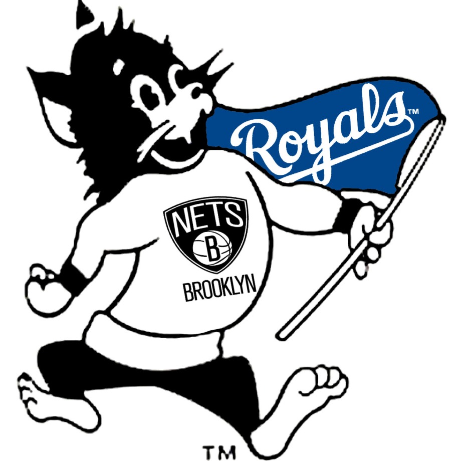
This mashup was worth 4 stars. The goal of this assignment was to combine multiple team logos to make a cohesive one. I used pixlr to edit my photos, that I got from google. I used a cavalier logo, the falcons logo and the lakers logo.

The final logo is pretty interesting… I would cheer for this team.

Royals, Nets, and Wildcats..oh my

For this assignment, Your Favorite Teams Mashup, you were meant to create a mashup picture with your favorite team logos on them. Since most of my favorite team don’t really even have a physical mascot (except for the wildcats) I decided to make Willie the Wildcat the main part here. My favorite teams on this picture shown are, Kansas State Wildcats, Kansas City Royals, and the Brooklyn Nets. I used Photoshop to edit together and this project was pretty fun!

willienetsroyals

P.S. sorry that the Willie is a little fuzzy, I tried to find a large photo that wasn’t blurry/fuzzy, but with no luck this was the best I could do….

Capital Wizards

For my next assignment, I chose to mashup two different sports team logos. I decided to use the curly W for the nationals and the Wizards logo for mine. I’m not super into sports so I just asked a friend what his two favorite sports were  and decided to use those logos. I used Gimp to remove the W from the middle of the Wizards logo and then added a layer that was the curly W. I had to make the background of the curly W image transparent and scale it so it was small enough to fit where the W is. I then used the paint bucket to change the color and make it as close to the blue in the wizards image as I could. While it wasn’t super creative in terms of the logos I could’ve used, it was challenging to combine them and remove the background around the original logo images (I’m super challenged with photo-shop related things). Here’s the final product!

mashup

Sports Team Remix

For my first remix, I chose the favorite sports team mash up. I am from Charlotte, North Carolina, home of the NBA team, the Charlotte Hornets, and the NFL team, the Carolina Panthers.. so obviously I had to choose them. Plus! They are my favorite.

I remixed it and my result was to incorporate art by Jackson Pollock with my picture.

Screen Shot 2016-04-06 at 4.24.48 PM

Below is a screenshot an array of Jackson Pollock’s pieces, so you can get an idea of what they look like.

Screen Shot 2016-04-06 at 4.33.48 PM

Here is my final remixed product:

Screen Shot 2016-04-06 at 4.31.42 PM

I created this using a website called sketchpad. It allows you to draw up your own creations. I imported a picture of my two teams. I placed them in a way so it looked as if they were having a stare down. They look like they are in the perfect position to attack each other. Then I used the pen tool on sketchpad and did a bunch of scribbles to mimic Jackson Pollock’s art. I tried to choose colors that would sort of match the mascots I used. It was fun to draw a bunch of random marks and then discover that it actually looks kind of cool!

Sports Teams Mashup

The Work Itself 

This assignment is titled “Your Favorite Teams Mashup“, its instructions are to “combine the logos of two or more of your favorite sports teams. Don’t just create an image with the two logos next to each other! Make the final logo look natural and cohesive.” It is currently rated 3.5 stars for difficulty. I mashed up the Oilers logo, Georgia Tech Yellow Jacket, and Falcons logo together. Here it is on my flickr.
sports-mashup-


The Story Behind The Story 

In this case, the yellow jacket is prey for the falcon. To observe the land better and for hunting purposes, the falcon likes to perch atop tall places and see what is below. The falcon finds a oil rig tower (oilers logo) and sits on top until it sees its prey. Eventually the falcon spots a yellow jacket, the falcon swoops on top of it, and grabs it with its talons. It brings the prey back to the oil tower, where the falcon will eat the yellow jacket. I chose these logos because I wanted to make it as realistic as possible and as relatable to nature as possible.

The Process, Narrated 

I googled searched an image of the “Oilers”, “Georgia Tech Yellow Jacket”, and “Falcons logo”. I then opened up Pixlr Editor. I inserted each image as a “layer” into from my desktop into Pixlr Editor. I then used the shaping/cropping tool to position and either minimize or enlarge the photos as I desired. I used the paint bucket tool to fill in the background color all white. I horizontally flipped the yellow jacket so it would be facing away from the falcon. In this position the yellow jacket appears dead or more so than if it were facing towards the falcon. Here a few photos to document my process.

Screen Shot 2015-11-18 at 7.00.56 PM


Screen Shot 2015-11-18 at 7.25.03 PM


Screen Shot 2015-11-18 at 7.23.42 PM

Favorite Team MashUp

For this MashUp Assignment I chose the Your Favorite Teams assignment (3 stars). The basis of the assignment is to mix together your favorite team’s logo into one logo. The goal is to make it work together as if it could be an actual team logo. Here’s my design:

Baltimore Logo

As you can tell I’m a big Maryland sports fan. I combined three of my favorite teams the Baltimore Ravens, Baltimore Orioles, and University of Maryland Terrapins. I got started loving Maryland sports teams by my Mom’s side of the family. My Poppop loved his Maryland sports and started me loving the Ravens. The Ravens are the team I follow more than the others. Some people would say I love them a little too much. I don’t follow the other two nearly as much. I’m not a big baseball fan, but if pressured I would definitely keep with my roots and say Orioles. The Terps come from my Mom. She went to college at the University of Maryland and if I watch college football we always find their game.

To make this new logo I took pictures off the internet and then used the lasso to copy/paste them into a single frame. I then had to remove remaining edges and do some touching up around where the Ravens symbol covers up the M on the Terp’s chest. I wish I could better blend the Oriole head onto the Terp but the color schemes are so different. I didn’t want to mess with either so they could still retain some aspect of their previous association.

New England BruPats

For my third Mashup assignment I did the Favorite Teams Mashup. I decided to combine some of my favorite Boston sports teams together. I combined the New England Patriots logo with the Boston Bruins logo using gimp. I wasn’t sure which teams I should combine but I ended up going with a couple of retro logos from each of the teams. I used the retro Patriots logo and an alternate retro Bruins logo. I thought it would be pretty generic to just combine a couple of the logos used now.

I found the classic Pat the Patriot logo that they used to use and inserted as a layer into gimp. Then I added in the Bruins Bear logo in and put it over Pat the Patriot’s head. Then I was able to merge layers.

PatBears

I like the way it came out. It looks a little goofy but I think its pretty funny hopefully you all enjoy the mashup of these two logos.

Favorite Team Mashup

This assignment was funny, I enjoyed making it so much I did my tutorial on it. You can see my tutorial here. I decided to combine the three favorites teams of my household; the Redskins, the Bears, and the Capitals. You can see my process in my tutorial.

Bears Caps Redskins

The New Logo For Baltimore Sports

I decided to complete the Your Favorite Sports Teams Mashup. For this assignment I used the Baltimore Ravens and Orioles logo.

Ravens logo 2 orioles 3


Then Using photo shop I cut out the O logo and merged it onto the Ravens logo. I used the magnetic lasso for the process. Then I used the clone stamp to fill the inside of the O with purple and edit the purple around the orioles logo. It took a little time but I enjoyed this one because I love Baltimore Sports.

Baltimore Sports Logo

3 stars

Heatskins!

Heatskins

http://assignments.ds106.us/assignments/your-favorite-teams-mashup/

For this assignment I decided to find two teams (Heat and Redskins) and combine their logos together. I used PowerPoint to make the logo, and managed to fit them over each other to be like a Redskin comet. In the end, I decided on the team name the Heatskins.

I decided on these teams because I was looking for emblems that had relatively similar color schemes. I was also looking for some emblems that had somewhat similar shapes so they flowed well together. The Redskins’ emblem seemed to fit very well with the Heat emblem and I for one thought it turned out very well. It really hold that comet, like appearance.

Let me know what you think!

:)