For my first assignment this week I took a little spin off the Consumer Mashup assignment. I wanted keep with the 1980’s theme so I looked up the most popular 1980’s brands for inspiration.
I decided to focus on food and began to look into Pepsi and Coca-Cola products of the ’80’s. I specifically looked at “New Coke.” New Coke was released in 1985 as a reformulated Coke. Coca-Cola stocks had been slipping during this time and Coke wanted introduce something that they hoped would reignite people’s interest. Unfortunately, New Coke did not have the intended effect and was short lived. It was briefly rebranded “Coke II” in the 90’s, but ultimately was pulled from the shelves. It made a brief come back as a promotional tool recently for the newest season of “Stranger Things.”
Opposed to Coca-Cola, Pepsi was fairing quite will in the 1980’s and its product were rapidly expanding in the global market.
Given that Coca-Cola and Pepsi are arguable the biggest soda competitors of our current age, I decided to mash them together. I first found a stock image of the New Coke product and then found the Pepsi logo used in the 1980’s.
New Coke on the left courtesy of Fox Business and the Pepsi logo of the 80’s courtesy of design hill.com.
The next step was to upload both images into Photoshop, erase the coke brand from the Coke can, and isolated the Pepsi logo. To isolate the Coke lettering I color matched the red and silver coloring of the can and simply colored over the letters. To isolate the Pepsi logo I selected the circular logo with the “Quick Selection” tool in Photoshop and the hit the masking tool.
My original design utilized another Pepsi logo used on their 1980’s cans; however, I thought it was too plain.
In the end I opted for the circular Pepsi logo and layered the blank New Coke can with the new Pepsi logo. Here is the finished result:
It’s not perfect, but given Photoshops inability to cooperate with me while I was making it (some added technical difficulties, I don’t normally have with Photoshop), it turned out ok.
For this assignment I was asked to take two iconic movie scenes or images and combine them in an unnatural way that makes you think – yeah, that doesn’t belong there. I chose the iconic scene from Titanic, and the Millennium falcon from star wars to fly in the background. I used photoshop to create this mashup and it is worth 4 stars!
Consumer Mashup:
For this assignment I decided to use my favorite company (and most often used) Starbucks! I used photoshop for this assignment and simply painted over the original lettering and added my own text in to replace it with my favorite drink. I also used a coffee cup clip art on the sides to replace the stars that were there before! 4 stars!
This is my final assignment for the assignment bank. I picked the one where we have to edit a logo and have it include one of my favorite things from the place that the logo was made for.
I took my favorite place of wawa and added a cup of coffee in the bird’s mouth. It looks like the bird is carrying the coffee, which of course it what I always get from wawa.
For my second assignment I did a mashup where I take a logo from a business and add something to it to show my favorite product from that place (3.5 stars). I decided to go with Sephora.
My favorite thing to buy from Sephora is eyeshadow singles and pallets. When I decided to do this I did not realize how creepy it was going to turn out. However, the reality of this creation has inspired a new story to attached with it. Anyone who has every been to Sephora knows that when you go with no makeup on you instantly feel judged. You can feel the employees watching you with their perfectly lined eyes wondering what an amateur is doing in their store. I do not wear make-up most days right now so I have definitely been feeling this stare. So this image, originally intended to be a simplistic edit to an already minimalist design, has become the judge-y eye of the Sephora employees.
I love coffee, but I really love iced coffee. Every morning, regardless of the temperature, I grab an iced coffee from Dunkin’ Donuts. That’s why my mind immediately went to Dunkin’ when I stumbled upon the Consumer Mashup assignment. This assignment required me to redesign a company’s logo by incorporating my favorite product. Using Photoshop, I removed the hot coffee image from the Dunkin’ Donuts logo and replaced it with an iced coffee. Then I edited the text to read, “America runs on ice”. I think I should get this made into a bumper sticker for my car because this actually sums up who I am as a person.
These two logo mashups were great. The North Face is one of many people’s, including my own, favorite brands and is known for it’s really simple text logo. The cliff logo is from Prudential Financial and is also relatively clean and simple.
Choosing all black made things really simple and made the overall design and look of these mashups even better in my opinion.
The second mashup is of the Playboy Bunny, which I always thought to be funny, and IHOP. Because what else do Playboy bunnies eat? This one was definitely more humorous than the first, but kept the same simple all black stripped-down type of design aspect that I think works incredibly well in todays markets.
Todays blog is focused entirely on how I completed the Consumer Mashup assignment. This particular assignment is found within the Mashup Assignment section on the ds106 website.
Whilst I was cycling through the different Mashup Assignments using the random assignment shortcut, I found this task caught my attention the most. Looking into the assignment brief, the task was to “Think of anyplace you spend money, and what you most often buy at that place. Then redesign their logo to incorporate your favorite product“. This assignment seems very different, I like how it is made personal to everybody because you have to think what product do I buy the most, where is it I’m buying this product and how can I incorporate this product with the logo of the place I’m buying it at. Most peoples results are going to look very different as we all buy different things from different places and mainly have different creative outputs to design digital media. Here is an example I looked at to further help to grasp the concept of the task, as you can see by the example the logo created was obviously personal to the creator.
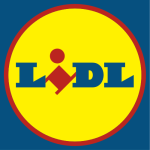
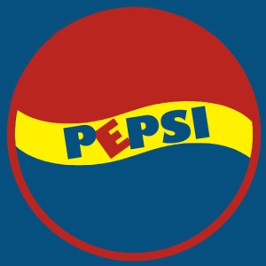
I started the process by having a brainstorm of what type of things I buy the most and where I shop the most. Different things sprung to mind, my first thought I was of clothing as I often buy cheap t-shirts from River Island. The only other idea that works as I don’t buy too many things would be to choose something food related as like most people I shop at supermarkets. I decided to go with the supermarket idea so the item I buy the most is Pepsi and the place I buy from the most is Lidl.
To get an idea of how I would incorporate Pepsi and Lidl logo together I looked at a few more examples of what other people did for this assignment. Here is the example to somebody else’s assignment.
This logo helped me out to get an idea on how to merge the two things into one. If you check out this persons example you’ll find the person (Amber Lynn) has merged the cat food brand Whiskas together with American supermarket Target. The logo she created is a great basis to go off of. I personally think it is a very simple, quickly done creation. I plan to use this method of combining logos, though I plan on using Photoshop to add more precision and detail into my logo.
Now i’m going through the process I went through on Photoshop in order to create my logo. The first step I went through to create my logo was importing both Pepsi and Lidl logos into Photoshop to make them ideal to be merged together.
The first step I took after importing the Lidl logo was to remove the text so I can have a nice template to work with. The way I removed the text was by simply using the paint brush tool to paint over the text with the same colour of yellow which effectively removed the text.
The way I made the Pepsi logo ready to be merged was done by changing the original red and blue to match the shade of red and blue used in the Lidl logo, this was done quite easy using the colour sample tool to get the exact shade. I then removed the white background behind the Pepsi logo so it wouldn’t cover any of the Lidl logo. To finish the Pepsi logo off I added the red ring around the edge of the Pepsi symbol enabling it to fit in flush with the Lidl logo.
The image above is what was created after both the edited logos were merged together. This was done by placing the edited Pepsi symbol on top of edited Lidl logo. At first glance you cant really tell its a mix between Pepsi and Lidl so the final step to do was to add the text on top of this image. Above is the finished product, once I added the text to it, it really has come to life. All I had to do was type out the text find a fitting font and single out the ‘E’ which I made red and tilted over just like the red ‘I’ on the Lidl logo.
I don’t really know why this caught my attention, I guess it’s because I seen this as a creative challenge I wanted to tackle. This was a really fun task I enjoy assignments where I’m allowed to let loose a bit and come up with my very own creation or take on things. This is a great task for everybody as most peoples outcomes should be very different.
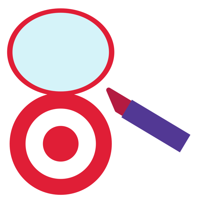
This is my response to the Consumer Mashup assignment, worth 4 stars. I had to take one of my favorite retailers as well as what I like to buy there and make a new logo. Target is one of my favorite places to shop and makeup is something I like to get there. I started by replicating the Target logo. Then, I made the lipstick tube. I noticed that the logo just felt empty. It seemed like there should be something more, so I added the top ellipse and turned the Target logo into a portable Makeup mirror. I’d totally buy one like it. The logo ended up looking quite lopsided. I did everything in Inkscape.
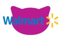
This assignment was worth 4 stars originally but I found it to be worth only 2 bringing it down to 3 1/2 stars (overrated still). We had to take 2 logos and mash them together. The first thing that came to my mind is Whiskas cat food because I have 2 new additions to my family and feel like I am constantly buying cat food for them (though my preferred brand is friskies). I always go to Walmart to buy the food for them.
The Whiskas logo looks like this:
And the Walmart logo looks like this:
So I got the awesome idea to mesh them into one! I used Photoshop to create my new meshed logo. I hand painted my own version of the Whiskas cat head in Photoshop with the “brush tool” and made sure I selected a color as close to the Whiskas purple as I could. The I took the Walmart logo and made the background transparent through LunaPic. Once I had my cat head and Walmart logo ready to go, I layered them together in Photoshop. This was really easy to do which is why I didn’t really get the rating on this assignment.
McDonald’s, if you’re reading this, I just really like burritos. And I definitely want a mention if you use it.
This assignment was to take the logo of a place where you often spend money and to redesign it based on what you buy.
Link to Assignment: http://assignments.ds106.us/assignments/consumer-mashup/
Stars: 3.5
Process: For this, I began with a copy of the McDonald’s logo and an image of breakfast burritos. I threw the logo into Photoshop and cut the ‘M’ into a new layer (to use as a guideline). I selected one of the burritos from the original image and ran an inverse selection to isolate it, then put it into the logo at the base of the M. The rest was basically copying the burrito into new layers and placing them over the M. Towards the end I decided to select and make a new layer of the red lettering to be able to overlap the burritos and closer emulate the style of the original logo. Overall, I’m pretty happy with the final result.


 Above is the finished product, once I added the text to it, it really has come to life. All I had to do was type out the text find a fitting font and single out the ‘E’ which I made red and tilted over just like the red ‘I’ on the Lidl logo.


