PowaAde

The three star assignment Consumer Mashup directed us to mashup up two different corporate logos.

I frequent WaWa where I buy Powerade. To I decided to mashup their logos.

grey

I obtained both company logos and misplaced the ‘wer’ in PowerAde with one of the ‘wa’s in WaWa. It was the only placement that made sense. I placed the Powerade logo ‘P’ so that it propagates from the bird’s beak.

The placement of the logos with respect to each other was the hardest part of the assignment to figure out. Placed anywhere else, the logos wouldn’t have meshed together.

Mashup Assignment – Consumer Mashup

This assignment is very similar to the design assignment The Ultimate Merger, so I have some experience working with logos. However, I connected the assignment to my character this time, so changing it up a bit. I took the logo of Smith & Wesson, a gun manufacturer, of which my character owns a gun from. I figured ammo would be something he would buy often, so it’s fitting to place their logo on the backside of a bullet. Here’s the original logo:

And my version is below:

s&w

The process was fairly simple. In Photoshop, I created a couple circles, and added gradients and textures to them. I found the font similar to that of the logo, which was Georgia, and added in the manufacturer and type of ammo around the bullet. Then, I embossed to give the edges and imprinted effect, both on the font and the interior logo. Most of the time spent was being finnicky with the settings, not actually finding the techniques to do this.

[Witty Title about Consumer Mashups]

So, it’s been a long couple days, where I’ve mostly just been sleeping and eating delicious foods. Not that that isn’t what I do normally, just now I’m at home so it’s making assignments even more tiring. You know? Anyway, I decided to do the Consumer Mashup assignment (3 stars). For this assignment, we had to think of a place where we normally buy stuff, and then think of what we normally buy there, and mash them together into a nice little logo.

I chose to use Giant, because despite living on the other side of campus, I go there pretty much all the time. It’s part of my “I eat all the time” quota. And what do I eat more of than ice cream.

redonegiant

I probably eat ice cream way too often, and I don’t know why. It’s just so good, you know? I get ice cream almost every time I go to Giant, so that’s got to be my biggest purchase.

I decided to take the little fruit pieces/feathers (depending on how you see the logo) and turn them into an ice cream sundae, with a little cherry on top. Typically I just buy little pints of Ben and Jerry’s (Chubby Hubby is the best flavor), but I didn’t think that would translate as well into the design.

Process:

Step 1: Find the logo in a decent size. I used this image from google.

(Decent size can translate to whatever you want, but I try to use bigger images. Scaling a large image down turns out much cleaner than scaling a small image up)

Step 2: Open GIMP and paste the image into a new file

Step 3: Take the little fruits/feathers, use the rotate tool and the scale tool until they were the way I wanted them

Step 4: Select one of the little scoops of ice cream using the wand tool, then go to Colors > Colorize and fiddle around with them until they’re whatever color

Step 5: I decided to just free hand a little cherry on top

Step 6: Then export the file and voila, it’s done!

Chicken Logo Needs Chicken

One of my favorite places to get some quick food is at Kentucky Fried Chicken. However after further review of the KFC logo I noticed something is missing. There is a serious lack of chicken on the KFC logo. However, me being a gracious person decided to edit the KFC logo to include that missing chicken.

KFC_Logo_chicken

This is a 3 star mashup assignment for Ds106 titled Consumer Mashup. This was created by getting the KFC logo into GIMP and then adding chicken legs to create the KFC letters.

ds106 – Assignment Bank – July 7, 2015 – Mashup Assignments

Assignment: Think of anyplace you spend money, and what you most often buy at that place. Then redesign their logo to incorporate your favorite product. Do as many as you want.

Whole Foods Veggies

Since choosing to eat a vegan/plant based diet, I have been shopping at Whole foods Market more and more. I Mostly purchase vegetables and other vegan items, but have started to pick up a few whole body items. Since this assignment said to chose the items you purchase most, I went with VEGGIES. Spending a little bit more for better quality items, is completely worth it to me.

Consumer Mashup

Original Assignment (3 stars)

Macys-Logo


For this assignment, the objective was to pick a store that we frequent visit, and edit their original logo (using text, images. etc). Although I dislike the Macy’s here in Fredericksburg (kind of limited than other locations), I still visit from time to time to purchase garments. I usually browse through their Ralph Lauren Polo collection and see what they have to offer. I never pay full price, because frankly, their prices are ridiculously high. In the fall/winter seasons, I like to scoop up some Champion hoodies/sweatshirts that they carry. So those are mainly the two reasons why I shop there.

For the logo, I grabbed the original one off google images in high quality. I did not want to add any additional text, just a couple images. Next, I grabbed the Polo and Champion logos and it was a wrap as far as what I needed for my logo makeover. All 3 images were opened in Photoshop. For the Macy’s logo, I grabbed the eraser tool and got rid of the letter c. I used the Champion “C”. resized it, and put it in it’s place. Lastly, I cut out the Ralph Lauren pony logo and placed it in the red star after resizing (it just felt and looked right). It was a pretty simple task and straightforward, probably the easiest assignment this week. To sum it up, I guess this logo states that I shop at Macy’s because I am a Ralph Lauren and Champion addict.

Consumer Mashup

Every Sunday at noon, my friends and I go to Chipotle for burritos! To complete this assignment, I googled pictures of the Chipotle sign and a burrito and used Photoshop to put the two together. It was actually a pretty simple assignment!

Consumer Mashup

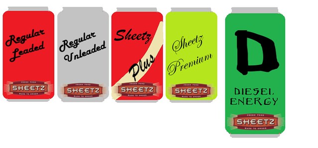
Sheetz Long Lost Soda

This week was mashup week(crazy huh?) and my first assignment to do was Consumer Mashup. This assignment asked, “Think of anyplace you spend money, and what you most often buy at that place. Then redesign their logo to incorporate your favorite product.” Well, if you go back to my post waaaaaaaaaaaaaay back in week one, you would find my video for my keychain story…and if you watched that, you would find out that one of my favorite places to go is Sheetz. It’s convenient, it’s cheap, it has gas, and I have a Sheetz Card, Woot! But one thing always baffled me…Most convenient stores/grocery stores have their own generic soda and silly names to rip on the name brands, like Coke and Pepsi. Why doesn’t Sheetz have THEIR own soda? I feel like it would make a killing since soooo many people love Sheetz…

606,639 people to be exact!(or at least according to Facebook).

Well, alright then, I’m going to do my consumer mash by combining Sheetz and soda. But first, I needed to research why Sheetz hasn’t already done this themselves. As it turns out, they DID have their own soda line. If you go to the Wiki page and read the history section, you will find that Sheetz had a brand called It! Cola. Flash back into the mid 1990′s, the wiki even mentions that this brand had a cult following! =o So what the heck happened? No clue, and Wiki doesn’t know either. Damn. Well, if anyone finds an answer, I would love to hear it!

Continuing on, I now needed to incorporate soda and Sheetz. Well being the genius that I am (not really) I came up with this brilliant idea:
soda
Okay, so admittedly, the “flavors” aren’t the most appealing, but it got the job done. I basically copped off of the major brand of Coke and Monster and went from there! Leaded = Coke; Unleaded = Diet Coke; Plus = Coke Vanilla; Premium = Mellow Yellow; Diesel Energy = Monster Energy. I even went as far as to download the Monster font from dafont.com!

Consumer Mashup

For the assignment Consumer Mashup I actually had a hard time thinking of something I buy a lot at one specific place. In fact, I couldn’t think of any examples for me. However,one of my friends used to always buy candy at this random CITGO. She would rarely buy candy from any other place. I decided to use her as an inspiration and and do CANDYGO.

This assignment was fairly simple. I found a CITGO logo and uploaded it onto a powerpoint presentation (not sure why I used this, just seemed like a simple way to manipulate the picture). I then added a text box and tried to find the text that matched the original logo the best. I came up with aharoni. I then fixed the color and put a white box over the original logo and added my new text.

McLovin’

Consumer Mashup

“Think of anyplace you spend money, and what you most often buy at that place. “

I mashed McDonalds logo and it’s delicious coffee:
I LOVE the mornings I can get myself out of bed 5 minutes early to stop at McDonald’s for coffee before class. I’ve never been much of a caffeine junky, but this semester I think I’ve entered adulthood and needed it more mornings then not.

I made this mash up by finding the McDonalds logo and coffee through google (links above) putting both pictures in Microsoft Word, changing the M’s settings to be behind text and the coffee settings to be in front of text. Then I played on the slogan “i’m lovin’ it” with “coffee lovin’” by typing the phrase and then taking a screen shot of the new logo.