Killer Birds Descend Upon Us

Decorative Image

In a moment no one could have predicted, killer birds descended upon campus. Faculty and staff have attempted to chase away these birds but to no avail. The birds seem here to stay whether we want them or not.

One brave student attempted to paint these birds and reported that the birds were far from the happy little subjects they have painted in the past while watching Bob Ross. “They are pure evil,” said the student, “if pure evil came in bird form.” The next day the student disappeared after the birds attacked them.

Assignment

The assignment, Color Changer, was worth 2.5 stars. In it, I had to change the color of a photo.

Decorative Image
Original Image

I accomplished this much like I did DreamScape. Admittedly, I played around with the settings in order to make the birds look more menacing instead of simply changing the color.

Anyways the original birds were killer enough. This is the second time I’ve been walking and have been distracted by random birds on campus.

Color Makes a Difference

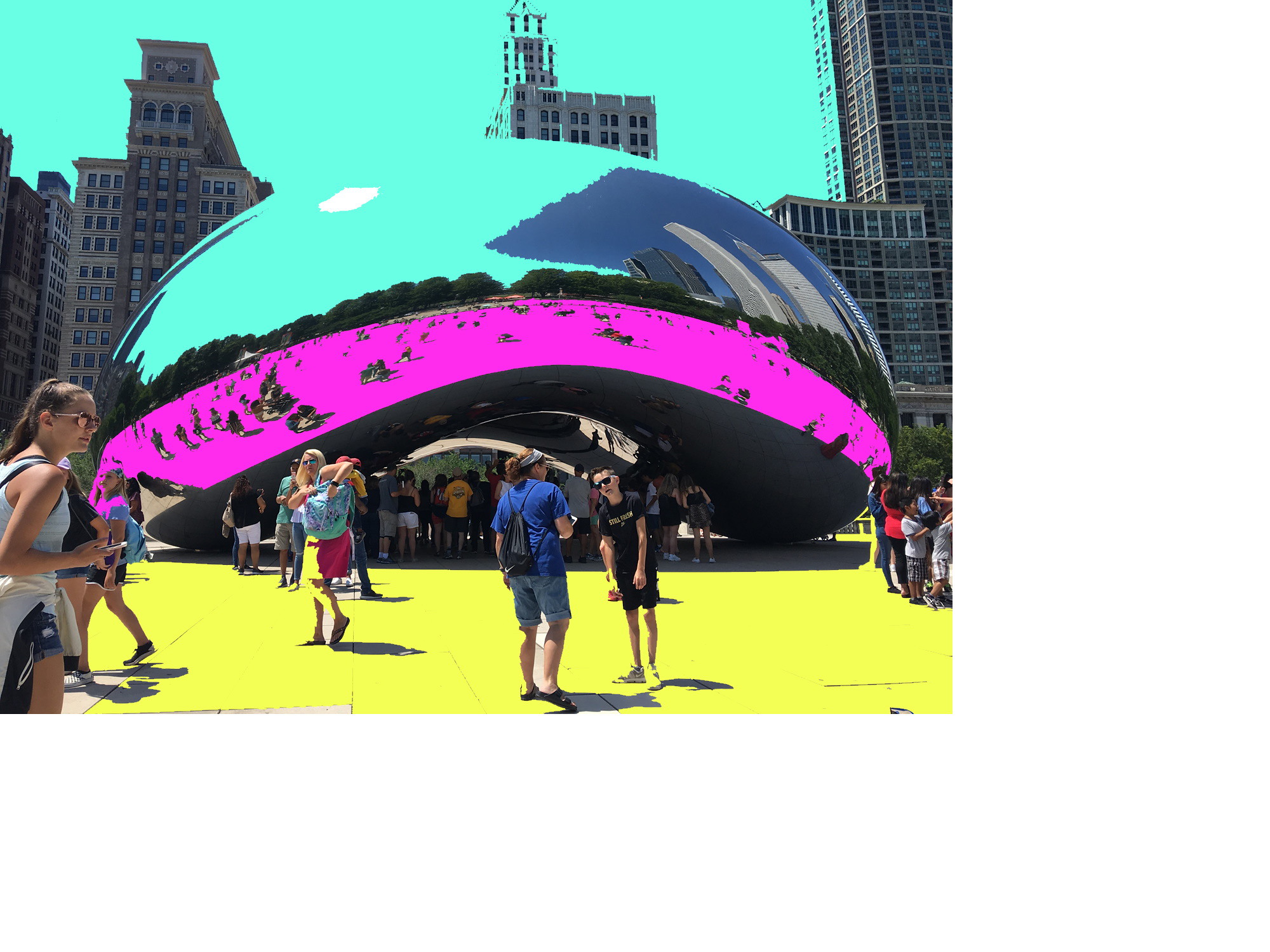
We feel excited, calm, happy and sad, many times based on the colors around us. So when the colors are changed up, what does that do? Check out what happens to the sky, ground and The Bean in Chicago.

The Bean Colored

For this VisualAssignments1701 “Color Changer,” I installed Paint.net so I could manipulate the image. I used the Paint Bucket to take large areas within the photo and turned them one of three colors–yellow, magenta or teal. I’m sure there were more sophisticated effects I could have used but it is late and I don’t have time to spend learning this program. Actually, paint.net looks a lot like Photoshop (but that’s been years since I used Photoshop). This gave The Bean and the area an Abstract Art look along with the skyscrapers and also The Bean sculpture. This seems to make the humans look like they are more in a theme park than in Millennium Park in an urban center.

The other piece of this assignment was to post the image to Flickr for all the world to see, which I did then embedded it from Flickr to this blog. I had to copy the code from Flickr into the Code Editor, which worked well, although the Flickr logo came along with the image as a background theme which surprised me, along with the file and photographer’s name, and copyright, so that was a first for me to see that additional information. I guess Flickr does that to provide some cursory/pseudo legal protection of my work.

Assignment Bank assignment Color Changer, 2.5 stars

Changed the hue of the picture

Apocalypse Again?

In the world of visual assignment’s you never quite know what you’re going to get. For this one it wanted me to take some photo from the whole wide world and mess with the hue’s to change it a bit. Afterwards I needed to let the whole flickr world see. Right before starting I was re-reading my blog writings from last week, so I still had apocalypse looming on the mind. With that said, what area is more iconic to show after the apocalypse than New York City? Nowhere! Even Planet of the Apes did it.

Enjoy my purple skyline dead world. Post supernova, we only see violet from the surface of Earth. Of course by we, I mean me, because the radiation killed off all the inhabitants, sorry. It makes me wish the sun really did shine purple.

VisualAssignments1701

I enjoyed this assignment. it was fairly easy and i got to edit a picture i liked from my San
Francisco trip.

Color-Changer

Hey there, welcome back to my blog. Today, I’d like to share with you my first visual assignment of the week, if you don’t count the photo blitz I did yesterday. Basically, the goal of the assignment was to get us to interface with and develop an understanding of RGB color manipulation in photos. The assignment specifically called for creating a completely different color scheme in the photo.

To complete my masterpiece, I used the free photoshop phone app. It is extremely detailed, quick, and did I mention free? I highly recommend it for anyone who doesn’t want to download a bulky photoshop suite onto their main computers. This was an effective project because it makes you really consider multiple factors inside of your photo. For example, if you turn up the reds to brighten up a spot you like, what will it do to your darker blue areas? And so on.

And now, the moment I’m sure you’re waiting for- the photos. I will post the before and after pic, in case you guys wanted to see what it looked like before.

**Also if you think the picture is super weird, you’d be right. I was trying to think of what I should take a picture of, and then I looked down at my mini hands and I knew what was up after that.

Before (he writes, somewhat unnecessarily)
After

Let me know what you think! If you want to do this assignment yourself, the original post is here, and be sure to leave a comment!

Color Changer

I loved this. I really love doing this to photos and I do it often when I break videos. When datamoshing, you have to color shift to make the transitions stick out more so that they break.

Ceto Swims

I was excited when I saw that we’d incorporate our recently-created characters in a visual assignment. I really loved the setting of Ceto’s entrance and decided to recreate it by adjusting the colors of an image that already existed. I figured the best way to approach this was through the Color Changer assignment.

In the excerpt I wrote last week, Ceto rises from the depths of the ocean and rests on top of the water. So, my first task was to find an image of a woman on, in or around water. Once I had one, I used the quick selection tool in Photoshop to isolate the woman from the rest of the picture. I adjusted the colors and lighting of the water and the woman separately to reflect my idea of Ceto’s intro. Because Ceto has light-gray skin and black hair, I made the woman black and white. Then I adjusted different levels to make the water appear dark purplish-blue. I think it matches my description well.

Original Image
Ceto

Color changer

I did the Color Changer assignment and played around with the hue. I think the end result was kinda cool. I took this picture in Helsingborg, Sweden (my hometown). I was sitting at a beach side restaurant with my friends having a few drinks and there was this kid playing in the sand all by himself. The beach was completely empty because it was around 8 pm, and the minute I thought “Oh this would be a pretty picture” I saw the ship in the background. Those kinds of ships don’t pass through our waters very often so I’m glad I got to snap this picture. I changed the colors to the end result you see above because I wanted to keep the light in the picture. I was playing around with the red hue too, but I thought the sky looked nicer blue.

Color Changer – to the point where you can see my plaque

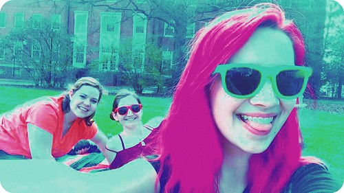
The color changer prompt stood out to me because I have a hyper awareness of color. I’m not particularly artistic, but having purple hair does make me think a lot about the color palette of my pictures. I wanted to see if I could drastically change the color of my hair, but I quickly discovered that I would need more sophisticated, more expensive software for that.

I took a picture of me and a few friends outside – I thought the setting would make the color change more obvious. My product was the following image.

18765774_1452808161447920_3903655968864727048_n

I used Fotor to edit the picture. As I said, the free version didn’t afford me too many tools, so I had to work with what was at my disposal. I increased the saturation to make my colors more dramatic. Then I put an overexposed effect on it to sap the realism out of the shading. After that, I threw on a couple filters. One was a straightforward green tint that made our skin look almost alien. It also resulted in making the subtle spots on my teeth (which I imagine is the yellowing that comes from excessive coffee intake) look like they’ve been treated with the children’s toothpaste that turns your plaque green so you can see how well you’re brushing. Finally, I added a vignette filter that gave us some shadows around the edge of the picture. It also rounded the edges, which I like. The product looks like it could either be a normal picture from another planet, or en earth picture that was just developed poorly with really cheap equipment.