Happy Campers

When I see the opportunity to create a fun and/or nostalgic poster, I jump at the opportunity. I’ve absolutely loved graphic design for years and recently started using Canva to create some professional looking posters. This assignment really spoke to me on a personal level for more than my obsession with graphic design, but also because there was a “camp” I went to every year in high school called Catholic Heart Work Camp that shaped me into the person I am today. It was a religious camp with a lot of worship and connecting with other Catholics my age, which seems to contradict my last statement as I’m no longer religious, but that wasn’t what really stuck with me. What stuck with me, instead, were the memories of bonding with others who wanted to make a difference and then actually going out and making that difference in the lives of those less fortunate than us. We would paint schools, build sheds, do landscaping, and so on for hours and hours each day and it was the most rewarding experience. Regardless of how the work was sometimes intense and backbreaking, you were always accompanied by like-minded new friends, working to restore communities in need. I wanted to create a sleek poster to advertise this, keeping it simple in terms of information but powerful in terms of message and design. Here’s what I came up with and I hope you guys like it!

Apocalypse Training Camp

The prompt

The poster:

Apocalypse Training Camp

I only ever did Girl Scout day camps when I was younger (most of them at Algonkian Regional Park) but I thought something with a more intense theme than “animals” or “princesses” would be cool. I’ve started thinking more about the apocalypse and what I would do to survive. I have a journal with instructions on how to do everything from filter water to make cheese so that if everything falls apart, I will at least know how to survive. I just thought an apocalypse survival camp would be cool.

The poster wasn’t too difficult to make, I used Canva to design it and then put the finished product on Flickr. The hardest parts were finding a cool idea for a camp, and choosing a font that was apocalypse-y but still legible.

Visual Assignment: Camp Poster

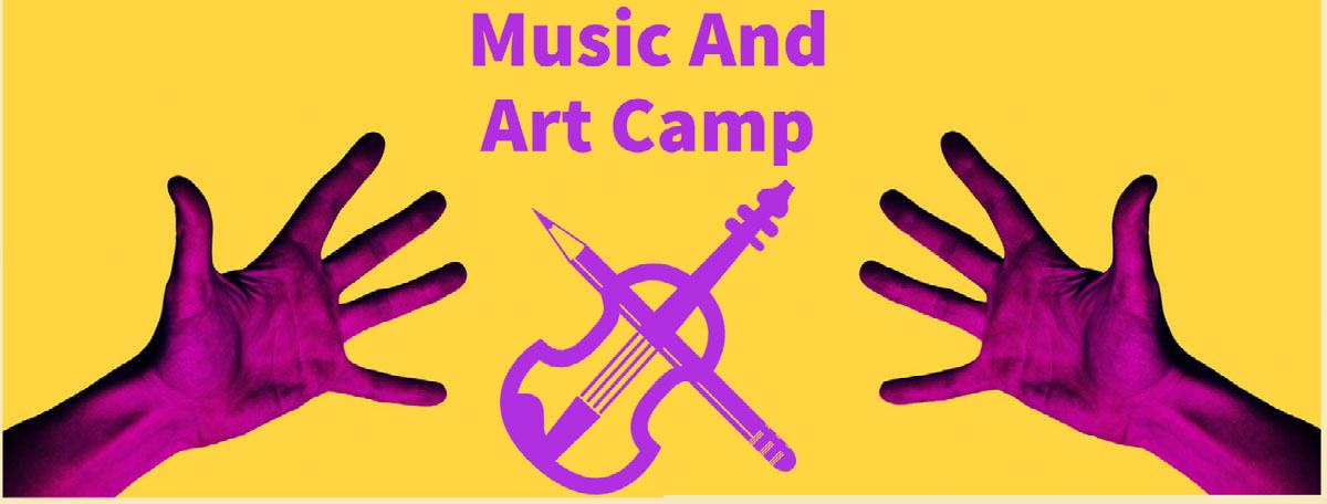
I never had the chance to go to a summer camp as a kid. My parents worked pretty hard to shelter us from the dangers of the outside world. Now that I’m an adult myself I can understand that they were concerned for my safety and well being, especially being a Black kid with all the terrible things you hear about happening to other children of color. With all that being said, I would have really enjoyed going to a music and arts class when I was young so I could hone my skills and dive deeper into my interests, since I only really got the opportunity to explore these interests seriously in my last few years of high school. This is the poster I made for the imaginary music and arts camp that I went to when I was a kid

Music And Art Camp Music And Art Camp

I learned a lot while making this poster, Such as the fact that colors look different on the texture of skin than they do on matte, or the fact that when you flip and image the image will not nessacarilly be symmetrical and even with the original image, which is annoying, but I still enjoyed making this poster.

dance camp

Camp Poster Assignment: 3.5 stars 

When I saw this assignment in the bank, I immediately thought of dance camp. I grew up dancing (you probably know by now if you’ve read my photoblitz post), so I thought this would be the perfect poster to make for this assignment. The name of the dance studio I included (Footnotes) is actually the name of my dance studio at home (the number is not real of course), but I thought this was a fairly easy thing to make and once again, PicsArt was my friend today. Have you had any experience with dancing or any type of sport related to it? Let me know! 

What Happens at Dance Camp…

So when I was younger, I always did a summer dance camp. I was highly involved and participated in a lot of groups. For this visual assignment, I wanted the poster to be a bit retro to fit the theme of the class. I chose a picture that would help describe the kind of dance camp this was: a camp for dance through the ages! I always did ballet, lyrical, and jazz. You know, the more typical dance. I wanted this to be a bit more fun!

Come join DS106!

For this remixed assignment the whole purpose was for us to come up with an advertisement for DS106. I wanted to add the storytelling element of the assignment while also incorporating our theme. This was a fairly simple remix assignment as it was only worth 1 star. Here is the advertisement that I came up with!

Image result for be a secret agent advertising

Spy Camp!

Directions: Make a poster an advertisement of some sort for a camp or summer activity that you enjoyed as a child. If you didn’t go to any camps as a kid, make a poster for a camp you wish you had attended.

I never went to camp as a kid, but I would have loved going to a spy camp! I definitely think the character I created, Jess Carter, would have gone to a camp like this.

I created the flier on Canva! I found a template with the black and yellow coloring, and then I typed in “spy” under their elements sections. I was impressed with the spy character they had available and I tried to change the spy to look more like Jess Carter (the spy I created). She also has brown hair, so I thought that was a cool tie in. Then I added the fingerprint and magnifying glass elements, and finally added the text. I love it! I think it turned out so well. I didn’t want to include actual location or time, because I wanted to keep that mystery. I feel like a real spy camp would try to make every element of registering for camp with a secret agent feel and limited information.

Camp Poster

3.5 stars

I have always wanted to go to a rock climbing camp. Nothing interest me more then free climbing. The adrenaline, the thrill, the risk. Love it. So if I had a choice I would spend a week learning to free climb, I don’t even care how dangerous.

Come to Snyder’s Lake Camp!

For my second assignment this week I decided to make a camp poster for a camp I used to go to. In this case, I used to go to Snyder’s Lake Camp in North Greenbush, New York! To create this assignment I first found one of the only pictures of the camp on Google. I wanted to use a real picture of this camp to make it more meaningful for me, but the only one was blurry. I’m still using it because it has the sentimental value of the true summer camp and not a fake one. I met so many cool friends in my summer camp days here, as well as various babysitters from my camp counselors. I picked a picture that shows the pavilion we all were under for most of the day with our own age groups as well as groups down below playing games. Usually I waited there to run to the ice cream truck when it came and be the first in line. I am glad the water is in the picture too because that’s where I got swim lessons every week and sun tanned on the beach. I transformed this picture into a poster by adding text in my Snapchat app and moving the text to various parts of the picture to not cover the background. I tried to make the text balanced with the picture and I did that successfully I think. In addition, I tried to use black, red, and white because when I think of that summer camp, I always think of the red, white, and blue day we had and my friend Terri split his finger open because another kid smashed it with a rock by accident… good times. Lol. I also added a fake Facebook user at the bottom of the page so people could follow the camp. I feel like on most posters they have a social media always posted in the corner. And lastly, I added an encouraging phrase to get more children to join the camp “…to join in on all of this fun”.

Here’s my piece!

Week 2 – Daily Creates, Assignment Bank and Customizing my Blog

The Daily Creates

This was fun and interesting to see what the “create of the day” challenge on Twitter was going to be. I was impatient waiting for the next days create, I am not a very patient person. The three “create of the day” that I chose were, Can you hear me knocking strangely, Doubles and How small can I draw. All of the creates were fun and made me think creatively.

The first create of the day was, can you hear me knocking strangely. This took  some time to figure out how and where is was going to record the knocking sound.

The second create of the day was, Doubles. I decided to use my favorite candies as doubles. After-all, two sets of candy is always better than one.


The third daily create was, How small can I draw. For this create challenge, I borrowed my daughters very fine tip pen to draw the flower. My children are always willing to make suggestions and/or letting me borrow their supplies for my homework assignments.


Assignment Bank

It was fun looking at all the assignments that I had to choose from. I spent way to much time looking at all my option. From the Visual section, I did the Camp Poster. Google Draw Something came form the Web Assignment section. Can’t forget the Design Assignment category, that is where I found Generate Cool Letter. I spent a lot of time playing/learning about these assignments.

The first assignment was the Camp poster. I never went to camp as a kid, I never wanted to go to camp. I changed the assignment just a little. I made a Camp Poster for a Camp for Mom’s. Sometimes a mom needs to have a break away from being a mom, just to relax and recharge.


The next assignment was, Google Draw Something. I spent way to much time playing with Google Draw. The program said my paintbrush looked like a carrot, I thought that was funny.


The last assignment was Generate Cool Letters. I played with several words and phrases, checked out the different colors and backgrounds. You can do so much with this website.


Customizing the Blog

This is still a work in progress because I am still learning to use the tools for my domain and blogs. I hope to keep making improvements to my site. I knew this would be a challenge for me but I know I can do it.

This week I have learned that digital studies is fun. There are so many ways to be creative online with websites, blogs and Twitter. Most of this weeks assignments were not as hard as I thought they would be. Being creative with my domain and blog was/is a challenge for me. The creative aspect of the blog drove me crazy this week. I got frustrated because I was not getting the results I wanted. I really enjoyed the doubles and the google draw something, spent way to much time playing with the two assignments.  I do need to work on commenting on my classmates blogs, this was a small challenge for me. Overall, these assignments were a lot of fun and I enjoyed the creativity.  Looking forward to week three assignments.