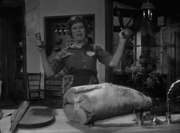
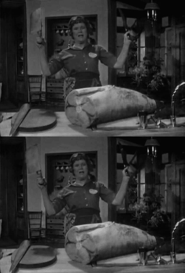
This week brought .GIF’s, tears, and laughs. The tears and laughs were brought on by watching awful and some amazing movie scenes. It is hilarious how BAD some movies actually are!
Seriously, Gigli??? Max and Me??? Glitter??? Worst of the worst really. That said I decided to NOT do a .GIF of any of those. Period.
The assignment:
Say It Like the Peanut Butter
“Make an animated gif from your favorite/least favorite movie capturing the essence of a key scene. Make sure the movement is minimal but essential.”
I made 4 .GIF”s this week. Some were more successful than others. You can see them HERE and HERE. I’m gonna share my 2 favorites right here.
I was a little concerned at the beginning of this week. I watched some tutorials, read some articles, and took a deep breath. After figuring out how to use Photoshop to import the videos I decided to use- I got down to business. Some of the scenes DID NOT WORK. Some of the scenes worked well. Some of the scenes would have worked if I was more proficient with Photoshop. (that will come with more practice and work.)
I was totally excited to be building these and hope like them.
The first .GIF is from Gone With the Wind. It is the scene where Scarlett and Rhett’s daughter, Bonnie dies.
Now this second one isn’t minimal at all. BUT! I love it. It is the scene from 200 Cigarettes where the cabbie is giving Cindy a life lesson.
Both of these were created with PwnYouTube, Photoshop CS6, and lots of patience.
The short and dirty of it:
1. Grab video from YouTube (PwnYouTube),
2. Import in frames to Photoshop CS6,
3. Edit down to as few frames as possible, I was shooting for between 3 and 6,
4. Set the frame times,
5. Close your eyes, cross your fingers, and hope for the best,
6. Save for the web (32 colors),
7. Post.
_________________________________________________________________________
Okay, now for my daily Creates! These are really fun. Next week I want to do more than just two, I loved all of the ideas this week, but I chose to do Got milk? Another favorite breakfast beverage? Make a picture. Make it art.
and Describe the sky in a single sentence without using any color words.
(This is a cropped screenshot of my submission.)
______________________________________________________________________________________
Building the site has gone pretty well. The one snag I’ve hit is part of the template isn’t properly supported in Firefox. All of the posts are supposed to have a circle on the front page, but in Firefox the posts with pictures that are the featured image (no way to get rid of this) the circle doesn’t appear unless you hover above it. It just looks like a blank space unless the mouse is over it. Annoying. I am still trying to figure out how to change this…in the CSS?…because I have seen this template in a few other places and it looks perfect. I am working on this piece of the puzzle.
I really think the site looks like ME. Style-wise. Simple, clean and fun at the same time. LOVE.
I have made a welcome site, the header on the right connects it to this site.
I am going to start putting my daily creates in one post a week I think, I need to get them organized in some fashion or another.
______________________________________________________________________________________
Time for me to get down to business.


