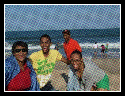
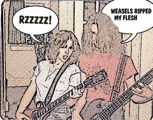
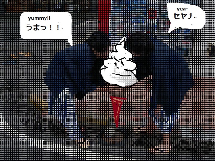
This photo is for the assignment for the commic book effect in the visual signments.
I think the keys were color, brightness and sharpness.
Using GIMP, I played with the balance of color and brightness. The yellower it is, the more it looks like a picture in a commic book. Then, I put some filter effects such as newspaper print and commic effect. Be careful ! Putting too much effect makes a model ugly. Although I am happy, she might become unhappy!


