One of the visual assignments I chose to complete this week was the album cover assignment. The assignment is worth 3 stars. Here are the instructions for the assignment:
So here’s something fun for everyone to do, should be quick and easy, but try to make it pretty. First, go here:
http://en.wikipedia.org/wiki/Special:Random The title of the article is now the name of your band. Next, go here:
http://www.quotationspage.com/random.php3 Go to the bottom of the page. The last four to five words of the last quote are the title of your first album Lastly, go here:
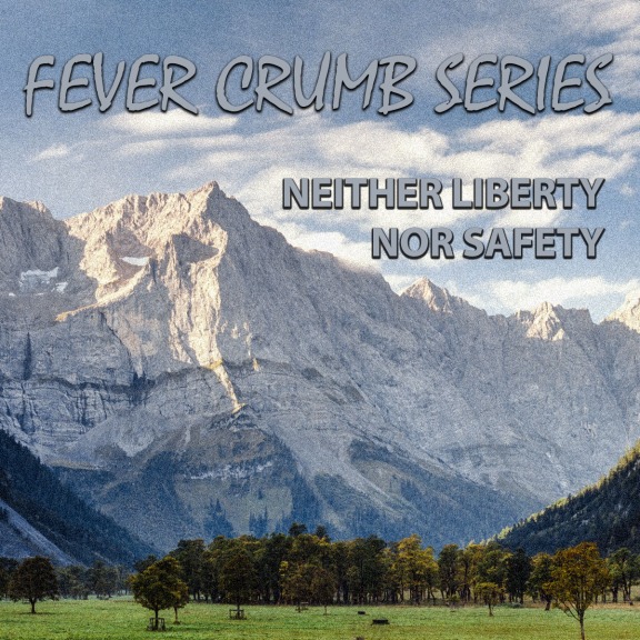
http://www.flickr.com/explore/interesting/7days Select the 3rd image. It is the picture for your album cover. Manipulate the picture, resize it, add some other color, whatever. Do the same with the band name and album title, put them over top. However you wanna do it. Make it look cool.
This is a link to the assignment page, if you want to take a look.
The title of the Wikipedia article I was directed to was “Montenegrin Navy.” The random quote I got was “Forsake not an old friend; for the new is not comparable to him: a new friend is as new wine; when it is old, thou shalt drink it with pleasure.” I was pleased to see that the three parts I drew actually worked well together. Album art of a shark matched up very well with the band name Montenegrin Navy and the bible quote was appropriately strange (out of context, anyway).
Here’s what I put together:

I used GIMP to create this image. I started by making a duplicate of the original, colored image. Using directions I found here, I selectively colored the eye. I had to zoom in to 800% and use a 1-pixel brush to get the border right. When I zoomed back out, I decided that I wanted a bit more color, so I decided to color the mouth as well. I started off with a large brush and filled in most of the center before going back with a much smaller brush to get the borders. Most of the teeth were a blue color, so I used the Color Picker Tool to copy the color of one of the whiter teeth and then brushed over the other teeth with it. There’s still a decent amount of blue, but it definitely looks better than it did. With the cover art complete, I used the Text Tool to add the band name to the top right corner. I chose to color the text red because I wanted something that would pop out of the gray color of the background. Sharks and the color red also just go together so well. Next, I worked on the album title. I added the text first. Then, I used these instructions to make the bubble around the text. I merged the text layer down into the bubble layer and edited the border to make it black. The original image of the shark was rectangular, so I used the Crop Tool to cut it down to a square and then exported it as a JPEG image.
Overall, I’m happy with what I was able to do. I realize now that I had the text bubble start a little to the left of where it should. The eye and the left side of the mouth turned out well, I think, but the right side of the mouth was much more difficult and you can see where I had trouble. I tried to go back to convert some of that portion back to grayscale, but that was harder than I expected and I ended up just moving on. I figure that each of these assignments should help me get better with these tools, but that doesn’t mean that they need to be perfect. I’ll be doing the “Splash That Color” assignment next and I think that I’ll be able to do a better job with that now that I know how difficult it is to go back to correct mistakes.
I forgot to grab screenshots of my work as I went, but I’ll be sure to do that for the next two assignments I complete.


