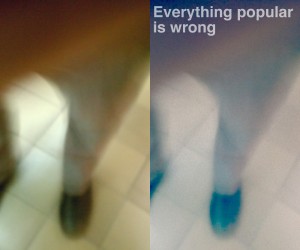
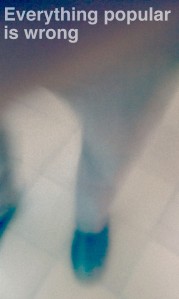
I hate GIMP. Every single version of GIMP I have used in the past was frustrating. Tasks I found easy in photoshop seemed to have no equivalent in GIMP. However, I was willing to give the program a second chance. I used the latest version to complete an assignment for my Digital Storytelling class: “Pick A Bad Photo, Apply A Vintage Effect And Write Something In Helvetica.” The image below on the left was the base for the one on the right. This post will detail how I did it. At the very end, I’ll describe my current opinion to gimp.

Left: initial fumbled cellphone image. Right: Final product.
A warning: If you’ve never used GIMP before, you should start with a smaller image as your base so some of the steps detailed here don’t take forever.
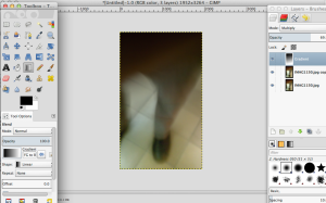
I open my base image in GIMP and get started by duplicating the base layer. This gives me something to compare against the original version. I do this by going into the layers window and right clicking (CTRL-click on stock OSX w/o a mouse) the current only layer and selecting “duplicate” from the dropdown. So what next? I think that tan region at the top that appears to be my fingers is a good place to put some text. But it’s not exactly as faded as I’d like. I need a region with less detail for the text to shine through. Here come layer modes to the rescue, after the break.
Adding a Gradient

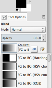
This is what my settings for the gradient tool look like.
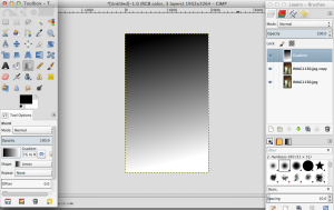
I make a new layer: Shift-Command-N, or Shift-Ctrl-N if you’re on Windows (you can also reach it through the new layer quick button or the layers window menu). Now I have three layers: a blank one, and two containing the photo. Then I select the gradient tool by clicking the a square with a gradient in it from the toolbox. I make sure the upper color in the color selector is black, the lower white, and the “FG to BG (RGB)” gradient is selected (see left). Then I drag it from the top of the screen to the bottom. If you didn’t downsize your image and/or your computer is slow/low on free RAM, GIMP might take a second to think at this point. But then you should have a screen of black turning to white. Here’s a screenshot of my workspace:

This is a zoomed out view. You can drag the gradient tool in different directions to get different orientations of the gradient.
Now, go over to the layers window and click the drop down labelled “mode” that currently contains “Normal”. That is not what we want. From the dropdown, select “Multiply”. And bam: you should now see an image that’s darker at the top and like the original at the bottom.

You can adjust how much darker the top is by clicking at different points in the “Opacity” box or the arrows on it. You can also type a number if you click on the number, or you can try to click and drag (this does not work very well however)
More Vintage Effects
Film Grain: Bringing The Noise
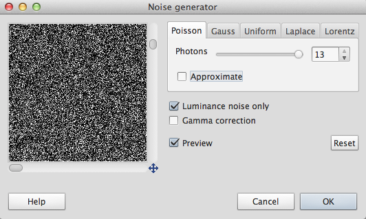
The dark areas of any layer set to multiply darken whatever is underneath. I’m going to add some film grain to this photo by adding some noise. With the same Gradient layer selected, I open up the filters menu. I choose Filters > Noise > Noise Generator. I go through each of the tabs and drag the slider way over to the right. The preview window will show up as black with white spots on it. That’s what we want. Don’t worry.

Pushing the sliders to the right adds more noise. Don’t sweat a perfect amount of noise here. Just drag the sliders to where you like it.
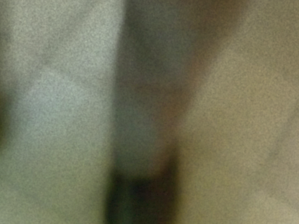
If your image still looks exactly the same, that’s okay. The larger an image is, the less 1-pixel sized noise will show up. Choose Filters > Blur > Gaussian Blur from the menu. If your image is large, choose somewhere between 4px and 9px as the size of the blur. Otherwise, 2-4px will do fine. Click Ok and wait for it to finish softening the noise. You should now have some actual grain.

It should look somewhat like this. Undo and play with the blur settings if you’re unhappy.
Maximum Instagram
At this point, I’m thinking we need more instagram. Select the copy layer. Choose Colors > Levels. From the drop down labelled Channels, select Green. Drag the black (left) triangle under Output Levels to the right towards the middle. Select Blue from the Channels drop down. Repeat. Select Value from the Channels dropdown in the levels window. In the Input Levels section drag the left (black) and middle (grey) slider towards the right. Play with these values until you get something that looks decent. Then hit OK.
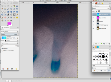
I took some additional optional steps that tried to emulate my favorite features of photoshop (fill, gradient, and adjustment layers). Beware, these can be slow in large images. First, I made a new layer. I filled it with a bright pink color. I then set its Mode in the layer box to Soft Light and turned the opacity down to 17. Then I made another layer and used the gradient tool on it with a preset called Blue Green. I set its mode to Subtract after trying a few, and cranked its opacity down to 4.0. You will probably have to play with the settings here to get something that looks good for your image. But at this point, I think I have a perfect instagram effect going.

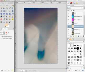
This is where the above instructions got me.
At this point, this is looking a little too dark for my tastes. So I’m going to lighten it up. Remember the gradient layer? I turn down the opacity on that to about 38. That leaves the pink a little strong. So I turn the opacity on that down to about 4.0. But it still needs a bit more Sepia tone. So I make an new layer and open the color picker. Then I choose a nice tan color and set the layer mode to multiply and the opacity to 18.0. And now, I get this:

This looks much better. It’s not quite as dark as the previous one.
Adding Text
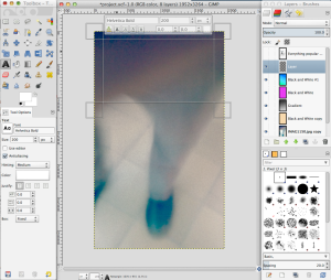
See that darker space at the top? That’s where text is going to go. Step 1: click the big bold A in the toolbox. Enter Helvetica Bold into the textbox. I chose a size around 200px. You’ll have to play with it to find one that’s good for your quote. Make sure Color is set to white in the font toolbox. Then click and drag to indicate the area where your text will go.

A text area freshly defined. See the Tool Options on the left side of the screen for the settings I used.
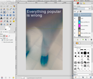
Click inside of the text area and type whatever you want. I’m going to take this assignment’s “instagram hipster photo” thing to 11 : “Everything popular is wrong” suggests that Oscar Wilde beat the hipster stereotype to the punch by over a hundred years. After entering the text I select the text layer, set its mode to screen, and reduce its opacity to 64.0.

Almost finished with the photo.
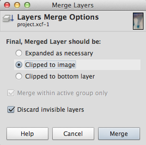
Now I just need to save it for posting to the blog. At this point, I have a lot of layers so I first save the image: File > Save. .xcf is GIMP’s file format. Now I’m ready to export it. I flatten the layers from the Image menu: Image > Merge Visible Layers. This should bring up a dialog box.

I used these settings. I may have had a layer I forgot about as Image > Flatten Image changed the look of the image.
Now I have one layer. I’m more or less ready to export . If you have a huge image, you might want to scale it down through Image > Scale Image (this is optional). Otherwise, simply choose File > Export and save the image as a .jpg wherever you want to keep it. In the settings dialog, you can ignore the quality slider and just hit Export. Let it save and…we’re done.

The end product. It’s not quite instragram-y as I’d hoped, but it’s close enough. I’m not going to try to imitate bokeh or color streaks in this software.
Do I Still Hate GIMP?
The short answer is no. I’m mostly just disappointed. It does have highlights. For example, the text tool is drastically improved. It also has some unique filters and effects it includes look like they’re fun to play with, and can use some photoshop plugins through an add-on. However, the program is missing crucial features. Its current approach of making everything into raster layers is unacceptably slow; adjustment and fill layers would speed up editing drastically. Layer styles are another crucial feature I miss from photoshop. You want to apply effects to text? A simple bevel perhaps? In Photoshop, you’re done in under a five minutes. If you’d like to change the text or the effect applied to it later, you can do so whenever you wish. In GIMP, you’re out of luck. Instead, you have to re-enter the text and re-apply the effect. Why? Because the effect is rendered to a raster layer. Also, better OS integration would not hurt GIMP. Spacebar to preview on OSX is also a convenience I’ve found myself missing.
I’ll post a more detailed examination of why GIMP needs to add these features later. However, that information doesn’t change the bottom line: I’ll only use GIMP when I absolutely have to. It’s too much of a hassle when compared to photoshop, but it can get the job done in an emergency.


