Valentine’s Day Caption Challenge

2 and half stars http://assignments.ds106.us/assignments/valentines-day-caption-challenge/

For this assignment I am creating the scenario where Melody Bay has sneaked into the radio studio of House of Noir one night to listen to old Sebastian Crane tapes. She would never admit it but she finds his voice mesmerizing and enthralling. In a moment of creative weakness she decides to create this valentine for the lovely heart-breaker if she could have him on her turf.

valentine

Immediately upon finishing this she destroyed any evidence that it ever existed.

Some people just like to show off

For the Valentine visual assignment I chose to caption the following picture

Ds 106 Valentine Assignment

I looked at all of the other cards in the set and thought of captions for a few of them but in the end I chose to do this one. This one seemed to be a bit more ridiculous than the others and the caption just seemed obvious as soon as I saw it.

I used gimp to caption it. I had already used gimp once to add text to a gif so only doing an image was much easier. After I downloaded the image from flickr I opened it in gimp. Then I used the text tool to highlight the area where I wanted the text to be then added the text. I changed the font and color and enlarged it so that it was easier to read.

I lacked the confidence to give this to you, but I hope you say yes

valentine

I tried doing this assignment SO MANY TIMES this week and couldn’t come up with anything.  Even this one isn’t too original (I don’t think), but it’s all I could think of.  This was a silly, fun assignment though, and the timing was perfect for obvious reasons.  It was probably my least favorite of the  assignments of the week but I’m not sure if that’s because I didn’t care much for it or if it’s because I had a harder time with it.  I liked a lot of other people’s posts though.  Lara Hampson‘s especially made me laugh!

For this one, I opened the image in GIMP and just added text.  It was pretty simple and straightforward, so not too much to report here.

Off to complete my weekly response though even earlier than I did last week!  My goal is to eventually not be working on this Sunday night but maybe Sunday afternoon instead.  Gotta have dreams, right?

Assignment Bank | Two Points

The Assignment:

“For this week, you need to complete 10 stars worth of Visual Assignments — this could be doing 5 assignments rated 2 stars, etc. One of them is required by everyone, so we can all do the same one and compare our ideas, but beyond that, you get to pick the ones you want to do to complete your 10 pack.”

Valentine’s Day Caption Challenge


super and wonder


I LOVED this assignment!  I think my Holiday Cards will be something like this next year…hmmmmm.

———————————————–

Photoshop was my friend in this post. Nothing fancy, just added text to a downloaded image.

Sneak A Peak

The challenge was to add a caption to one of 30 different valentine’s day postcards. These were no ordinary valentine’s day cards. To do this activity, I uploaded the picture to pixlr and added text with the online editing tool. I realize my inserted text was a bit childish, but I think this kind of assignment called for that.

VDay


Grammar are everything

Most of the other postcards could be inappropriate, so I went with something more tame.

Your the only one for me

Before I made this, I was chatting with my friends, and we decided that even if someone is attractive, when they have bad grammar–they lose any appeal they had.

So I grabbed this cover and got to work in Adobe Photoshop CS6!

The first thing that I did was put the text on the note. I wanted it to be a guy’s handwriting, so I used the font Christopher Hand. Then I simply tilted the text box.

I originally had black text, but it didn’t look right. It looked like it wasn’t part of the original picture. So I played around with the Layer Properties. I tried Multiply, Lighten, etc., but none of them were giving me what I wanted.

While I was playing with the opacity for the text, I found that 75% lightened the text enough to where it looked like it was written, possibly in pencil on the card.

After that, the real text of the message needed to be put in.

The font wasn’t hard to decide on. I used Pacifico, the same font that the creator of this theme used.

The text color is #D9D9D9, and the stroke is #545252. I then scrolled through the Layer Properties and found that Linear Light was the best one for this application.


And there you have it!

Valentine’s Day Caption Challenge (2 Stars)

ds106vdaycard

For this assignment, I decided to use this photo from Sara’s flickr set. I saved this photo and uploaded it onto Pixlr.com, a website Michael Branson-Smith talked about during this week’s ds106 show. On Pixlr, I used the text tool to add in the text, chose my font (an elegant cursive font), sized it, moved it, and changed the colour to black so it would stand out against the red fire. Then, TA-DA, all done! It was surprisingly easy to do, considering Michael made it seem super hard (but then again, I didn’t need to get rid of any text in the original image…)

But yeah! That’s my Valentine’s day card, even though it’s not super romantic at all (but pretty funny!) Let me know what you guys think (:


A Valentine Controversy from 1965

Jeb's Telescopefrom Hatchet Jack

Jeb’s Telescope
from Hatchet Jack

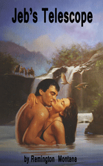
Hatchet Jack posted a Valentine Book cover yesterday that sent my little mind whirling decades back to the sixties. The book, entitled “Jeb’s Telescope,” and written by “Remington Montana,” was very clearly a re-release of a very controversial novel that I encountered way back in 1965.

While the newer cover is in colour, and the title clearly refers to the key plot features of the original (and even the author name is clearly an updated pseudonym), the implications inherent in the original release have been clearly toned down to get the book safely onto to the book shelves and get money out of the book-buyers’ pocket books.

It took me a good day of scrounging around to find a copy of the earlier, release but compare Hatchet Jack’s find above with this:

Image

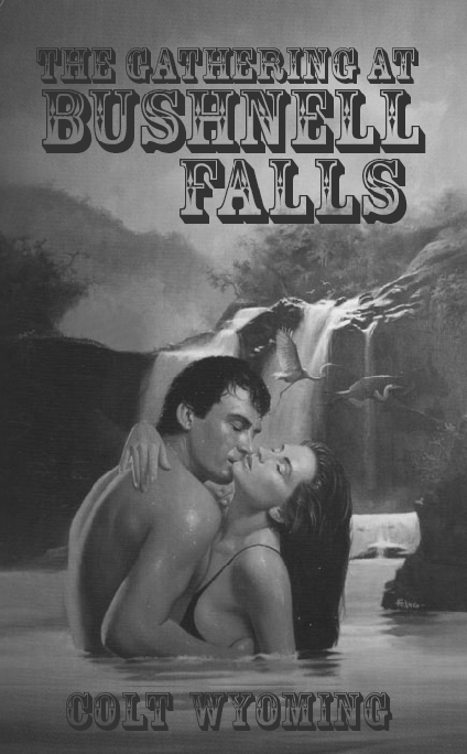
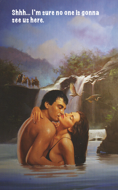
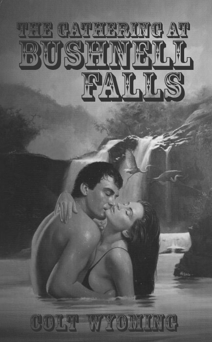
Original cover (1965) of “The Gathering at Bushnell Falls” (Animated GIF)

I recall a lot of furor in the news when this book first came out. People really raised their eyebrows at the word “Gathering” in the title.  There were lawsuits from manufacturers of optical devices. There was a mitigating attempt to re-issue the book with a more accurate and less stimulating and legally provocative title, “The Five Evil Brothers at Bushney’s Falls.”   But it was all to no avail. The book was pulled, the author moved out of state (perhaps to Montana?), and everyone forgot about it.

To see that the book was re-released later, after all that spectacle (did you see what I did there?), with the relatively passive title “Jeb’s Telescope,” just goes to show how much folks still judge a book by its cover.

Speaking of which, I hope you are are seeing me in a new light, now that I am out of that old musty cardboard box and taking some time to work at helping folks see me as I truly want to be seen. Perhaps you have been enjoying my newly-updated publicity photo, my very first piece of voice work for ds106radio, and my Valentine shared for all of you yesterday.

I am still waiting for comments to float my way. I currently only have one measly pingback — and it is from myself (although those self-links I just added above should get me more).

I do trust that all my new friends here at ds106 aren’t too busy to pay me a little attention. You know that real Friends don’t forget one another.

That would be a sad thing. Andbad thing. Very bad.

Hey you over there…

I saw Alan post about this assignment this morning, so I followed the link and went for it. I’m married, so pickup lines aren’t my thing. The creepiness of the image I chose really stood out and makes me glad I don’t have to worry about peekers any more.

When No Words Exist to Describe the Love

Image