Pods embed error: Pod not found

My Stance Obsession

I absolutely adore this car. Over the past year, I have developed an obsession with cars that sit aggressively low to the ground; otherwise known as “stance”, where the wheels and tires fit snuggly underneath the fender, with decent spacing and slightly negative camber. Call me crazy, but it gives me a feeling of being whole; as if I just finished a delectable meal, and can now sit back and revel over how good it tasted. The car pictured above; a Volkswagen Golf mkii owned by Jamie McToldridge, sports BBS E50 wheels custom built by Rotiform using pre-1978 centres and mounted to motorsport barrels is. This particular automobile is definitely on my list to own at some point in my life; and the combination of wheels, color, and suspension, makes it one of my personal favorites. Credit to Stephen Brooks for the photo.


“2 STAR DESIGN ASSIGNMENT # 3?‘ “THE LITTLE CAPTION”

For this assignment I had to choose any picture from Flickr Creative Commons (http://www.flickr.com/creativecommons/) or one from the DS 106 Flickr group (http://www.flickr.com/groups/ds-106/) and caption it. So, I chose this adorable picture from (http://www.flickr.com/groups/-106/)  and I thought of a catchy title that went with the theme of the picture. It was very easy for me to come up with a caption just by looking at the birthday boy’s facial expression on his face while getting ready to blow out his candles from his dessert, and the facial expressions on his friends faces who look like their urging and can’t wait to get their lips on it! I thought it would be funny to make a caption relative to that and plus it would catch my audiences attention whenever they see the picture. The process was very easy, I just used Picnik.com to upload the picture then I used the text tool and the fonts to create my captions. I chose to use the splash the color effect on this picture just because I thought it would be more funny and go with the flow of my caption which is the reason why I chose to only have the birthday boy in bright colors to show that he is the center of attention, and that he is the only one important on that day…. sort of like a king. I put everyone else in black&white to show that they were beneath him and weren’t getting any of his birthday dessert LOL! I wanted to be a little more creative with this one! Hope you guys like!!

My Favorite Color

Summer Weather
Summer Time
This is a picture taking from Pier 21,over looking brooklyn.My mother was visiting me in New York from Florida, for a whole month. And we decided to go out to eat in the city. Memories like this makes me love the Summer time.

BLUE
This is a picture of my favorite color blue.I always loved the color blue i find it as a very relaxing color.. i use to gaze up at the skys alot and just think when i was younger and it been my favorite color since then.

My Visual Assignment
Central Park before
This is the original picture of Central park
Photo shop
This is the after the Photo Art
My trip to central park with a touch of Splash
My trip to Central Park
This is from a trip to central park i made in the summer time, I find central park a very beautiful place, full of alot of life and natural colors.I found this project very intersting because i got a change to eliminate, the colors and still fill the picture with enough color for you to still see the beauty. The way that i made the splash of color is by first having the picture in my cellphone I had doadload at application via android called photo art. And with that i was able to make the changes. First i made the whole picture grayscale.With color eleminated from the picture I added color to the item in the picture that I thought would stand out, and that was the bridge. And the last picture you see is the finished product.

I found Superman in Manhattan

I guess Superman lives there!


This photo is for the assignment of Splash the Color

I used GIMP to create this photo. First, I downloaded GIMP for free and then I googled how to use GIMP. Some say using “layer function” is helpful. Layer is one function to pile many pictures as an animation movie is made. However, clicking the icon of scissors select tool or free select tool and encircling the part where I wanted to  leave the color seemed much easier. Then I inverted selected area and changed the color of the photo into black and white except  that of the area I selected first.

Actually, I changed the whole color to sepia rather than black and white, and put the edge to make the photo seem like an old movie.

Banner Revamp

Third ds106 assignment!

This is the assignment submitted by roundhouseslap , “Revamp your Banner”.

What I had to do:

“Color splash is a technique to emphasize details- you remove all color from a photo, and then restore original color to a single object.”

The image I used in my banner:

What I did: In my wordpress dashboard, I selected ‘Appearance’ and then ‘Header’. In the header page I chose an image I had from the ‘upload image’ option.

I cropped image so that it looked like this:

Then I published it!

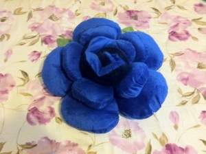
Story: This assignment was something I have been wanting to do . I came across it when searching for an assignment and thought why not give it a try! The picture used is a random photo I clicked of a blue rose cushion. As the theme of my wordpress site’s appearance is blue I thought this might look good!

Dawn and Dusk!

Erase Me Purple!

My 2nd ds106 assignment for this section!

What I had to do:

“Color splash is a technique to emphasize details- you remove all color from a photo, and then restore original color to a single object.”

The original picture:

The photo after being edited:

Process:

  • Open the photo using GIMP
  • Duplicated the image (Image -> Duplicate)
  • Added a Alpha channel for the layer.
  • Using the eraser tool with the transparency option ,erased the part of the flower I wanted in order to bring back its original color.

Story:

I got the inspiration of coloring just one flower from a picture I had seen where someone had colored just one sunflower in a sunflower field. It took me sometime(alot of time) to figure out how to do this in GIMP. Google still remains as the savior!

This is a picture of a flower vase at home clicked by my uncle and I happened to see it! It was a nice image so thought I’d use it for this assignment-saves time nah! ;)

Four icon concert

The Rolling Stones’ US tour of 1969 culminated in a free concert in the San Francisco area. Being free, the concert drew a larger crowd than anticipated. The Hell’s Angels were used as security. They beat up a number of people throughout the day, concertgoers as well as musicians, and finally stabbed a man to death in front of the stage while the Stones were playing. The Maysles brothers made a documentary of the tour called Gimme Shelter.

I thought I’d try telling the story on animated GIFs, but the Stones’ and Angels’ logos suggested iconography. The knife would be another icon. I scanned through clips of the movie on Youtube. There’s a scene of people climbing scaffolding to get a better view that I thought I might use to represent the crowd. It doesn’t appear that the Stones were using their famous logo at that time, but the singer wears a stars n’ stripes top hat on stage, and an omega on his shirt, so I went with that. I captured a few shots with Grab, a Mac utility, and played with contrast and levels in Photoshop to try to reduce the images to B&W. That didn’t quite seem to do it. I thought of Frank Miller’s Sin City books, which were stark black and white, heavy on the black, with an occasional splash of color.

But it’s more four panels than four icons. I thought instead of representing a crowd I should find something that says “concert,” so I searched for some spotlight clipart. Then I got the idea to combine that with the logos and a knife.

I tried to skew the logos to make it look like they were on the floor, but I wasn’t very successful. I got the spotlight/shadow effect by duplicating the background layer, bringing it to the top of the pile, lowering the opacity and setting the layer blending mode to darken.

It’s just a shot away…

Bad Guy Business Cards

download Honestly… This was my laziest work ever… But i feel the need to crank out something. Just been really strapped on time and I have not cranked out a DS106 assignment since the pioneer stage. So he is a quick business card I created for John Gotti, for those of you who don’t know him he is a notorious mobster. I used this card generator to make a quick business card. Its very simple, anyone can do it.

Abbey

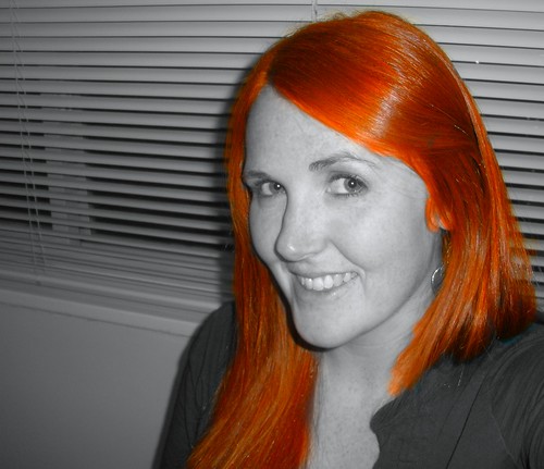
Meet Abbey.  She is kind and sweet and has red hair.  I saw Abbey this weekend and we had this conversation:

Me: I want to take pictures of your face.

Abbey: Ok.

Me: No, really.  I have my camera and I want to take pictures of your face.

Abbey: What? Wait, what?

But like I said, Abbey is kind and sweet.  She let me take pictures of her face.  See, I was going to color-splash her gorgeous blue eyes.  There is something so fabulous about her hair though, that I did that instead for the “Splash the Color” visual assignment.  I also fiddled with the saturation and temperature of the color on Picnik.  It was a little difficult to get her hairline and ends to look nice and not too harsh but overall, I’m pleased with the final product.

So here she is, color-splashed Abbey:

Abbey

Go Blue (or, Go Maize)

I completed my first visual assignment last night.  I chose to use the color splash on the University of Michigan football helmets.

I have always loved the contrast in colors of the maize and the blue.  The Michigan uniforms are unique, and thought the color splash would go well with the helment.


I used GIMP to complete this assignment.  It was a lot easier than I though it would be and I really enjoyed it.  The color splash is cool way to add emphasis to certain parts of the picture.  Cool stuff.


Here is the tutorial I used, which was straightforward and overall very helpful.  http://www.gimp.org/tutorials/Selective_Color/