Pods embed error: Pod not found

Splash of Color – Tutorial

This tutorial will show you a quick and easy way to complete the color splash visual assignment.

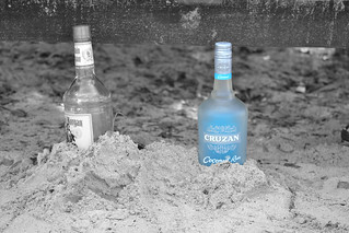
  1. Choose the image you want to color splash. I chose this one.

Colorful Butterfly

2.  The open the picture in the  Adobe photo shop

Tutorial Step 1


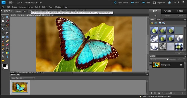
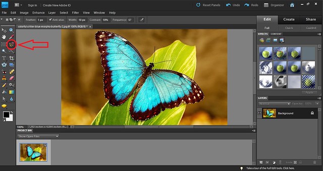
  1. Click on the magnetic lasso tool on the left. It is circled in the image below. Using the magnetic lasso click your mouse on the outline of the area you want to have the color. Trace the outline of the area using your mouse. The magnetic lasso should automatically trace the area. If it does not move your mouse and click on the outline for the magnetic lasso to trace the area.

Tutorial Step 2

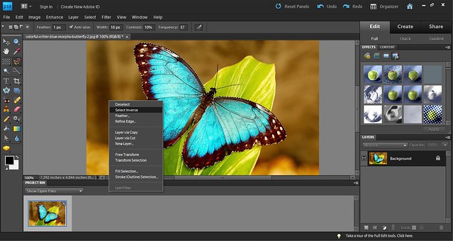
4. Once you  have magnetic lassoed the area you want right click on the picture and choose  select inverse. This will select all areas other than the area you magnetic lassoed.

Tutorial Step 3


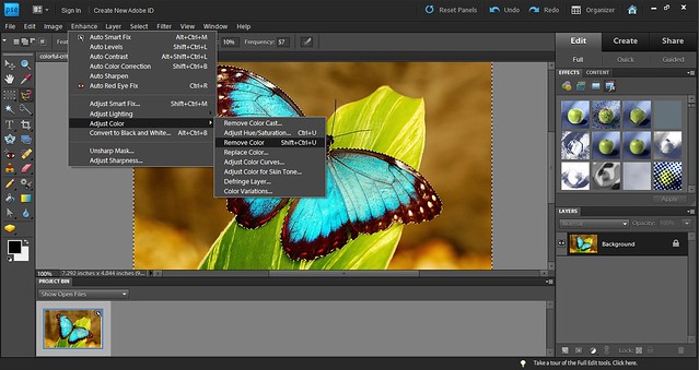
5. After the inverse is selected choose the “Enhance” dropdown at the top of the window. Select “Adjust Color” and the “Remove Color.” OR you can click Shift+Ctlr+U and it will do this action.

Tutorial Step 4

6. The area you selected will be in color and the rest in B&W.

Final


Color Splash Crash Davis Style

Color spash app plus the cutest dog in the world = Color Splash Crash Davis style

Splash the Wire

06target

A lot of people have been noticing color in The Wire, so it’s a natural for the Splash the Color assignment. Here, I took one of the shots inside the Can Office with the orange target on the floor. I wanted to keep the orange and make the rest black and white. I did this by selecting the orange parts of the floor with the Polygonal Select tool (which I seem to use for just about everything) in Photoshop. This was a little tedious and you can see I missed a spot towards the back. Then I used the Select->Inverse function to change my selection to the rest of the picture – the part I wanted to be gray scale. To make it gray scale, I use the Image->Adjustments->Desaturate function. Saturation refers to the color intensity. No saturation = gray.

target-colorsplash

The picture is really designed to be in color, and it shows in the grayscale version. Everything is dark and indistinct, because the color hues gave the picture its life, rather than the light and dark values. Draining the color also makes the scene much colder. The earth tones added warmth.

Color Splash

This assignment had to do with focusing on one color in a picture. I used a picture taken a few years ago on one of my trips to St. Thomas. It is a picture of a bottle of Captain Morgan and a bottle of Cruzan Rum. The blue in the Cruzan Rum is focused on because blue is such a predominant color of the island. The range of blues you see are so wide. They vary with everything you look at. From the blues of the skies and ocean/sea to the blues of the liquor bottles, it is beautiful.

Color Splash

Splash of Color!

The assignment was pretty straight forward. I took a picture that I absolutely adore of my girlfriend and used it for this assignment. You can take any photo you’d like, and using an app( I used color effects) it’ll transform your photo into a greyscale picture. From there I picked her beanie and colored in the greyish purple color that it originally was to contrast with the rest of the picture. Splash of color is meant for a specific detail to pop, not everything. While my coloring was vibrant and brings notice to her hat it also allow people to notice to her eyes. Or maybe another aspect they would not have noticed before.

IMG_2058


Color Splash Assignment 

Splash the Color (3 stars)

I love doing this all the time, therefore I wanted to do this as a visual assignment! I chose a picture that is near and dear to me of my godson when I gave him yet another present, i spoil him so much, this one was a green monkey pillow pet (well we think its a monkey) and he will not let it go to this day and I think it is so precious!

BymJOyqCUAEk7ej

Stop Sign Color Splash

This assignment was pretty simple, other than the minor difficulty of finding a proper application to use for this color splash. I ended up finding an app on my iPhone with a similar name, but it was called Color Effects. I chose to use a Stop Sign as my picture, because of the simplicity and dominating red color it usually has.

This is before the color effects:

And this was after (I do not know why there are huge black spaces above and below the photo so I apologize for that):

IMG_1109


I thought this assignment was pretty fun, as I got to experiment and play around with the app I used, although it was annoying to use because of the amount ads that kept popping up, but granted, it is a free app. This assignment was three stars, and the second one contributing towards my total of eight.

Splash That Color!! (3 Stars)

Going through the different assignments the title Splash That Color really caught my attention. I really enjoyed doing this assignment, it was by far the most fun I have had. Going into it, there was a little struggle trying to figure out what picture I wanted to use. However, after thinking for a little bit I decided to take a picture that was taken for my Senior Photos. I chose a picture of my basketball shoes and a basketball. There is nothing complex about the picture, but it will allow me to use bright colors to complete this assignment.

During my senior year of high school, our basketball team finished the season with the best school record in the history of the school. It was a great year, it a lot of amazing memories. But the one thing that I will never forget are the shoes I wore during that season. At the end of my Junior year, I knew that I wanted these shoes for next season and so I waited and save up the money to get them. Finally, during the first week of practice of my last year I was able to buy them. They were without a doubt my favorite basketball shoes ever and they still are today. I would still wear them today, unfortunately they do not fit anymore. Those shoes remind me of all the great games we play and memories I shared with my teammates that year.

shoes


The process to creating this was tricky at first, but once I found the right software to use, it was easy and very fun to make this picture. I used the app  ColorSplash in order to create this picture. All I did was to take the picture I wanted and upload it to the computer then I took the picture and put it through the app. The tricky part was trying to find the right color that matches my shows, because it is not just a regular green. I changed the shading of the color and was able to find the perfect match. After finding the right color, it was just basically painting the object you wanted to have color and that was it. This assignment was really enjoyable for me and allowed me to take a simple picture and add some creativeness to it.

Splash of Color: Betta Fish!

For my first Visual Assignment, I decided to do the Splash of Color assignment!  At first, I was unsure of how to start, but after a quick Google search I came across the Touch Color app.

IMG_1981

After downloading the app, I opened it up and decided I would color a picture of my Betta fish in his bowl!

IMG_1982


The app was very easy to use, you simply touched the spots on the picture that you wanted to add color to!  After a little while, I came up with this!

IMG_1980

Now you can see Cy’s vibrant blue color!  Overall, I think the picture turned out pretty well!

PhotoSplash

http://assignments.ds106.us/assignments/splash-the-color/

This assignment was a hell of a lot of fun. I had never tried to do this type of editing before but had seen finished products countless times, and really appreciate the effect that it gives. In selecting an image to use, I wanted to emphasize an emotion as well as a visual image from my life that is warm and welcoming. Over the years, I have always been away from my parents and childhood home. It is one of the hardest aspects of life when having a career in the Marine Corps. Having said that, going home for the holidays was made that much sweeter. Not having seen my Mom and Dad for a year, I would pile gifts skis and of course my buddy Jake into my Jeep, and away we’d go. Over the river, through the woods, snow covered roads in the middle of the night trying to get home to enjoy time with family. No matter what time I would arrive in Upstate NY, my Mom would always have the front porch sconces burning bright through the snowy darkness, letting me know that when I saw them, I was home.

Frontdoor

I used Gimp to produce the effect, and it was surprisingly easy to do accomplish. I used a YouTube tutorial assist me along the way.

As you can see, the tutorial video is only 3:16 long, and that’s how long it took me to make the effect. I first selected my image and opened it in Gimp. I then added an alpha channel and duplicated the image. I then clicked desaturation to remove all of the color from the original image. The next step was to choose my eraser and erase the area where the color of the light once was. This brought the color through from the other layer of the image. I adjusted the hue, brightness and contrast, to get the effect you see here.  bright burning welcome home light shining through the snow storm.