


For this assignment I decided to make a minimalist poster for one of my favorite TV shows, Avatar the Last Airbender. To make this poster I took the main title logo and used the main character’s signature tattoo and glowing eyes and layered them over a background. I used an orange background because that is one of the color of the main character’s nation.


So, how about a collaboration between Fifty Shades Of Grey and The Grey?
I recently saw a post with the most recent Fifty Shade’s Of Grey movie trailer. In the trailer it attempted to be dark and dramatic, so I thought, “Self, let’s make 50 Shades Of Grey a few shades darker.” Thus, enter Liam Neeson and his pack of hungry man eating wolves!
I made this Visual Assignment after my movie Scene Assignment and it was actually much less difficult. I think I’ve gotten the hang of photoshop a bit more, although I am still a complete amateur. Searching for photos that could be easily cropped was probably the most difficult part.
Now, I’m dreaming of what this actual movie would be like and what other little things I can photoshop and create. I know how addictive the Internet can be when it comes to videos, memes, etc. But it just got a little more addictive now that I have photoshop.


I chose this assignment because I love movie posters. I worked at a movie theater during my freshmen year and sometimes they would let us take home the movie posters after they were finished with them. I have about five or six of my favorite movies that played there in my closet currently. I picked Beginners, which is my favorite movie of all time. It makes me cry but it also makes me feel inspired and creative. From the expressions of the characters on the poster I got that people express emotions differently and sometimes social constructs tell us which ones we are allowed to openly display or not openly display. For example, smiling is heavily encouraged but crying would distress people and make them uncomfortable. So that is why I chose to superimpose the title of: “Laugh, Cry, Shout: Display Rules and Showing Emotions in Contemporary Society”.
In this assignment, you’re supposed to pick a movie poster and animate it in some way. I picked this up initially thinking it wouldn’t be too difficult, especially for a 4.5 star assignment, but boy was I wrong. I chose 2001 because it was the last movie I watched, and the movie poster was simple enough to plop some moving footage in. While going through the movie, I realized the movement is so subdued in general, and most of the scenes wouldn’t make a great cover. I ended up going with a short shot that includes HAL and Dave. The gif itself is rather large, so I’m making it required to click it to see it in motion.

The process was a lot harder than I expected. My first problem was cutting the clip out of the 2 hour+ movie file I had. I soon realized there isn’t a good free movie editing software akin to audacity, and I immediately regretted not getting the entire Adobe app collection. What I ended up doing was playing the scene on my computer while recording with OBS, which is one of the best screen capture programs, and also free. I then imported that 5 seconds into photoshop as layers, cropped out the rest of my screen that was included in the recording, and overlaid the cropped portion of the poster onto those layers. With that done, it’s easy enough exporting the layers as a gif, although it was rather large, and I wish I could have exported it as a webm, but you can’t do that through Photoshop, at least not to my knowledge. Anyway, I think it came out fairly decent, though I’d like to try this again once I have better software.
I love minimalist movie poster designs. The simplicity in it makes it all the more enjoyable to view. For this assignment I chose to do a minimalist movie poster on the movie The Martian.

The movie already had a basic poster. Simply the actor, Matt Damon, looking into the camera with a quote from the book/movie. I found an image online of a simple, almost cartoonish version of mars:

This image was created as a space tourism poster. Since my photoshop skills aren’t great, I was happy that all that was required of me was to remove the existing text and replace it with the background colors. I then simply inserted the text that I wanted into their own existing layers. All editing was done using freephototool.com. I hope you guys enjoy!


 For my second assignment of the week, I delved into the design category, and decided on the creation of a minimalist movie poster. I found the hardest part of this assignment deciding on a subject matter for the poster. I ended up going with the last movie I saw in theatres, which was Star Wars: The Force Awakens. Even after deciding on the movie, I couldn’t decide on the critical part of the movie to include in the poster. I went with the lightsaber of Luke Skywalker and Kylo Ren; Ren because of his driving influence in each part of the movie and partially due to its unique look, and Skywalker’s because of its legend within the context of the movie. I found this assignment fairly challenging, for the idea of it alone if not the work itself. As you can see, I ended up with two results. I’m not 100% satisfied with either, and might work on them some more on my own time, as I found it a pretty fun assignment.
Now for the actual creation of the poster: all the work was done in Photoshop, using a combination of outside resources and creating my own. I got the lightsaber hilts from DCMJS, and the Star Wars logo from the Disney Wiki. I created the beams with the rounded rectangle tool in Photoshop, using layers of color to give it some depth, and added a glow around them. Finally, I created the starry background with the simple brush, tweaking settings around to get varying opacity, size, and spacing. I feel like the vertical poster has way more potential, but I’m not really sure what to put in the white space. Anyway, it was a pretty fun assignment, and if anyone had some suggestions, it would be much appreciated. Thanks for reading!
For the This Doesn’t Belong Here assignment, we had to take two scenes from two different movies and mash a picture out of them. I used one scene and technically a movie poster, but I feel the affect is the same.
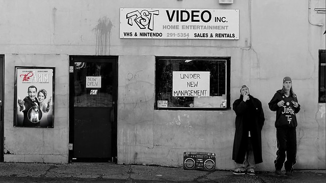
Clerks is a movie released in the 90’s that was filmed in black and white because of budget constraints. The Artist is a movie released in 2011 that was filmed in black and white as a stylistic choice. Thinking about it, the poster for The Artist doesn’t feel too out of place. Someone in the 90’s probably wouldn’t think of it as a film that would be made two decades later. Considering it’s place in the scene as a poster outside a video rental store (yeah, it’s the 90’s), the effect is magnified.
I enjoyed both of these movies, despite their completely contrasting styles. Clerks is very raunchy and vulgar comedy, while The Artist is a very stylized film that makes you think. I think both of them are iconic in their own ways. They are both creative in telling two completely different stories without needing the overly imposing computer effects of Hollywood. Thinking about it deeply, they don’t feel completely different from each other.
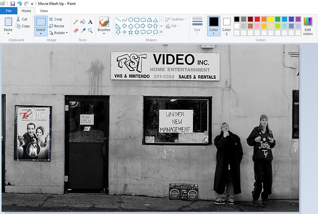
How I made it:
4. Saved the image and uploaded it to Flickr