Pods embed error: Pod not found

Citizen Kane: Minimalist Movie Poster

Create a tv/movie poster that captures the essence of the story through the use of minimalist design/iconography (Minimalist TV/Movie Poster)

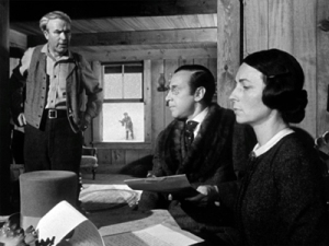
The concept for this design assignment came to mind immediately based on this scene from Citizen Kane (1941):

947223-citizen-kane

Cinematographer Gregg Toland pioneered a deep focus photography that enabled complex storytelling to be achieved in a single shot. In this part of the film, the parents of the young Charles Foster Kane are handing over supervison of the boy to a banker who will oversee his education and entry into a life of power and privilege using the proceeds from a gold mine found on the Kane property. It is a key scene on a number of levels. While the young Kane’s future is being discussed inside the house, we can see him playing happily outside oblivious of the new direction his life will take. Thus begins the problematic downside of his emotional impoverishment that will dog his use of power and wealth as an adult. Although we don’t know it at the time of this scene, Kane is also playing with the sled called ‘Rosebud’, Kane’s final word uttered before his death in the opening of the film and a mystery that drives the investigative plot. The sled, then, seen at the end of the film being destroyed deliberately as an unwanted and  lost possession of the dead Kane, is a powerful symbol of childhood contentment betrayed by parental insensitivity and (particularly a mother’s) ambition that we recall with new resonance from this earlier scene at the Kane home.

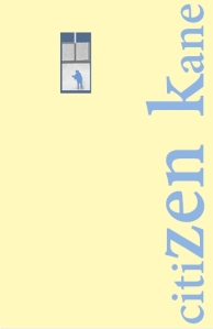
Therefore, the image of the boy Kane playing with Rosebud framed by the window is a good basis for creating an essential and minimalist motif for the film. The film still was imported into Paint and isolated by overpainting the rest of the image as background. The window motif was then copied into PowerPoint and arranged in portrait poster format with the window placed toward the top left of the poster creating a sense of some perspective depth. The font is Adobe Devanagari with serifs that hint at Kane’s position as a newspaper magnate. The title of the film was also placed along the vertical edge of the frame to also try to create a sense of depth and the font enlarged in the middle of the title to make it more figurative or architectural and to play around with the word ‘zen’ to associate kane with the idea of self-enlightenment. But, I decided that this was getting less and less minimalist and that the original colours chosen (light blue and sand) were inappropriately related to the beach:

citizen kane film postert

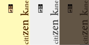
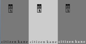
Other colourways were tried:

kane 3 ways

And moving the position of the text and getting rid of the mixed font sizes to create a sense of deep focus:

kane deep focus

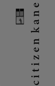
In the minimalist spirit of ‘less is more’, the text was placed at the bottom and various colour combinations tried (using the ‘Format Picture’ Recolour tool):

kan 3 text bottom

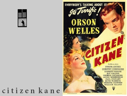
So, this is the final version chosen (next to the original theatrical poster from 1941), but I no longer know which one is best, so you decide:

kane posters old and new


The Ascent – Movie Poster

Weeeeeeeeeeeeeeeeeeeeee

Animated Movie Posters

4.5 stars

Conway’s movie poster

PicsArt_1424056781797

One of this weeks assignments was to create a movie poster that captures the story through minimalist design. I created this poster for my character Conway. It is a black and white picture of the magazine and bullet to his gun that he does his “work” with. It looks noir to me using the contrasts and shadows. I took this image and then used an app called Picsart to give it the black and white color and to add the text. This was a very fun and creative assignment. The original assignment can be found at http://assignments.ds106.us/assignments/minimalist-tvmovie-poster/. It is worth 3.5 stars.

A Toy’s Life: movie poster remix

A Toy's Life

A Toy’s life is a movie poster that I remixed for this Ds106 assignment. It is a combination of two of my favorite Pixar movies. In “A toy’s Life” the toys are going to be become part of “A Bug’s Life” world.

I chose both of these stories because when I was a child I used to watch both movies all the time. Whenever we took a long care ride I would watch one after another on repeat. It would be awesome for them to collaborate together.

For my poster think “Night at the Museum” were Owen wilson gets pinned down by the Indians. The bugs think that the toys are there to hurt them but in reality they all work together to help the bug’s colony. It would be a very cheesy movie but a classic none the less.

For my poster I used Photoshop and Canva to create my poster. I had a lot of different combinations before I settled on this design.

I placed a photo into Photoshop from “A Bug’s Life” and erased around it to make it appear like a leaf. I thought that added a nature feel to the bug’s life side of the story.

When I was done with Photoshop I brought the picture into Canva and added the text. I tend to use Canva for the text because they have better fonts.

I hope you enjoy my remixed movie poster.

Stars: 4.5

Movie Poster MashUp

For my MashUp Assignment requirement I chose the Movie Mashup (4 1/2 stars). The basis of the assignment was to take two movies which have been compared to one another and mix them together into one movie poster. Here’s my submission:

Iron man SuperMan  poster

To complete the assignment I took several pictures off the internet and merged them together using pixlr.com. I started with a good background canvas with Superman and the buildings. To add Iron Man I selected around him and copy and pasted him into the other frame. I then had to erased any borders around him that remained from his original background. The movie poster title was added using the test box tool in italic font. To finish I included the movie’s production details in the same method as Iron Man. I enjoyed how user friendly pixlr is. It is very similar to Photoshop, which is good because my subscription just ran out. The only complaint I have is that I had to redo this assignment 3 times, because the site kept dropping me for various reasons.

minmalize your philosophy + (kind of) movie poster?

though my soul may set in darkness,

it will rise in perfect light.

i have loved the stars too fondly

to be fearful of the night.

“the old astronomer to his pupil” by sarah williams

I originally found this poem attached to a Star Trek blog that I was browsing back when J.J. Abrams’s Into Darkness was released. The passage was associated with Captain Kirk, another one of my favorite TV heroes, and I was struck by the piece’s simplicity and powerful, inspiring message. To embrace one’s fear–to investigate it, dwell in it–is to conquer it and discover a new world.

Since this creation is a part of a poem and inspired by a movie, I wasn’t sure under which assignment this should fall. I finally decided on Minimalize My Philosophy, because this quote moves and encourages me with its easy rhyme and precise imagery.

As with my minimalist poster, I worked on this graphic in Pixlr editor.The background is a black, blue, and radial gradient drawn diagonally through the center. I downloaded a galaxy brush set from Pixlr and then mixed and matched various galaxies and star clusters to create my desired, vast, outer space effect.

Then, I input the image into PowerPoint and added some white text–matching the stars’ color–that echoed the elegance of the poem (the font is Engravers MT Regular). For the final touch, I added a soft, nearly transparent glow around the words to enhance the dreamy effect.

I have this poem saved on my phone when I need a pick-me-up; I hope it provides some happiness for you, too, on those days when you could use some rising galaxies and an endless expanse of gleaming stars.

Aladdin Movie Poster

I chose to do the “Minimalist TV/Movie Poster” (3.5 stars) assignment in the category of “Design/Re-designing Posters” in this weeks Design Assignments. Unsure of which movie to chose, I decided to stick to Disney movies to simplify my options, and after I found the Genie Lamp by Randall Barriga on the Noun Project website, I knew I wanted to do Aladdin.

To start, I downloaded Gimp, which took about an hour. This was all my fault because I had way too many windows open when I decided to download it, so my computer completely froze and shut down. Arggh! Anyway, once I downloaded it, I was able to finally get confused as I always do anytime I download a new software (incase you haven’t been able to tell from my previous posts). I decided I needed help to make a poster that actually looked nice, so I read some tutorials on what tools to use, how to change the background and foreground colors, etc.

Once I finally sorted the basics out, I made the background color a bit of a evening blue-ish type color. This color definitely seemed appropriate for Aladdin to me, as if I remember correctly, a lot of the key points in the movie happy around night time. After that, I added in the genie lamp icon, tried to put it in the layer in a unique way, rather than just have it small and in the middle of the poster. I added the title of the movie to the bottom, to keep the top open and empty and maybe a bit balanced that way. However, I then decided to mess around with the paint for a bit, and found a cool sparkle tool, and impulsively decided to have that coming out of the lamp. I’m not sure how much I prefer it to how the poster looked without it, but it added more color while still keeping it simple, so I think I’ll stick with it. I exported the file as a .jpg, uploaded to Flickr, and here’s the final product!

movie poster

minimalist movie poster.

The truth is out there.

The truth is out there.


For this assignment, I initially thought that I wanted to use a movie. After seeing a previous post re-creating Snow White, I toyed with the idea of using my own favorite Disney/folk tale movie: Sleeping Beauty. Then, I re-considered going with a grittier theme like in my four icons post.

The grittier theme idea lead to a spookier idea, and I was instantly reminded of my favorite television show. I discovered The X-Files at an older age than most (mostly because I was only 1-2 when the show originally began airing) but quickly fell in love with the mythos of the show as a whole as well as the clever, eerie individual episodes. Scully is a personal hero of mine with her intelligence, beauty, strength, and courage, and forget Californication–David Duchovny is only Fox Mulder in my eyes!

Without quick access to Photoshop, I started this piece on the Pixlr editor. I laid down a gray-green background to echo the alien aspect of the TV show, and then I put my own spin on the show’s logo. I emphasized the flying saucer shape to further the alien feel, added bold text in PowerPoint (the Pixlr editor doesn’t allow me to add text, which is apparently a commonly-reported bug), and a vignette effect.

Viola–spooky, 90s minimalism!

Truthful Lego Movie Poster

This is either the second or third time I have used “The Lego Movie” for school work, which is strange because I thought the movie was okay. Any who I thought it would be appropriate to share the truthful side of this movie maybe before you go and see it, plus it was an easy target for manipulation. Here is the before poster:

the lego movie poster

And here is the after:LEGO MOVIE poster


The process was a little more tricky this time simply because I was using GIMP and not Photoshop. It most certainly would have been a lot easier using Photoshop because of the various blending tools I could use for the background where the white text once was, but it turned out just fine.

To get rid of the original text I used the color picker tool to match the color of the background. For those of you that don’t know about the color picker tool, it allows you to select a color that is already in a picture you have. So if you wanted to mimic the exact color of an object you would use this tool and it looks like this:

Screen Shot 2014-07-02 at 7.17.01 PM

After selecting the color of the background, I just used the paint brush to cover up the text and repeated the process around the firetruck ladder. Once all the text was gone I replaced it with my own text using the you guessed it the text tool!

It was a little tedious to get the color right around the firetruck and make the sky match the proper colors, but it was a fairly simple process. Plus I don’t give away to many spoilers unlike one person who would ruin “The Departed” if you have never seen it! Oh well I hope you guys enjoy my movie poster. Let me know if you have any questions!

If you would like to attempt this assignment yourself here is the link:

http://assignments.ds106.us/assignments/truthful-movie-poster/