Pods embed error: Pod not found

A Space Odyssey

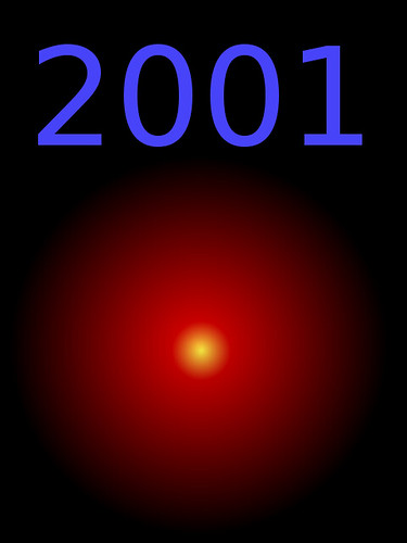
This is a design assignment I chose for my Digital Storytelling class.  My favorite movie of all time by far.

2001 Poster

The HAL-9000's iconic camera eye

Considered to be one of the greatest movie villains of all time, the HAL-9000′s camera eye is very iconic within the film (yes, I know, Wikipedia describes it as such as well–I’m not plagiarizing their description, I’m agreeing with it).  It was always the one image I remembered the most from the film, along with the monolith, and that trippy “Beyond the Infinite” sequence.

The Pit of Despair!

I decided to do another design assignment since the last one was such a success!

This time I picked the movie location poster one, but I decided to animate it.

The movie: The Princess Bride.

The location:

It is all grey-scale, and on the very darkest end of the scale. The idea was to preserve the gloomy, oppressive nature of the torture chamber, and I think it worked pretty well. I made the cogs radially symmetric around each cog, so that I only had to animate the rotation of the distance of one spoke.

The entire animation is only five frames, but it loops seamlessly. The whole picture is limited to 8 colors, and I used a patterned dither rather than a gradient-based one so that it looks more artistic and abstract, rather than literal.

The low number of colors and frames make for a fairly quick, smooth animation, especially considering its size. I’ll be curious to see how it does on other computers, and especially with less solid internet connections. My guess is that it’ll be a little slow to download, and once it’s cached it’ll run fine pretty much anywhere.

Despite the simplicity of the design, the final Photoshop document is 14 layers deep. Most of them are repeat layers for the animation (I copied a layer for each cog, for each frame of the animation. There might be a better way to do it, but this wasn’t too bad). I don’t do this kind of stuff very often, so it took me a bit longer than I’d anticipated, but I think the result is pretty cool.

I thought about making a poster for the Cliffs of Insanity or the Thieves’ Forest instead, but when I came up with the animation idea I decided that this one was definitely the coolest to animate.

What do you guys think?
What the Font?

I decided to do another design assignment for ds106 because they’re a lot of fun. As I was scrolling through the design assignment I decided on the Font assignment. I already had an idea in mind when I was reading through the description. I decided to design the Deathly Hallows “logo” from the Harry Potter series but instead of doing letters (to make it easier on me) I decided to use words. If you haven’t read the Harry Potter books (go and read) or you haven’t seen the movies (ehhh) you probably have no idea what the Deathly Hallows are. So, I decided to use the words of the description of each artifact as the design. The first one is the line and that represents the Elder Wand, which is the most powerful wand in the Wizardarding World; if you own this wand no one can defeat you. The circle represents the Resurrection Stone and if you turn this three times over in your hand, it can bring back the dead. The last, the triangle, represents the Cloak of Invisibility, which allows you to hide from anything, even death. According to the legend whoever possesses all three of these artifacts becomes the Master of Death.

Anyways, I went about doing this by typing out the descriptions into a word document and then just changing the font and color and size. I’m sure there is an easier way of doing that but it was fun because I have two of the Harry Potter fonts. Then, I finally downloaded GIMP!, I copy and pasted the words into gimp and rotated at leisure. The Resurrection Stone was really hard to do because I had to make it into a circle shape so, I just did it word by word rotation…there was probably a better way to do that too but I think it looks pretty good. Then I just inverted the colors because I wanted a black background. I realize now that it’s kind of hard to read sorry but it’s basically all from the Wiki of Harry Potter.

Minimal Trouble in Little China

John Carpenter’s Big Trouble in Little China – one of the best movies of the 80s, or perhaps of all time?  Anyhow, this is my Minimalist Movie/TV poster assignment.  If you’ve seen the film, you’ll get it, and if not, you probably won’t.  Either way you should go and watch the film.  Now.  Please?

The Social Network

I was going to do the “minimalist” poster assignment but wasn’t satisfied with my first attempt and decided to do another one that’s “semi-minimalist” but with a key frame of the movie integrated in there. I like how this turned out, and I do love me some monochrome action here.

Four Icon Challenge

I’ll be doing a number of the visual/design submitted assignments for ds106 in preparation for my talk with Martin Weller this coming week for our online film club bavathursdays. I’m working up to a 80s movie theme here, and I will be covering it from one too many angles in the coming posts—I apologize in advance for the onslaught of bad 80s movie visuals.

So, inspired by Tom, Megan, Alan, Lisa, and D’Arcy here is my attempt at the very fun four icon challenge assignment (thank you Timmmmyboy), keep in mind all my images were found through google search. I took the easy road with found art.

Image sources:
Flamethrower
http://www.roleplaygateway.com/inferi-decretum-t37484.html
Husky
http://www.spirit-teez.com/mascots.htm
Petri Dish
http://www.therpf.com/f9/my-thing-palmer-blood-monster-completed-77660/index2.html
Helicopter
http://www.baotranhuynh.com/vector1.html