Pods embed error: Pod not found

I see dead people–even you! Truthful movie poster

I will admit while this poster looks like it took about 4 seconds to make, it actually was more of an involved effort than first appears…First I had to think of a movie.  I looked through the past few year’s worth of Oscar winners and while I could think of a few sarcastic things to say, I wasn’t sure if I felt comfortable putting my snarky thoughts out on the blog.  Next.  I then looked up “top movie spoilers” and came upon this list.  Many of them were either films I didn’t know or seemed too obscure for me to use, but one seemed to fit the bill: “The Sixth Sense”.

Next I had to find a good image of its movie poster.  I wanted one with Bruce Willis on it, as my “truth” has to do with his character.  More searching…and found this one:

sixth senseI figured I could put my spoiler directly under the title.  I wanted to match the font though.  I used Paint to cut out the title and pasted it on a Word doc for safe keeping:

sixthsense titleFrom there, I looked through Word’s fonts and wasn’t very successful.  The closest I came was Tempus Sans:

title for blog post
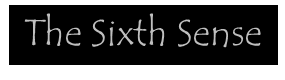
Not great. I went to What the Font to try to find a suitable match.  After inverting the image in Pixlr to make it easier to read, and then isolating one letter to see if that helped (like this): sixthsense title iinvert s onlythe closest font I came up with was Orion:  orionfontNot bad.  However, to actually be able to download Orion cost money, and when I tried to get it free from a website, the download prompted me to download some extra software so I bailed.  So much for having spoiler text in the title font.  How about the font below that says “Not Every Gift is a Blessing.”, however?  That looked easy enough to replicate.  I went to MS Word again and the closest font I came up with was Cambria.  See the original and the fake below:

tagline for blog spoiler2
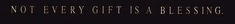
I used Power Point to create a black text box with my spoiler–that Bruce Willis’ character is just another ghost that the child sees.  I made the font grey and used the shadow effect.  From there, I used Pixlr to add a layer over the original poster and add my own tagline:

sixth sense spoilerNot as earth shattering as I thought, but I did learn some new functionality in Pixlr- got to practice more with layers and used the “free transform” button to move the tagline down to the bottom of the poster:

pixlr2
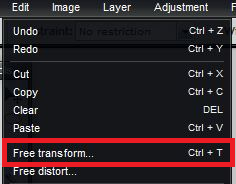
I think I could have done more in terms of optimizing the layer quality and blending in the layer with the background.  I guess that’s what I will have to familiarize myself with next!


Literature Movie Poster Project

I didn’t know about #DS106 at the time but I actually gave an assignment very similar to this to my graphic design students. I was shocked at the results. They had to take a classic piece of literature and create a minimalist movie poster for the book. Here were the top 4 images. A similar […]

Animated Movie Poster

For this assignment, I made an animated poster for the Twilight Zone episode “Time Enough At Last“. This was my favorite episode so far, but it was also the most depressing so I ended up in bed afterwards and drowned out some of the pain with the ever timely humor of Lieutenant Data. Then I had to work.

This took a little longer than I would have liked it to, but as a wise boyfriend once told me yesterday “Just figure out how to do the layers and Google it before you ask me”. So, I eventually figured out that I could link all the frames of my gif in GIMP and thus scale them all at once, rather than painstakingly one by one.

poster2

I tried to use a climatic scene because I feel like that’s how movie posters do, ya know? This one was fun, but definitely challenging.

Link to Original Assignment

Truthful Movie Poster: Zombieland

“Imagine if movie posters told the REAL story about the fillm they’re advertising. Redesign an existing movie poster by changing the text/images to tell us the real story.”

zombieland

There has to be something to said about the success of Jesse Eisenberg because of Michael Cera’s early work. lol Haters gonna hate. These two actors play the same character every movie, they’re nearly interchangeable. I think if the movie starred Michael Cera as the lead role in this film, it would still be the same movie.

Truthful Movie Poster assignment.

Worth: 2 stars.

Spin on Avatar Movie Poster

Spin on Avatar Movie Poster

Animated Movie Poster

For this assignment, I designed a moving poster for the move Inception.  Here it is.inception gif

For this I loaded the poster of Inception into Gimp.  I smart cutted the head of Mr DiCaprio out of the image and reversed it.  I had to play around with the clouds on the other side using the airbrush and imagine what would have gone in there so it’s not quite perfect.  Then I loaded another copy of the poster into a new Gimp file.  From there, I decided to paint the back of Leo’s head with the paintbrush, added in some airbrushed highlights (too keep the shiny part on the top, and airbrushed in some more clouds.

After I finished everything in Gimp, I loaded the three pictures into my gif creator app that I got from the appstore (I think its just called gif creator).  The final product was the original picture, followed by the third picture of the back of his head, the image of his flipped head, and then the back of his head again.

Minimalist Movie Poster Walk Tutorial and Poster

I decided to make a better more improved minimalist movie poster and let you all know how I did it.

Here is ma poster:


Well to accomplish this assignment you either have to have some way of making all those cartoonish looking drawings on a computer, or spend a couple of minutes messing around with a photo editing program. Rather than using my usual go to photo editor of pixlr.com I was adventurous and tried to do the whole thing in GIMP. I sort of accomplished this.

My idea was to make a minimalist poster for Office Space, one of Mike Judge’s non-King of the Hill related works.

Here’s the original Movie Poster

So what I did was that  I found a stock image of the classic red Swingline staplers that almost anyone whose even heard of the movie knows about. After I found one I wanted I loaded it into GIMP.

This is where my experimenting began, but for you I’ll skip to the meaty parts. Once the image is in, darken it a little. Just like when we made the stencil image, things just seem to work better when the original image is a little bit darker. DON’T mess with the contrast; we’re trying to make a hand drawn looking picture here so the lines can be a little simplistic. Once darker go ahead and click “posterize” and take that number of layers down to 2.

Now we’re halfway there, things are starting to look simpler and more minimalist by the minute. After we’ve poserized the image, go ahead and use GIMP’s filter labled “cartoon” under the “artistic” tab.  Lower the number of black marks, because too many, again, add to must definition. Only do this once, don’t repeat this step. After this go back over the image and “clean it up.” By this I mean eliminate anything that seems messy or too defining. I tried to keep the number of colors no more than three: red, white and black.

The matchstick was a personal choice, but if you choose to include it ONLY cartoonize it. It doesn’t really need to be posterized.

This is were I reverted back to my old ways and used pixlr, mostly because I don’t really understand how text-boxes work in GIMP. All I did was pick an office-y looking font, slap in the words “Office Space”, added my two GIMP images as layers, “free transformed” them around till they looked good, and then flattened the images.

The good thing about making a minimalist movie poster is that it doesn’t have that many steps once you figure the basics out. The most important things to remember is to posterize THEN cartoonize.


Tutorial for Truthful Movie Poster (Dumb in 90 Minutes)

Here’s my tutorial for my attempt at a truthful movie poster.

1. Even though I’m beyond raw with Photoshop, I still stuck with it for this work. Call me stubborn.

2. The polygonal lasso (PL) was definitely my go-to tool–it allows me to easily outline around a number or letter and thus isolate a particular space.

3. I started with the PL and outlined the 6 in “60.” My first goal was to rotate the 6 to create a 9, and there’s probably a way to do this easily. Instead, I first copy/pasted the area to create a duplicate 6, which I moved to the side. I used the Edit, Transform, Rotate tool to then turn this copy into a 9. I re-selected the area around the original 6, and used the Brush Tool to fill it in with black. Then I moved over the 9 I’d just created and positioned it just so. Pretty easy.

4. One move I had to keep making as I did this work was Layer, Flatten Image. Each time you copy and paste a section in Photoshop, you essentially create a new layer. Experts get really good at moving between layers to control/adjust elements, but I’m a total rookie and it was easier for me to just flatten the layers out each time so I was just working with one canvas. I’m sure what I just wrote would drive knowledgeable Photoshop folks crazy and reveals my total n00bness.

5. Using this select-copy-paste-flatten process, I was able to move copies of existing letters to the dark area on the left and perform operations in order to create new letters. Creating most of the new letters was pretty easy. I used the PL tool to highlight areas and then copy/paste them into new places, or fill them with color instead. Zooming in helped, and I used the Clone Stamp tool to copy some of the gritty weathered look. Once a new letter passed the “glance test” I moved on.

6. The major challenge was M. All of the letters provided were the same width, so this took some playing around. My first attempt began with an N, and I copied the rightward slanting middle stoke to serve as the last stroke in the new letter. This ended up as looking out of place, something like “N\” if you can imagine that. I decided this wouldn’t be good enough, that I basically need to build a new letter out of the raw material of an N. This took a lot of copy-paste and finessing until it looked okay.

Remix #3 (Design): Dumb in 90 Minutes (Truthful Movie Poster)

I definitely wanted to give this assignment a try–the challenge (as Lindsay points out)–is generating humor with the remix. Is my effort funny? We shall see.

Which film to choose? The one that came to mind immediately was Gone in 60 Seconds (2000), a Nicholas Cage / Angelina Jolie matinee film. Here’s the original movie poster:

One big mea culpa is necessary here: I have not seen this film. But twelve years ago, when the movie arrived in theaters, I remember thinking that it looked pretty mindless, and that a snarky film reviewer might use “Dumb in 90 Minutes” as the title of a negative review. (For what it’s worth, Rotten Tomatoes scores the film at 25%–a certified rotten score–which is pretty bad.)

And so here’s my remix:

The work took probably three or four hours all told, and I’m pretty happy with how it turned out. The most difficult work came in creating new letters. U, B, T and I weren’t so tough, but I struggled with M. My first version had the second leg of the M at an odd angle that looked really jarring, so I spent probably an hour tweaking an N into something better. I think you have to look closely now to notice the amateurish work. Check out my tutorial for more details.

I guess someone could quibble that the film actually clocks in at closer to two hours… but it looks like most reviewers would have liked it to be shorter. :)

Remix #3 Reflection: Truthful Movie Posters

For this remix project, I was inspired by both the Halloween season and the emergence of advertisements promoting the next, and thankfully last, installment of the Twilight films.  Being a huge fan of Bram Stoker’s Dracula, I have watched the evolution of his character and story through television, serialized novels, films, and even graphic novels over the years, and I believe that Stoker’s original vision has been clouded to say the least.  I have always been fascinated with the metaphorical value of the vampire – blood as life, immortality, and the intimacy of his methods.  All of these themes hold immense creative potential and room for development, but I have been disappointed with the direction the most popular treatment of the vampire myth has taken with Stephanie Myers’ Twilight Saga.  As a result, I wanted to comment on the superficial commercialism and overall teeny-bopper appeal that Myers has created in her books and that has translated to the big screen as the most recent pop culture blockbuster.  So, I had a go at the movie poster.

My remix project, Truthful Movie Poster,was relatively simple to achieve once I decided on the idea.  I located a Google Image of one of the Breaking Dawn movie posters and cut and pasted the image into www.Pixlr.com (advanced level).  Once I had the image uploaded, I made some minor tweaks on the image to make it appear a bit moodier.  I adjusted the tint and cranked up the gray images a bit to enhance the spooky factor of the poster in hopes of making some connection back to the gothic roots of the original text.  Once I had played around with the image itself, I went to work on changing the text on the poster.  My plan was to take out the tag line in the center of the poster which read, “Will the truth alone be enough to protect them?” and replace it with the line, “Bram Stoker will spin in his grave one more time.”  This line is my subtle commentary on how Stoker’s novel and character has been so drastically commercialized and sensationalized for profit, original vision be damned.  I thought the “grave” image was a nice touch as well, considering the subject matter.  At the top of the poster, I made the timing of the release relevant by overlaying, “This Halloween…” in a spooky “chiller’ font.  I initially made the font orange in reference to the holiday, but the color splash detracted from the mood of the poster, so I reverted back to a flat off-white color similar to that of the original text color.  I also tried to simulate the original font type and color with the internal blurb as well.  My intention here was to make the poster as close to the original version as possible while making the subtle change in the text.  Sometimes less is more.

In replacing the original text on the poster, I had to rasterize the image.  This enabled me to “paint” over the text to hide it so that I could replace it with my own text.  It took me a good deal of time to figure out how to do this.  The “help” menu on the Pixlr site directed me on this process.  There is most certainly a better way to eliminate the text from the image, but once I made this work, I stopped looking for solutions.  It turned out fairly well, anyway.  The only thing that I really wanted to do that I was not able to figure out how to do was to rewrite the title in the same font it was written in on the original poster.  I wanted to change the title from Breaking Dawn to Breaking Wind to further denigrate the film, albeit in a childish way.  Although I did search through a large number of fonts to find something similar to that used on the poster, I was not able to find anything close enough.  Again, there is likely a way to simulate, or outright copy existing fonts, but I could not find a way to do that.  I imagine there are some copyright restrictions protecting original artistic fonts, anyway.

Overall, I am relatively pleased with the way the poster turned out, although I did not think this particular assignment provided many creative applications not offered by the Remix #1 assignment.  I did enjoy being able to manipulate existing images to create a new perspective.  This is the part of the assignment that I will definitely take into the classroom with me.  I plan on using this remix design idea to create an assignment for students in which they rework existing book covers or movie posters for works we read in class.  One idea I had was to reimagine a book cover or movie poster from the perspective of the antagonist rather than the protagonist.  How would the different perspective impact the aspects of the story chosen to promote the work? What types of images or text may be used to represent the text if the “other side” had a voice in the promotion of the text?  This assignment was helpful to me in that it challenged me to consider the decision-making processes at work when PR departments create promotional materials for various texts.  This is the aspect of the assignment that I plan on using when teaching this project to my students.